The 10-year US Treasury yield is trading above 5.1%, a level unseen in more than two decades. But the level itself is not the most interesting thing about this market. On a single day in August 2026, a routine US Treasury buyback announcement was enough to knock longer-dated yields back from their highs, and that small retreat sent gold surging 4% and Bitcoin jumping 6% in the same session.
That asymmetry is where this analysis begins. When a modest yield move produces multi-percent swings across other asset classes, the yield is no longer just a bond-market number. It has become the master variable.
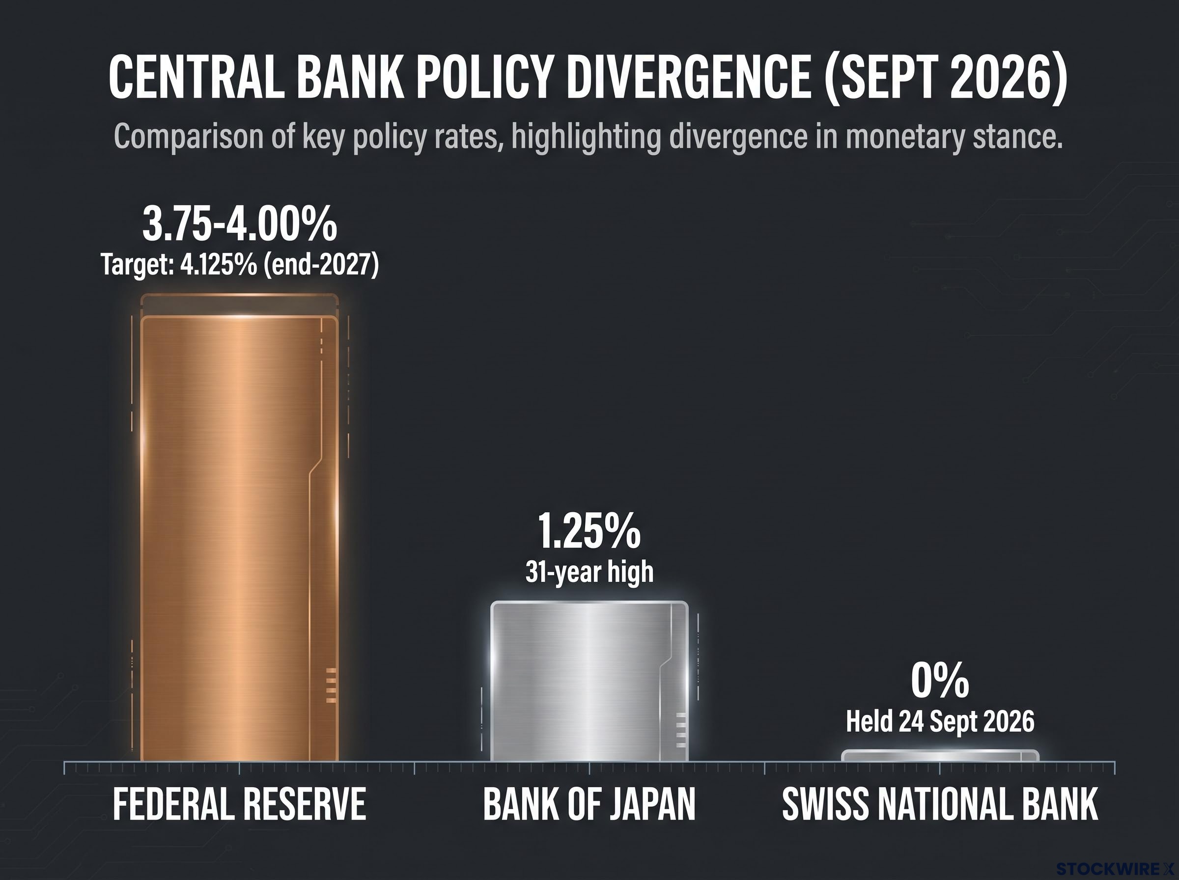
Consider the backdrop. The Federal Reserve has raised rates to 3.75-4.00% and its dot plot points higher still. The Bank of Japan is hiking for the first time in a generation, now at 1.25%. The Swiss National Bank is holding at 0%. Three major central banks, three different directions, all at once.
This is not a routine tightening cycle. It is a live experiment in policy divergence, and the impact of treasury yields is transmitting through every asset class you hold. Here is the mechanism, and here is how to read it in real time.
What is actually driving the 10-year yield above 5%
Before you can decide whether a yield spike is an entry point or a warning sign, you need to know what is causing it. And on that question, the market is genuinely split.
The 10-year yield sat around 5.09% in Societe Generale’s late-September reading, oscillating in a 4.95-5.14% band through September trading. The 2-year yield had climbed to 4.94%. The move looked extended, Societe Generale strategists observed, but showed no clear sign of reversing.
Two explanations compete for why. Each points to a different place for yields next.
Two camps, two very different implications
The first is the fiscal and supply camp. In this reading, the surge is a market reaction to swelling US sovereign debt and heavy issuance, with investors demanding a higher term premium to hold long-dated paper. The clearest evidence arrived on 19 August 2026, when the US Treasury announced expanded buybacks of longer-dated securities and yields promptly retreated from multi-decade highs. Societe Generale also flagged sell and stop-loss orders, possibly amplified by pre-auction concessions ahead of a 5-year sale, as mechanical contributors to the run-up.
Treasury supply dynamics have shifted the structural backdrop materially: the Fed’s share of outstanding public debt has shrunk from roughly 26% in 2021 to approximately 14% in mid-2026, and Japan’s simultaneous domestic policy normalisation represents a persistent withdrawal of foreign demand that amplifies the term premium pressures visible in the current yield level.
The second is the macro and policy camp. Here, the move reflects a genuine repricing of growth and inflation expectations along a higher rate path. The Fed lifted its target range to 3.75-4.00% on 16 September 2026, and its September dot plot signalled at least one more 25 basis point hike, with the median rate held near 4.125% through end-2027 and the longer-run neutral rate nudged up to 3.2%. On 4 September 2026, a strong US jobs print pushed the 10-year back toward 4.80% as investors repriced how long policy would need to stay restrictive.
The 2-year yield adds a wrinkle worth isolating.
Societe Generale noted the 2-year yield at 4.94% may reflect a market perception that the Fed is behind the curve on inflation, a signal that markets doubt current policy is tight enough.
The distinction matters because each camp implies a different tool for relief.
| Interpretive camp | Primary evidence and yield implication |
|---|---|
| Fiscal / supply | Treasury buyback on 19 August capped yields; term premium and stop-loss dynamics. Implication: policy tools can cap yields. |
| Macro / policy | Hawkish dot plot at 4.125%; strong jobs print pushed 10-year toward 4.80%. Implication: only weaker data relieves pressure. |
If fiscal concerns dominate, buyback interventions can put a ceiling on yields, and a spike may be a buying opportunity. If macro repricing dominates, only a deterioration in the economic data will bring genuine relief. Which thesis you find more credible should shape how much rate-sensitive risk you are willing to carry right now.
When big ASX news breaks, our subscribers know first
How yield moves transmit across gold, Bitcoin, and equities
You do not need a model to see this mechanism at work. Two sessions, six weeks apart, show it running in both directions.
The chain itself is straightforward logic:
- The 10-year yield rises.
- The discount rate applied to future cash flows rises with it, compressing valuations.
- The US dollar strengthens on the higher rate differential.
- The opportunity cost of holding non-yielding assets like gold and speculative ones like Bitcoin increases.
- Gold and Bitcoin sell off.
Run that chain in reverse and you get 19 August. The Treasury buyback announcement pulled longer-dated yields down, the dollar tumbled, and non-yielding assets rallied hard: spot gold rose 4.05% to $4,508.64 an ounce, and Bitcoin gained 6.06% to $68,470.91.
Then watch it run forward on 4 September. A strong US jobs print pushed the 10-year back toward 4.80%, the dollar firmed, gold fell more than 2%, and Bitcoin slid from above $81,000 to below $80,000 as leveraged long positions were liquidated. By 24 September, gold was back below $4,300 near a one-week low and Bitcoin below $84,000.
| Date | Yield trigger | Gold move | Bitcoin move |
|---|---|---|---|
| 19 Aug 2026 | Treasury buyback, yields retreat | +4.05% to $4,508.64 | +6.06% to $68,470.91 |
| 4 Sep 2026 | Strong jobs print, 10-year toward 4.80% | -2%+ | Below $80,000 (from $81,000+) |
The symmetry is the point. When the 10-year moves materially, gold and Bitcoin tend to move the opposite way within the same session, which gives you a live early-warning signal before the effect fully spreads to broader indices. Speculative crypto feels it hardest: Worldcoin (WLD) and Pepe (PEPE) both posted double-digit losses in the 24 hours to 24 September.
Why equities do not always follow the same script
Equities are the exception that proves the rule. When yields rise because growth expectations are improving rather than because a central bank is tightening unexpectedly, stronger earnings can partially offset the valuation drag.
That is why a broad index may hold up better than a long-duration growth stock in the same move. Growth names, whose value sits in distant future cash flows, are the most exposed; value stocks and financials, which can benefit from wider margins, may weather it or even gain.
Equity duration exposure varies sharply across sectors: technology and biotech, whose valuations lean most heavily on distant future cash flows, face the steepest multiple compression when the discount rate rises, while financials and energy, with nearer-term earnings, can partially absorb or even benefit from the same move.
So when the next Fed data release lands, the question to ask is not just whether yields moved, but why. A growth-driven rise reads very differently for your equity book than a policy-driven one.
Three central banks, three directions: what divergence means in practice
Start with the anchor. The Fed sits at 3.75-4.00% with a dot plot pointing toward 4.125% through end-2027, the most aggressive tightening stance in a generation.
Now add the counter-narrative. The Bank of Japan has moved from near-zero to 1.25% in under two years, a 31-year high confirmed in a 7-2 vote, following its June hike to 1.0%. That normalisation has bolstered the yen and pulled USD/JPY back from three-week highs near 158.00, unwinding one of the largest carry trades in global markets.
Then place a third data point beside them. The Swiss National Bank held its policy rate at 0% on 24 September 2026, revising its 2026 inflation forecast only marginally higher to 0.7% from 0.6%. One economy tightening hard, one normalising fast, one sitting still.
| Central bank | Current rate | Recent direction | Key FX implication |
|---|---|---|---|
| Federal Reserve | 3.75-4.00% | Tightening, one more hike signalled | Dollar strength across pairs |
| Bank of Japan | 1.25% | Normalising from near-zero | Yen bid, USD/JPY off 158.00 |
| Swiss National Bank | 0% | On hold | Franc as potential funding currency |
The reason this matters to you comes down to carry trade mechanics:
- Investors borrow in a low-rate currency, historically the yen and now potentially the franc.
- They invest the proceeds in higher-yielding assets, often dollar-denominated.
- The trade works as long as the funding currency stays cheap and stable.
- A rapid policy shift in that funding currency, such as a BoJ hike, can force an abrupt, disorderly unwind.
That last point is the risk most retail portfolios are not pricing.
Carry trade arithmetic still holds at a US-Japan rate differential of roughly 250-275 basis points, but the margin of error is materially thinner than during the near-zero yen-funding era of 2023-2024, when the BoJ was effectively underwriting the trade with no credible normalisation timeline.
Analysts frequently invoke the mid-1990s bond rout and the 2013 taper tantrum as reference points, episodes where US tightening clashed with easier stances elsewhere and triggered rapid repricing across yields and exchange rates. They are pattern-recognition tools, not forecasts.
The practical read: a BoJ move or an SNB surprise can trigger cross-asset volatility that has nothing to do with US economic data, hitting portfolios funded cheaply in yen or francs regardless of what your own holdings are doing.
Reading the signals: which indicators to watch as this plays out
If you watch only the headline 10-year yield, you are working with one instrument on a dashboard built for several. Read together, the signals are far richer. Here are the seven that matter, in order of priority.
- The 10-year Treasury yield. The absolute level counts, but the direction and velocity matter more for short-term asset reactions. September traded a 4.95-5.14% range.
- The 2-year Treasury yield. At 4.94%, it reflects where markets think the Fed is heading, and whether they believe policy is tight enough.
- Credit spreads. These show whether tighter conditions are actually feeding into real-world borrowing costs yet, or remaining a rates-market phenomenon.
- The Fed dot plot and FOMC statements. The medium-term framework setters. On 24 September, appearances by Philadelphia Fed President Anna Paulson and Cleveland Fed President Beth Hammack were exactly the kind of event that can shift dot-plot interpretation.
- Initial Jobless Claims. The 24 September release carried a 201,000 consensus against a prior 196,000.
- Major FX pairs. USD/JPY as the Fed-versus-BoJ barometer, and USD/CHF as the SNB signal.
- Gold and Bitcoin. Their rapid directional response makes them leading, not lagging, indicators of whether a yield move is being read as risk-off or growth-positive.
On the labour data, one caveat matters.
Watch the four-week moving average of Initial Jobless Claims, not the weekly print. The single-week number is noisy; the trend is the signal that feeds into Fed expectations and, through them, into yields.
FX pairs as live policy-divergence gauges
USD/JPY is your cleanest read on the Fed-versus-BoJ gap. A sustained break back above 158.00 would signal the dollar reasserting despite BoJ hikes, while a move below that level would suggest the yen carry unwind is gathering pace.
USD/CHF, meanwhile, tracks the SNB divergence, with a 0% Swiss rate against a tightening Fed keeping the franc a candidate funding currency.
One tail factor sits over USD/JPY specifically: Japanese intervention risk, which market participants continue to cite near elevated levels and which can force sharp reversals with little warning.
What the yield environment means for asset allocation going forward
You now face the same market you started with, but with better information about what drives it. The core finding is that this is not a standard tightening cycle. It pairs the highest US yields in two decades with simultaneous BoJ normalisation and SNB stasis, a policy configuration with no clean modern precedent.
Two trajectories are plausible from here. If the data stays strong and the Fed delivers another hike, yields hold high or climb toward the dot-plot ceiling near 4.125%, compressing valuations and sustaining pressure on gold and Bitcoin. If data weakens or Treasury supply management accelerates, yields retreat and non-yielding assets can stage the kind of sharp relief rally seen on 19 August, when gold jumped 4.05% and Bitcoin 6.06%.
For investors wanting to stress-test the higher-for-longer path in concrete terms, our deep-dive into a 6% Treasury yield scenario models the implied mortgage rate impact, equity multiple compression, and duration loss across bond portfolio structures if the 10-year climbs materially beyond its current range.
Where does that leave your exposure? Long-duration bonds and growth equities are most vulnerable in a sustained high-yield regime. Gold and crypto are the most yield-sensitive in either direction. And the carry-trade unwind from the BoJ’s climb to 1.25% is the least priced-in risk in most retail portfolios.
In this environment, yield direction is not one input among many. Any meaningful position in equities, gold, or crypto is effectively a secondary bet on where yields go next, whether you intend it that way or not.
Three variables will resolve which path plays out:
- Incoming US economic data, particularly the labour market.
- The next FOMC and BoJ decisions.
- Any further Treasury supply management actions such as buybacks.
This article is for informational purposes only and should not be considered financial advice. Investors should conduct their own research and consult with financial professionals before making investment decisions. Past performance does not guarantee future results. Financial projections are subject to market conditions and various risk factors, and forward-looking scenarios remain speculative and subject to change based on incoming data and central bank decisions.