Here is a chart that looks like a trap in both directions at once. GBP/USD is trading below its 50-, 100-, and 200-day moving averages, its RSI is edging toward the level most retail traders treat as a green light to buy, and yet the professional commentary is still leaning short.
That tension, between what a beginner reads on the chart and what an experienced analyst concludes, is exactly what makes this setup worth studying.
The current GBP/USD picture, as of mid-September 2026, is a rare live exam question for technical analysis. The pair has broken below a rising trendline, is sitting inside layered support, and faces a macro backdrop of Federal Reserve and Bank of England policy divergence alongside fresh commodity-driven inflation fears. These are the conditions that turn a chart into a genuine case study rather than a hypothetical.
By working through this live chart, you will know exactly what each signal means, where the common misreadings happen, and how to apply the same framework to any currency pair you follow. The point is not to predict where sterling goes next. The point is to walk away with a repeatable process you can run on any instrument tomorrow.
What it means when GBP/USD trades below all three major moving averages
Open the daily GBP/USD chart and the first thing you see is price sitting under a stack of lines. To a first-time viewer, those lines look like decoration. They are not.
Those lines are the 50-, 100-, and 200-day simple moving averages, and each one tracks a different group of market participants. When price trades below all three at once, it tells you sellers have overwhelmed demand from every one of those groups, not just the fast money.
Here is which cohort each average represents:
- 50-day SMA: short-term swing traders who move in and out over weeks.
- 100-day SMA: medium-term position traders holding for months.
- 200-day SMA: long-term trend followers and institutional benchmarks.
According to the original technical analysis, these three averages were clustered near 1.3481, forming a single dense band of overhead resistance. Subsequent research confirms the pair has been trading under its 200-day average since mid-September 2026.
| Moving Average | Trader Group It Represents | Current Level (Sept 2026) |
|---|---|---|
| 50-day SMA | Short-term swing traders | Clustered near 1.3481 |
| 100-day SMA | Medium-term position traders | Clustered near 1.3481 |
| 200-day SMA | Long-term trend followers | Clustered near 1.3481 |
Whether you are watching this pair or another, the message is the same: the path of least resistance is lower until price reclaims those levels. Any long position held through this configuration carries elevated risk, and the sensible response is to price that risk explicitly into where you place your stop.
Distinguishing a corrective pullback versus reversal on GBP/USD is a separate but closely related skill: in late August 2026 the same SMA cluster and RSI framework pointed to a bullish structural bias at 1.3594, a direct contrast to the bearish configuration the pair had moved into by mid-September.
When support becomes resistance
Earlier in September, the pair was actually being held up by the 50-day average. That support broke, and the moment it did, something important flipped.
Sellers who bought near 1.3481 are now underwater. On any recovery back toward that band, they will sell to escape at breakeven or to trim their losses, turning old support into fresh overhead supply.
This is a repeatable, observable pattern, not a GBP/USD quirk. Your practical heuristic: watch for rising volume on rallies that stall at a prior support zone. When a bounce fails there on heavy volume, the flip is confirming itself in real time.
When big ASX news breaks, our subscribers know first
How to read RSI without falling into the most common trap
The Relative Strength Index (RSI) is a momentum gauge that moves on a 0-100 scale over a 14-period lookback. Below 30 is traditionally called oversold, and above 70 overbought.
The GBP/USD RSI sat at 31.9 on the daily chart in the original analysis, just above that oversold line. That is precisely the kind of number that tempts a retail trader into a long position, on the assumption that a bounce is due.
Here is where sourcing discipline matters. Subsequent research reported a 14-day RSI of 41.845 generating a “Sell” signal on 17-18 September 2026, a different figure on a different date and timeframe. Neither reading is wrong; they simply measure different windows. Always verify which period and which timeframe a cited RSI reading applies to before you act on it.
The deeper trap is treating an oversold number as a buy signal in a downtrend.
In a persistent downtrend, RSI can stay oversold for a long stretch while price keeps falling. The reading is a momentum thermometer, not a bottom-caller. It tells you selling is losing intensity, not that the low is in.
This is why professionals adjust the thresholds to 20/80 in strongly trending markets, to stop themselves reacting to noise. And it is why they wait for a specific structural signal called a failure swing before treating an oversold reading as actionable.
The StockCharts RSI guide covers failure swings in depth, explaining precisely why an oversold reading in a downtrend carries no standalone predictive value without the four-step structural confirmation sequence.
A failure swing unfolds in four steps:
- RSI drops below 30, confirming oversold momentum.
- RSI rebounds back above 30.
- Price pulls back again, but RSI holds above 30 this time.
- RSI then breaks above the high of its earlier rebound.
That sequence is the momentum telling you the character of the move has genuinely changed.
The GBP/USD reading near 31.9 had shown none of that. Without a confirmed failure swing or a macro catalyst for reversal, all it told you was that momentum was slowing, not that the trend had turned. Most retail traders lose money buying “oversold” downtrends for exactly this reason: they trade the number instead of the structure.
RSI divergence at structural levels has an 87.61% success rate in academic studies of equity markets, a meaningful contrast to bare threshold readings like the 31.9 print on GBP/USD, where no divergence signal was present and the structural case for a long trade remained weak.
Mapping support and resistance levels: how to identify where price is likely to pause or reverse
Scan a chart the way a trader does, from the top down, and support and resistance stop looking like arbitrary lines. They become zones where specific groups of participants have already made decisions and are likely to make them again.
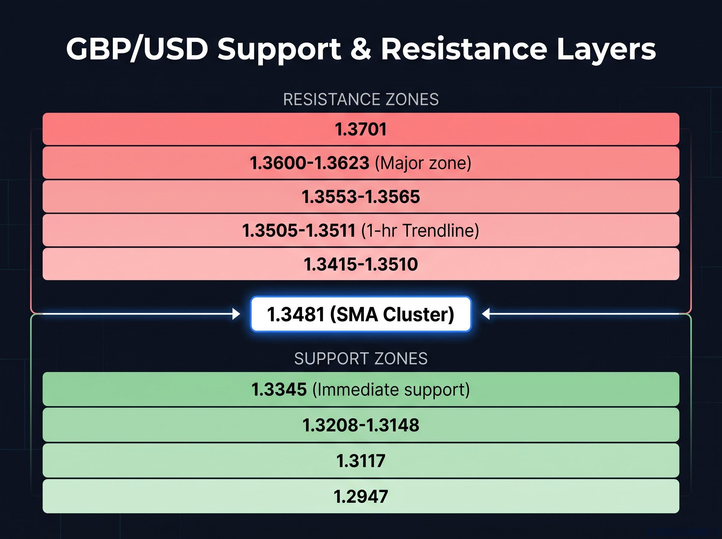
Start with the ceiling. On the 1-hour chart, price actively rejected a descending trendline in the 1.3505-1.3511 area, leaving it as live resistance capping every rebound.
Above and around that sit the layered resistance zones: 1.3415-1.3510 nearest, then 1.3553-1.3565, with a major zone at 1.3600-1.3623 flagged in subsequent research. The original analysis also noted resistance at 1.3488 and further out at 1.3701.
Now the floor. Immediate support ran at 1.3345, the level of the earlier trendline break. Below that, layered support stretched down to 1.3208-1.3148, with deeper weekly thresholds at 1.3117 and 1.2947.
| Level / Zone | Price Range | Type | Significance |
|---|---|---|---|
| Trendline (1-hr) | 1.3505-1.3511 | Resistance | Active rejection point capping rebounds |
| Nearer resistance | 1.3415-1.3510 | Resistance | First recovery hurdle, overlaps SMA cluster |
| Mid resistance | 1.3553-1.3565 | Resistance | Secondary sell zone on extended bounces |
| Major zone | 1.3600-1.3623 | Resistance | Structural ceiling from broader research |
| Immediate support | 1.3345 | Support | Trendline-break level, near-term stop reference |
If you are holding a long GBP/USD position right now, this map does concrete work for you. Your stop belongs below 1.3336, the level where the structure breaks down, and your recovery trade should expect selling pressure first at 1.3415-1.3510, then at 1.3553-1.3565.
Reading levels in layers rather than as single lines is the difference between a stop placed at a logical structural point and one placed arbitrarily.
Reading trendline resistance
Drawing a descending trendline takes three steps. Identify the most recent significant high, connect it to the next lower high, then extend that line forward across the chart.
That extended line is where traders who missed earlier entries wait to sell, which is why it concentrates selling pressure.
On the GBP/USD 1-hour chart, the trendline in the 1.3505-1.3511 area gave you a live demonstration. Price rallied into it, met that wall of waiting sell orders, and turned back down. That rejection is what a descending trendline holding looks like in practice.
Why macro context determines whether technical signals hold or break down
Here is the mental shift that separates a chart reader from a trader. Technical analysis tells you where to watch. Macro conditions tell you which direction to trust.
For an exchange rate, this hierarchy is not optional, because a currency pair is ultimately a relative macro price. Interest rate differentials, inflation, and growth set the medium-term direction over weeks and months. Moving averages, RSI, and trendlines are best used for timing entries, exits, and stops within that direction.
The top-down sequence looks like this:
- Global risk appetite and central bank divergence: the biggest lever on FX direction.
- Data surprise trends: inflation, growth, and employment relative to expectations.
- Exogenous shocks: commodity spikes and geopolitical events.
- Technical signals: used last, for entry timing and stop placement.
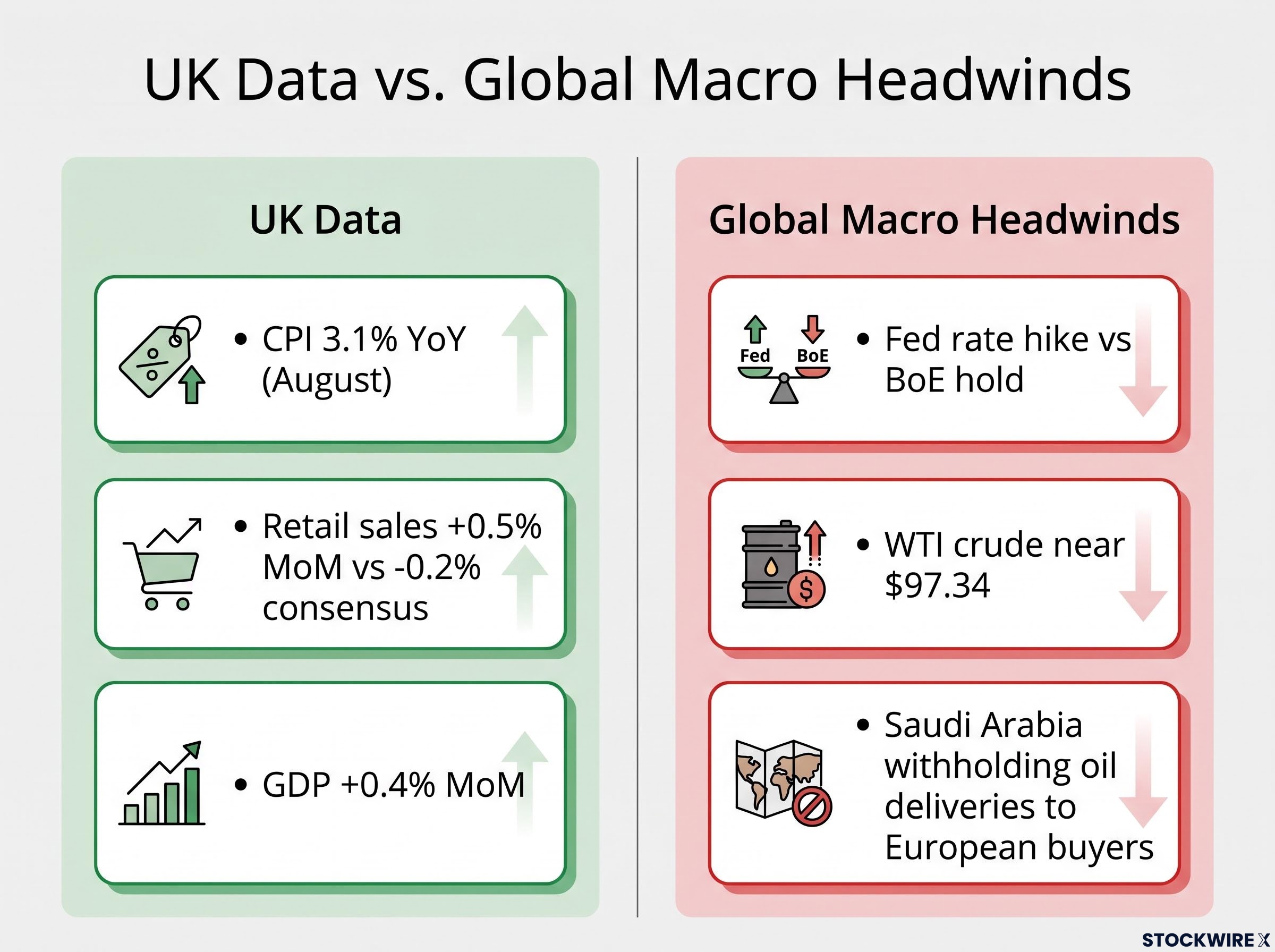
GBP/USD in September 2026 shows exactly why the order matters. Markets were pricing a Federal Reserve rate hike while the Bank of England was widely expected to hold, and that policy divergence is structurally bearish for the pair because it pulls capital toward the higher-yielding US dollar.
Central bank divergence moves currencies primarily through forward rate path expectations rather than individual decision sizes: the Fed-ECB gap in 2022 drove EUR/USD below parity even as the ECB was actively hiking, because markets priced the full projected rate trajectory, not the most recent meeting outcome.
The UK data was genuinely encouraging. CPI came in at 3.1% year-over-year in August, its highest since March. Retail sales rose 0.5% month-over-month against a consensus for a 0.2% contraction, and GDP grew 0.4% month-over-month. On paper, that is a supportive backdrop for sterling.
It was not enough. A Bloomberg report that Saudi Arabia would withhold oil deliveries to European buyers rekindled inflation fears, with WTI crude near $97.34, and that reinforced demand for the dollar as a haven.
Technical signals are most reliable when they align with the macro direction, and most dangerous when they appear to contradict it. An oversold RSI and strong UK data both failed to lift GBP/USD because the macro current was running the other way.
That is the answer to the puzzle in the introduction. When the macro tide runs in one direction, technical signals operate within it, not against it. The most expensive mistake in retail FX is taking a technically valid-looking long in a macro downtrend.
What AI tools can and cannot do for your technical analysis
The original GBP/USD analysis was assisted by an AI tool, as disclosed by FXStreet, and that reflects a growing practice you now have access to yourself.
Platforms such as TrendSpider, ForexGPT, TradeAlgo, and Jenova AI automate work that would take a human analyst hours. They draw trendlines, run RSI scans across dozens of pairs at once, recognise patterns, and backtest setups tick by tick.
The limitations are just as important. According to the FMSB’s “AI in Trading” framework, these models can overfit to historical noise, performing well in backtests but faltering live. They are fragile during macro regime shifts, precisely the environment GBP/USD is in now, and their reasoning can be opaque, which regulators flag as a governance risk.
Most prop firms position them as analysis assistants, not execution replacements. The practical rule for you: use AI for level identification and pattern scanning, apply your own judgment for macro context, and never delegate the stop-loss decision to an automated system.
Applying the GBP/USD framework to your own analysis
Every concept above collapses into one repeatable sequence you can run on any chart tomorrow morning.
- Establish the moving average configuration to read the structural trend bias before anything else.
- Check RSI in the context of that trend, looking for a failure swing rather than a bare threshold crossing.
- Map support and resistance in layers, not as single lines.
- Cross-check the technical signals against the macro direction before you act.
| Framework Step | GBP/USD Example | What to Watch For On Your Chart |
|---|---|---|
| Trend bias | Price below 1.3481 SMA cluster | Position of price relative to all three SMAs |
| Momentum context | RSI at 31.9, no failure swing | Failure swing sequence, not just a sub-30 print |
| Support / resistance | Immediate support 1.3345 | Layered zones for stop and target placement |
| Macro direction | Fed hike vs BoE on hold | Rate differentials and data surprises |
Run this sequence on a pair or instrument you actually follow, using your own charting platform, and the method transfers directly. One calibration note: the signals here apply to the daily chart. On shorter timeframes, RSI moves faster and support and resistance zones tighten, which is why the 1-hour trendline at 1.3505-1.3511 sits apart from the daily-chart levels.
Multi-factor confluence is what separates a thin probabilistic tilt from a genuinely tradeable edge: research estimates the probability of a trade moving in the anticipated direction rises from roughly 60% with one factor to approximately 85% when three independent analytical families confirm the same read.
The pair’s session low of 1.3336 on 18 September 2026 pierced closely below the framework’s flagged support level of 1.3345, a real-time test of the method. Apply the four steps consistently and you make fewer reactive trades triggered by one indicator, and more deliberate calls grounded in the full picture. That is the difference between using charts as confirmation and using them as a decision framework.
What the GBP/USD setup is telling you, and what comes next
Pull the threads together and the read is coherent. Price sits below the 1.3481 SMA cluster, RSI is near oversold but shows no confirmed failure swing, and the macro headwinds from Fed and BoE divergence remain intact. On that evidence, the technical bias stays bearish.
Two specific conditions would change it:
- A confirmed RSI failure swing on the daily chart, signalling a genuine momentum shift.
- A reclaim of the 1.3481 SMA cluster on a daily closing basis, turning that band back into support.
Until then, treat this as a monitoring framework, not a prediction. Watch the 1.3345 support zone as the near-term test, and the 1.3481 cluster as the recovery threshold that would shift the structural bias. Upcoming BoE and Fed decisions are the macro variables that will either reinforce or undercut the setup in the weeks ahead.
The pair’s technical picture stays under pressure until it reclaims the 1.3481 SMA cluster on a daily closing basis. No single data point or RSI reading changes that structural fact.
For any GBP/USD position in the near term, the risk is skewed to the downside until those two conditions are met, and both are now clearly defined and watchable.
This article is for informational purposes only and should not be considered financial advice. Investors should conduct their own research and consult with financial professionals before making investment decisions. Past performance does not guarantee future results, and these statements are speculative and subject to change based on market developments.