Most investors think Federal Reserve policy is decided behind closed doors, revealed only when the committee finally speaks. The reality is stranger. Financial markets price the exact move weeks ahead of any announcement, and they do it by reading a single monthly data release.
That release is the Consumer Price Index, and its timing right now could not be sharper. The July 2026 reading showed inflation cooling, yet Brent crude has surged toward $98 per barrel on the back of attacks on Saudi energy facilities. Those two forces are pulling in opposite directions.
The next inflation print is the undisputed catalyst for the September Federal Open Market Committee (FOMC) meeting. Everything else is noise around it.
Here is the framework for interpreting that data the way an institutional investor does: translating raw monthly percentages directly into bond market moves and rate hike odds, so you can grade the release yourself the moment it lands.
How consumer price data actually moves the interest rate needle
The Federal Reserve operates under a dual mandate: keep prices stable and keep employment full. Price stability is defined as roughly 2% annual inflation. When inflation runs hot, the Fed raises interest rates to cool the economy. When it cools, the Fed can ease.
Think of inflation data as the speedometer. The Fed watches it constantly, then decides whether to press the brakes harder or let off. CPI is the most closely watched reading on that dial because it arrives first and it is comprehensive.
But not all inflation is treated equally. There are two figures that matter, and confusing them is where retail investors get caught out.
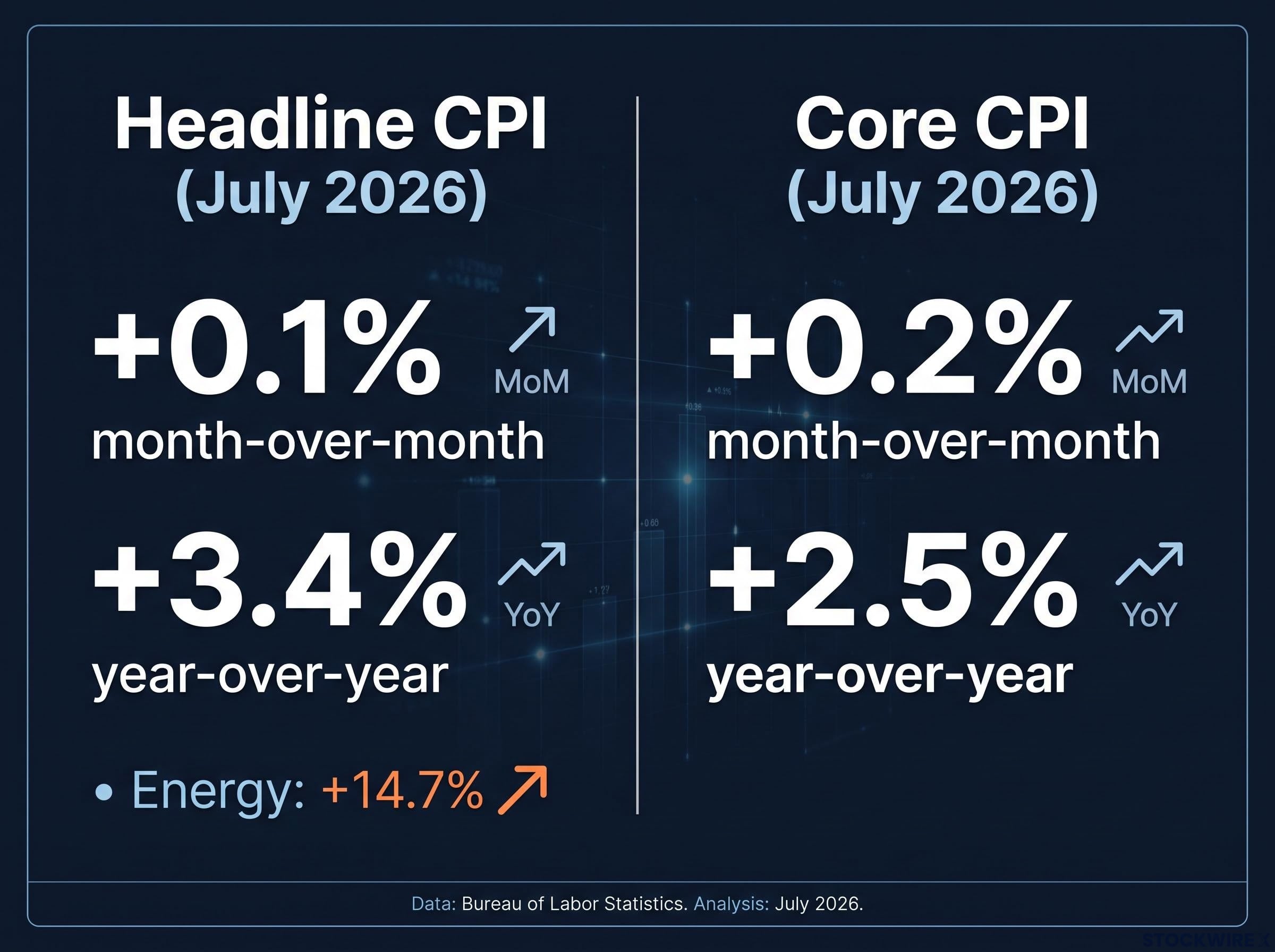
- Headline CPI captures everything a household buys, including food and energy. In July 2026, this came in at +0.1% month-over-month and +3.4% year-over-year.
- Core CPI strips out food and energy, the two most volatile categories, to reveal the underlying trend. In July 2026, core printed at +0.2% month-over-month and +2.5% year-over-year.
The July 2026 CPI report confirmed headline inflation at 3.4% and core at 2.5%, with shelter accounting for roughly two-thirds of remaining monthly gains even as energy provided temporary relief — establishing the baseline the next print must either extend or reverse.
Energy is exactly why this distinction exists. Energy prices in the July release were up 14.7% over the year, a swing large enough to distort the headline number entirely while telling you little about the economy’s underlying pressure.
There is one more wrinkle. The Fed officially prefers a different gauge called Personal Consumption Expenditures (PCE), which covers a broader basket and better accounts for shoppers switching between products. Yet markets stay glued to CPI because it is released roughly two weeks earlier.
You need to understand this mechanism because acting on the headline figure will put you offside. The Fed builds its decisions around core inflation and PCE, so a scary headline number driven by an oil spike may mean far less than it appears.
When big ASX news breaks, our subscribers know first
The specific inflation thresholds that matter right now
Vague talk of “hot” or “cool” inflation is useless when the data lands. You need numbers. According to DBS Group Research economist Eugene Leow, as reported by the FXStreet Insights Team, there are precise monthly readings that decide which way the Fed leans.
The hawkish trigger is clear. A monthly headline CPI of 0.4% paired with a core reading of 0.3% represents the minimum needed to meaningfully lift the odds of near-term tightening. Anything at or above that line hands the Fed a reason to act.
The dovish outcome is equally defined. A monthly reading of 0.2% for both headline and core would push the probability of a near-term hike toward zero. That is the print that takes September off the table.
Everything between those two boundaries is the grey zone where the market fights over interpretation.
Right now, the stakes are finely balanced. The market-implied probability of a 25-basis-point hike at the September FOMC sits in the 50-60% range, with DBS Group Research placing its own estimate at roughly 60%. Recent readings have been subdued, with transport prices coming in softer than expected and no sign that inflation is broadening across categories.
| Scenario | Monthly CPI thresholds | Implied Fed action |
|---|---|---|
| Hawkish | 0.4% headline / 0.3% core | Odds of near-term tightening rise meaningfully |
| Neutral | Between the two boundaries | Market stays divided; probability holds in 50-60% range |
| Dovish | 0.2% headline / 0.2% core | Near-term hike probability pushed toward zero |
Knowing these exact thresholds lets you grade the Bureau of Labor Statistics (BLS) release the instant it hits at 8:30 AM Eastern, rather than waiting for a talking head to tell you what it means.
Why the 2-year Treasury yield acts as your real-time decoder
The FOMC meeting is where the decision becomes official. The trading floor is where it gets made first. Long before the committee gathers, one instrument has already voted: the 2-year US Treasury yield.
Bond yields reprice through a competitive auction and secondary market mechanism, and understanding why they move inversely to price is the mechanical foundation for reading the 2-year Treasury as a live Fed expectations gauge rather than just another rate on a screen.
Here is the mechanical reason. A 2-year Treasury yield is essentially a bundle of the market’s expectations for the federal funds rate over the next two years. When a CPI surprise shifts those expectations, the 2-year yield moves almost instantly to reflect the new path.
That makes it far more sensitive to inflation data than the 10-year yield. Longer-dated bonds are shaped by broad forces like long-run growth, fiscal outlook, and global demand for safe assets. Any single monthly CPI print barely dents them. The 2-year, by contrast, lives and dies on the near-term Fed path.
As of early September 2026, the 2-year note yielded around 4.40%, its highest level since January 2025. DBS Group Research confirmed that front-end USD rates already embed roughly 2.5 rate hikes, meaning much of the hawkish case is baked in.
The energy shock is part of that pricing too. With Brent settling near $97.92 per barrel, DBS Group Research assessed that elevated oil prices have already been partially incorporated into current front-end levels. The market is not waiting to be surprised by oil; it has factored a good deal of it in.
Short-duration USD interest rates are currently viewed by DBS Group Research as adequately valued, with limited potential for further upside. Front-end rates are seen as sufficiently reflecting a hawkish Fed.
Watching the 2-year yield gives you a live scoreboard of Fed expectations. In the seconds after a CPI print, it shows you exactly how institutional money is voting, no interpretation required.
The yield curve reaction
The moves are measurable. Market commentary suggests a 0.1% upside surprise in core CPI typically lifts 2-year yields by roughly 8-15 basis points, against just 4-8 basis points on the 10-year.
That gap is why release days often reshape the yield curve within minutes. When the front end jumps faster than the long end, the curve flattens or steepens rapidly, telling you whether the market sees the inflation shock as short-lived or something more entrenched.
Why hot data speeds up the clock rather than adding hikes
A hot inflation print triggers a familiar reflex: sell now, more hikes are coming. That reflex is usually wrong, and understanding why can save you from a costly overreaction.
The key is separating two different things. There is the timing and pace of hikes, meaning when the next move lands and how big it is. Then there is the terminal rate, the ultimate peak where the Fed stops. A strong CPI print far more often shifts the former than the latter.
DBS Group Research made this exact point about the current cycle: a robust reading would more likely push the market to accelerate the timing of hikes already anticipated, rather than add fresh hikes on top. In a mature tightening cycle, the destination is often already in sight.
History backs this up. Here is how a hot print typically plays out:
- The data releases and beats expectations to the upside.
- Odds for the immediate meeting reprice, so a hike may arrive a month sooner or a pause turns into action.
- The long-term terminal rate holds, because the market still sees roughly the same peak, just reached on a slightly compressed schedule.
The 2022-2024 record shows this repeatedly. Softer prints late in 2022 shifted a December move from an expected 75 basis points down to 50, changing the size without changing the tightening bias. In March 2024, an unexpected 3.5% annual reading pushed traders to delay expected rate cuts by months rather than pricing a new hiking wave.
The International Monetary Fund (IMF) frames it the same way: stronger inflation data generally keeps policy tight for longer and delays cuts, rather than launching a fresh round of hikes.
Understanding this stops you from panic-selling on a hot number. The peak rate often stays completely unchanged even when the next move arrives sooner than planned.
The hidden lags and blind spots in using official data
There is a final layer that separates the educated reader from the crowd: the data itself is flawed, and the Fed knows it. Two components in particular can send the headline number in a direction that does not reflect reality on the ground.
Start with housing. Shelter is one of the largest pieces of the CPI basket, and it is fundamentally backward-looking. The BLS measures rents paid by both new and existing tenants using a staggered comparison, which creates what researchers call the market-shelter gap.
NBER research by Ball and Koh (2025) found it can take years for CPI shelter to fully catch up to actual market rents, with substantial adjustment stretching across 12, 24, and 36 months. A Boston Fed study reached a similar conclusion, and Fed Chair Jerome Powell himself has acknowledged the “big lags” in shelter data.
NBER research on shelter inflation lags identifies three distinct sources of measurement delay, finding that CPI shelter can take 12 to 36 months to fully reflect actual market rent conditions — a distortion large enough to materially mislead any analyst relying solely on the official headline print.
What this means is blunt. A high shelter reading today may be reflecting rent moves from one to three years ago, conditions the Fed has already discounted in its own models.
Then there is energy. The July 2026 data showed energy prices up 14.7% annually, a figure driven far more by geopolitical shocks than by domestic demand. When Brent leaps from the low-90s to near $98 in days on news from Saudi Arabia, that volatility floods into the headline number and tells you little about underlying inflation.
The diagnostic between energy-driven vs demand-driven inflation is the gap between headline and core CPI: the 1.3 percentage-point spread recorded in May 2026 confirmed the spike was geopolitical in origin, not a broad-based demand spiral running through goods and services.
Recognising these structural lags helps you look past artificially high headline prints. While retail investors react to the top-line figure, you can strip out lagging shelter data and volatile oil spikes to find the signal the Fed is actually watching.
Positioning your portfolio for the next policy window
The pieces now fit together. The upcoming CPI release feeds directly into the 2-year Treasury yield, which votes on Fed expectations in real time, which in turn frames the September FOMC decision.
For this week, the number to fixate on is the 0.3% core threshold. At or above it, the hawkish case strengthens and the 2-year should push higher. A 0.2% core reading does the opposite and takes the pressure off.
But weigh that headline against what you now know. A hot print driven by lagging shelter or an oil spike is far less meaningful than a broad-based rise across core categories. The market may react to the top line; you can read the composition underneath it.
For investors wanting to extend this framework beyond the September meeting window, our deep-dive into Treasury yields as policy levers examines how the 10-year and 30-year yields have displaced equity selloffs as Washington’s primary policy pressure mechanism, with direct implications for how you read rate signals across the full yield curve.
This article is for informational purposes only and should not be considered financial advice. Investors should conduct their own research and consult with financial professionals before making investment decisions. Past performance does not guarantee future results, and forward-looking projections are subject to market conditions and various risk factors.