
A signal with “golden” in its name sounds like a buying opportunity, and one called a “death cross” sounds like a catastrophe. In practice, both names overstate the case. Traders who act on either signal without understanding the mechanics behind it tend to arrive late, exit early, or get stopped out on a counter-trend move that evaporates their account before the predicted direction actually materialises.
The golden cross and death cross are among the most referenced chart patterns in equity markets, built from two of the simplest tools in technical analysis: the 50-period and 200-period Simple Moving Averages (SMAs). Their widespread use makes them worth understanding precisely because markets react to them, not just because they have predictive value.
The 50-day and 200-day SMA crossover framework is treated as foundational in CFA curriculum technical analysis indicators, reflecting how widely these tools are embedded in professional finance education and why market participants across skill levels respond to the signals they generate.
Here is a clear framework for reading these signals accurately: what they are, what historical data says they actually deliver, where they fail, and how traders with a disciplined approach incorporate them without treating them as automatic trade triggers.
What a Simple Moving Average is actually measuring
On a price chart, an SMA appears as a smooth line tracking price action with a delay. That smoothing effect is the whole point: it filters out day-to-day noise and surfaces the direction of the underlying trend. But the mechanics behind that line determine everything about how crossover signals behave.
Before crossover signals become interpretable, the foundations of reading stock charts matter: knowing how price and volume data is structured on a chart, what candlestick formats reveal about buyer and seller behaviour, and why every overlaid indicator is simply a re-interpretation of that same historical data.
An SMA is the arithmetic mean of closing prices over a fixed number of periods. Each time a new bar closes, the calculation updates: the newest closing price enters the average, and the oldest one drops out. The result is a continuously rolling average that shifts with price, always lagging behind actual movements.
The speed at which an SMA responds to price changes depends entirely on the number of periods it covers. A 50-period SMA reacts faster because each new data point represents a larger fraction of the total average. A 200-period SMA moves slowly because any single day’s price is diluted across a much longer window. That speed difference is not a technical footnote. It is the entire basis for why a crossover carries any meaning at all, and it is also why these signals always arrive late.
The three most commonly used SMA intervals in technical analysis are:
- 20-period: roughly four weeks of daily trading history, used for short-term trend tracking
- 50-period: roughly 10 weeks of daily trading history, the standard “fast” line in crossover analysis
- 200-period: approximately 40 weeks (close to a full trading year), the standard “slow” line representing the long-term trend
Daily versus weekly charts: same signal, different scale
Most golden cross and death cross references in financial media use daily chart data. That is also the timeframe used in the majority of backtests, and it is where these signals generate the most frequent trading opportunities.
On weekly charts, the same 50/200 parameters expand to approximately one year and four years of trading history. Weekly crosses produce fewer, slower signals that represent significantly longer trend shifts. They are more useful for macro-oriented investors than for active traders, but the trade-off is even later entries and exits. These signals are accessible across all timeframes on platforms such as TradingView.
When big ASX news breaks, our subscribers know first
How a golden cross forms, and what it is actually confirming
A golden cross occurs when the 50-day SMA crosses above the 200-day SMA and closes there. That crossover confirms that intermediate-term momentum has shifted strongly positive relative to the long-term trend baseline.
The formation follows a three-stage sequence:
- A sustained price rise pushes closing prices higher over several weeks
- The 50-day SMA begins bending upward as recent prices pull the average higher
- The 50-day line crosses above the 200-day line, completing the golden cross
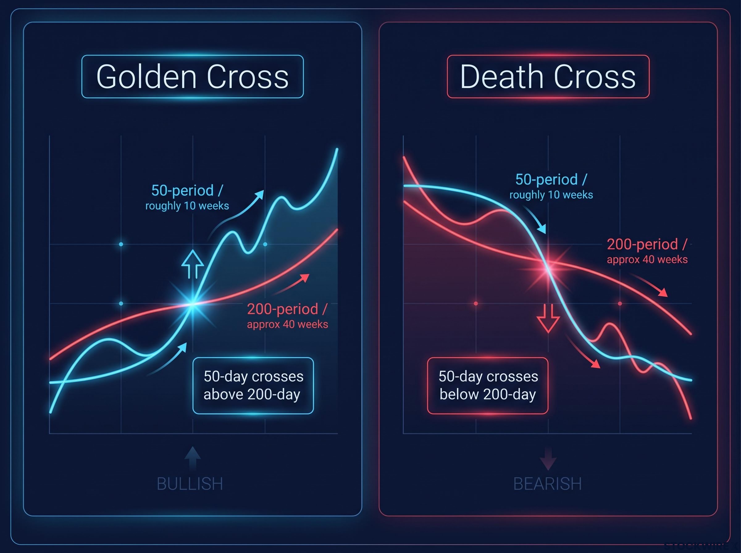
Systematic strategies use this crossover as a regime filter: hold the asset while the 50-period remains above the 200-period, move to cash when it falls back below. It is a binary switch between risk-on and risk-off.
Real-world examples anchor how this plays out. Following a golden cross on the S&P 500, prices advanced by approximately 50% over the subsequent trend. The Nasdaq QQQ produced a comparable result, with a golden cross forming in the wake of a shallow death cross and the index then climbing close to 26%. Both illustrate trend confirmation, not precise entry timing.
A golden cross does not start a rally. It confirms one that has already been running.
Because the golden cross only appears after prices have already trended higher for some time, you are entering a confirmed uptrend, not catching the beginning of a move. The early gains have already been distributed to those who acted on other signals. That does not make the signal useless; it means your expectations for the entry should be realistic rather than euphoric.
The death cross in practice: what the data says about this “ominous” signal
The death cross is the mirror of the golden cross: the 50-day SMA crosses below the 200-day SMA, confirming that medium-term prices have weakened enough to drag the fast average under the long-term trend line. Like its bullish counterpart, it is a lagging confirmation signal. By the time it appears, the market has usually been falling for weeks or months.
The name sounds catastrophic. The historical data tells a very different story.
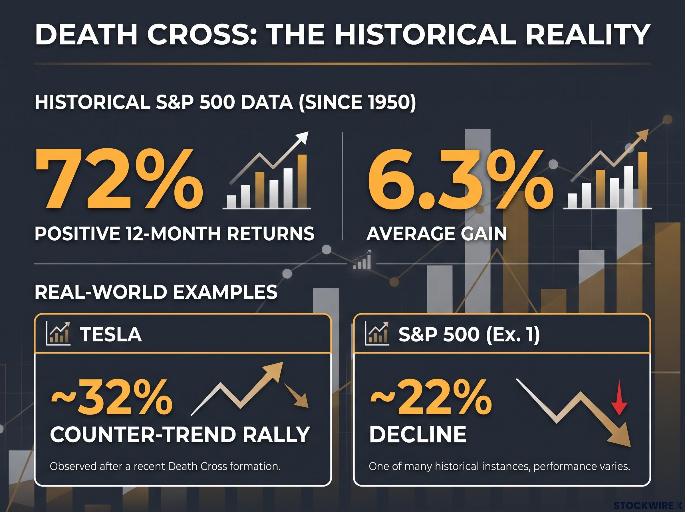
Since 1950, the S&P 500 has posted positive 12-month returns approximately 72% of the time following a death cross, with an average gain of roughly 6.3%.
That figure tells you most death crosses occur inside ongoing bull markets, not at the onset of crashes. Acting on every death cross as a sell signal is statistically likely to cost you returns more often than it protects them.
The individual examples illustrate why the signal demands nuance rather than panic:
| Instrument | Counter-move before resolution | Subsequent direction | Approximate magnitude |
|---|---|---|---|
| S&P 500 (example 1) | Minimal | Down | ~22% decline |
| S&P 500 (example 2) | ~6% brief gain before reversal | Turned higher | Bearish case negated |
| Nasdaq QQQ | ~7% initial softness | Recovered upward | Limited drop, then sustained advance |
| Tesla | ~32% counter-trend rally | Down (eventually) | Significant decline after interim surge |
The Tesla case warrants close study. Although the death cross eventually pointed in the right direction, the stock first staged a counter-trend rally of close to 32% before rolling over. That interim move was steep enough to force out traders who had sized their positions without accounting for such a retracement, leaving them unable to benefit from the eventual decline they had correctly anticipated. Directional accuracy counts for little if the position is closed before the thesis plays out.
Position sizing is the variable that determines whether a correct directional call produces a profitable outcome: in the Tesla death cross case, the 32% counter-trend rally destroyed accounts not because the trend analysis was wrong but because position sizing and stop placement were not established before the signal was acted upon.
The historical data reframes the death cross from a panic signal into a risk-awareness signal. That is a meaningfully different and more actionable mental model for you as an investor.
What backtests reveal about long-term performance
If golden and death crosses reliably identified the best times to buy and sell, every mechanical crossover strategy would outperform simply holding the market. They do not. But the reason they fall short on total returns is also the reason they still earn a place in a risk-management framework.
The pattern is remarkably consistent across markets and time periods. Multiple third-party backtest studies, while not independently verified, point in the same direction:
| Market | Strategy return (CAGR) | Buy-and-hold return (CAGR) | Max drawdown reduction |
|---|---|---|---|
| S&P 500 (since 1960) | ~6.8% | Higher | ~33% vs ~56% |
| Nifty 50 (2010-2022) | ~4.0% | ~9.9% | Volatility 12.5% vs 22.5% |
| SPY (2010-2025) | ~7.2% | Higher | Significantly reduced |
Note: Figures are indicative, sourced from third-party studies, and have not been independently verified.
On Bitcoin, a 200-day SMA price filter actually outperformed the 50/200 crossover on annualised returns (approximately 26% CAGR) while still reducing maximum drawdown versus buy-and-hold. That finding tells you something important: even within trend-following, simpler filters can sometimes beat the more popular crossover pattern.
The S&P 500 crossover strategy did post a win rate of approximately 79% per trade, with an average trade gain of roughly 15-16%. The directional confirmation works more often than not. But the lag on entries and exits, combined with whipsaw losses in sideways markets, consistently erodes total returns below what a patient buy-and-hold investor would have earned.
A 79% win rate on individual golden cross signals sounds compelling until trading expectancy is applied: the metric that multiplies win rate by average gain and subtracts loss rate by average loss to reveal whether a strategy has a genuine mathematical edge across a meaningful sample of trades, not just a favourable batting average.
The fundamental trade-off these signals present
The trade-off is clear: lower total returns in exchange for meaningfully smaller drawdowns and smoother equity curves. The S&P 500 crossover strategy’s maximum drawdown of approximately 33% compared to 56% for buy-and-hold is a real difference in lived experience, even if the final return number is lower.
Which side of this trade-off matters most depends on your time horizon and risk tolerance, not on the signal itself being right or wrong. If you are investing over decades with a high tolerance for volatility, buy-and-hold wins. If you are managing a portfolio where a 50%+ drawdown would cause you to sell at the bottom or lose sleep, the regime-filtering value of these signals is genuine and measurable.
How to set up and read these signals without acting on them mechanically
Setting up these signals on a chart takes less than a minute. Using them with discipline takes considerably more thought. Here is the setup process:
- Add a 50-period SMA to your chart
- Add a 200-period SMA in a contrasting colour (for example, blue for the 50-period and red for the 200-period)
- Identify the crossover point where the two lines intersect
- Apply to the instrument and timeframe relevant to your strategy, whether that is an index, individual stock, or ETF
These indicators are available across all timeframes on platforms such as TradingView.
The more important part is what you do with the signal once it appears. Five practical usage principles, drawn from how data-driven traders actually apply these signals, form a disciplined framework:
- Use the golden cross as trend confirmation, not an entry trigger; refine entries with faster indicators or price patterns
- Use the death cross as a risk warning, not an automatic exit; tighten stops and reduce position size rather than liquidating immediately
- Favour higher timeframes for macro trend work, where fewer but more meaningful regime shifts occur with less whipsaw noise
- Combine crossovers with volatility and macro context, since a death cross during broad market stress carries more weight than one during a shallow correction in a strong bull market
- Always define your position size and stops before acting on any signal
In the Tesla death cross, the stock rallied close to 32% against the anticipated direction before the actual decline set in. Correct trend identification offers no account protection when position sizing and risk controls are not established in advance.
That example is not a cautionary tale about the signal being wrong. It is a demonstration that even correct signals can destroy accounts when position size and risk controls are absent. If you take one actionable lesson from this entire framework, make it that one.
This article is for informational purposes only and should not be considered financial advice. Investors should conduct their own research and consult with financial professionals before making investment decisions. Past performance does not guarantee future results.
Using crosses as a compass, not a map
The golden cross and death cross do three things reliably:
- Confirm the direction of the prevailing regime (bullish or bearish)
- Reduce peak-to-trough drawdowns compared to staying fully invested
- Serve as widely-watched reference points that the broader market responds to
They do not do two things reliably:
- Predict precise turning points
- Outperform buy-and-hold on total returns
That distinction is everything. These signals belong in your analytical toolkit alongside other inputs (momentum oscillators, macro context, volatility measures, and defined risk parameters) rather than as a single decision-maker. The 79% win rate on individual S&P 500 golden cross signals confirms the directional read is often valid. The consistent underperformance versus buy-and-hold confirms the timing is always imprecise.
The difference between informed use and mechanical application is the difference between a compass and a map. A compass gives you direction. You still need to read the terrain, check the weather, and decide how far to walk. Golden and death crosses tell you which regime the market is in. What you do with that information is where your edge either emerges or evaporates.
For readers wanting to explore alternative chart constructions that filter noise differently to SMAs, our deep-dive into Renko chart strategies covers ATR-based brick sizing, construction method selection, and the specific backtest conditions under which Renko outperformed time-based equivalents on drawdown metrics.