How to Read a Small-Cap Order Book Using a Live ASX Example
3 hrs ago
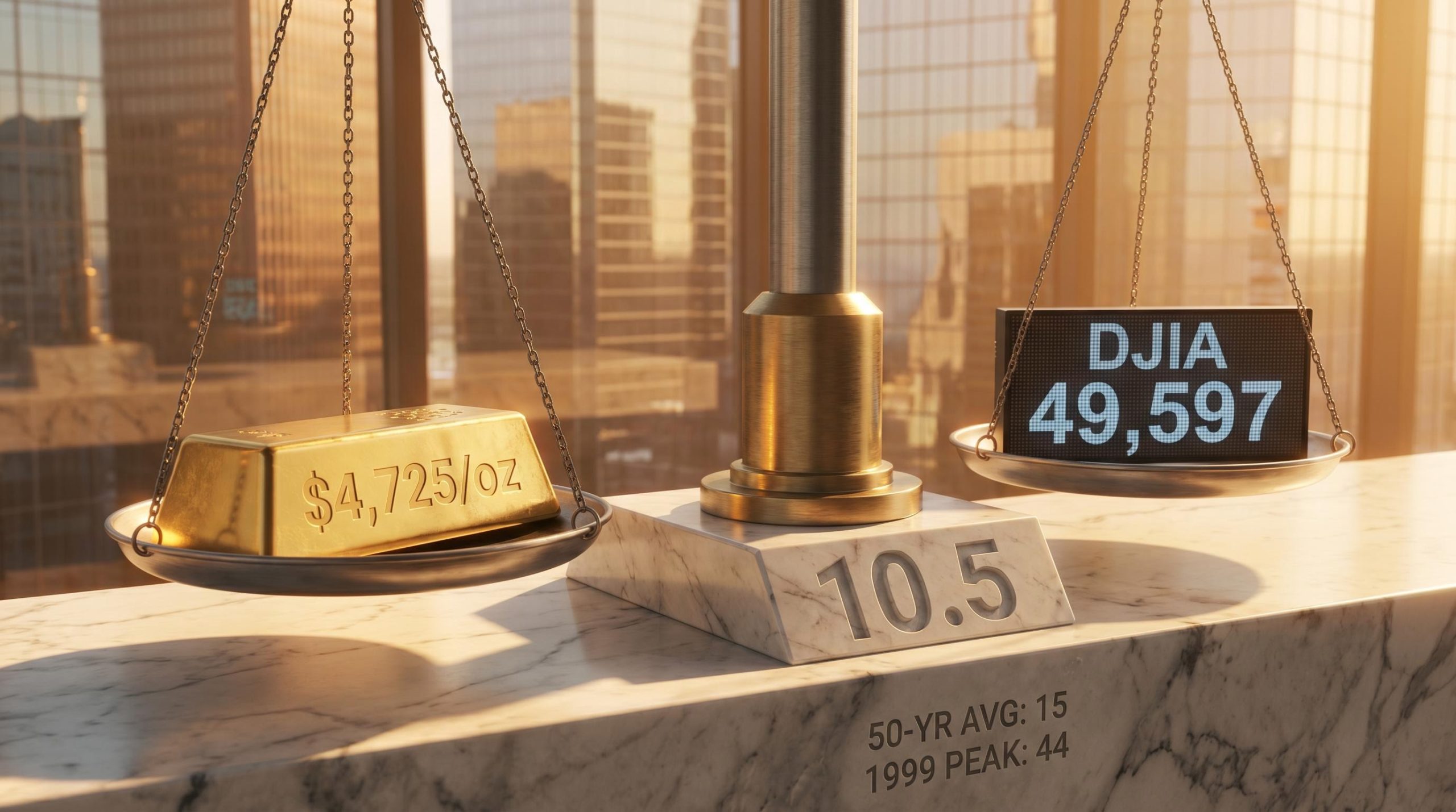
At roughly 10.5 today, the Dow-to-gold ratio tells a story that nominal index levels simply cannot. In real purchasing power terms, measured in ounces of gold rather than dollars, US equities are worth less than half what they were at the peak of the dot-com bubble. While financial media tracks the Dow Jones Industrial Average (DJIA) in dollar terms, this parallel metric has been quietly signalling a very different picture of equity valuations.
Gold has surged past $4,725 per ounce as of May 2026, and the ratio of the Dow to gold has fallen well below its 50-year average of roughly 15. For investors trying to understand whether markets are genuinely expensive or cheap, nominal index levels provide an incomplete answer. What follows is an explanation of what the Dow-to-gold ratio is, how to read it, what history says about where cycles tend to end, and what current institutional forecasts imply about the path ahead. The goal is a practical valuation tool that fits into broader macro thinking.
Measuring equity performance in fiat currency embeds a problem into the result. Currencies lose purchasing power over time, and that debasement makes nominal gains appear larger than they are in real terms. A stock index that doubles over two decades may look impressive until the currency it is priced in has lost 40% of its buying power over the same period.
The Dow-to-gold ratio strips that distortion away.
Dow-to-gold ratio = DJIA divided by gold spot price per troy ounce
The resulting number represents how many ounces of gold are required to buy one unit of the index. Using the May 7 close: 49,597 (DJIA) divided by $4,725/oz equals approximately 10.5. A falling ratio means gold is outperforming equities in real terms. A rising ratio means equities are gaining ground against gold.
The same framework applies to the S&P 500-to-gold ratio, which State Street Global Advisors tracks explicitly in its Gold Chart Pack. The Dow version is the most widely referenced because of the DJIA’s longer continuous history.
| Ratio Level | What It Signals | Historical Association |
|---|---|---|
| Above 20 | Stocks expensive relative to gold | Risk-on bull markets (e.g., late 1990s) |
| Around 15 | Long-run average; neutral | 50-year mean |
| Below 5 | Gold dominant | Economic stress or high inflation (e.g., 1980) |
Most retail investors evaluate portfolios entirely in nominal currency. This section provides the conceptual reframing needed to use the ratio as a practical alternative lens.
The Dow-to-gold ratio does not operate in isolation; equity valuation signals such as the Buffett Indicator, which stood at 223.6% as of May 2026, and the earnings yield versus Treasury yield spread are simultaneously pointing toward stretched US equity valuations, reinforcing rather than contradicting what the gold-adjusted ratio captures.
Before the Federal Reserve’s creation in 1913, the ratio fluctuated within a relatively narrow band of roughly 2.5 to 5 ounces, reflecting a gold-backed monetary system with limited scope for credit expansion. What happened after that tells a more volatile story.
By the late 1920s, the ratio had climbed to approximately 28.5, reflecting the speculative equity boom that preceded the 1929 crash. Within four years it had collapsed to roughly 1.94 by February 1933, the Depression’s lowest point. Equities that had taken a generation to build were, in gold terms, nearly worthless.
The pattern repeated. A secondary peak arrived around 1966, another pre-decline high before the 1970s gold surge eroded equity valuations in real terms. By January 1980, with inflation peaking and gold at record highs, the ratio hit its all-time low of approximately 1.29. One ounce of gold could nearly buy the entire Dow.
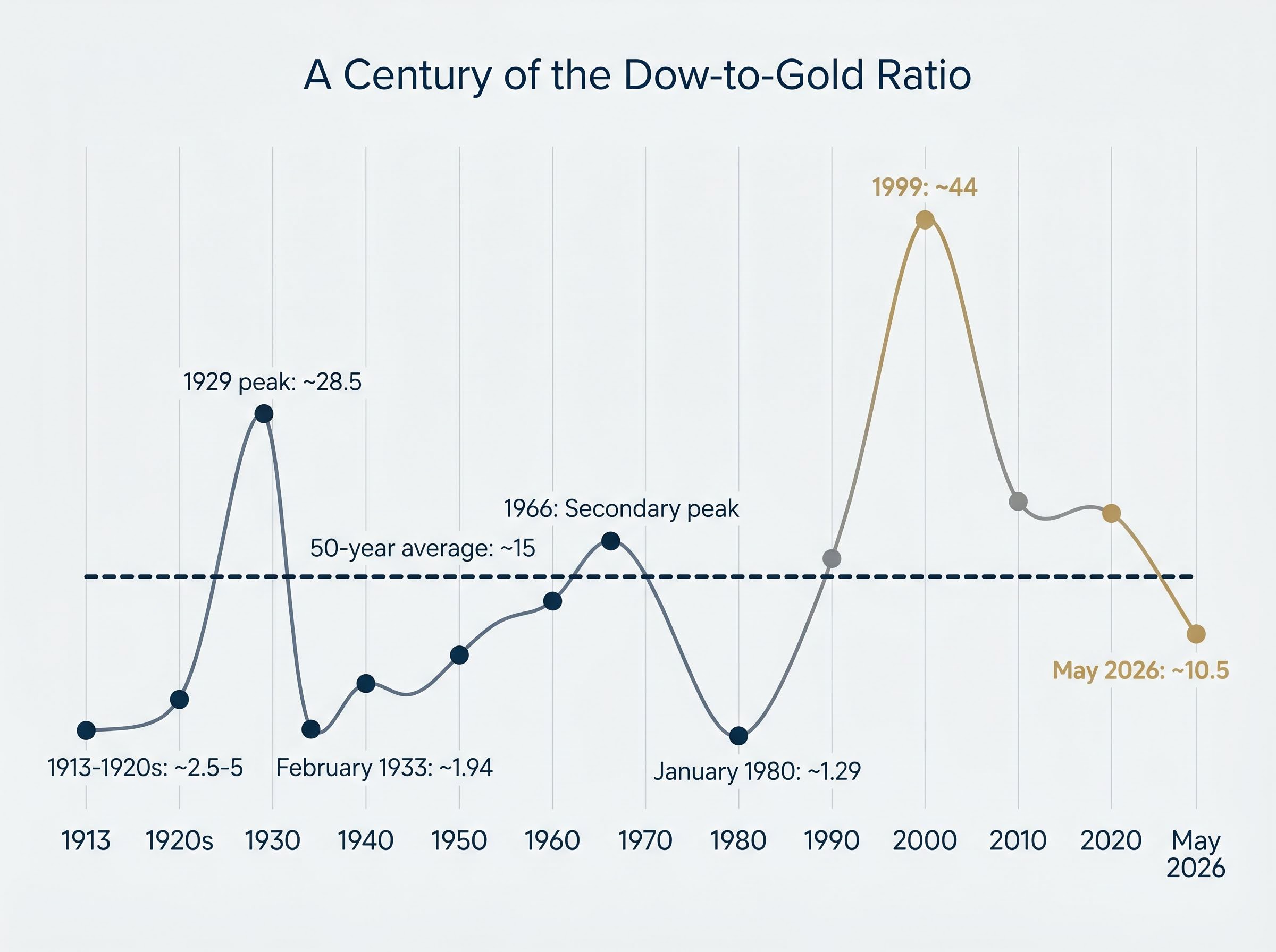
| Year/Period | Ratio Level | Market Condition | What Followed |
|---|---|---|---|
| 1913-1920s baseline | ~2.5-5 | Gold standard era | Credit expansion, ratio climbed |
| 1929 peak | ~28.5 | Pre-crash stock high | Depression collapse |
| February 1933 | ~1.94 | Depression bottom | Equities began multi-decade recovery |
| 1966 peak | Secondary high | Pre-inflation equity peak | 1970s gold surge |
| January 1980 | ~1.29 | Inflation peak, gold bull market end | Equities recovered, ratio climbed for 20 years |
| 1999 | ~44 | Dot-com peak | Equity bear market, gold outperformance |
| May 2026 | ~10.5 | Current | Ongoing |
The 1999 peak of approximately 44 remains the most extreme reading in the ratio’s recorded history. While nominal equity prices were rising sharply through the late 1990s, the gold-adjusted measure showed equities reaching an unprecedented extreme, one that dwarfed even the 1929 peak.
The ratio has been in structural decline since that point, meaning gold has outperformed equities in real terms across most of the intervening period. That context reframes how investors should interpret the current level: 10.5 is not a crisis reading, but it sits in the lower half of a multi-decade downtrend that began at the most stretched valuation in a century.
When the ratio falls, the signal is visible. Understanding why it falls requires looking at the mechanics underneath.
Gold tends to outperform equities when inflation erodes real returns, when confidence in fiat currency weakens, or when fiscal and geopolitical risk premiums rise. These conditions do not arrive in isolation. They reinforce each other, creating sustained periods where capital flows toward hard assets and away from paper-denominated claims on future earnings.
Four structural drivers explain the current cycle:
“73% of central banks expect the US dollar’s share of global reserves to decline by 2030.” World Gold Council, 2025 central bank survey
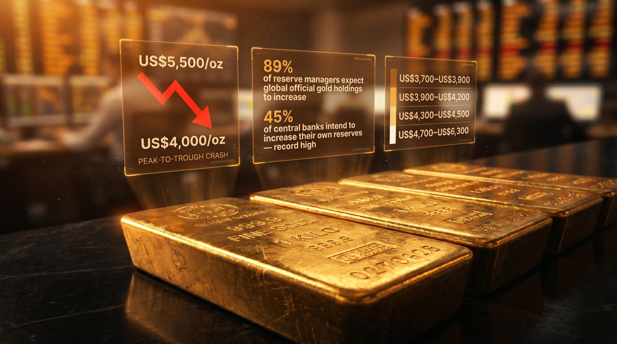
The Federal Reserve currently holds rates at 3.5%-3.75%, with officials signalling potential hikes given economic resilience. Gold’s advance has not required an easing cycle; structural factors have been sufficient. Gold first crossed $4,000/oz in October 2025 and has climbed to approximately $4,725/oz by May 2026. Year-to-date to 31 March 2026, gold gained 30.3% according to State Street Global Advisors, compared with the DJIA’s year-to-date gain of approximately 3.2% to 7 May 2026.
The FOMC policy statement issued on April 29, 2026 confirmed the federal funds rate target at 3.5%-3.75%, with the Committee noting that economic resilience and persistent uncertainty around the inflation outlook warranted a cautious approach to any future adjustment.
That divergence is precisely what the falling ratio captures. Short-term equity rallies can push the ratio upward within a longer downtrend, which is why the metric functions as a secular cycle tool rather than a short-term timing instrument.
At approximately 10.5, the Dow-to-gold ratio sits roughly 30% below its 50-year average of 15. It remains well above the historical troughs of 1.29 (1980) and 1.94 (1933), but the distance from the long-run mean reflects sustained gold outperformance that has not yet resolved.
Translating institutional gold price forecasts into implied ratio levels provides a framework for evaluating what the next phase may look like. Using a modest DJIA growth assumption of 50,000-52,000 by end-2026:
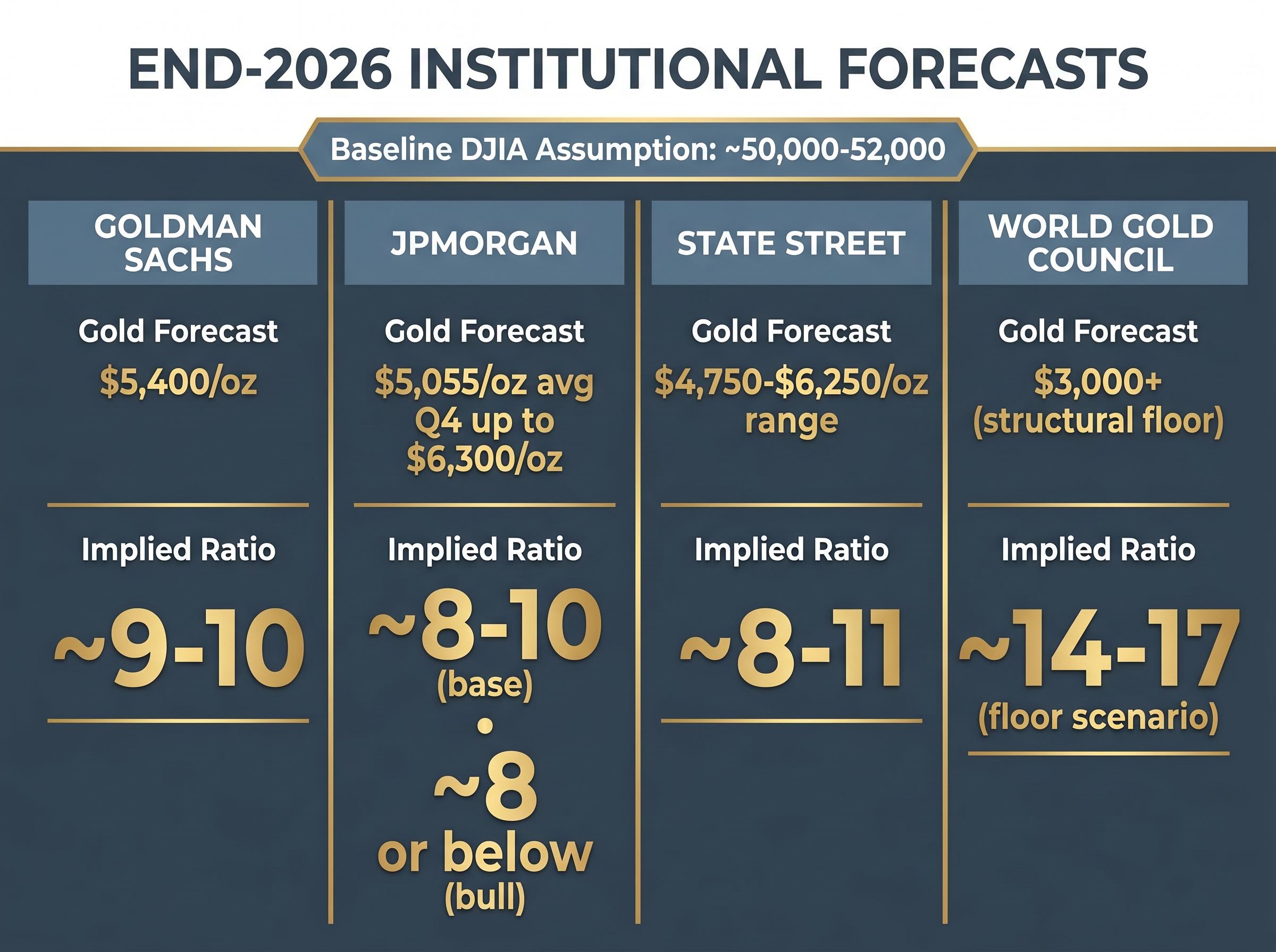
| Institution | End-2026 Gold Forecast | DJIA Assumption | Implied Ratio | Key Drivers |
|---|---|---|---|---|
| Goldman Sachs | $5,400/oz | ~50,000-52,000 | ~9-10 | Fiscal dominance, inflation, USD weakness |
| JPMorgan | $5,055/oz avg Q4; up to $6,300/oz | ~50,000-52,000 | ~8-10 (base); ~8 or below (bull) | Geopolitics, ETF demand, central bank buying |
| State Street | $4,750-$6,250/oz range | ~50,000-52,000 | ~8-11 | Central bank resilience, structural tailwinds |
| World Gold Council | $3,000+ (structural floor) | ~50,000-52,000 | ~14-17 (floor scenario) | Reserve diversification |
The directional consensus among major institutions points toward continued ratio compression, though the speed and depth remain contested.
Investors wanting to examine the full analytical basis behind Goldman’s projection will find our dedicated guide to Goldman Sachs’s $5,400 gold price forecast, which breaks down the firm’s assumptions around central bank accumulation volumes, modelled Federal Reserve rate impacts, and the liquidation risks that could temporarily push prices lower despite the structural bull case.
A sustained move into the 8-10 range would represent continued below-average territory, yet it remains far above the historical troughs. The 1980 low of 1.29 and the 1933 low of 1.94 occurred during periods of severe economic distress and runaway inflation, conditions not currently present.
Some analysts project an eventual return toward parity. The current trajectory, however, is more consistent with an ongoing gold outperformance cycle that has further to run rather than an imminent reversal toward equities.
The Dow-to-gold ratio is a secular cycle indicator suited to multi-year positioning decisions. It is not a precise entry or exit signal for individual trades, and treating it as one will produce frustration.
Three specific limitations are worth noting:
The ratio also reflects relative performance between two assets without predicting absolute returns for either. Equities could fall, gold could rise, or both could move simultaneously in ways that compress or expand the ratio.
Nominal index levels reached new all-time highs for the S&P 500 in late April 2026 even as Brent crude traded above $112 per barrel, illustrating precisely the kind of divergence the gold-adjusted ratio is designed to surface: price action that looks like strength in dollar terms can mask deteriorating real-return conditions underneath.
Three complementary tools can validate or complicate the signal:
The Dow-to-gold ratio is not directly published by major institutions in a standardised form but is derivable from publicly available data. Investors who understand both the signal value and the limitations are better equipped to use it as one input in a broader framework.
The ratio’s primary practical use is as a cross-check on nominal market valuations. When equities look expensive in dollar terms and the ratio is also elevated, that convergence strengthens the valuation concern. When the ratio is low while nominal prices are high, it flags a gap between how markets appear in dollars and how they perform in real terms.
A sustained ratio below the 50-year average of 15 is a macro signal worth monitoring for portfolio diversification decisions, particularly around the role of gold or gold-adjacent assets.
Portfolio diversification decisions in an environment where the Dow-to-gold ratio sits 30% below its long-run average involve more than simply adding a gold allocation; tactical positioning across Treasury Inflation-Protected Securities, real assets, and quality equities with pricing power can provide a more layered response to the macro conditions the ratio is signalling.
This does not require a view on fiat currency collapse or extreme scenarios. Even investors with conventional frameworks can benefit from tracking how equities perform in gold-adjusted terms over multi-year horizons. Gold’s year-to-date performance to March 2026 (+30.3%) versus the DJIA’s year-to-date gain (+3.2%) illustrates the practical divergence the ratio captures. State Street characterises the structural tailwinds for gold as persisting despite short-term equity rallies.
Three steps to put this into practice:
“At approximately 10.5 today, the ratio sits roughly 30% below its 50-year average, suggesting gold’s structural outperformance cycle has not yet reached historical resolution.”
When the stock market is measured in gold ounces rather than dollars, the picture of where real wealth stands today is materially different from what nominal index levels suggest. At 10.5, the Dow-to-gold ratio sits in the lower half of its historical range, well below the 50-year average of 15 and a long way from the 44 reached in 1999.
No one can predict the timing or depth of further ratio compression. The metric is most useful as a long-horizon orientation tool rather than a near-term market call. What a century of data does confirm is that the ratio’s extremes have consistently marked turning points, and the current level sits closer to past periods of gold dominance than to past periods of equity excess.
Investors who track this metric alongside conventional valuation tools carry a broader view of macro risk than those relying on nominal data alone. Bookmarking the calculation and revisiting it quarterly alongside standard portfolio reviews takes minimal effort and offers a perspective that dollar-denominated analysis alone cannot provide.
This article is for informational purposes only and should not be considered financial advice. Investors should conduct their own research and consult with financial professionals before making investment decisions.
The Dow-to-gold ratio is calculated by dividing the Dow Jones Industrial Average by the spot price of gold per troy ounce, showing how many ounces of gold are needed to buy one unit of the index. It strips out currency debasement to reveal equity valuations in real purchasing power terms.
A falling Dow-to-gold ratio means gold is outperforming equities in real terms, signalling that nominal stock gains may be masking deteriorating purchasing power returns. It is used as a secular cycle indicator for multi-year portfolio positioning rather than short-term trading decisions.
The 50-year average for the Dow-to-gold ratio is approximately 15, with historical extremes ranging from a peak of around 44 at the 1999 dot-com bubble to a trough of approximately 1.29 in January 1980 during peak inflation.
Goldman Sachs, JPMorgan, and State Street all project gold prices in the $5,000-$6,300 range by end-2026, which would imply a Dow-to-gold ratio of approximately 8-10 assuming modest DJIA growth to 50,000-52,000. The directional consensus points toward continued ratio compression.
The ratio offers no short-term timing precision, can remain at a given level for years, and does not distinguish between gold rising and stocks falling since both move the ratio in the same direction. It is best used as one input within a broader macro valuation framework rather than as a standalone trading signal.