
How Wesfarmers Buys, Builds, and Exits to Create Value
2 hrs ago
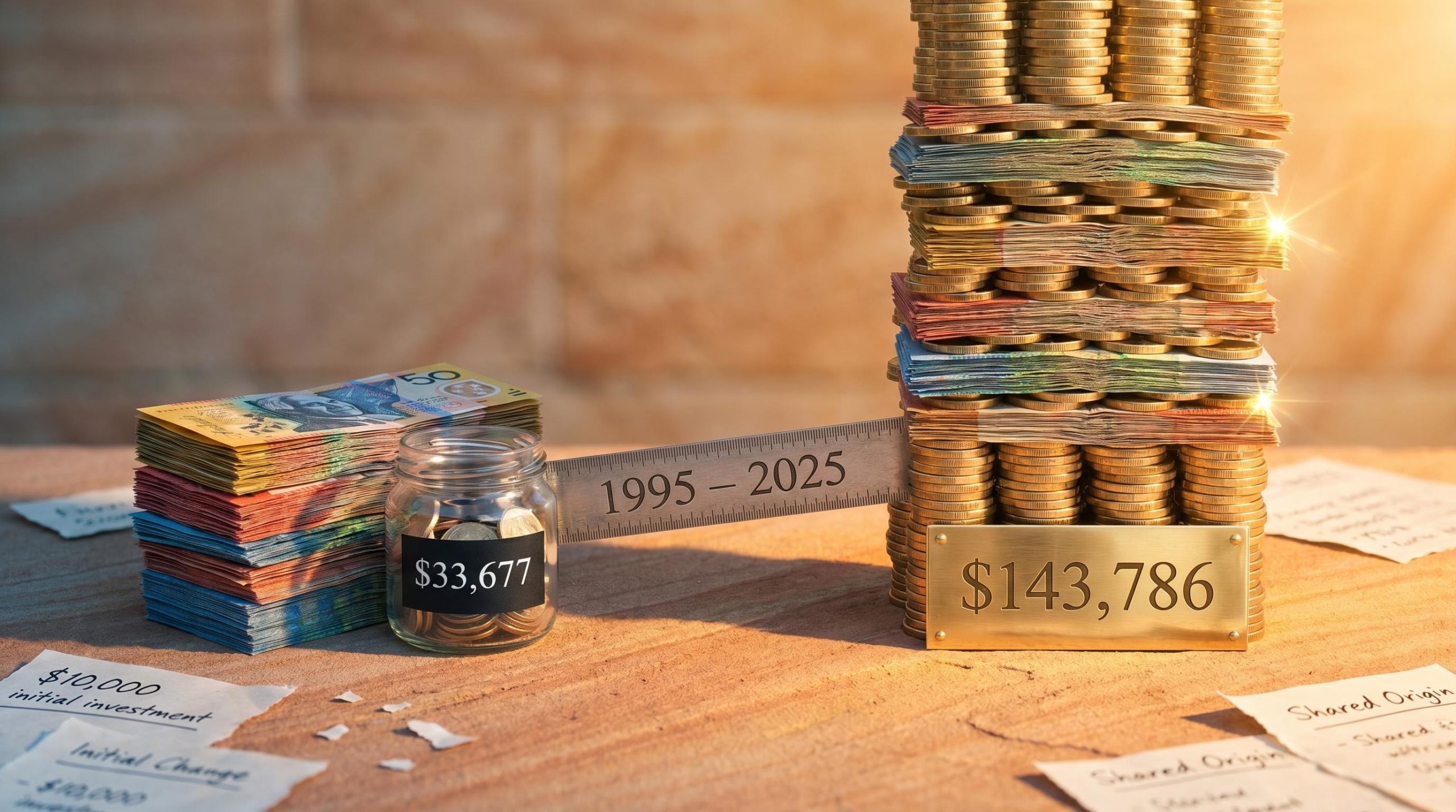
A single investment decision made in 1995 and never revisited could have produced either $143,786 or $33,677 from the same $10,000 starting point. That gap, verified by the Vanguard 2025 Index Chart covering 30 years of Australian market data, is the central fact this analysis unpacks. In mid-2026, Australian savings accounts are advertising introductory rates as high as 5.90% p.a., making cash feel more competitive than it has in years. This creates a tempting but potentially costly illusion: that cash and equities are now close alternatives for long-term money. The historical record says otherwise, and the gap compounds over time in ways that are genuinely difficult to intuit. What follows walks through exactly what three decades of verified return data shows about shares versus cash for Australian investors, explains the mechanism behind the wealth gap (including why crashes are already priced into the long-run average), and closes with a clear framework for deciding which money belongs where.
The starting point is a single verified data set. The Vanguard 2025 Index Chart, compiled by Andex Charts Pty Ltd and covering 1 July 1995 to 30 June 2025, tracks what actually happened to $10,000 invested across three asset classes. All figures assume reinvestment of income and exclude taxes and fees.
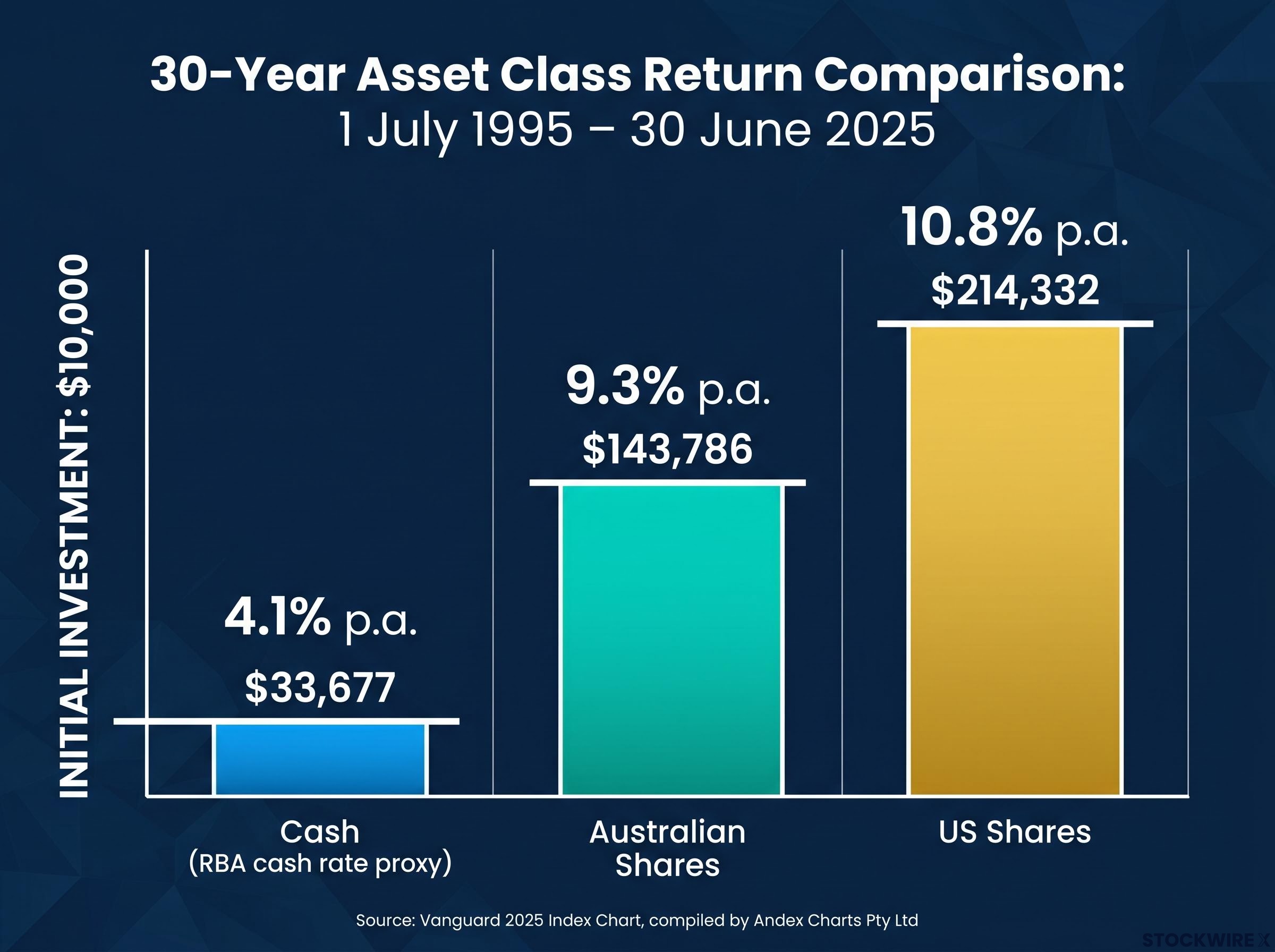
Cash, proxied by the RBA cash rate, returned 4.1% p.a. over the period. That turned $10,000 into approximately $33,677. Australian shares returned 9.3% p.a., growing the same $10,000 to $143,786. US shares, at 10.8% p.a., produced $214,332, more than 20 times the original capital.
ASX market performance has averaged roughly half the annualised return of the S&P 500 over 15 years, a structural gap driven by the index’s heavy concentration in financials and materials rather than the technology-led sectors that powered US returns, which explains why the Vanguard data shows US shares at 10.8% p.a. outpacing Australian shares at 9.3% p.a. over the same long horizon.
The RBA cash rate target history records the full cycle of Australian monetary policy settings from the high-rate environment of the mid-1990s through the sustained low-rate period from 2010 to 2021, providing the primary data underlying the 4.1% p.a. long-run cash return figure cited in the Vanguard 2025 Index Chart.
| Asset Class | Average Annual Return | $10,000 Terminal Value (30 Years) |
|---|---|---|
| Cash (RBA cash rate proxy) | 4.1% p.a. | $33,677 |
| Australian Shares | 9.3% p.a. | $143,786 |
| US Shares | 10.8% p.a. | $214,332 |
Scale those figures to $100,000, the kind of number that makes the gap personally relevant rather than academic, and the divergence sharpens.
$336,000 versus $1.4 million over 30 years, from the same starting point.
These are not projections or simulations. They are historical outcomes from a verified data set that includes every major market event of the past three decades.
The difference between 4.1% and 9.3% looks modest in a single year. On $100,000, it amounts to roughly $5,200 in year one. That figure is easy to dismiss.
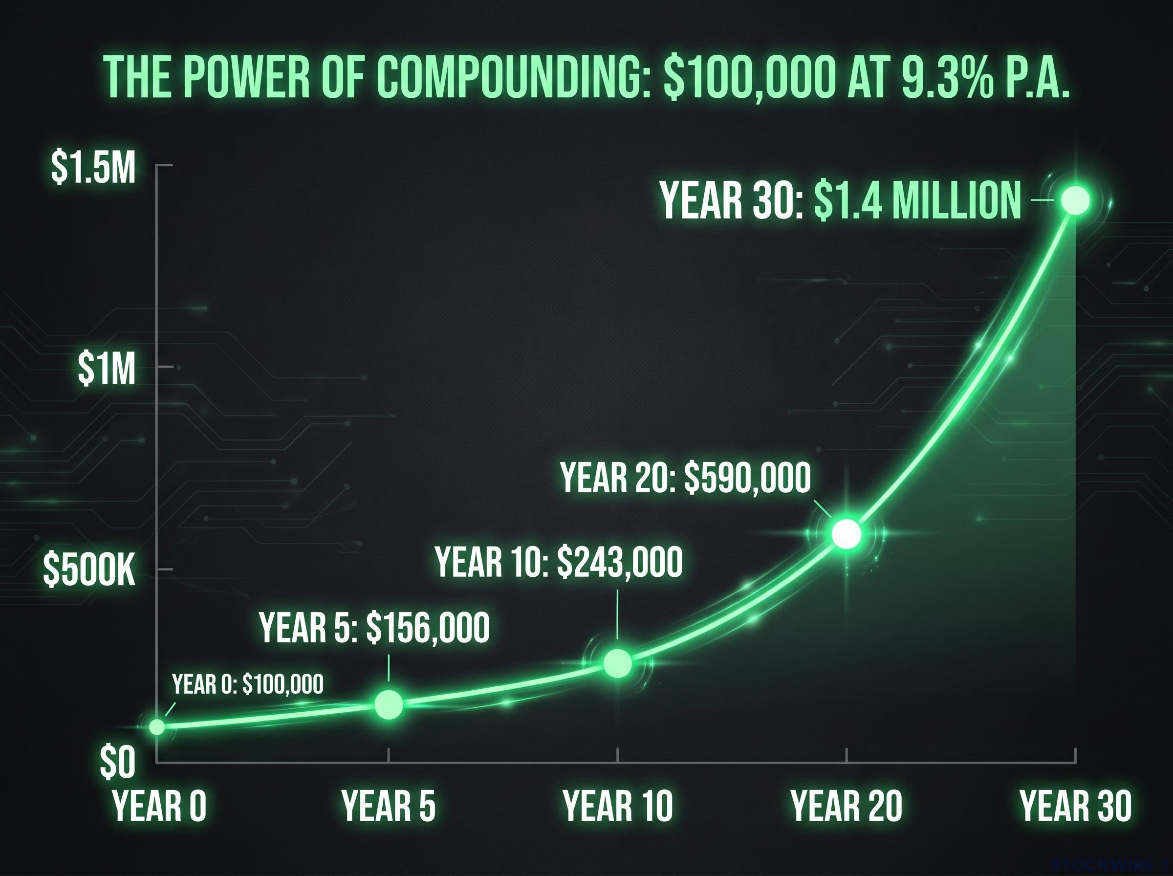
It should not be. Compounding means returns generate further returns, and growth accelerates rather than accumulating in a straight line. Each year’s gains are added to the base, and the following year’s return applies to a larger sum. In the early years, the effect is barely visible. By year ten, the base has grown enough that annual gains are noticeably larger than they were at the start. By year twenty-five, the acceleration becomes striking: a single year’s growth at 9.3% applied to a compounding portfolio can exceed the $100,000 originally invested.
This is where the compounding curve bends upward most sharply. The majority of terminal wealth is created in the final third of the time horizon. Exiting early does not mean missing some growth. It means missing most of it.
A 25-year-old investing $100,000 once, with no further contributions, could retire with over $1 million after 30 years based on the historical average for Australian shares.
The following illustrative snapshots show what $100,000 at 9.3% p.a. looks like at four time points:
The acceleration effect becomes visibly pronounced around year 25 in the Vanguard data. Before that point, the difference between shares and cash feels manageable. After it, the gulf is enormous.
The instinctive objection to equities is not about averages. It is about the feeling of watching a portfolio fall 20% or 30% in a matter of months.
That feeling is grounded in real events. The 30-year window from 1995 to 2025 contains three significant downturns:
More recently, tariff-related volatility through 2025 and into 2026 has provided a fresh reminder that uncertainty is a permanent feature of equity markets.
Here is the point that changes the frame: the 9.3% p.a. average is calculated across all thirty years, including every one of those crash years. The volatility is not a separate risk sitting alongside the return. It is already embedded in the outcome.
The relationship between investment risk and return is not symmetrical across time horizons; drawdowns that would be catastrophic over a three-year window are largely absorbed over 25 years, which is precisely why the 9.3% p.a. historical average for Australian shares already reflects every major market disruption in the data set.
“The 9.3% p.a. long-term average already includes every crash between 1995 and 2025. The volatility is embedded in the outcome, not separate from it.”
Investors who sold during downturns locked in losses and missed the subsequent recoveries. Those who held achieved the full 30-year average. The question is not whether markets will fall again; they will. The question is whether a given time horizon is long enough for those falls to become absorbed into a positive long-run average, as they have been for the past three decades.
Switching super to cash during a downturn is one of the most quantifiably costly decisions Australian investors make; members who moved to cash during the April 2025 sell-off were positioned to miss an approximately 5.8% single-month recovery the following month, a loss that, compounded across a remaining accumulation phase, can reduce retirement balances by tens of thousands of dollars.
Current savings account rates deserve honest acknowledgement. An introductory rate of 5.90% p.a. from a provider such as Rabobank (a four-month promotional rate, as at 1 June 2026, per Canstar data) looks attractive. Other competitive providers, including ING and ubank, are offering ongoing rates in the 4.00-4.65% range depending on conditions.
Those rates are real, and for short-term money they are genuinely useful. The error is applying a short-term rate to a long-term question. Introductory rates are promotional. They revert. The 30-year long-run average for cash, covering the full interest rate cycle including the sustained low-rate environment from 2010 to 2021, is 4.1% p.a.
| Rate Type | Rate | Duration | Notes |
|---|---|---|---|
| Best introductory savings rate | 5.90% p.a. | 4 months | Reverts after promotional period |
| Typical ongoing savings rate | 4.00-4.65% p.a. | Ongoing | Conditions apply |
| 30-year cash average | 4.1% p.a. | 1995-2025 | Vanguard 2025 Index Chart |
There is also an inflation consideration. A cash return of 4-5% in a period of elevated inflation produces a materially lower real (after-inflation) gain than the nominal figure suggests. The greater financial risk for long-term savers may be inflation gradually eroding purchasing power rather than short-term equity fluctuations.
For money intended to be invested for a decade or more, benchmarking against a promotional rate that will not persist for the duration is a comparison error. The relevant benchmark is the long-run average, and the 5.2 percentage point differential between that average and historical equity returns compounds into the $1.4 million versus $336,000 outcome documented above.
The data above answers the analytical question. The practical question is simpler: which money goes where?
The primary sorting mechanism is time horizon. Money needed within three to five years stays in cash. Money not needed for a decade or more belongs in growth-oriented investments. The framework breaks down into four steps:
ASIC MoneySmart guidance on ETFs outlines how exchange-traded funds provide broad market exposure through a single listed security, confirming them as suitable vehicles for retail investors seeking low-cost access to index returns without requiring individual stock selection.
The 5-10 year zone is genuinely ambiguous. Whether money in this window belongs in growth assets or safer vehicles depends on individual risk tolerance, not just the timeline itself. There is no universal answer for this boundary.
For most Australians, the lowest-friction first step is already in place: superannuation. Super fund growth and balanced options typically allocate heavily to Australian and international shares, embedding the same long-run equity returns (approximately 9%+ p.a.) seen in market indices. Checking whether a super fund’s default option is growth-oriented, rather than conservative or cash, is the simplest way to ensure long-term money is positioned appropriately.
The figures return to the same place regardless of the angle: 9.3% p.a. versus 4.1% p.a. over 30 years. $1.4 million versus $336,000 from $100,000. This is not a market prediction. It is the verified historical outcome of three decades of Australian and global market performance, covering a period containing two of the worst market crashes in modern history.
Cash feels safer because its value does not fall on a Tuesday afternoon. The cost of that feeling is visible only over decades, and it is substantial.
“The relevant question is not whether to take risk. It is whether your time horizon is long enough that risk becomes absorbed into the long-run average. Thirty years of Australian data suggests it usually is.”
This article is for informational purposes only and should not be considered financial advice. Investors should conduct their own research and consult with financial professionals before making investment decisions. Past performance does not guarantee future results. Financial projections are subject to market conditions and various risk factors.
Over 30 years from 1995 to 2025, Australian shares returned 9.3% p.a. versus 4.1% p.a. for cash, turning $10,000 into $143,786 compared to $33,677 for cash, according to the Vanguard 2025 Index Chart.
No. The 9.3% p.a. historical average for Australian shares already includes every major downturn between 1995 and 2025, including the dot-com bust, the Global Financial Crisis, and the COVID-19 sell-off, meaning the volatility is embedded in the outcome rather than sitting alongside it.
The primary sorting factor is time horizon: money needed within three to five years should stay in cash, while money not required for a decade or more is better suited to growth-oriented investments such as low-cost index ETFs tracking the S&P/ASX 200.
Not materially. Introductory rates such as 5.90% p.a. are promotional and revert after a few months, while the 30-year long-run cash average is 4.1% p.a., meaning the roughly 5.2 percentage point gap with historical equity returns persists over a full investment cycle.
The gap accelerates sharply in the later years of a long investment horizon; $100,000 in Australian shares at the historical 9.3% p.a. average grows to approximately $1.4 million over 30 years, compared to around $336,000 in cash, with the majority of wealth created in the final third of the period.