
The price-to-earnings ratio is arguably the most cited number in share investing commentary. It appears on every research platform, anchors thousands of broker notes a year, and gets dropped into dinner-party stock conversations as though it settles arguments. Yet most investors who use it regularly have never examined what it actually cannot tell them.
Here is the situation you have probably lived through already. You pull up a company on your research platform, see a P/E of 32 (or 8, or simply “N/A”), and genuinely do not know what to do with that number. Is 32 expensive? Is 8 a bargain? Why does another platform show a completely different figure for the same stock? The ratio is genuinely useful as a starting point, but its value depends entirely on how you contextualise it.
Here is a clear framework for reading the P/E ratio accurately, avoiding the mistakes that make it dangerous, and knowing exactly what to reach for when the number alone is not enough. Think of it as a practical toolkit you carry into your next investment decision, not a theoretical exercise.
What the P/E ratio actually measures (and how to calculate it)
The P/E ratio shows you the price an investor pays for each unit of a company’s yearly profit. It is not a company metric. It is an investor metric: what price is the market asking you to pay for this level of profit?
P/E ratio = Share price ÷ Earnings per share (EPS)
The calculation is a two-step process:
- Find the earnings per share (EPS). EPS is calculated by dividing the company’s net profit by the total number of shares on issue. Research platforms generally pull this figure directly from published financial statements and present it alongside the ratio.
- Divide the current share price by the EPS. Take a share trading at $30 with an EPS of $2.00: dividing those two figures gives a P/E of 15, which means the market is pricing each $1 of annual profit at $15.
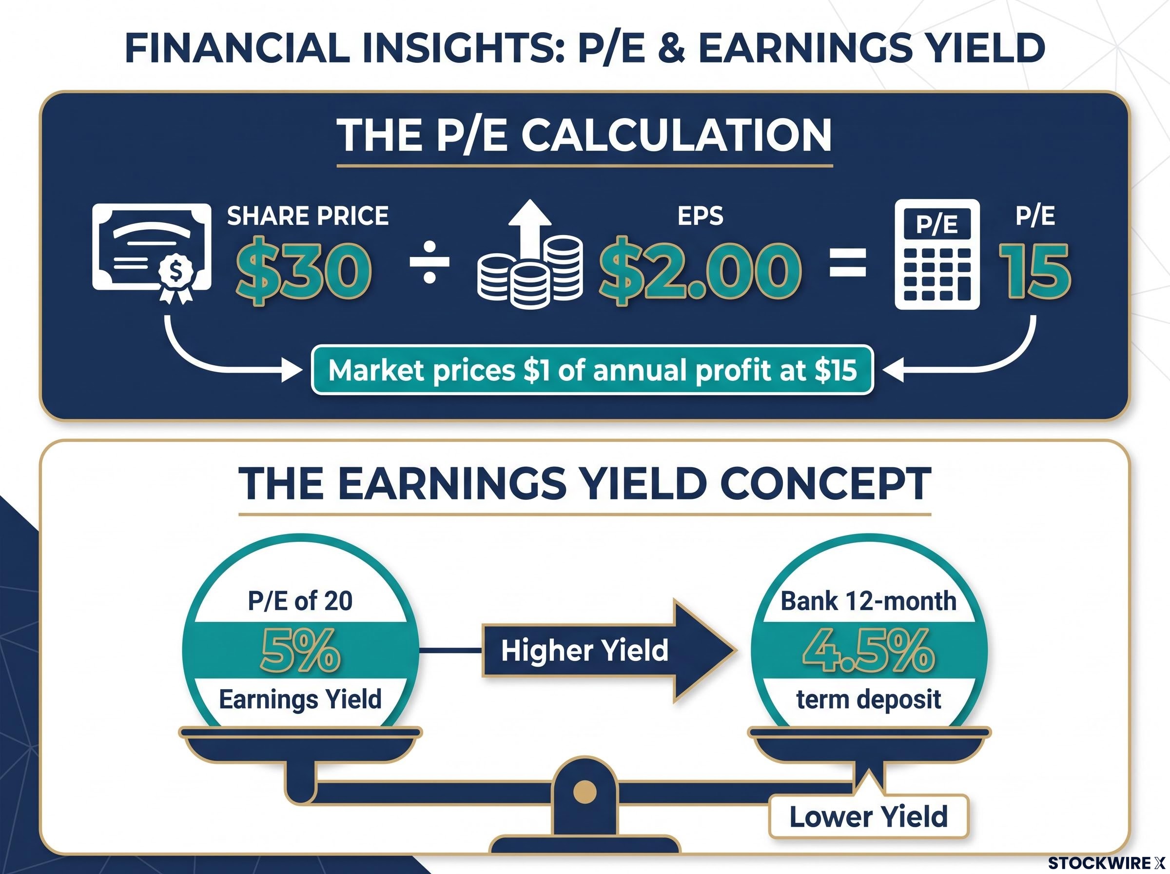
One framing worth keeping in your back pocket is the earnings yield, which is the P/E flipped upside down: earnings divided by price. A P/E of 20 implies an earnings yield of 5%. That matters for you specifically because it translates a ratio into a return concept you can compare directly against the prevailing cash rate or a term deposit. When your bank is offering 4.5% on a twelve-month term deposit, an earnings yield of 5% from a share tells you the equity premium you are being offered for taking on share-market risk.
Understanding these mechanics prevents you from treating a platform-displayed number as a verdict. Once you know what feeds into it, you are equipped to question the inputs rather than accept the output uncritically.
The P/E ratio is one of five fundamental analysis metrics that together give you a complete picture of a company’s financial health; EPS, revenue growth, profit margins, and return on equity each answer a different question that the ratio alone cannot address.
When big ASX news breaks, our subscribers know first
Understanding the two P/E variants: how the same stock produces different figures across platforms
When two research platforms display different P/E figures for the same company on the same day, it is not a data error on either side. It reflects the different methodological choices each platform has made in constructing the ratio.
The primary distinction is between trailing P/E and forward P/E:
| Attribute | Trailing P/E | Forward P/E |
|---|---|---|
| Data source | Reported earnings from the most recent 12-month period | Projected earnings compiled from analyst estimates for the year ahead |
| Reliability | Factual and retrospective | Inherently uncertain; forecasts diverge between analysts |
| Best use case | Comparing against a company’s own history | Assessing market expectations for future growth |
| Key risk | Past earnings may not reflect current conditions | Forecasts can change rapidly and miss by wide margins |
Beyond that core split, secondary factors also produce divergent figures across platforms:
- Share count methodology (whether the calculation uses fully diluted share counts, which incorporate potential shares from options and convertible instruments, or the basic undiluted figure)
- Normalisation of one-off items (platforms differ on whether extraordinary gains or charges are excluded from the earnings figure)
- Publishing cadence (the interval between data refreshes varies across providers)
- Foreign exchange rate timing for companies with earnings in multiple currencies
None of these approaches is wrong. They reflect distinct analytical choices. For you, the practical step is this: before comparing P/E ratios across two companies using different sources, confirm which variant each platform is using and whether its methodology is consistent. Without that step, you risk a comparison that looks meaningful but is actually measuring two different things.
Reading the signal: what an elevated or depressed P/E reveals about market expectations
A high P/E does not mean expensive. A low P/E does not mean cheap. Both are common instincts, and both lead investors astray.
A high P/E typically signals that the market is pricing in substantial profit growth ahead. The premium you pay per dollar of today’s earnings reflects collective confidence that those earnings will be considerably higher in future periods. Growth-oriented sectors such as technology and healthcare on the ASX tend to carry elevated multiples for precisely this reason. The corresponding risk is clear: when expected growth fails to arrive, the repricing can be swift and severe.
A low P/E is more ambiguous. It might signal genuine undervaluation, a company the market has overlooked. Or it might be a value trap: a stock that appears cheap but is priced low for structural reasons the market has already identified.
A value trap is a stock that looks inexpensive on the P/E ratio but is priced low for fundamental reasons. The “bargain” never recovers because the business itself is deteriorating.
Three red flags help you distinguish an undervalued opportunity from a value trap:
- Falling revenues across multiple reporting periods
- Shrinking margins, suggesting the company’s pricing power or cost structure is eroding
- Persistent negative free cash flow, meaning reported profit is not translating into actual cash the business generates
This concept is particularly relevant for you as an Australian investor. Resource and industrial companies on the ASX can appear cheap at peak earnings while actually sitting at the top of their earnings cycle. The low P/E is not a buy signal; it is a question that demands investigation. What comes next determines whether the number is telling you something useful or something misleading.
Identifying undervalued stocks using P/E as one of three overlapping filters, alongside free cash flow yield and debt-to-equity ratio, is more reliable than any single-metric screen precisely because each filter catches a different category of value trap that the others miss.
What counts as a normal P/E on the ASX, and why sector context changes everything
Determining whether a P/E is attractive requires a reference point, and no single universal figure serves that purpose. You need to evaluate the number against three distinct benchmarks:
- The company’s own historical range. Looking at where this specific business has traded across its own history controls for sector norms and captures how the market has previously valued its earnings. This is often the most revealing single comparison available.
- Sector peers. Banks compared against banks. Miners against miners. Technology companies against technology companies.
- The broader Australian market average. The S&P/ASX 200 has generally traded in the upper-teens to mid-twenties P/E range in recent years, though the precise figure shifts with earnings and price cycles. You should verify the current number from sources such as Market Index or a major broker rather than relying on any fixed benchmark.
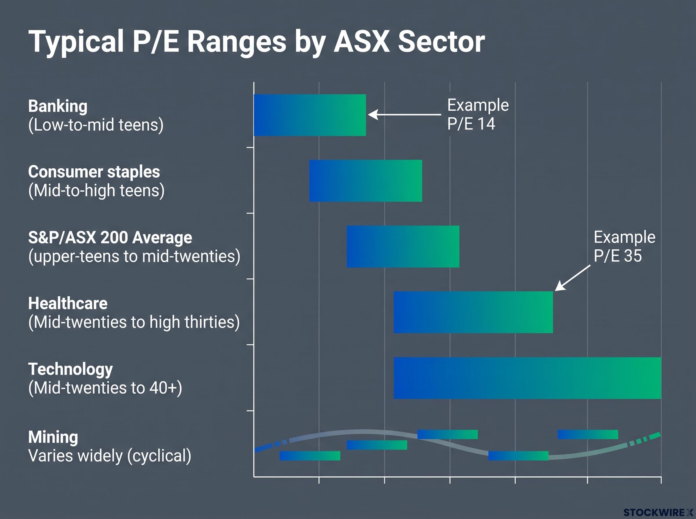
The sector dimension is where most cross-company comparisons go wrong. Consider the typical P/E ranges across major ASX sectors:
| ASX sector | Typical P/E range | Growth profile | Key reason for the multiple |
|---|---|---|---|
| Banking | Low-to-mid teens | Mature, stable | Predictable earnings, high payout ratios |
| Mining | Varies widely (cyclical) | Commodity-dependent | Earnings swing with commodity prices |
| Technology | Mid-twenties to 40+ | High growth | Market prices in rapid future earnings expansion |
| Healthcare | Mid-twenties to high thirties | Growth-oriented | Long product lifecycles, defensive demand |
| Consumer staples | Mid-to-high teens | Defensive, steady | Resilient earnings with modest growth |
Figures are illustrative. Verify current data from live market sources such as Market Index or major Australian brokers.
A major bank trading at a P/E of 14 and a healthcare company trading at 35 are not telling you one is cheap and the other expensive. They are reflecting fundamentally different growth profiles. Comparing them directly on P/E alone yields little useful insight.
ASX bank stock valuation illustrates the sector context principle clearly: major banks typically trade in the low-to-mid teens on P/E, and a discount to that sector average reflects persistent structural factors, including lower return on equity and tighter capital constraints, rather than a straightforward buying opportunity.
For you, the first question when you encounter a P/E figure is not “is this high or low?” It is “is this high or low relative to where this company and its sector have historically traded?”
Where the P/E ratio breaks down: the six situations where it misleads more than it guides
Every tool has failure modes. Knowing the P/E ratio’s specific failure modes is arguably more valuable than knowing how to calculate it, because calculation is handled by your platform. Interpretation is on you.
Here are the six situations where the ratio misleads more than it guides:
- Loss-making companies. A company reporting a net loss will produce a negative or undefined P/E. Pre-profit businesses, whether early-stage startups or growth companies reinvesting heavily, sit entirely outside the ratio’s useful range.
- Cyclical distortions. In commodity-driven sectors such as mining, energy, and materials, profits expand and contract with underlying commodity prices. At peak earnings, the ratio can appear artificially compressed; at earnings troughs, it can look inflated without any change in the business itself.
- Debt blindness. Two companies with identical P/E ratios can carry vastly different financial risk. The ratio tells you nothing about how much debt sits behind the earnings figure.
- One-off items. Significant non-recurring transactions, whether a major asset sale, a restructuring programme, or an accounting write-down, can lift or depress reported earnings in ways that distort the ratio well beyond what the underlying business justifies.
- Buyback effects. Large share buybacks reduce the number of shares outstanding, mechanically boosting EPS (and lowering the apparent P/E) without any improvement in the company’s actual operational performance.
- Backward-looking nature. Because trailing P/E draws on earnings already recorded, it reflects a version of the business that may no longer exist. Historical profit figures carry no assurance about what the company will earn going forward.
How to handle P/E ratios for cyclical ASX sectors
For ASX investors evaluating mining or energy companies, a low P/E at commodity price peaks is often the riskiest moment, not the safest. The earnings figure in the denominator may be unsustainably high.
The practical fix is to assess normalised earnings averaged across a full commodity or business cycle, typically 5-7 years, rather than relying on the most recent twelve-month EPS figure. This smooths out the dramatic swings that cause point-in-time P/E ratios to mislead. For cyclical ASX sectors, the normalised approach gives you a far more honest read on the multiple you are actually paying.
Understanding where this tool breaks is what separates informed investors from pattern-matchers. A P/E figure that looks compelling on the surface may be telling you the opposite of what you think, and this checklist helps you catch it before it costs you.
How to use the P/E ratio properly: pairing it with the metrics that fill its gaps
The P/E ratio’s weaknesses are well-defined, which means the complementary metrics that address them are equally clear. Each of the following fills a specific gap the ratio leaves open:
- PEG ratio (calculated by taking the P/E and dividing it by the company’s expected annual earnings growth rate). This accounts for the growth that justifies a premium multiple. When you are evaluating a high-P/E growth stock, the PEG ratio tells you whether the premium you are paying is supported by the company’s actual earnings growth trajectory. A PEG below 1.0 is often considered attractive for growth stocks, though it is a starting point for analysis, not a guarantee.
- Dividend yield. Particularly relevant for mature ASX businesses where income is a meaningful return component alongside capital growth. The P/E captures the price-to-profit relationship but says nothing about how much of that profit reaches you as a shareholder.
- Free cash flow. This is your litmus test for whether reported earnings translate into real economic value. A company can report attractive EPS while burning cash operationally, and free cash flow exposes that gap. It is also the single best early-warning indicator for value traps.
- Debt levels and capital structure. Given the P/E ratio’s complete blindness to leverage, you need to assess how much debt underpins the earnings figure you are paying for. Enterprise value-based metrics such as EV/EBITDA can sometimes substitute for the P/E entirely when comparing companies with different capital structures.
PEG ratio = P/E ratio ÷ Annual earnings growth rate (%)
For you as an Australian investor evaluating a high-P/E growth stock, the PEG ratio is the single most valuable addition to your toolkit. It directly answers the question the P/E ratio raises but cannot resolve: is the premium I am paying justified by how fast this company is actually growing?
The CFA Institute analysis of the PEG ratio examines how dividing the P/E by the earnings growth rate adjusts for the growth premium embedded in high-multiple stocks, and why Peter Lynch popularised it as a practical screen for growth investors seeking to avoid overpaying.
This shift, from relying on a single ratio to using a framework of complementary metrics, is the meaningful upgrade in investment literacy this article exists to deliver.
For investors wanting to go one step further, our dedicated guide to implied growth rate calculations converts any share price into a measurable minimum revenue growth requirement, giving you the one number standard research platforms never display.
Using the P/E ratio as a starting point, not a shortcut
The P/E ratio is one of the most useful and most misused tools in share investing. The difference lies entirely in whether you use it as a starting point for deeper analysis or as a shortcut to a conclusion.
Every time you encounter a P/E figure, run through these five questions before you draw any inference:
- Which variant am I looking at? Trailing or forward? And has the platform spelled out its methodology?
- What is the sector norm? Is this multiple typical for companies in this industry, or does it stand out?
- How does this compare to the company’s own history? Is the current P/E elevated or depressed relative to where this specific business has traded?
- Is there an earnings distortion at work? One-off items, cyclical peaks, or buyback effects that skew the denominator?
- What do cash flow and debt levels add to the picture? Does free cash flow confirm the earnings story, and is the balance sheet sustainable?
The ratio works best when paired with the PEG ratio, dividend yield, free cash flow analysis, and capital structure assessment. None of these is difficult to find on most Australian research platforms.
The ASX’s structural diversity, spanning high-growth technology and healthcare alongside cyclical resources and mature financials, makes context-dependent reading especially important. A single number cannot capture the complexity of valuing businesses across those categories. But a disciplined process for interpreting that number, and knowing when to set it aside, gives you a genuine edge in how you evaluate every stock you research.
This article is for informational purposes only and should not be considered financial advice. Investors should conduct their own research and consult with financial professionals before making investment decisions.