
The US economy just handed investors two numbers that cannot both be comforting. Q3 GDP is tracking at 3.7% annualised, according to the Atlanta Fed’s GDPNow nowcast updated on 30 September 2026. In the same week, the Conference Board reported consumer confidence at 81.9, its lowest reading since 2014.
So which one do you trust? When the headline growth figure points up and the signal from households points sharply down, you have a navigation problem, not a curiosity to admire.
This split is not unprecedented, but it is unusually legible right now. Consumer spending drives roughly 68% of US GDP, while the much-discussed AI-driven investment boom accounts for only around 14%. That gap between the two engines of growth is what makes this moment worth studying carefully.
Here is a framework for reading economic releases beyond the headline number, so you understand what the composition of that figure is actually telling you about whether the growth will last. By the end, you should be able to evaluate the next data release with structural scepticism rather than headline acceptance.
Why the headline GDP number can mislead you
You probably arrived with a reasonable assumption: strong GDP means a strong economy. The quarter just gone shows why that assumption needs an asterisk.
Q2 2026 GDP was revised upward to 3.0% annualised in headline terms. Underneath that number, the picture was less reassuring: the revision showed a negative contribution from consumer spending and a drag from net exports, the latter linked to elevated energy costs and shipping disruptions tied to Middle East tensions.
That is a quality-of-growth problem. Not every component of GDP carries the same weight for durability, and a top-line figure held up by the wrong parts can mask real weakness underneath.
The distinction worth internalising is between growth that signals forward momentum and growth that can reverse. Consumer spending and business investment tell you households and firms have conviction about the future. Inventory accumulation, front-loaded exports, and one-off fiscal support can vanish next quarter and drag the headline down with them.
GDP component arithmetic explains why a dramatic sector move can register as near-zero impact on the headline figure: a component needs both a large share of output and a large percentage change to shift the top-line number meaningfully, and most sectors that dominate economic coverage satisfy only one of those two conditions.
- Higher-quality components: consumer spending, business investment in equipment and intellectual property
- Lower-quality or transitory components: inventory restocking, net export swings, one-off government outlays
| GDP Component | Share of GDP | Durability Signal |
|---|---|---|
| Consumer spending | ~68% | High: broad-based consumption is the most durable driver |
| Business investment | ~14% | High: signals confidence in future demand |
| Inventories | Variable | Low: swings sharply and reverses |
| Net exports | Variable | Low: sensitive to energy costs and shipping shocks |
| Government spending | Variable | Mixed: durable if structural, transitory if one-off |
So when Q2 was revised up while consumers contributed negatively, that was not good news for your outlook. It signalled a number propped up by components that can retreat quickly, not by the household demand that sustains an expansion.
What the historical record shows about composition-driven revisions
The late-2007 case is the one worth remembering. Headline GDP stayed positive, supported partly by net exports and inventories, even as domestic final sales deteriorated. The Great Recession that followed showed how a solid-looking top line can conceal demand that is already buckling.
Post-recession recoveries offer the second pattern. When firms rebuild inventories after a downturn, GDP can surge temporarily, then slow sharply once the restocking is complete and underlying demand turns out to be weaker than the headline implied.
When big ASX news breaks, our subscribers know first
What consumer spending at 68% of GDP actually means for growth durability
That 68% figure is easy to skim past. It should stop you cold, because it means the consumer is not a part of the US economy. The consumer is effectively the US economy.
When one component is that large, nothing else is big enough to offset it. The AI-driven construction and investment boom, running at roughly 14% of GDP, cannot fill the hole if households retrench. Even rapid growth in a 14% slice does not mathematically compensate for weakness in a 68% one.
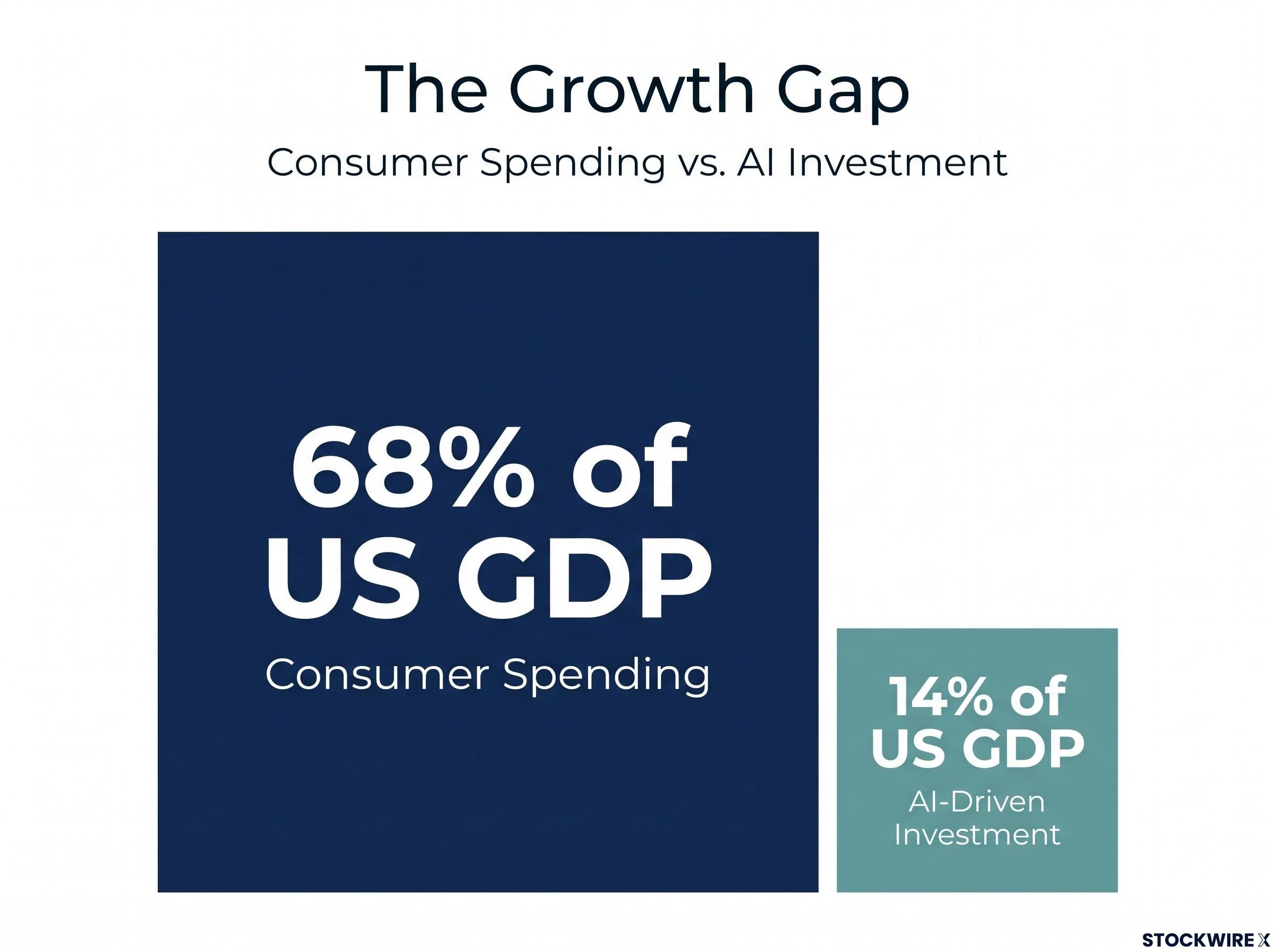
This is why a negative contribution from consumer spending is categorically more alarming than a similar-sized drag from net exports or inventories. The others have offsets available. The consumer does not.
Conference Board Consumer Confidence 81.9 in September 2026, the lowest reading since 2014.
The internal breakdown is where the concern deepens. All three sub-indices moved the wrong way:
- Overall index: fell from 88.6 in August to 81.9 in September, a drop of 6.7 points
- Present Situation Index: down from 117.2 to 109.3
- Expectations Index: down from 69.5 to 63.6, a third consecutive monthly decline
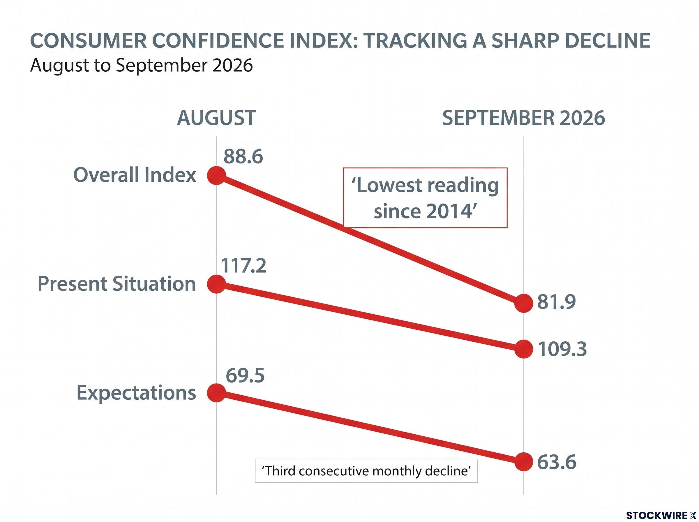
The expectations figure matters most. Confidence is a leading indicator for spending, and three straight monthly declines in the forward-looking component tell you households are starting to pull back psychologically before the harder data confirms it.
The Conference Board Consumer Confidence methodology samples roughly 3,000 US households monthly on current business conditions and six-month forward expectations, which is why the expectations sub-index carries particular weight as a leading indicator for spending.
That asymmetry is the point. When confidence cracks at the household level, wage growth tends to slow, credit conditions tighten, and the pessimism becomes self-reinforcing on the way down. With the consumer carrying 68% of the load, there is no compensating force large enough to hold the expansion together if that wall develops stress fractures.
Reading the labor market signal without mistaking cooling for collapse
The labour market is not a switch that flips between “fine” and “recession.” It is a dial, and the whole challenge is knowing where the threshold sits between cooling and collapsing.
The latest reading points to cooling. The Bureau of Labor Statistics (BLS) reported job openings of 7,079,000 for August 2026, a rate of 4.3%, and described them as “little changed.”
BLS characterisation “Little changed at 7.1 million.”
The rest of the August data fits the same gentle picture. Hires came in at 5.2 million and total separations held at 5.1 million, unchanged. Openings remain above pre-pandemic norms, which is why many read this as benign normalisation consistent with a soft landing rather than deterioration.
| Labor Indicator | August 2026 Reading | Characterisation | What It Signals |
|---|---|---|---|
| Job openings | 7,079,000 | Little changed | Leading: demand cooling, still above pre-COVID norms |
| Job openings rate | 4.3% | Gradual drift lower | Leading: labour demand normalising |
| Hires | 5.2 million | Little changed | Steady matching of workers to roles |
| Total separations | 5.1 million | Unchanged | No surge in layoffs yet |
Here is the distinction that matters for you. Openings are a leading signal; payrolls and unemployment are lagging ones. The upcoming non-farm payrolls release is expected to show moderation from the prior month, with unemployment projected to rise modestly, but by the time those lagging numbers turn clearly negative, the damage upstream is usually already done.
Labour force participation has quietly declined by roughly 2 million people since December 2025, meaning the stable unemployment rate is partly a statistical artefact of people stopping their job search rather than finding work, which is precisely the kind of upstream damage the JOLTS and payrolls headlines cannot directly see.
Where the “good news” interpretation breaks down
Labour markets have a habit of drifting lower calmly for months and then tipping into rapid deterioration. If you misjudge where that non-linear threshold sits, you read early softening as benign right up until layoffs spike and confidence collapses together.
There is also a policy trap. If inflation stays above target while the labour market softens, the Federal Reserve cannot simply pivot dovish. That undermines the entire “bad news is good news” assumption, because the rate relief the market is counting on may not arrive.
Then there is the lag itself. Slower hiring feeds slower wage growth, which flows into weaker consumer spending and, eventually, higher loan delinquencies. By the time payrolls make the weakness obvious, the consumer and credit damage may already be well advanced.
The three narratives competing to explain the same data
Three camps are looking at identical data and reaching different conclusions. This is not a horse race where you need to crown a winner. These are structurally distinct lenses that weight the same figures differently, which is why the disagreement is rational rather than one side simply being wrong.
The soft-landing view points to GDPNow at 3.7%, JOLTS openings still above pre-pandemic norms, and inflation trending toward target. In this reading, the mixed signals are successful normalisation, and equities stay supported as long as earnings hold.
The stagflation-risk view weights the confidence decline and strained real activity differently. If shelter and services inflation stay sticky while growth slows, the Fed’s room to ease is constrained, and weak data stops being reliably bullish.
The recession-risk view anchors on confidence at the lowest since 2014, the persistent downward drift in openings, and the lagged effect of prior aggressive tightening. Here, any rate-cut rally is vulnerable to reversal once earnings downgrades arrive.
Fed policy transmission works through five distinct channels, from interest rate and expectations effects through to credit, asset prices, and exchange rates, with lags ranging from near-immediate for yield-curve repricing to twelve to twenty-four months for full demand suppression, which is why prior aggressive tightening continues to work through the system even as rate decisions pause.
| Narrative | Core Argument | Key Data It Weights | What It Implies for Equities |
|---|---|---|---|
| Soft landing | Growth slows to sustainable pace, inflation converges | GDPNow 3.7%, openings above pre-COVID norms | Supported if earnings hold |
| Stagflation risk | Below-trend growth with sticky inflation | Falling confidence, sticky shelter and services prices | Constrained; weak data not reliably bullish |
| Recession risk | Tightening works through with a lag into contraction | Confidence at 81.9, persistent JOLTS drift lower | Vulnerable; rate-cut rallies reverse on downgrades |
Strategists at Goldman Sachs, Morgan Stanley, and JPMorgan frame the split as a tug-of-war between the discount-rate channel and the earnings channel: moderate weakness lowers rate expectations and lifts valuations, while severe weakness destroys the earnings those valuations rest on. Fed officials including Jerome Powell, Christopher Waller, and Mary Daly stress data dependency, and warn that inflation above target can prevent a straightforward dovish pivot.
The cautionary view Mohamed El-Erian and Lawrence Summers warn that markets sometimes over-celebrate weak data, which eventually hits earnings, not just discount rates.
Why does this three-camp framework matter to you? Because the narrative you find most credible should shape which sectors you scrutinise now. Not because one camp is definitively right, but because each implies a different sequence of events over the next two to four quarters.
How to read the next economic release before the headline lands
Here is the practical skill all of this builds toward. The next time a GDP revision or JOLTS report drops, you want a repeatable checklist, not a vague instruction to “look deeper.”
Work through these questions in order:
- Read the headline figure and note what it claims.
- Immediately ask which components drove it.
- Check whether those components are durable (consumer spending, investment) or transitory (inventories, net exports, one-off support).
- If consumers contributed positively and broadly, treat the headline as credible. If it is held up by transitory parts, discount it.
- For labour data, ask not just whether openings rose or fell, but whether the trend is accelerating or decelerating.
- Confirm whether confidence and wage growth are moving in the same direction as the headline.
- Ask whether the release confirms or contradicts the other signals already on the board.
The “bad news is good news” dynamic runs both ways, which is worth watching. A strong ISM Manufacturing PMI reading could be read negatively right now, because it reduces the pressure on the Fed to cut.
The narrow window “Bad news is good news” applies only where data are soft enough to cool the Fed but not so weak as to threaten earnings or financial stability.
Applying the framework to the current data set
Run October’s numbers through the checklist. GDPNow sits at 3.7%, but Q2 composition showed consumers contributing negatively, so the headline fails the durability test. Confidence at 81.9 is low and falling for a third month, so sentiment and the headline are moving apart. JOLTS is drifting lower but not collapsing, so the trend is decelerating without yet breaching the danger threshold. The upcoming payrolls and ISM releases are the live next test: through the composition lens, the question is whether each confirms the softening or contradicts it.
For readers wanting a forward-looking signal to track alongside GDP composition and confidence data, our dedicated guide to equipment investment as a recession indicator explains why firms defer capital purchases rapidly when conviction fades, making durable goods orders a genuine leading read on the business cycle months before official accounts confirm it.
Deciding how much uncertainty you can afford to carry right now
Strength on the surface and weakness underneath is precisely the configuration where all three narratives stay plausible at once. GDPNow at 3.7%, Q2 composition showing consumer weakness, confidence at 81.9 and the lowest since 2014, JOLTS around 7.1 million and drifting lower, expectations falling for a third straight month. Accepting that ambiguity is more honest than forcing a single answer.
Your task is not to pick the winning narrative. It is to know what each one would cost you if it proved correct. The sharpest practical question: how much of your current exposure assumes the discount-rate benefit arrives before earnings deterioration does?
Ambiguity like this tends to resolve faster than the drift that preceded it. So use the uncertainty as a prompt, not a reason to wait. Ask yourself:
- What is my exposure to consumer-facing sectors if confidence keeps falling?
- What does my current positioning assume about the Fed’s rate path?
- Have I thought through my response if the composition weakness proves to be an early recession signal rather than soft-landing noise?
This article is for informational purposes only and should not be considered financial advice. Investors should conduct their own research and consult with financial professionals before making investment decisions.
Past performance does not guarantee future results, and these interpretations are speculative and subject to change as new data arrives.