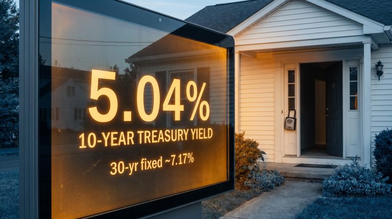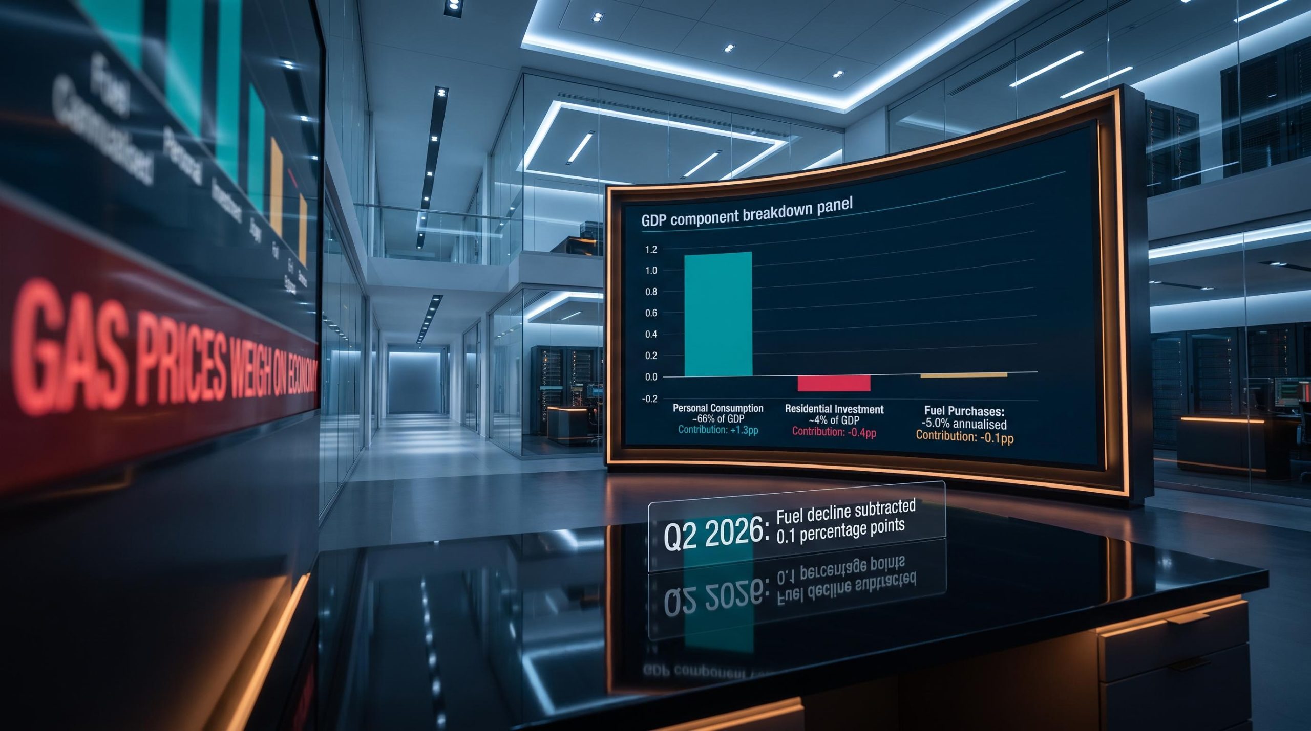
In Q2 2026, gas prices and housing weakness dominated economic headlines. Commentary warned of consumer strain, flagged a struggling housing market, and painted a picture of an economy under pressure from multiple directions. Then the actual GDP data arrived, and it told a quieter story.
This gap between alarming narratives and moderate outcomes is not a one-off. It is a structural feature of how economic news gets reported. The sectors that generate the most dramatic headlines rarely carry enough arithmetic weight in GDP to justify the anxiety they produce. Energy prices and housing are perennial examples: they dominate airtime, but their direct contribution to headline growth is routinely modest.
Here is the framework for interpreting GDP data the way institutional economists do: by checking each component’s actual share, translating percentage changes into contribution points, and testing whether the headline narrative matches the underlying numbers. By the time you finish, you will have a repeatable process for reading any GDP release without being misled by the loudest sector in the room.
Why scary GDP headlines and calm GDP data keep telling different stories
The pattern is remarkably consistent. Every quarter, economic coverage gravitates toward the inputs with the most dramatic storylines: surging petrol prices, housing market weakness, geopolitical risk, recession fears. These topics generate attention because they feel urgent and personal. But attention and arithmetic weight are two different things.
A sector can post a large percentage move in its own activity and still barely register in headline GDP. Two conditions must hold simultaneously for a component to move the headline number meaningfully: it needs a large share of the economy, and it needs a large percentage change. Most of the sectors that dominate coverage satisfy only one of those conditions, and sometimes neither.
The institutional forecasts for 2026 illustrate the gap at the macro level. The World Bank, IMF, ECB, and OECD all simultaneously describe alarming inputs, including elevated energy prices, geopolitical conflict, and trade uncertainty, while projecting positive global growth of roughly 2.5-3.1%.
Even in downside stress scenarios, global growth reductions remain in the 0.4-0.7 percentage-point range, not the multi-percentage-point collapses the headlines imply. Institutions describe frightening inputs and project moderate outcomes because they do the arithmetic the headlines skip.
That persistent gap between narrative and arithmetic means that if you absorb economic headlines without checking the underlying component contributions, you are making decisions based on a systematically distorted picture of macro risk. Recognising this selection mechanism is the first step toward correcting for it.
When big ASX news breaks, our subscribers know first
What GDP components actually are, and why share size is the starting point
GDP is not a single number pulled from thin air. It is a weighted sum of component contributions, where each sector’s impact on headline growth equals its share of the economy multiplied by its own percentage change. That share is the denominator most coverage ignores.
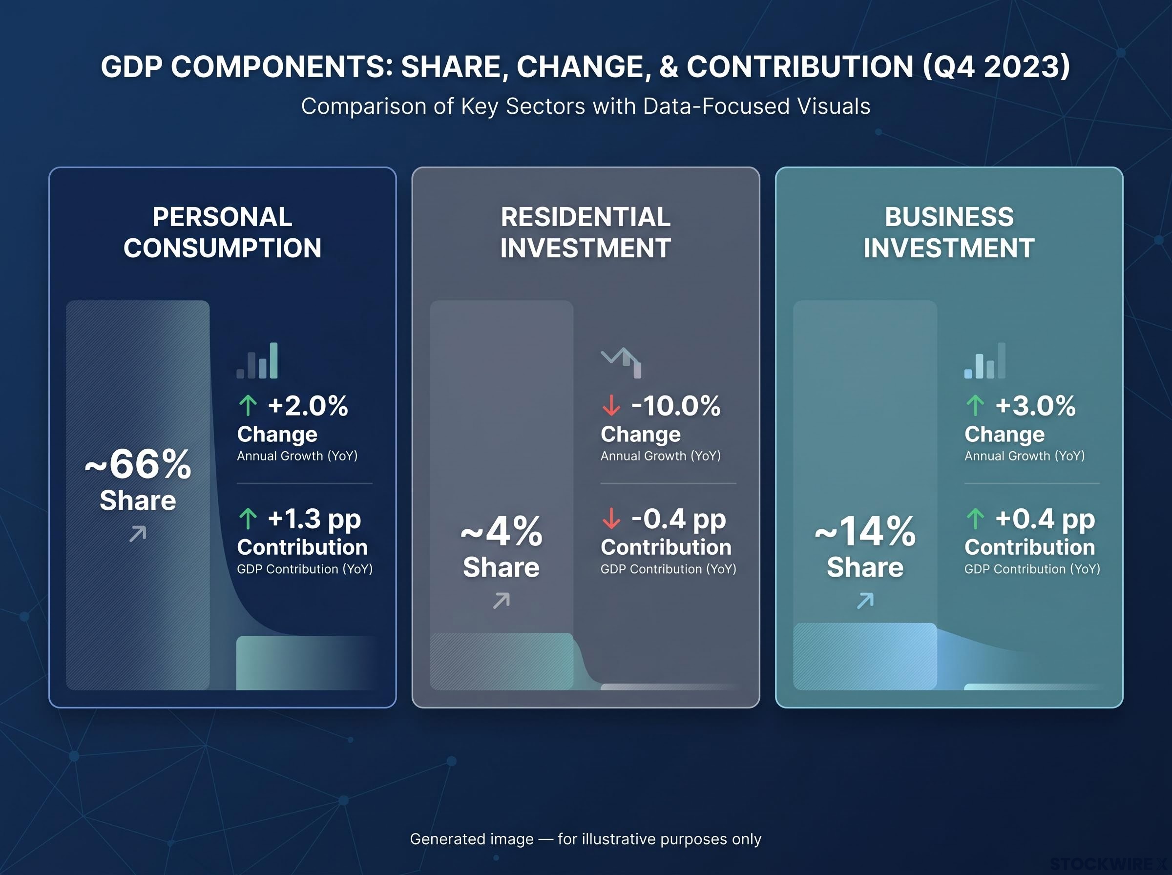
Consider the scale differences. Personal consumption, everything from groceries to healthcare to streaming subscriptions, constitutes roughly two-thirds of the US economy. Residential investment, which covers new home construction and related activity, sits at approximately 3-6% of GDP in advanced economies. When you see a headline reporting that residential investment fell 10%, the instinct is alarm. But 10% of a 4% share produces a contribution of roughly 0.4 percentage points, not a macro-level event.
The right unit for comparing components is “contribution in percentage points,” the amount each component adds to or subtracts from headline growth. Without converting to this unit, you are comparing apples to aircraft carriers.
| GDP Component | Approximate GDP Share | Illustrative Change | Contribution to Headline GDP |
|---|---|---|---|
| Personal Consumption | ~66% | +2.0% | +1.3 pp |
| Residential Investment | ~4% | -10.0% | -0.4 pp |
| Business Investment | ~14% | +3.0% | +0.4 pp |
Two conditions must be met for a component to move headline GDP meaningfully:
- It must represent a large share of total GDP
- It must experience a large percentage change in its own activity
Most sectors that dominate headlines satisfy only one. That is why the share is your starting point every time.
The gas price case study: a 5% fuel decline that barely registered
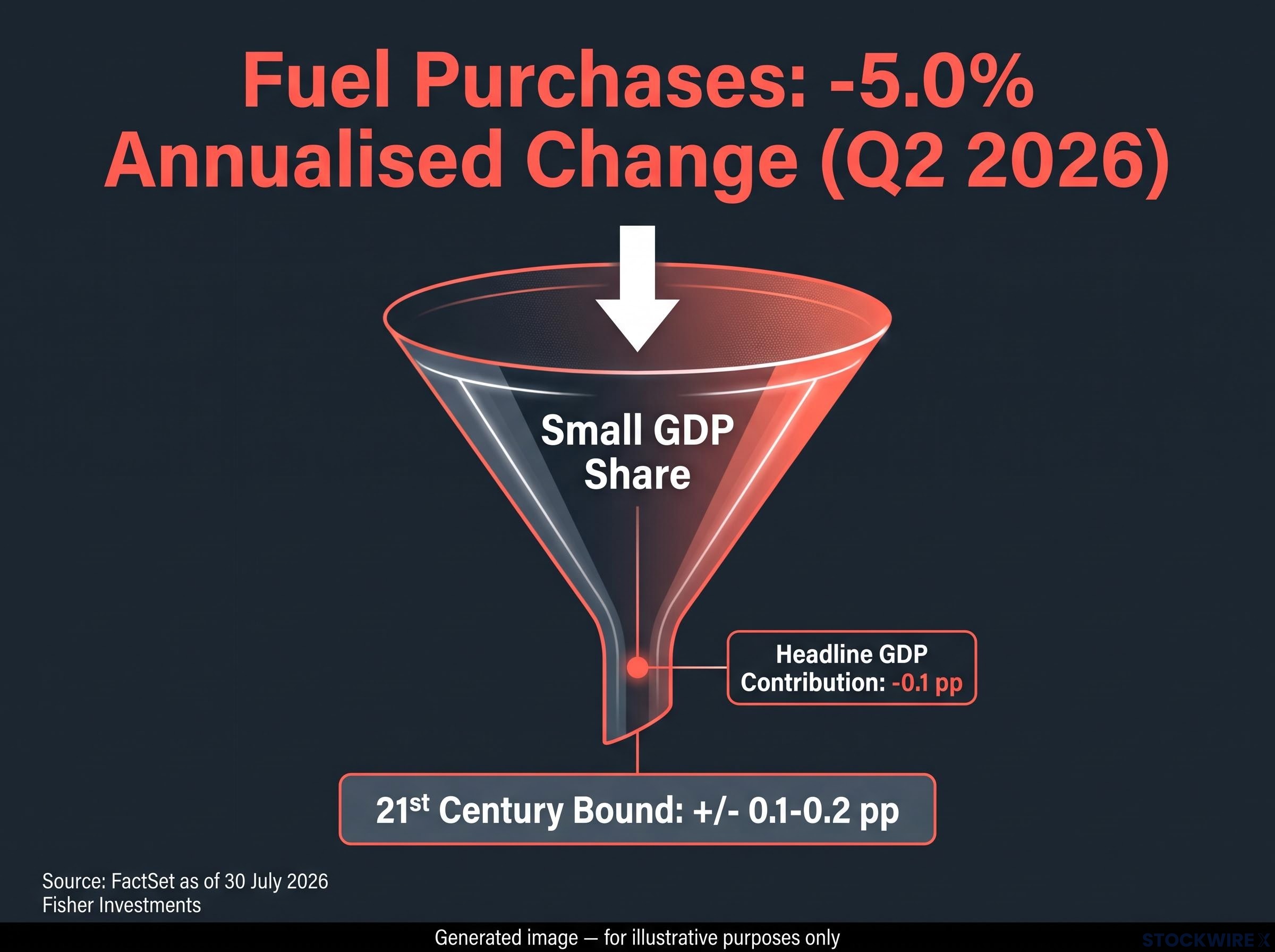
Fuel purchases fell 5.0% on an annualised basis in Q2 2026, according to FactSet data as of 30 July 2026. A 5% decline in anything sounds significant. It made headlines. It fed into narratives about consumers pulling back and energy costs weighing on the economy.
Now run the arithmetic. Fuel purchases represent a small fraction of total consumer spending, which itself is roughly two-thirds of GDP. When you translate that 5.0% annualised decline into its actual contribution to headline GDP growth, it subtracted approximately 0.1 percentage points.
In Q2 2026, annualised fuel purchases dropped 5.0%, trimming roughly 0.1 percentage points from headline GDP growth, per FactSet and Fisher Investments analysis.
One tenth of a percentage point. That is the distance between the headline and the arithmetic. Meanwhile, broader consumer spending continued at a healthy pace. The pattern of spending across other categories held firm even as fuel outlays fell, suggesting households were exercising conservation rather than pulling back broadly on consumption.
Is Q2 2026 an anomaly, or is this how energy always works in GDP?
It is how energy almost always works. Looking back across the 21st century, Fisher Investments analysis shows that fuel consumption has almost never pushed quarterly GDP growth by more than plus or minus 0.1-0.2 percentage points, making it a consistently minor arithmetic factor. The Q2 2026 outcome is entirely typical of that long-run pattern.
Global institutional forecasts reinforce the pattern. The Bank of Canada explicitly noted in its July 2026 Monetary Policy Report that the impact of higher global oil prices on economic activity is small, even though inflation ran approximately 0.3 percentage points higher than previously expected. The EU’s 2026 forecast showed GDP growth revised down only 0.3 percentage points versus earlier projections, an energy-price-driven inflation adjustment rather than a growth collapse.
A fuel price move that dominated paragraphs of economic commentary subtracted one tenth of a percentage point from GDP growth. Keeping that translation in view resets your appropriate level of concern the next time energy prices appear in an economic headline.
Why a ‘struggling’ housing sector can barely move the headline number
According to FactSet data as of 30 July 2026, residential investment grew 1.5% on an annualised basis in Q2 2026, marking the first quarterly gain after five successive periods of decline. The sector’s return to expansion following roughly a year and a half of contraction suggests that persistently high prices for existing homes may be beginning to draw more construction activity, which could gradually ease the supply squeeze confronting prospective buyers.
Yet even this shift, from contraction to expansion, registers modestly at the headline level. Why? Because residential investment represents roughly 3-6% of GDP in advanced economies. A 1.5% move in a 4% share produces a contribution measured in hundredths of a percentage point.
| Period | Residential Investment Growth | Approx. GDP Share | Likely Headline Contribution |
|---|---|---|---|
| Q2 2025 – Q1 2026 (five quarters) | Negative | ~3-6% | Small drag |
| Q2 2026 | +1.5% annualised | ~3-6% | Small positive |
The instinct to treat housing weakness as a macro catastrophe comes from 2008. But the macro damage in that episode came primarily from financial-system stress, wealth effects, and confidence collapse, not from the mechanical GDP weight of residential construction activity itself.
That distinction matters, because housing data is genuinely useful when you read it for the right purpose:
- As an arithmetic GDP contributor: Its direct weight is small. Even large percentage swings produce modest headline contributions.
- As a leading indicator: Residential investment signals credit conditions, consumer confidence, and future construction pipelines. That signalling value is significant.
The return to growth after five negative quarters is meaningful as a signal about credit conditions and housing supply. But treating housing weakness as a macro growth catastrophe overstates the mechanical risk. Your best use of this data is to separate what it tells you about financial conditions from what it actually contributes to the headline number.
A practical framework for reading any GDP release without being misled
You now have the two case studies. Here is the framework that generalises them into a repeatable process, one that mirrors how professional economists and institutional strategists read GDP releases.
- Start with shares. Before reacting to any component’s growth rate, check what share of GDP it represents. Consumption is roughly two-thirds. Residential investment is roughly 3-6%. The share is your multiplier and your reality check.
- Translate percentage changes into contributions. A 5% decline in a small component and a 5% decline in a large component are fundamentally different events for the economy. Express the impact in percentage points of contribution, not in the component’s own growth rate.
- Compare the narrative to the arithmetic. If a GDP headline emphasises housing or energy weakness, run the first two steps and check whether the contribution matches the prominence. In Q2 2026, fuel’s 5.0% decline subtracted 0.1 percentage points. That is the gap.
- Look beyond the scary sectors. Broad consumer spending and business investment are the primary drivers of corporate earnings and equity valuations. After checking the alarming component, check what the dominant components actually did.
- Put recurring worries in historical context. Energy and housing anxieties recur every cycle. Their actual GDP effects are empirically bounded. Across the 21st century, fuel’s quarterly contribution to GDP has almost never strayed beyond plus or minus 0.2 percentage points. Anchoring to that historical range keeps routine fluctuations in perspective rather than letting them read as emergencies.
A component needs both a large share of GDP and a large percentage change to move the headline number meaningfully. Most scary sectors satisfy only one of those conditions.
Having this five-step process converts an anxiety-inducing GDP release into a structured analytical exercise. You are no longer at the mercy of which sector the media decided to amplify this quarter.
What the Q2 2026 data actually confirms about the economy’s underlying health
Step back from the component details and the broader picture comes into focus. The scary sectors were small. The broad drivers held up. The headline narrative overstated the risk.
- Fuel purchases declined meaningfully at -5.0% annualised, yet contributed only -0.1 percentage points to headline GDP
- Residential investment returned to growth at +1.5% annualised, its first positive quarter in five, signalling improving credit conditions
- Broader consumer spending continued at a healthy pace despite the fuel decline, indicating no broad-based consumer retrenchment
- Household and business financial positions are holding up well on the whole, according to Fisher Investments analysis published 31 July 2026, providing a foundation for continued expansion in corporate profits
The breadth of economic growth spanning multiple sectors and investment categories is underappreciated by commentary fixated on two components that represent a small fraction of the economy. The equity bull market’s drivers are similarly broad-based rather than concentrated in a single sector or theme; AI and technology-related activity appears alongside broad-based investment demand in 2026 institutional projections.
Backward-looking GDP data is historical by nature, but it provides evidence of economic resilience that is directly relevant to current equity market valuations. When you read past the energy and housing drag to the broader consumer spending and business investment picture, you get a more accurate input for your portfolio positioning than if you stopped at the headline.
This article is for informational purposes only and should not be considered financial advice. Investors should conduct their own research and consult with financial professionals before making investment decisions.
Reading the next GDP release with a sharper lens
The next GDP release will arrive with its own set of scary sector headlines. Energy, housing, or something else will dominate the coverage. The question is whether you absorb the narrative or evaluate the arithmetic.
You now have the tools to do the second. Start with shares. Translate changes into contributions. Compare the narrative to the numbers. Check what the dominant components actually did. Put recurring anxieties in their historical range.
A component needs both a large share of GDP and a large percentage change to move the headline number meaningfully. That two-condition test is the single most portable takeaway from Q2 2026.
The analytical habit of checking share times change before reacting to a GDP headline is not a one-time lesson. It is a repeatable discipline that pays off every quarter the media amplifies a sector that looks alarming on its own terms but registers as arithmetic noise in the headline. That advantage compounds, one GDP release at a time.
—