
On 17 September 2026, the Labor Department reported that initial jobless claims had fallen to 196,000 for the week ending 12 September, one of the lowest readings since the late 1960s. On paper, that is a picture of a labour market barely shedding workers at all.
Yet that same stretch of 2026 tells a different story. Roughly 2 million Americans have quietly left the labour force since December 2025, according to J.P. Morgan Chase, and the labour force participation rate has slipped to 61.6%, its lowest non-pandemic level since 1976.
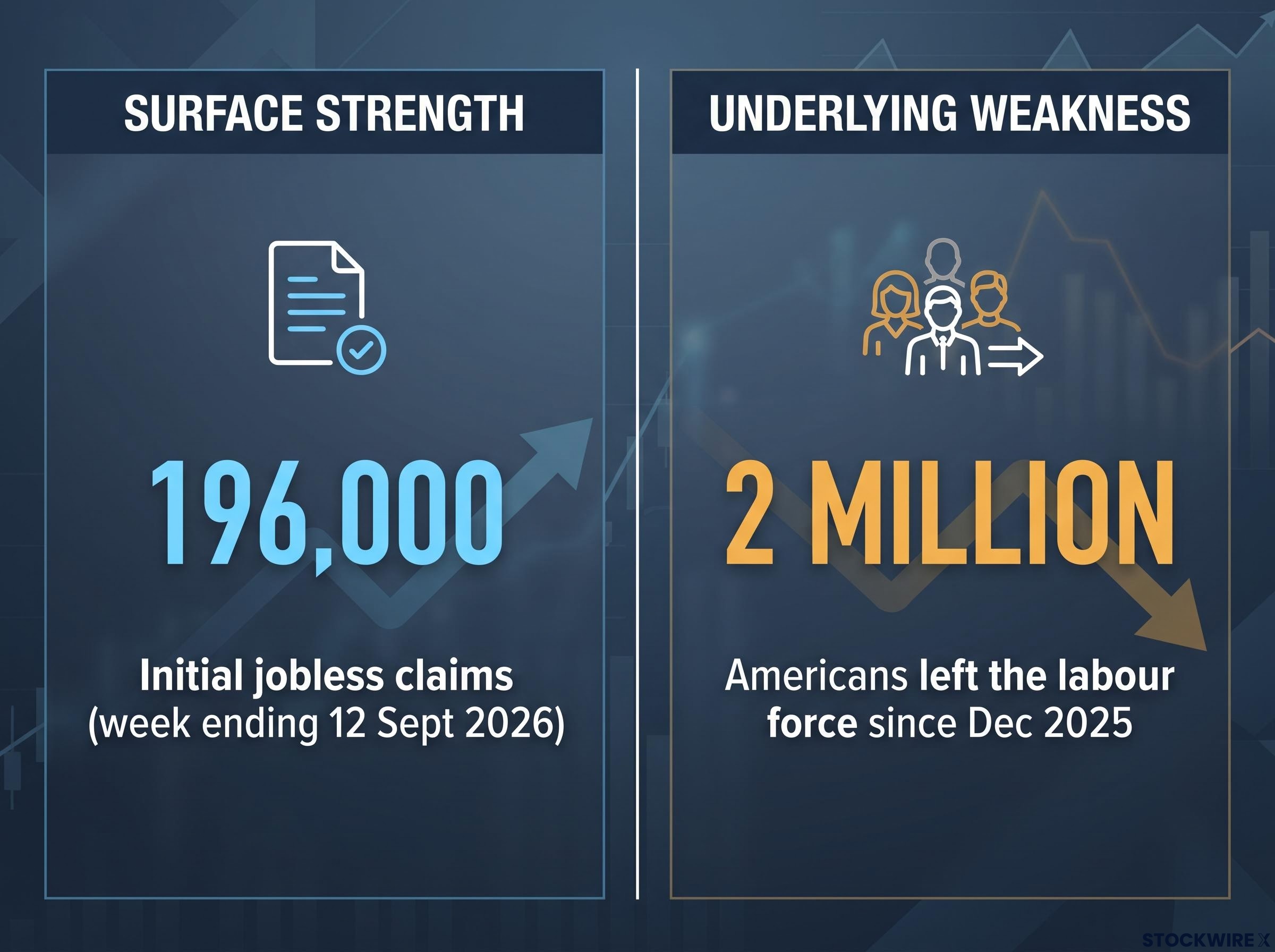
That contradiction matters because two of the most consequential decisions in the economy hinge on which version of reality is true. The Federal Reserve sets interest rates partly on its read of labour market health, and households decide whether to spend based on their actual employment security, not a headline claims figure.
When the data and the ground diverge this sharply, the risk of misreading it climbs. This piece is a working toolkit for closing that gap. After reading, you will know which specific indicators to cross-check against jobless claims and payrolls, and why the headline numbers can look strong while conditions for millions of workers quietly deteriorate.
Why 196,000 jobless claims tells you less than you think
A number like 196,000 feels reassuring. Claims fell by 10,000 from 206,000 the prior week, and readings this low have not been common since before the moon landing. The instinct is to treat it as a green light.
Here is the problem with that instinct. Initial jobless claims measure who successfully files for unemployment insurance, not who lost income or employment security. In the United States, only about one in four unemployed people is actively collecting UI benefits, which means three-quarters of labour market distress can occur without ever touching the claims number.
The timing makes this particular reading even shakier. The week ending 12 September included Labor Day, and holiday-affected weeks routinely distort filing patterns because state offices process claims on different schedules. A historically low figure from a holiday week is a weaker signal than a low figure from an ordinary one.
Former Fed Governor Kevin Warsh has been blunt about the limits of these lagging measures.
The unemployment rate is a lagging indicator that can understate underlying weakness when people exit the labour force or accept lower-quality, lower-hour work that still technically counts as employment. Warsh argues participation, hours worked, and wage growth must be cross-checked to avoid overestimating labour-market strength.
The deeper issue is what claims data structurally cannot see. Firms that struggled to hire in prior years may now hold onto staff while quietly tightening in ways no filing captures.
- Hiring freezes: New positions go unfilled, so displaced workers cannot find their next role, yet no claim is generated.
- Hours cuts: Employees keep their jobs on paper while their take-home pay shrinks.
- Bonus and overtime reductions: Income falls sharply without a single separation or claim.
Put together, a record-low claims figure from a Labor Day week, in a country where most unemployed people never file, is not strong evidence of a healthy labour market. It is evidence that a specific legal and administrative process produced fewer filings than usual. That distinction is the difference between reading the data and being led by it.
When big ASX news breaks, our subscribers know first
The labour force is shrinking, and that is making unemployment look better than it is
To see why the unemployment rate can mislead, you have to understand how it is built. The rate is the number of unemployed people divided by the labour force, where the labour force counts only those working or actively looking for work. Stop looking, and you vanish from both the numerator and the denominator.
That is the mechanism. When enough people give up searching, the unemployment rate can hold steady or even fall while zero new jobs are created. Fewer people are counted as unemployed simply because they are no longer counted at all.
The participation data reveals how much of this is happening now. After holding in a stable band of 62.3%-62.4% through 2025, the rate broke lower across 2026.
| Period | LFPR | Context note |
|---|---|---|
| 2025 (pre-decline) | 62.3%-62.4% | Prior stable band |
| May 2026 | 61.8% | Start of the 2026 slide |
| June 2026 | 61.5% | Lowest non-pandemic level since 1976 (St. Louis Fed) |
| July 2026 | 61.4% | Trough of the series |
| August 2026 | 61.6% | Modest uptick, still well below 2025 |
The scale of the exit is easier to grasp in headcount than in decimals.
J.P. Morgan Chase estimated on 14 July 2026 that roughly 2 million workers have left the labour force since December 2025, with participation at 61.5% in June against 62.3% a year earlier.
What is actually driving people out of the workforce
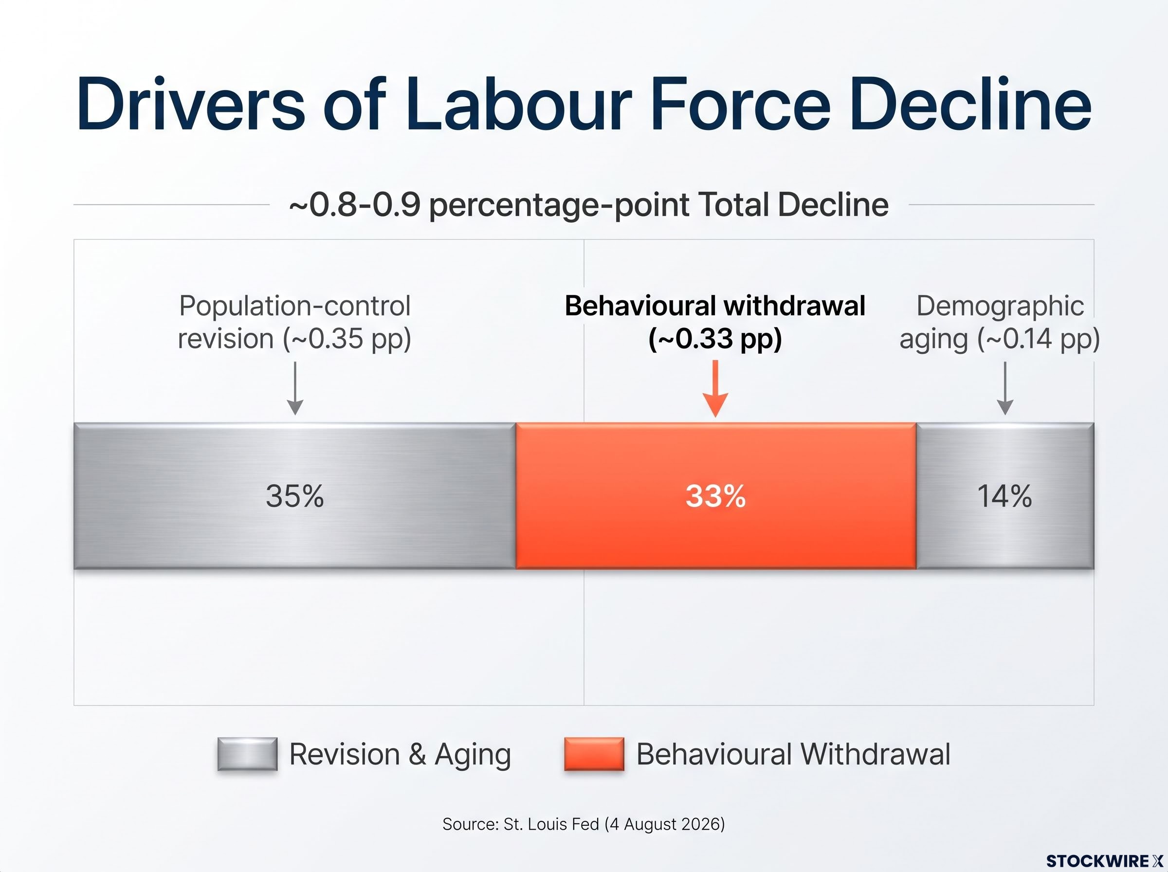
A St. Louis Fed analysis dated 4 August 2026 breaks the roughly 0.8-0.9 percentage-point decline into three parts, and the split is where the analysis gets sharp.
- Population-control revision (~0.35 pp): A one-off statistical adjustment made in January 2026. This is bookkeeping, not behaviour.
- Demographic aging (~0.14 pp): Older workers retiring on schedule. Expected and gradual.
- Behavioural withdrawal (~0.33 pp): Working-age people who could be in the labour force choosing not to be.
That last component is the one to watch. Demographics do not explain it, and revisions do not either. It represents discouragement, people stepping back because the search feels futile.
What this tells you is that the apparent stability of the unemployment rate is partly a statistical artefact. A meaningful slice of it reflects people who stopped being counted, not a job market clearing efficiently. When you see the participation rate falling, treat it as the leading warning that the unemployment rate is losing its informational value.
How the gig economy quietly absorbs displaced workers and vanishes from the data
Consider a delivery driver whose weekly earnings halve as platform demand dries up. In an older economy, a comparable income shock might have ended in a layoff and a claim. In the gig economy, it produces nothing measurable at all.
That invisibility is not an accident of the data. It is built into how gig work interacts with every official statistic, through several distinct mechanisms.
- UI eligibility gaps: Workers classified as independent contractors generally do not qualify for state unemployment benefits, so their income loss never reaches the claims report.
- Continuous but unstable attachment: A driver can stay nominally active on an app while hours and earnings collapse, producing no formal separation.
- Multi-platform churn: Workers rotate between rideshare, delivery, and freelance work to absorb shocks, spreading income risk without ever entering measured unemployment.
- Classification and survey design: Standard surveys were built for employer-employee relationships, so gig work gets undercounted or folded into self-employment.
The payroll survey adds its own distortion. Danielle DiMartino Booth of QI Research has made the point repeatedly.
The establishment survey counts jobs, not distinct workers. One person holding two low-quality positions can inflate payroll figures even as job quality declines and financial strain rises, and discouraged and gig-economy workers are not adequately captured in the standard unemployment rate.
There is a real-time signal that surfaces what the official data cannot. Google searches for rideshare and gig platform work have reportedly risen meaningfully even as jobless claims fell, a divergence that is difficult to reconcile unless people losing traditional income are quietly turning to platform work instead of filing.
When claims drop while gig-work search interest climbs, you are watching a measurement gap in action. The headline labour data is describing an economy it can no longer fully see.
For anyone tracking consumer spending, this matters more than it first appears. Workers cycling through platform work rather than filing for unemployment still face acute income volatility, and that volatility suppresses spending. It tends to surface in retail earnings well before it shows up in any labour statistic.
What household finances reveal that the jobs report does not
Strip away the methodology and one number captures how low measured unemployment actually feels. The personal savings rate stood at 3.0% in July 2026 and just 2.7% in June, according to the Bureau of Economic Analysis.
A savings rate near 3% is thin in any environment. Paired with credit card interest rates reported to be approaching 30%, it becomes acutely dangerous, because any small income shock has to be absorbed on borrowed money at punishing rates rather than from a cash buffer.
The split within households is starker still. Fidelity data reportedly showed a simultaneous record in 401(k) millionaires and a record in emergency early withdrawals from retirement accounts.
Those two records describe two different economies living side by side. One is accumulating wealth; the other is raiding long-term savings to cover this month’s bills while remaining fully employed.
| Indicator | Current reading | What it signals |
|---|---|---|
| Initial jobless claims | 196,000 (week ending 12 Sept 2026) | Surface strength: near multi-decade low |
| Personal savings rate | 3.0% (July 2026) | Almost no buffer against income shocks |
| Labour force participation | 61.6% (August 2026) | Lowest non-pandemic level since 1976 |
| 401(k) hardship withdrawals | Record levels (Fidelity) | Employed households cannot meet expenses |
What retailers are seeing that the jobs report is not
Corporate earnings commentary corroborates the household data from an entirely different angle, and the consistency across retailers is what makes it hard to dismiss as anecdote.
- Dollar General: Management reported that even its higher-income customers, who had already traded down to shop at discount stores, were spending less.
- Kroger: The grocer removed certain brand products from shelves after declining to pass supplier price increases through to customers.
- Walmart and Dollar Tree: Both have flagged customers prioritising essentials, trading down to private-label goods, and reacting sharply to small price rises.
The critical detail sits beneath the revenue lines. Retailers are reporting that unit sales volumes are declining even as nominal revenues hold steady on higher prices. Fewer physical goods are being sold, which is demand compression, and it does not appear anywhere in payroll statistics.
The forward picture for lower-wage workers looks no better. The original reporting cites Challenger, Gray & Christmas projections that holiday retail hiring will fall below already-weak 2025 levels, though the specific 2026 report could not be independently located, so treat it as indicative rather than confirmed.
What all of this means for you is that the buffer between today’s employment levels and a genuine spending contraction is far thinner than any aggregate jobs figure suggests. A 3% savings rate against near-30% borrowing costs is a fragility you should factor directly into any forward view on retail, consumer discretionary, or rate-sensitive holdings. The New York Fed’s Survey of Consumer Expectations reinforces the point, showing rising expected default probabilities and deteriorating sentiment among lower-income households even while claims stay low.
Past performance does not guarantee future results. Financial projections are subject to market conditions and various risk factors.
What this means for the Fed, and for anyone reading the next jobs report
The same data supports two opposite policy conclusions, which is precisely why the next few releases carry weight. A hawk sees low claims and firm payrolls as proof the economy can absorb higher rates. A dove sees falling participation and household stress and concludes the labour market is far more fragile than the headlines admit, so further tightening risks triggering a sharper downturn.
Richmond Fed President Tom Barkin has described looking well beyond the headline unemployment rate, weighing job openings, quits, participation, and wage pressures. That is effectively an acknowledgement that a low unemployment rate can sit alongside a softening job market.
Four frameworks help reconcile the strong headlines with the weakening ground, and together they form a cross-check toolkit for the next jobs report.
- K-shaped distribution: Gains concentrate among higher-income workers while lower-income households face falling real wages, higher debt costs, and depleted savings.
- Quality versus quantity: The count of jobs can look strong even as hours, pay, and stability erode beneath it.
- Lagged monetary transmission: Tight financial conditions hit household finances first and hiring decisions later, so today’s low claims may not yet reflect the full impact of higher rates.
- Measurement-coverage gap: Official statistics simply do not capture large parts of gig work, hardship withdrawals, and informal financial stress.
Alongside jobless claims, these are the supplementary indicators worth watching at every release.
- Labour force participation trend
- Hours worked
- Real (inflation-adjusted) wage growth
- Credit delinquency rates
- Alternative data, such as gig platform search trends
The St. Louis Fed has flagged the central danger directly.
Policymakers might misread headline indicators and keep rates higher for longer than vulnerable households can withstand, given a sharp participation decline that is not visible in the unemployment rate itself.
The policy risk you should carry forward is asymmetric. If the Fed reads low claims as resilience and tightens further, the fragility already visible in savings, debt, and participation data means the eventual employment correction could arrive faster and harder than the headline numbers ever suggested was possible.
Reading the labour market clearly when the headlines are designed to mislead you
These facts belong in a single frame, not separate news cycles. The 196,000 claims figure sits beside a participation rate at its lowest non-pandemic level since 1976, roughly 2 million workers gone from the measured labour force, a 3.0% savings rate, and retailer earnings confirming consumer stress from the bottom up.
The value of the cross-check toolkit is not that it forecasts a recession. Participation, hours, real wages, household stress indicators, and platform data will not tell you the exact date the ground gives way. What they will do is stop you being surprised by it.
Two near-term moments are where the gap between headline data and underlying conditions will matter most: the next non-farm payrolls release and the next Fed meeting. Read both through the fuller framework built here rather than the single number the market reacts to first, and you will be interpreting the labour market as it actually is, not as its cleanest statistic prefers to present it.
This article is for informational purposes only and should not be considered financial advice. Investors should conduct their own research and consult with financial professionals before making investment decisions.