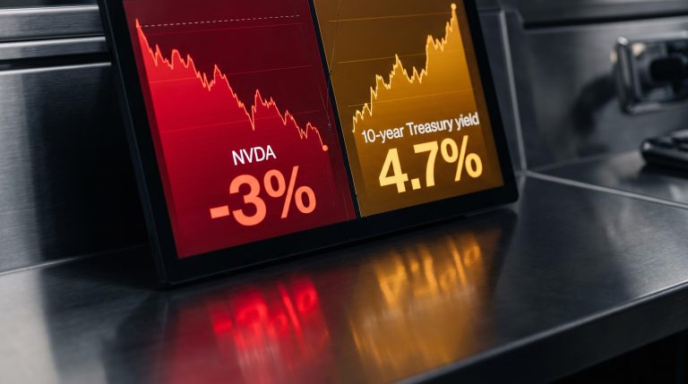
Gold has returned roughly 37% over the past twelve months. The S&P 500, measured in total-return terms, has delivered approximately 21% over the same window. That is not a rounding error, and it is not a weak-dollar story.
Something structural is shifting in the relative valuation of these two assets. The ratio that captures it most cleanly, the S&P 500 divided by the price of gold per ounce, has compressed to levels not seen since the early pandemic selloff. The comparison circulating most widely right now frames today’s reading as analogous to 2007. That comparison is wrong, and misreading it leads to the wrong portfolio conclusion.
Here is how the ratio actually works, what its current level tells you about the regime you are investing in, and what gold’s own chart adds when you read the two signals together. After that, a four-step framework for thinking through what, if anything, to do about it.
What the S&P 500-to-gold ratio actually measures (and how not to misread it)
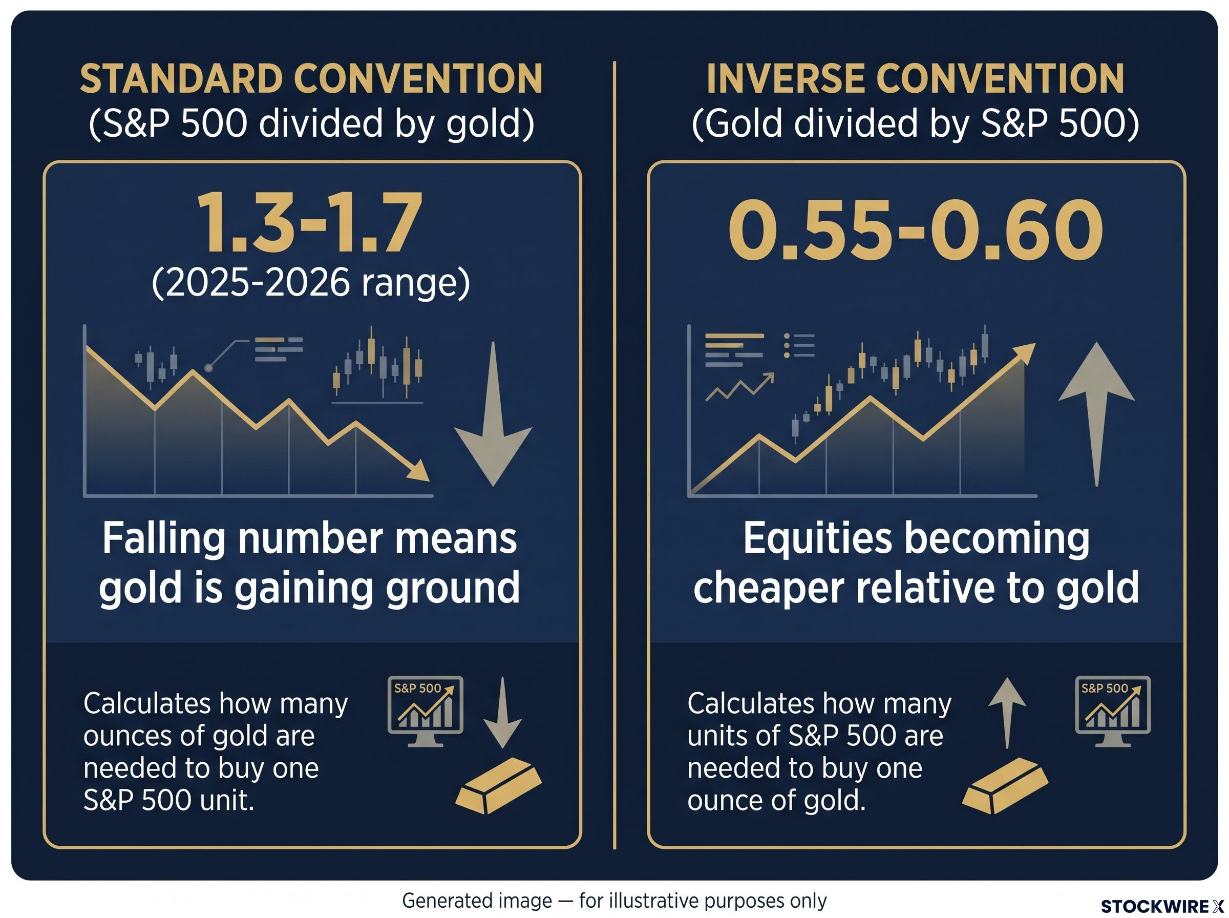
The S&P 500-to-gold ratio divides the index level by the gold price per ounce. That is the standard convention used by major data providers. A reading of 1.5 means the index is trading at 1.5 times the dollar price of an ounce of gold. Simple enough.
The confusion starts because some sources quote the inverse: gold divided by the S&P 500. That version currently reads around 0.55-0.60, and depending on the source, it gets labelled as gold being “cheap” or “expensive” relative to equities. If you do not know which convention you are looking at, you will draw the opposite conclusion from the same data. That is not a footnote issue. It is the difference between adding gold exposure and trimming it.
| Convention | Approximate current reading | What a declining number means |
|---|---|---|
| S&P 500 divided by gold | 1.3-1.7 (2025-2026 range) | Gold is outperforming equities |
| Gold divided by S&P 500 | 0.55-0.60 (inverse) | Equities are becoming cheaper relative to gold (same real-world movement, opposite numerical direction) |
This article uses the standard convention: S&P 500 divided by gold. A falling number means gold is gaining ground.
Why this ratio moves in cycles, not signals
The ratio is a regime indicator, not a timing tool. Its historical extremes, readings of roughly 5-6 at the 2000 dot-com peak and the 2007 pre-GFC peak, preceded multi-year periods of gold outperformance, but those shifts played out over years, not quarters. That matters because any portfolio decision anchored to this ratio should carry a multi-year time horizon. Treating it as a buy-sell trigger misreads its entire history.
When big ASX news breaks, our subscribers know first
Decoding the S&P 500-to-gold ratio: today’s signal in historical perspective
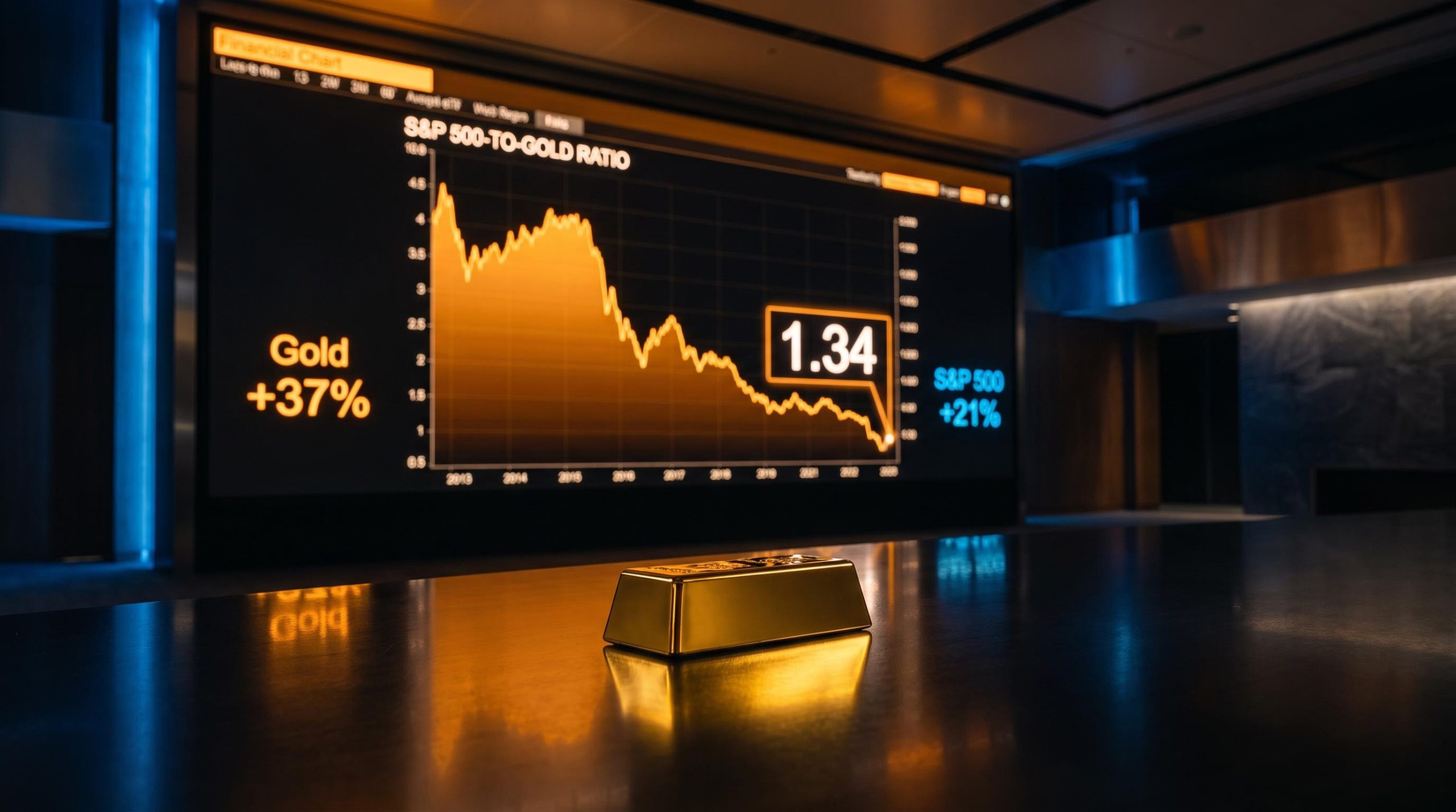
The compression has been sustained and directional. In mid-November 2025, the ratio stood at approximately 1.66, its lowest level since March 2020. By January 2026 it had dropped to roughly 1.50. By 1 March 2026, it hit approximately 1.34.
The S&P 500-to-gold ratio reached approximately 1.34 on 1 March 2026, marking one of the lowest readings in over a decade and the analytical anchor for the current gold outperformance thesis.
That trajectory looks alarming if you frame it against the wrong baseline. The 2007 analogy making the rounds implies today’s reading mirrors the moment before equities collapsed relative to gold. It does not.
At the 2007 pre-GFC peak, the ratio was in the range of 5-6. At the 2000 dot-com peak, similar. Today’s reading of 1.34-1.66 is roughly three to four times lower than those historical extremes. The ratio is not telling you equities are stretched to breaking point relative to gold. It is telling you the opposite: gold has already gained so much ground on equities that the ratio has compressed to the low end of its modern range.
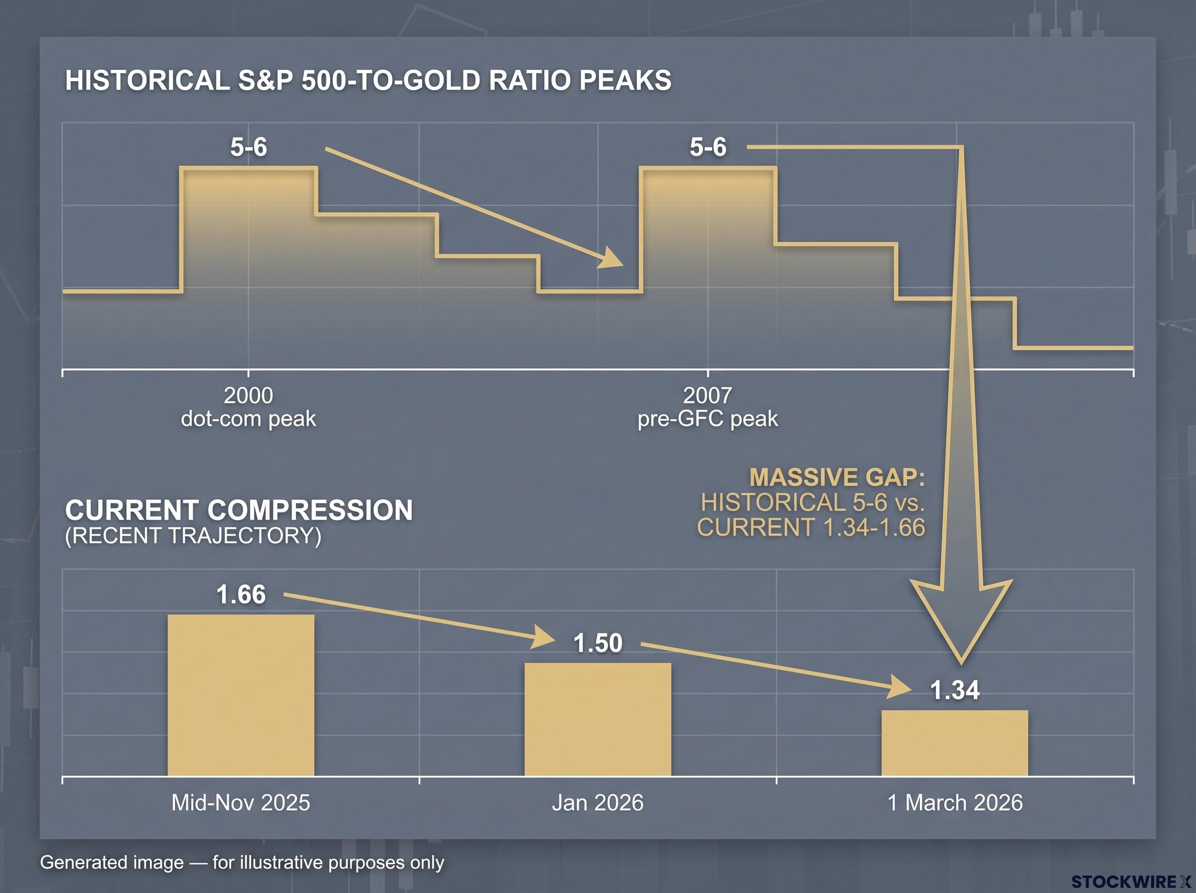
| Period | S&P/Gold ratio (approx.) | What it signalled | What followed |
|---|---|---|---|
| 2000 dot-com peak | 5-6 | Equities extremely overvalued vs. gold | Decade of gold outperformance (2000-2011) |
| 2007 pre-GFC peak | 5-6 | Same signal | Gold continued to outperform through 2011 |
| 2020 pandemic low | Local compression | Equities cheap moment | S&P 500 recovered sharply |
| 2025-2026 | 1.34-1.66 | Gold outperformance regime underway | Multi-year thesis, unresolved |
What the ratio’s compression to 1.34-1.66 actually tells you is this: the window in which gold was cheap relative to stocks has already mostly closed. The question now is whether the outperformance regime continues or mean-reverts. That is a portfolio positioning question, not a market-timing one, and the distinction protects you from both overreacting (selling all equities on a misapplied signal) and underreacting (dismissing the signal because the 2007 analogy seemed imprecise).
The Dow-to-gold ratio tells a structurally identical story, sitting approximately 30% below its 50-year average of 15 as of May 2026, and reinforces the same conclusion: gold has already reclaimed substantial real purchasing power ground from US equities across multiple index benchmarks, not just the S&P 500.
Gold’s own chart confirms what the ratio is suggesting
The ratio is a relative measure. Gold’s own price structure is an absolute one. When both arrive at the same directional conclusion independently, the thesis becomes harder to dismiss as ratio-driven noise.
Gold’s technical structure checks every box for a confirmed primary uptrend:
- A substantial accumulation phase in GLD that concluded in March 2024, establishing the launchpad for the current advance
- Two successive trend line breakouts since the base completion
- Confirmed sequence of higher highs and higher lows through mid-2026
- Support zone at approximately $3,800-$4,000, functioning as the primary reload area within the trend
- Resistance and congestion zone at $4,350-$4,400
- 12-month total return of approximately 37%
Gold has returned roughly 37% over the past twelve months versus approximately 21% for the S&P 500 in total-return terms. That gap represents genuine real-term outperformance, not a currency-translation effect from dollar weakness.
As of late May 2026, COMEX gold futures traded at approximately $4,560 per ounce. The confirmed record high sits slightly above $4,300. Gold’s previous extended bull run stretched from roughly 2004 through to August 2011, after which the metal spent approximately ten years delivering poor returns relative to equities. The current cycle’s major phase got underway in 2019, with momentum picking up sharply following the March 2024 base completion.
Central bank gold accumulation has doubled from roughly 500 tonnes per year in the prior decade to approximately 1,000 tonnes per year over the past four years, a structural demand floor that is largely price-insensitive and provides an institutional backstop to the outperformance regime the ratio is signalling.
Where speculation ends and confirmed data begins
The confirmed facts are these: record high slightly above $4,300, COMEX at approximately $4,560, a 37% twelve-month return, and a clean technical uptrend. The $5,000 level is an upper-bound scenario discussed in current technical work, conditional on the bull trend persisting. It is a reasonable extension of the trend, not a guaranteed destination.
Levels materially above $5,000, including scenarios of $6,000 within the current calendar year and five-digit prices within the following year, represent one presenter’s speculative framing. These do not appear in mainstream analyst consensus. They are worth noting as the far end of the bull case, but building an allocation around them would mean positioning for a tail outcome. That is a distinction worth keeping clean.
Gold price prediction carries a structurally poor track record even when macroeconomic conditions appear uniformly bullish: gold fell as much as 20% during the 2022-2023 tightening cycle despite 9.1% inflation and active geopolitical conflict, which is precisely why the ratio framework is more useful than price targets as a positioning tool.
Translating the dual-lens signal into a portfolio decision framework
The ratio has compressed from 1.66 to 1.34 in under four months. Gold’s technical structure is intact. Both signals point in the same direction. The question the commercial reader is actually here to answer: what do you do with this?
The answer is not “sell stocks and buy gold.” Ratio-based signals are multi-year instruments. They do not justify wholesale portfolio restructuring on any single reading. What they do support is a structured reassessment of where gold sits in your allocation and whether the answer you arrived at three or five years ago still holds.
- Assess your current gold allocation relative to the ratio signal. If gold currently represents zero or near-zero percent of your portfolio, the ratio’s compression is telling you that the decade in which ignoring gold was cost-free is over. The foregone returns are now measurable: 37% versus 21% over the past twelve months.
- Evaluate vehicle: physical versus ETF. Each has legitimate trade-offs. Physical gold removes counterparty risk but introduces storage and liquidity constraints. ETFs like GLD offer instant liquidity and no storage cost but carry counterparty exposure. Documented retail demand at major U.S. warehouse retailers, including widely reported sell-throughs at Costco in 2023-2024, illustrates broad public interest in physical ownership, though this is anecdotal colour rather than a fundamental indicator.
- Consider the technical map when thinking about entry. The $4,350-$4,400 zone functions as congestion and resistance in current technical frameworks, not a clear bargain entry. The $3,800-$4,000 support zone is where the trend’s structural foundation is defined. If you are adding exposure, knowing where the floor sits matters as much as knowing the current price.
- Set a multi-year time horizon. Ratio-based signals do not resolve in months. The prior gold outperformance regime ran from 2000 to 2011. The current cycle’s major phase began in 2019. Positioning for a regime shift with a six-month review window is a mismatch between the tool and the timeline.
This is a regime question, not a market-timing call. The cost of assuming gold does not belong in a diversified portfolio is no longer theoretical; it is visible in twelve months of measurable underperformance on the equity side of the ledger.
A note on silver: compared with gold, it carries greater price volatility, a less clearly defined technical structure, and the SLV ETF has recorded sharply wider swings than GLD during comparable market sessions. If you are building precious metals exposure on the basis of the ratio signal, gold is the cleaner expression of the thesis.
What the ratio’s trajectory from here will tell you
The ratio is not a one-time read. Its next directional move is the variable that determines whether this analysis ages well or needs revising.
Three monitoring checkpoints give you the framework to track it:
- S&P 500-to-gold ratio direction. Continued compression below 1.3 reinforces the gold outperformance thesis. A sustained recovery back above 2.0 signals the regime is fading and equities are reclaiming relative ground. The 2011 gold peak, when the prior bull market ended and the ratio began recovering from its lows, is the closest historical analogue for what a regime reversal looks like in practice.
- Gold’s higher-low structure on pullbacks. As long as gold continues to make higher lows, the bull case remains structurally intact. A lower low on a significant pullback, particularly a break below the $3,800-$4,000 support zone, would flag deterioration worth responding to.
- Macro backdrop variables. The ratio does not operate in a vacuum. Real interest rates, the trade-weighted dollar, and central bank gold demand are the three macro inputs most likely to either accelerate or interrupt the current regime. Track them alongside the ratio, not instead of it.
Chicago Fed research on gold and real interest rates establishes that gold prices are particularly sensitive to expected long-term real rates, which means any shift in Federal Reserve policy trajectory is among the most direct macro inputs capable of accelerating or interrupting the current outperformance regime.
The bull-market thesis remains intact as long as gold continues to make higher lows and the ratio stays below 2.0. That gives you a defined framework rather than a static conclusion: two specific things to watch, a level that would change the picture, and the discipline to reassess rather than set and forget.
For investors wanting to stress-test the bull thesis against the most detailed institutional bear argument currently in circulation, our full explainer on BofA’s gold bear case covers the five concurrent technical signals Paul Ciana flagged in July 2026, including an RSI of 90 last seen at the 1980 and 2011 secular peaks.
This article is for informational purposes only and should not be considered financial advice. Investors should conduct their own research and consult with financial professionals before making investment decisions. Past performance does not guarantee future results. Financial projections are subject to market conditions and various risk factors.