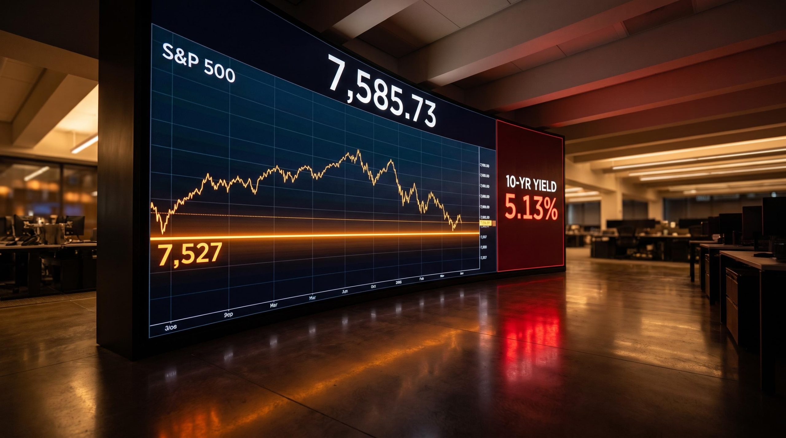
The S&P 500 is sitting roughly 60 points above a line that technicians treat as the difference between a healthy pullback and a genuine trend break. Below that line, the picture changes. Above it, the bulls stay in control.
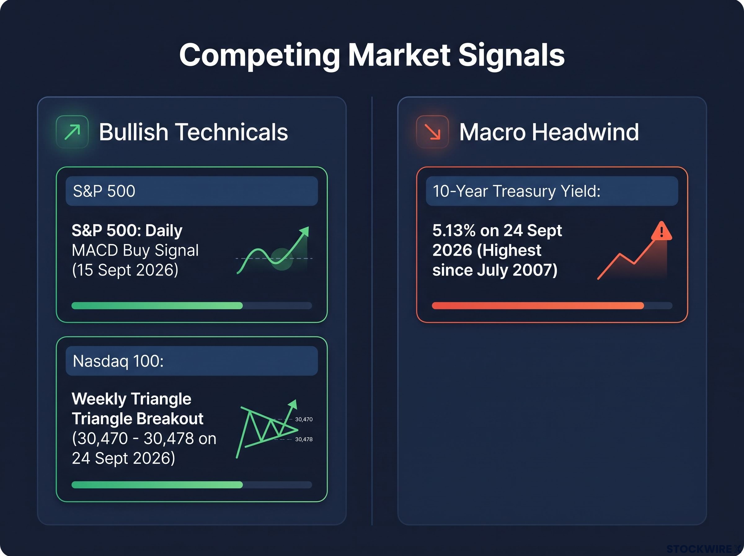
At the same time, the signals are refusing to agree with each other. The daily MACD is flashing a buy. The Nasdaq 100’s weekly triangle is resolving upward. And the 10-year Treasury yield just punched through 5% for the first time in 19 years.
The short-term charts say one thing. The intermediate-term momentum picture says something else. The gap between them is exactly where the risk lives right now.
Katie Stockton of Fairlead Strategies has flagged elevated risk toward late Q4, even as she acknowledges the constructive near-term setup. That tension, credible bullishness sitting inside a deteriorating backdrop, is what this S&P 500 and Nasdaq technical outlook has to resolve.
What follows here is a framework for reading these competing signals in the right order: what to watch first, what confirms or breaks each case, and what every outcome means for the remainder of the quarter.
The bullish signals in play: MACD buy, triangle breakout, and what they require to follow through
Two credible bullish signals are on the table right now, and both deserve to be understood precisely before anyone treats them as a green light.
The first is the daily MACD buy signal on the S&P 500. MACD, short for Moving Average Convergence Divergence, measures the relationship between two moving averages of price to gauge whether short-term momentum is accelerating or fading. A buy signal fires when the faster line crosses above the slower one, which is what Stockton flagged with the index sitting at 7,585.73 at its 15 September 2026 close (down 34.25 points, or 0.45% on the day).
RSI divergence at structural confluence levels achieved an 87.61% success rate across a 2024 academic study of Nifty 50 equities, a result that underscores why momentum confirmation from a second independent indicator matters when evaluating whether a MACD crossover has genuine follow-through behind it.
That crossover tells you near-term momentum has turned up. What it does not tell you is whether that momentum can survive contact with a weakening intermediate-term trend. A daily buy signal is a statement about days, not months.
What makes this Nasdaq 100 triangle formation high-probability
The second signal is structural. The Nasdaq 100 has been forming a triangle pattern on its weekly bar chart, and that formation is now resolving to the upside, with the index trading around 30,470 to 30,478 as of 24 September 2026. Stockton has described this configuration as among the most reliable in technical analysis.
The weekly timeframe is what gives it weight. Weekly patterns reflect the decisions of longer-term participants and carry more authority than daily patterns, which whipsaw far more easily. A weekly triangle resolving upward is a stronger statement than a daily one.
There is a clean path if the breakout holds. New all-time highs for either index would remove overhead resistance entirely, because there are no trapped sellers waiting to unload at higher prices. In that scenario, momentum tends to accelerate rather than stall.
But a pattern name is not an outcome. Technical literature from analysts including Thomas Bulkowski and John Murphy is consistent that triangle breakouts need confirmation before they can be trusted:
- Momentum alignment: the breakout should be accompanied by MACD and RSI turning higher in the same direction, not diverging from price.
- Breadth confirmation: the move should be supported by broad participation across the index, not driven by a handful of mega-cap names.
- Volume-at-price analysis: the breakout should push price into an area with limited prior supply, where sellers are scarce.
Here is what these signals actually mean for you. Their reliability degrades sharply when breadth is thin and macro headwinds are strong, and in a late-cycle environment with narrow leadership, a weak breakout can morph into a bull trap where price reverses hard on those who chased it. These two signals define the upside case. They do not guarantee it.
When big ASX news breaks, our subscribers know first
Understanding Ichimoku cloud support: why 7,527 is the level that changes the picture
To understand why one specific number matters so much here, you first need to understand what it is measuring.
The Ichimoku cloud, or kumo, is a support and resistance framework built to look forward rather than backward. It uses two lines, Senkou Span A and Senkou Span B, projected 26 periods ahead using recent highs, lows, and midpoints. The result is a shaded zone drawn ahead of current price, encoding both trend direction and expected volatility into a map of where support is likely to appear before price gets there.
How the Ichimoku cloud differs from a standard moving average
A standard moving average tells you where price has already been by averaging past closes. It reacts to what has happened. The cloud does something different: it projects where support and resistance are likely to emerge in advance, giving you a forward reference rather than a lagging one.
Thickness matters too. A wide cloud signals a broad zone where historical supply and demand previously fought it out, meaning a more significant support area than a thin cloud, which represents a shallower, less contested region.
That construction is why Stockton’s identified level carries weight rather than looking arbitrary.
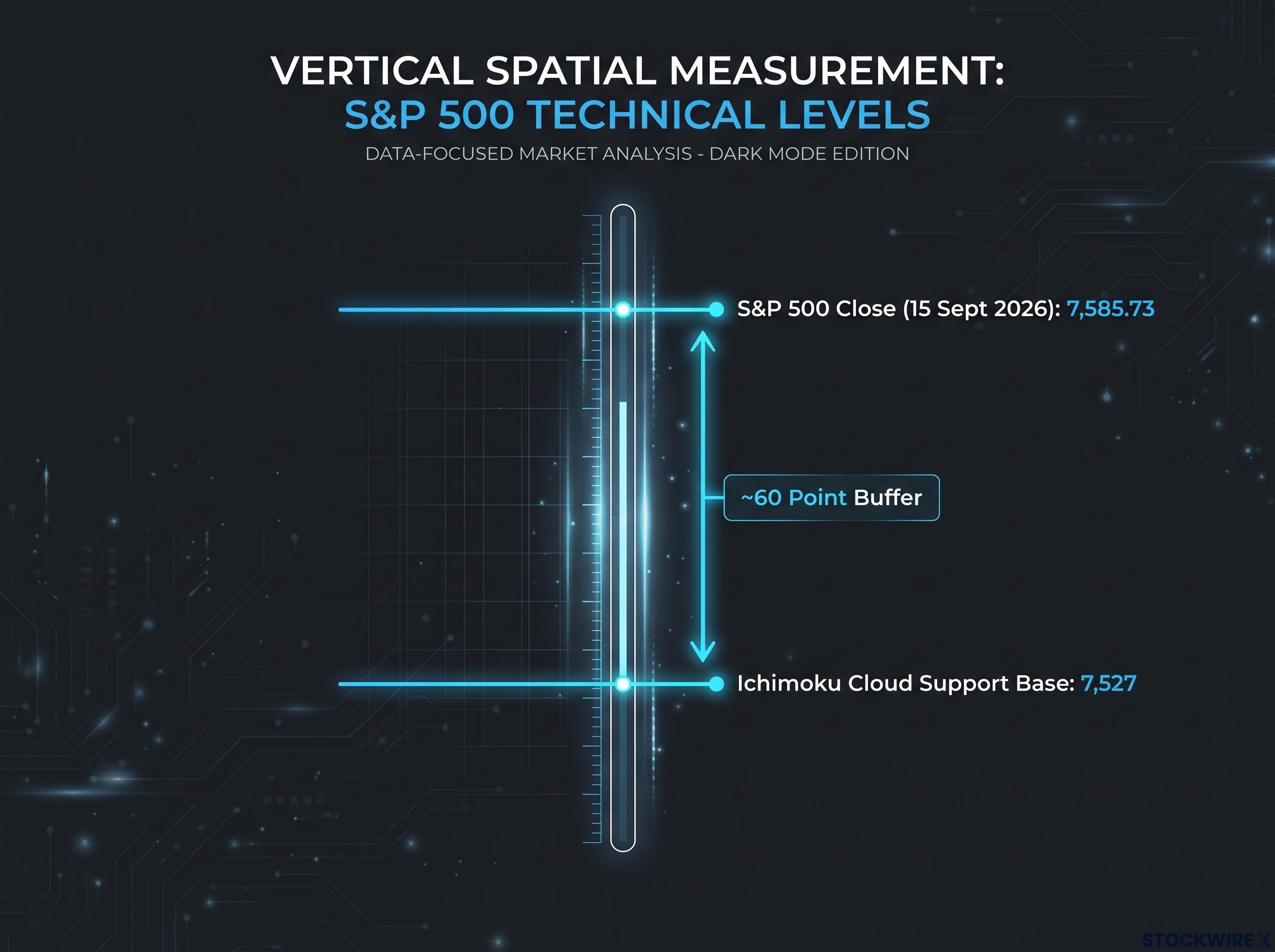
The level to watch Katie Stockton of Fairlead Strategies places S&P 500 cloud support at approximately 7,527, a level she expects to edge slightly higher through October. With the index closing at 7,585.73 on 15 September 2026, that leaves a buffer of roughly 59 points between price and the structural floor.
The cloud does not respond to every breach the same way. How long price spends below it changes everything, and there are three distinct scenarios worth separating clearly.
| Scenario | Duration | Interpretation | Positioning implication |
|---|---|---|---|
| Brief breach and recovery | 1-2 sessions | Treated as noise within an ongoing bull phase; a successful retest of support | Trend intact; dips can be treated as opportunities |
| Sustained breach | Multiple sessions | Signals a trend transition from bullish toward neutral or bearish | Reduce exposure; prior bullish signals lose reliability |
| Cloud as resistance | Extended period below | Rallies back toward the cloud are sold into; support becomes resistance | Defensive posture; rallies are exits, not entries |
There is recent precedent for the benign case. A brief dip below cloud support after a prior FOMC announcement was quickly recovered as the market bounced from short-term oversold conditions, exactly the “brief breach” scenario in action.
Here is the read for you. Ichimoku specialists including Nicole Elliott have long held that sustained closes below the cloud mark a regime shift, not a routine wobble. With the index only around 60 points above the base Stockton identifies as the structural floor, a multi-session close below 7,527 would represent a qualitative change in trend posture, not just another dip to buy.
The macro headwind: what the 10-year yield above 5% does to technical signals
None of these chart signals form in a vacuum, and the most important thing happening off the equity charts is what bonds are doing.
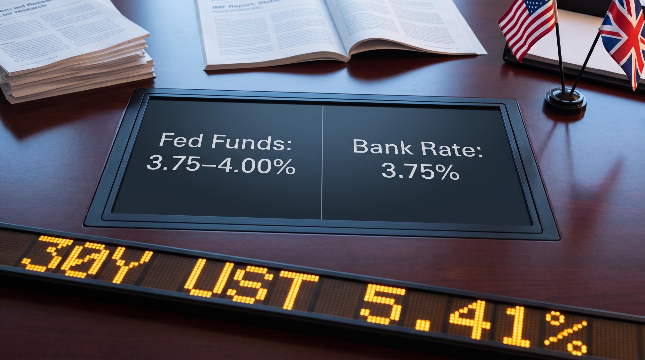
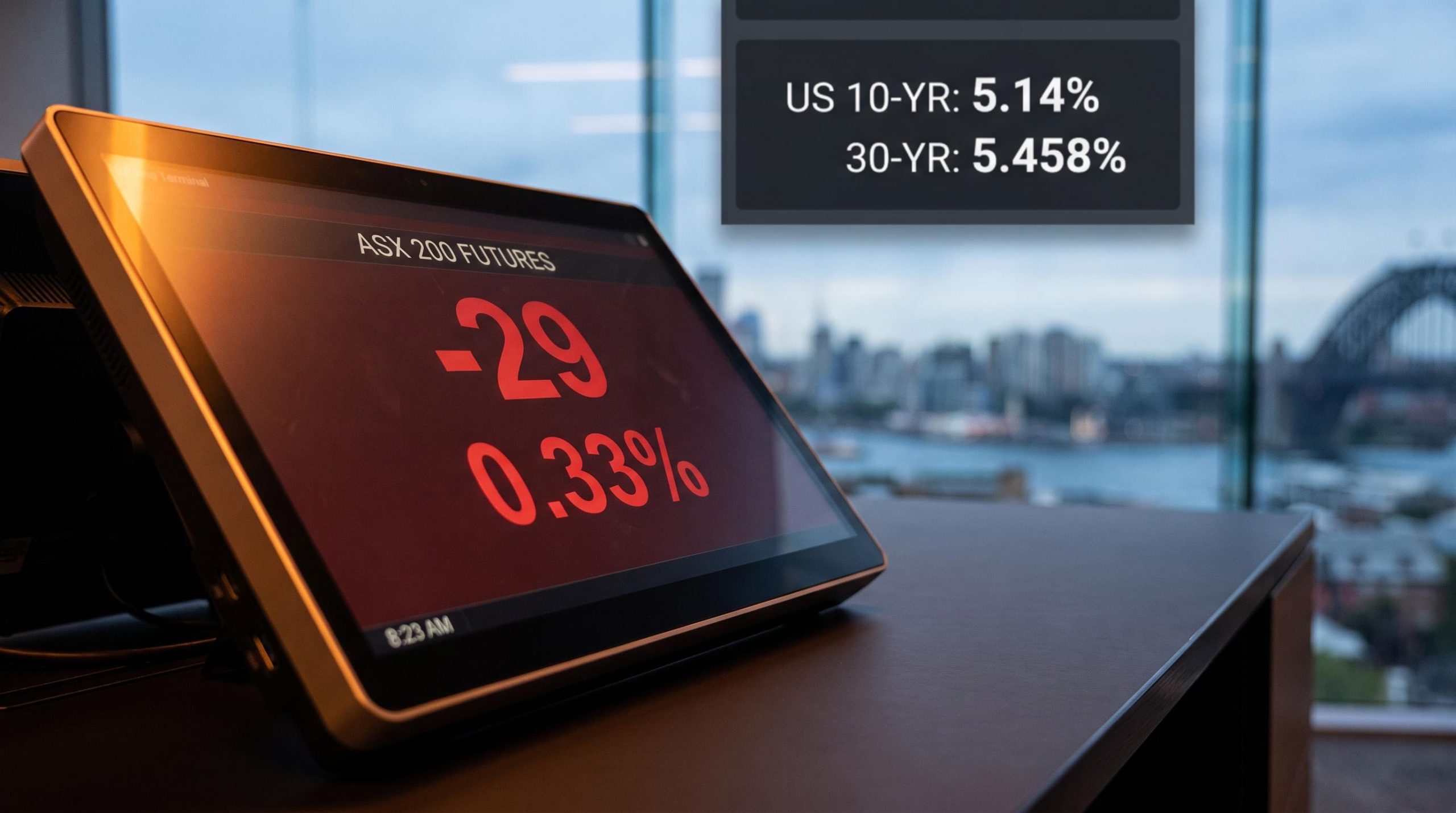
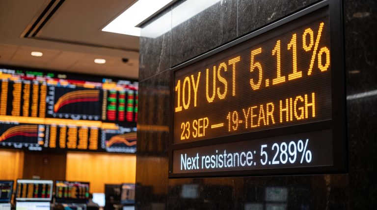
The 10-year Treasury yield broke decisively above 5% in September, a level it had not seen in nearly two decades. TradingEconomics reported the yield at 5.13% on 24 September 2026, describing it as the highest since July 2007.
The FRED 10-year Treasury yield data, maintained by the Federal Reserve Bank of St. Louis, shows the full historical context for that 5% threshold, confirming that the September 2026 breach represents a level the market had not sustained since the pre-financial-crisis era.
A 19-year high The 10-year Treasury yield reached 5.13% on 24 September 2026, its highest level since July 2007, according to TradingEconomics.
The move was fast. On 23 September 2026, CNN Business reported the yield surging 15 basis points to 5.11%, with an intraday high near 5.14%. CNBC noted the yield reached 5.104% and “gained steam” once it broke through the key 5% level, while its quote page showed intraday trade as high as 5.189%.
The equity reaction followed almost immediately. On that same 23 September session, the S&P 500 fell roughly 0.75% and the Nasdaq Composite dropped around 1.1%, per CNN Business. That is the cause-and-effect chain in real time: yields spike, and the long-duration growth names that dominate the indices reprice lower.
The pain was not evenly spread. The most rate-sensitive corners of the market took the heaviest pressure:
- Utilities
- Real estate investment trusts (REITs)
- Consumer staples
- Financials
CNBC also tied the yield spike to surging oil prices and renewed inflation worries, creating what macro-aware technicians describe as a double headwind. When yields and oil rise together, breadth deteriorates beneath the surface even as the headline indices attempt breakouts, which is precisely the condition under which patterns fail.
Stockton has pointed to a specific ceiling here: the 5% to roughly 5.25% range on the 10-year, a band that has acted as chart resistance since 2006. She also observed that yields appear to have risen beyond what fundamentals warrant, which leaves room for consolidation at current levels rather than a continued sprint higher.
Term premium normalisation is one of three structural forces analysts have identified as capable of pushing the 10-year yield toward 6%, a scenario that would compress equity discount rates by 100-300 basis points and amplify the exact double headwind the current breakout environment is already contending with.
Here is what this changes for you. A 10-year yield at 5.13% and climbing does not automatically invalidate the MACD buy or the triangle breakout. What it does is compress the window for follow-through. In high-rate environments with tightening liquidity, bullish signals tend to produce sharp rallies that fade quickly, so any breakout in this backdrop demands faster confirmation, not patient waiting.
Late-Q4 risk framework: what Stockton’s elevated risk flag means in practice
Pull the threads together, and a clearer picture of the rest of the quarter starts to form.
The calendar normally works in the bulls’ favour here. Late Q4 has historically delivered seasonal tailwinds for U.S. equities, the kind of strength investors are conditioned to expect into year-end.
Stockton’s explicit flag of elevated risk toward late Q4 runs directly against that baseline. The reason technicians discount seasonality in a moment like this is straightforward: when intermediate-term momentum is weakening, seasonal patterns become far less dependable, and risk management takes precedence over chasing a historical tendency.
A fragile market rally, as J.P. Morgan characterised the mid-2026 environment, has an unusually low tolerance for negative surprises relative to the index levels at which it trades, a condition that maps directly onto Stockton’s elevated late-Q4 risk flag and where small macro surprises produce outsized drawdowns.
Her posture has been consistent. On her 29 July 2026 CNBC appearance, Stockton characterised the Nasdaq 100 as still carrying downside risk, a cautious intermediate-term stance she has maintained beyond the original interview in which she laid out the cloud, MACD, and triangle framework.
History offers a clear guide for how to weigh conflicting signals across timeframes:
- Check what the daily charts show. Whipsaw around the cloud on the daily is common and, on its own, is often noise.
- Check what the weekly charts show. This is the higher-authority timeframe for trend.
- Weight them accordingly. When daily charts wobble but the weekly remains clearly bullish, the weekly dominates. When weekly cloud support fails while daily buy signals still fire, intermediate-term risk takes priority and rallies become opportunities to reduce, not add.
Those precedents are not abstract. During the 2008-2009 bear market and the March 2020 crash, sustained closes below the weekly cloud confirmed the trend had turned down, and rallies back toward the cloud were sold. In secular uptrends, by contrast, brief breaches that were quickly reversed reinforced trend confidence.
The two scenarios that define the rest of Q4
That leaves two concrete paths for the coming weeks, and heightened volatility is the expected environment in both, not just the bearish one.
In the first, cloud support at approximately 7,527 holds. A brief breach that quickly reverses keeps the prior bullish signals, the triangle breakout and the MACD buy, in play. Late-Q4 seasonality retains its usual role, albeit against a noisier tape.
In the second, cloud support fails for multiple sessions. At that point, seasonality becomes a secondary consideration, historical breakdowns argue for prioritising capital preservation, and short-term rallies are best treated with suspicion rather than enthusiasm.
The practical takeaway is binary and concrete. How price behaves around 7,527 in the coming sessions is the single most informative data point for whether the late-Q4 risk flag is a normal correction to buy or a regime shift to defend against.
What the data is actually telling you, and where to focus next
Three signal layers are in play at once, and the article’s job now is to name where they resolve.
The short-term technicals, the daily MACD buy and the upward-resolving Nasdaq 100 triangle, argue for continuation. The structural threshold, the roughly 60-point buffer between the 15 September close of 7,585.73 and the 7,527 cloud base, defines the floor. And the macro headwind, the 10-year yield at 5.13% on 24 September 2026, is the variable actively degrading the reliability of the other two.
The next two to three weeks function as a resolution window for signals currently pointing in different directions. The 7,527 level is the fulcrum on which the whole picture turns.
Three variables will tell you which way it breaks:
- Whether price can sustain itself above 7,527, or whether a breach becomes a multi-session event.
- How the 10-year yield behaves inside the 5% to 5.25% resistance band, which it has not yet breached at the top, and whether Stockton’s expectation of consolidation plays out.
- Whether breadth broadens or narrows around the Nasdaq 100 triangle breakout, since a narrow move is the classic setup for a failed one.
When a prior breakout level fails to hold after a pattern resolves, the technical read shifts from constructive to cautious almost immediately, as happened in late June 2026 when the Nasdaq 100 broke back below its 29,714 breakout zone and established 30,800 as hard overhead resistance — a precedent that illustrates how quickly a resolved triangle can reverse.
Stockton’s framing is the throughline. With intermediate-term momentum deteriorating and her cautious tone on the Nasdaq 100 intact since her 29 July 2026 CNBC appearance, elevated late-Q4 risk is a more credible scenario than seasonal tailwinds alone would suggest. The bullish signals are real. So is the fragility beneath them.
This article is for informational purposes only and should not be considered financial advice. Investors should conduct their own research and consult with financial professionals before making investment decisions. Past performance does not guarantee future results, and technical signals are subject to change based on market developments.