
Most investors who have heard David Hunter’s name know the melt-up call. Fewer have sat with the second half of his forecast: an 80% peak-to-trough equity collapse that he believes could rival the 1929-1932 bear market in severity, triggered not by inflation running hot, but by deflation arriving cold.
Hunter’s bust thesis sits outside the range of what most institutional strategists will publicly model. Yet the structural conditions he identifies as preconditions are verifiable in current data from the Bank for International Settlements (BIS): global debt at roughly 2.5 times world GDP, a private credit market that has grown about fivefold since 2009, and a Japanese government bond market breaking out of decades of yield suppression.
This is not a fringe data set. The disagreement is about what the data implies.
This piece walks through the mechanics of his bust scenario: what he believes will cause it, what could trigger it first, which asset classes face the sharpest exposure, and why he expects deflation rather than inflation to dominate. After this, you will have a clear structural map of a tail-risk scenario that is poorly understood and even more poorly priced.
Why Hunter sees an 80% crash where most see a 40% correction
David Hunter, Chief Macro Strategist at Contrarian Macro Advisors, is forecasting a decline that most strategists will not put on paper: an 80% peak-to-trough fall in global equities at the end of the current secular bull market.
To picture the scale, a hypothetical S&P 500 peak of 10,000 would imply a trough near 2,000. Hunter notes that a broad-market drop of this depth has not been seen in roughly 90 years. The closest comparison is the 1929-1932 bear market, which produced about a 90% drawdown. The NASDAQ’s near-80% fall in the early 2000s is the only recent echo, and that was sector-specific rather than market-wide.
Here is where the distance between Hunter and the mainstream matters. The 2008-2009 financial crisis saw the S&P 500 fall roughly 57% before policy intervention arrested it. Even strategists who warn loudly about bubbles typically project declines of 40-60%, not 80%.
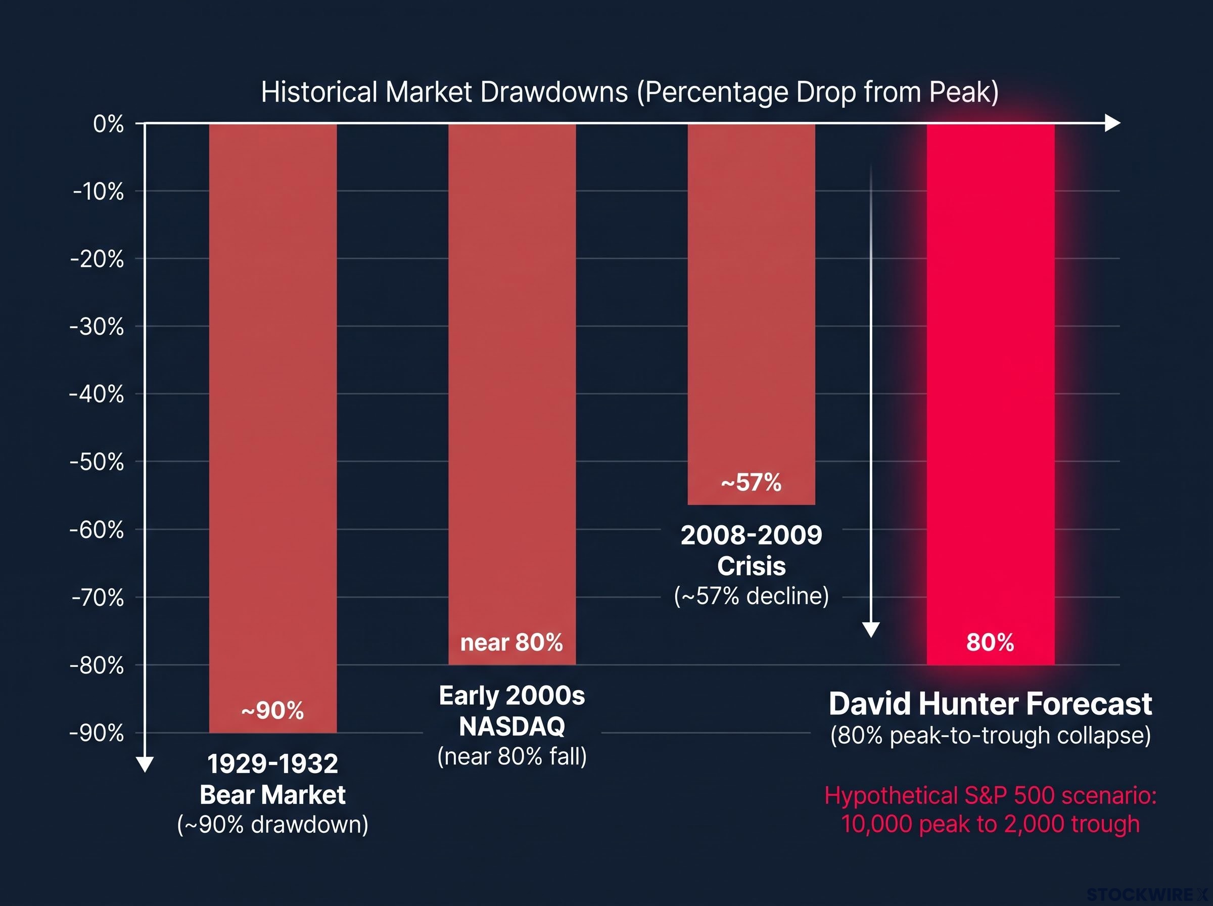
The scale difference between 57% and 80% is not cosmetic. At 80%, price-to-earnings ratios would fall below historical crisis lows, implying a collapse in earnings expectations that no living investor has navigated. That is precisely why understanding what Hunter believes makes this cycle different matters before dismissing the number.
What the mainstream bearish case looks like by comparison
The counterargument from major institutions is not that leverage is harmless. It is that the system has defences the 1930s lacked.
Three arguments carry most of the weight:
- Policy backstops. Deposit insurance, lender-of-last-resort frameworks, automatic fiscal stabilisers, and quantitative easing (QE), the practice of central banks creating money to buy assets, are all designed to truncate deflationary spirals.
- Historical precedent. The 2008 decline halted at around 57% once monetary and fiscal authorities acted decisively.
- Valuation math. An 80% fall would push valuation ratios far below prior crisis lows, effectively pricing in depression-level earnings.
The BIS itself frames the backdrop starkly.
The BIS Annual Economic Report 2024 warns that public and non-financial debt ratios now sit at “historical peaks,” with advanced-economy public debt roughly 30-40 percentage points higher than in 2007.
The fault line is simple. The mainstream expects the toolkit to contain the unwinding. Hunter expects the scale of leverage to overwhelm it. That single assumption, policy potency versus leverage mass, is what separates a 40% bear case from an 80% one, and it is the assumption worth stress-testing in your own thinking.
When big ASX news breaks, our subscribers know first
The leverage architecture that makes an 80% decline mechanically possible
An 80% fall cannot happen in an orderly market. It requires a structure that turns price declines into forced selling. That structure is leverage, and Hunter argues it is stacked higher today than in 2008.
Start at the top. Global non-financial debt, households, companies, and governments combined, sits at roughly 2.5 times world GDP, materially above its 2007-2008 level according to the BIS.
Beneath that sits a layer that barely existed last time. Private credit, loans made directly by investment funds rather than banks, has grown from about $100 billion globally in 2010 to over $1.2 trillion by 2024, roughly fivefold growth in the US market alone since 2009. It typically finances non-investment-grade borrowers on covenant-lite terms, meaning few of the protections that would normally flag trouble early.
The private credit market’s opacity is not incidental. Because its valuations are not marked to market daily, stress in that segment may stay invisible until it surfaces suddenly in banking credit lines. The early-warning signals you might watch for in public markets could arrive later than the underlying deterioration.
Private credit stress is no longer purely theoretical: public BDCs holding similar assets to private credit funds now trade at discounts of 17-26% to stated net asset values, and $7 billion in redemption requests went unfulfilled in Q1 2026 alone, giving the opacity risk described here a concrete present-tense dimension.
Then comes the derivatives layer. BIS statistics show OTC derivatives outstanding in the hundreds of trillions of dollars in notional terms, with gross market value and counterparty exposures large relative to bank capital.
| Leverage layer | Approximate scale | Key vulnerability |
|---|---|---|
| Sovereign and non-financial debt | ~2.5x world GDP | Rising rates weaken fiscal positions and limit policy room |
| Private credit | Over $1.2 trillion globally (2024) | Opacity and covenant-lite terms hide stress until it surfaces |
| OTC derivatives | Hundreds of trillions notional | Counterparty exposure large relative to bank capital |
Stack those layers and a downturn stops behaving proportionally. It compounds through three sequential mechanisms:
- Credit contraction. Deleveraging shrinks the effective money supply, pulling bank deposits and shadow-credit claims out of the system.
- Collateral spirals. Falling asset prices erode collateral, trigger margin calls, and force sales that push prices lower again.
- Balance-sheet recession. Households and firms prioritise paying down debt over spending, a dynamic economist Richard Koo documented, entrenching demand weakness and dragging prices down further.
The BIS captures the trap directly: high debt plus rising rates weakens fiscal positions, limits monetary policy, and raises the risk of abrupt deleveraging. That is the architecture that makes Hunter’s number mechanically conceivable, whether or not you accept his timing.
Japan as the most likely detonator, and how contagion travels
The theory stops being abstract the moment you look at Tokyo.
The 10-year Japanese Government Bond (JGB) yield reached approximately 3.085% on 1 October 2026, a year-over-year rise of roughly 1.41-1.44 percentage points, and a definitive break from the yield-curve-control levels below 1% that held through the early 2020s.
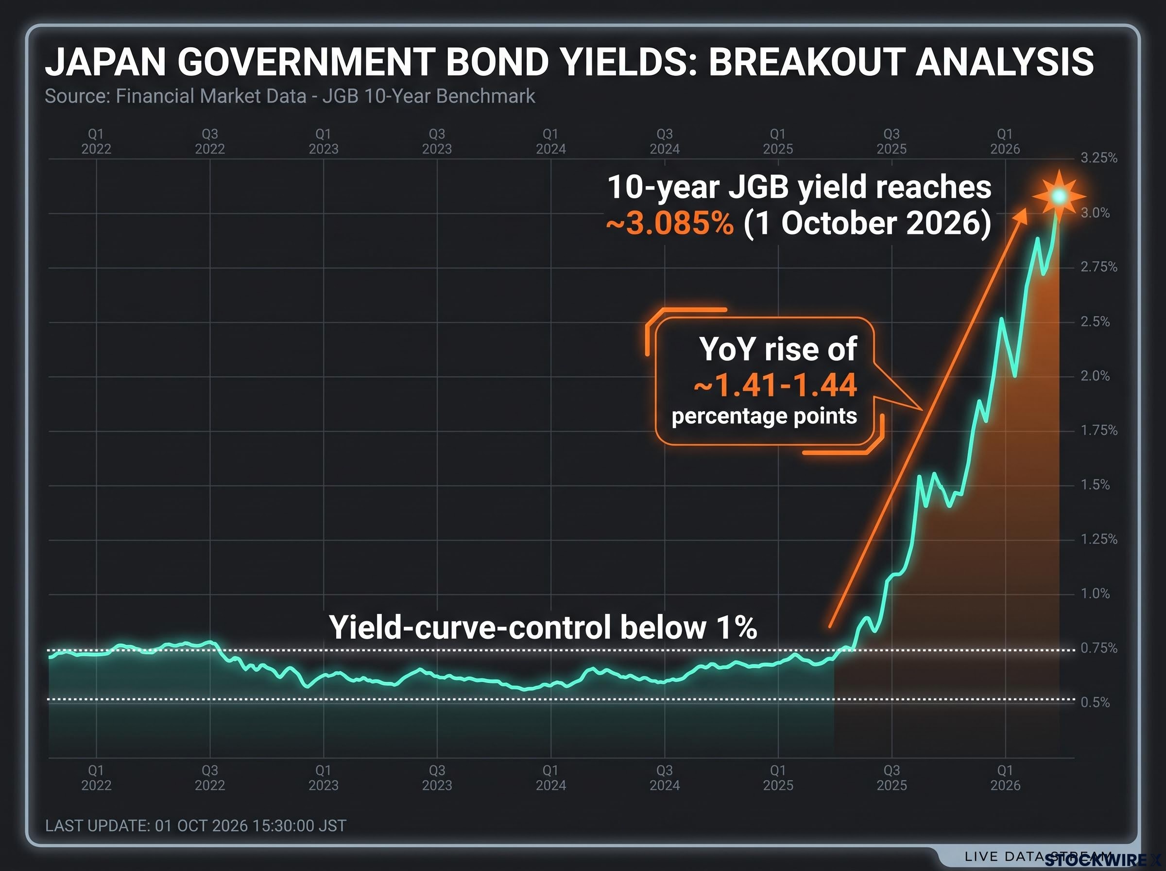
This is why Japan is Hunter’s primary wildcard trigger. Decades of near-zero rates, sovereign leverage he argues exceeds that of the United States in structural terms, and a yield trajectory now visibly breaking out of its suppressed range all converge in one market.
Hunter draws a pointed parallel to the US in the early 1980s, when rates jumped from around 9% to above 15%. Once suppressed rates break out, the upward move can become self-reinforcing.
For an investor outside Japan, this is not a distant foreign fixed-income story. Stress in Tokyo transmits globally through three channels, ordered here by how fast they move:
- Carry-trade unwind (fastest). Global trades funded in cheap yen face forced unwinds when yields spike or the yen appreciates, triggering cross-market margin calls and forced selling across equities, commodities, and credit within days.
- Interest-rate repatriation. Japanese investors selling foreign bonds and equities to lock in higher domestic yields push up global risk-free rates.
- Financial institution solvency (slowest). Japanese banks, insurers, and pension funds hold vast JGB portfolios; mark-to-market losses from rising yields pressure capital ratios and can force global asset sales.
Hunter estimates a 12-18 month window before the broader impacts of a Japanese disruption fully manifest. That window is your monitoring runway, and the signals to track are specific: yen appreciation, the JGB yield path, and Japanese institutional repatriation flows.
Japanese institutional repatriation is already running at a measurable pace: Japan’s US Treasury holdings fell by roughly $69 billion in the six months to June 2026, with Q1 2026 recording the largest quarterly net sell-off in overseas government bonds since Q2 2022.
Why expert opinion on Japan’s runway is split
This is a genuine uncertainty, not a settled question, and you should hold it as one.
One camp sees a finite runway ending in disorderly adjustment once yields climb far enough. The other, including economists Richard Koo and Jesper Koll, argues Japan’s debt is manageable because it is largely held domestically and backed by the Bank of Japan, which can absorb losses a foreign-creditor-dependent country could not.
Both positions draw on the same data. The difference lies in how much faith each places in the Bank of Japan’s capacity to backstop the market indefinitely.
Deflation, not inflation, and what it means for real estate and AI
You almost certainly carry an assumption into this: that the next crisis will be inflationary, driven by deficits and money printing. Hunter expects the opposite, and the mechanism is worth understanding clearly.
His reasoning starts with timing. He expects consumer inflation to moderate toward 2% before the bust begins. If the crisis arrives into an already disinflationary environment, a deflationary spiral becomes the path of least resistance, not an inflationary one. He views current commentary as over-indexed to inflation simply because of recent bond-market momentum.
A persistent inflation regime represents the mainstream alternative to Hunter’s deflationary thesis: analysis of 150 years of inflation data shows inflation moves in sustained generational cycles, and all 13 structural forces that drove four decades of disinflation have not only ceased but actively reversed, a position that sharply constrains how quickly deflation could become the dominant dynamic.
Real estate shows the deflationary pressure first. Hunter believes US property has already peaked, with mortgage rates above 7% (approaching 7.25% or higher at the time of his assessment) creating structural headwinds. In oversupplied markets such as Dallas and Atlanta, he expects declines that lower interest rates alone cannot reverse.
AI is the counterweight he treats differently. Hunter views it as a legitimate long-term driver, with technology earnings currently strong, but expects a bust to interrupt the spending cycle through project cancellations and a digestion period, with investment resuming after the crisis rather than being permanently derailed.
The deflation-versus-inflation debate is live among serious analysts:
- Price trajectory. Hunter and Ray Dalio see debt-cycle conclusions as typically deflationary; Nouriel Roubini expects stagflation, where inflation and a growth collapse coexist.
- Central bank response. Dalio notes deflation holds unless central banks execute a “beautiful deleveraging,” printing enough to offset credit destruction; Roubini expects deflation only if a severe shock forces a rapid credit crunch.
- Asset class implications. A deflationary path rewards cash and high-quality bonds; a stagflationary one rewards real assets and inflation hedges.
| Asset class | Hunter’s bust scenario outlook | Key assumption |
|---|---|---|
| Equities | Severe decline, up to 80% peak to trough | Leverage overwhelms policy backstops |
| Real estate (oversupplied markets) | Meaningful declines, concentrated in Dallas and Atlanta | Rate cuts cannot offset oversupply and weak demand |
| AI capital expenditure | Interrupted, then resumes post-crisis | Long-term driver intact; spending cycle pauses |
| Inflation hedges | Weak in a deflationary bust | Deflation, not inflation, dominates the crisis |
Here is the practical sting. If deflation is the dominant dynamic, the standard hedge of holding commodities or inflation-linked bonds for crisis protection may perform poorly precisely when you most need it. That is the assumption worth examining now rather than mid-crisis.
What the 2027 timeline means for investors preparing now
Hunter assigns a better-than-even probability to the bust landing around 2027. That is a central tendency, not a date carved in stone, and acting on it well means separating structural preparation, which is timeless, from tactical positioning, which depends on timing.
The useful move is to turn his thesis into a watchlist. Several leading indicators, in rough priority order, would signal the bust beginning to materialise:
- US lower-income consumer stress, where Hunter expects strain to show first.
- The JGB yield trajectory, currently near 3.085% and rising.
- Yen appreciation, which accelerates carry-trade unwinds.
- Japanese institutional repatriation flows out of foreign assets.
- Private credit stress surfacing in banking credit lines.
The consistent lesson from leverage-driven busts is that highly levered, illiquid assets fall hardest, and whether the crisis resolves through deflation or inflation depends on the speed and scale of central bank money creation relative to credit destruction.
Bear market recovery time has ranged from under six months to approximately 25 years across US history, with the cause of the decline proving a more reliable planning input than any single average: valuation-driven busts require years of earnings growth to absorb excess, while financial-system shocks can sometimes be addressed by aggressive policy intervention.
The value of Hunter’s framework for you is not in accepting the 2027 date. It is in using his structural checklist, leverage concentration, Japan’s yield path, and private credit opacity, as an ongoing monitoring tool that sharpens your own risk assessment.
What historical busts teach about timing and policy response
Three episodes make the pattern clear. Japan’s 1990s bust became a protracted balance-sheet recession. The 2008-2009 crisis saw a 57% S&P decline arrested by aggressive QE. The Eurozone crisis of 2010-2012 produced deflationary conditions until central-bank backstops were deployed.
The common thread: intervention determines whether a bust is short and sharp or long and grinding, but it does not prevent the bust.
The 2008 benchmark is itself a data point. QE was deployed at speed to arrest a 57% decline. With global debt now far higher, the open question is whether an equivalent intervention is even available next time.
Sizing the scenario honestly before the melt-up is over
The intellectual contribution of Hunter’s work is not the 80% number itself. It is the structural analysis beneath it: the composition of leverage, Japan’s fragility, and the deflation-not-inflation path that most commentary ignores.
The uncertainty here is genuine. Ray Dalio and Nouriel Roubini reach different conclusions from similar data: Dalio sees deflation unless a flawless deleveraging is executed, Roubini sees stagflation unless a credit crunch forces deflation. The outcome hinges on policy response speed and scale, variables no one can know in advance.
Three conditions underpin the case regardless of whether the specific forecast proves accurate:
- Global non-financial debt at roughly 2.5 times world GDP, with advanced-economy public debt 30-40 percentage points above 2007 levels.
- Japan’s 10-year yield breaking out toward 3.085%, a definitive regime shift.
- A private credit market whose opacity could hide stress until it surfaces in banking.
The orienting question is not whether you believe the 80% forecast. It is whether you are monitoring the right indicators, and whether your portfolio reflects the possibility that the next crisis resolves through deflation rather than inflation.
This article is for informational purposes only and should not be considered financial advice. Investors should conduct their own research and consult with financial professionals before making investment decisions. Past performance does not guarantee future results. These statements are speculative and subject to change based on market developments.