The U.S. stock market is now worth roughly 240% of the entire American economy, the highest reading ever recorded.
That single figure is what separates the current moment from a market that is merely expensive but functional. It sits at the centre of Marc Faber’s most pessimistic call in a career spanning more than 50 years, and it is why September 2026 is the right time to take his thesis seriously rather than filing it under the usual bearish noise.
The conditions have converged. Markets are showing renewed weakness, the 10-year Treasury yield sits at 4.77% to 4.79%, and a veteran investor who has warned through multiple cycles is arguing that the setup this time is structurally different.
Faber’s warnings are not new. He has been early and he has been wrong on timing before. What is different now is the specific stack of conditions he identifies, and whether the evidence actually supports each one.
Here is what the data actually supports, and where it falls short. After this, you will be able to evaluate his five core arguments on their individual merits and apply that read to your own view of current conditions.
The valuation ceiling: how far above historical norms are U.S. equities?
The strength of Faber’s valuation argument is not one alarming number. It is three separate measurement services arriving at nearly the same conclusion independently.
The Buffett Indicator, named after Warren Buffett, compares the total value of a country’s stock market to the size of its economy. A reading of 100% means the market is worth exactly as much as annual economic output. Anything far above that historically signals overvaluation.
As of 4 September 2026, BuffettIndicator.org measured U.S. total market capitalisation at about $78.2 trillion against annualised GDP of $32.5 trillion, producing a ratio of 240.8%. CurrentMarketValuation.com calculated 244% as of 30 June 2026. GuruFocus put it at 237% on the same September date.
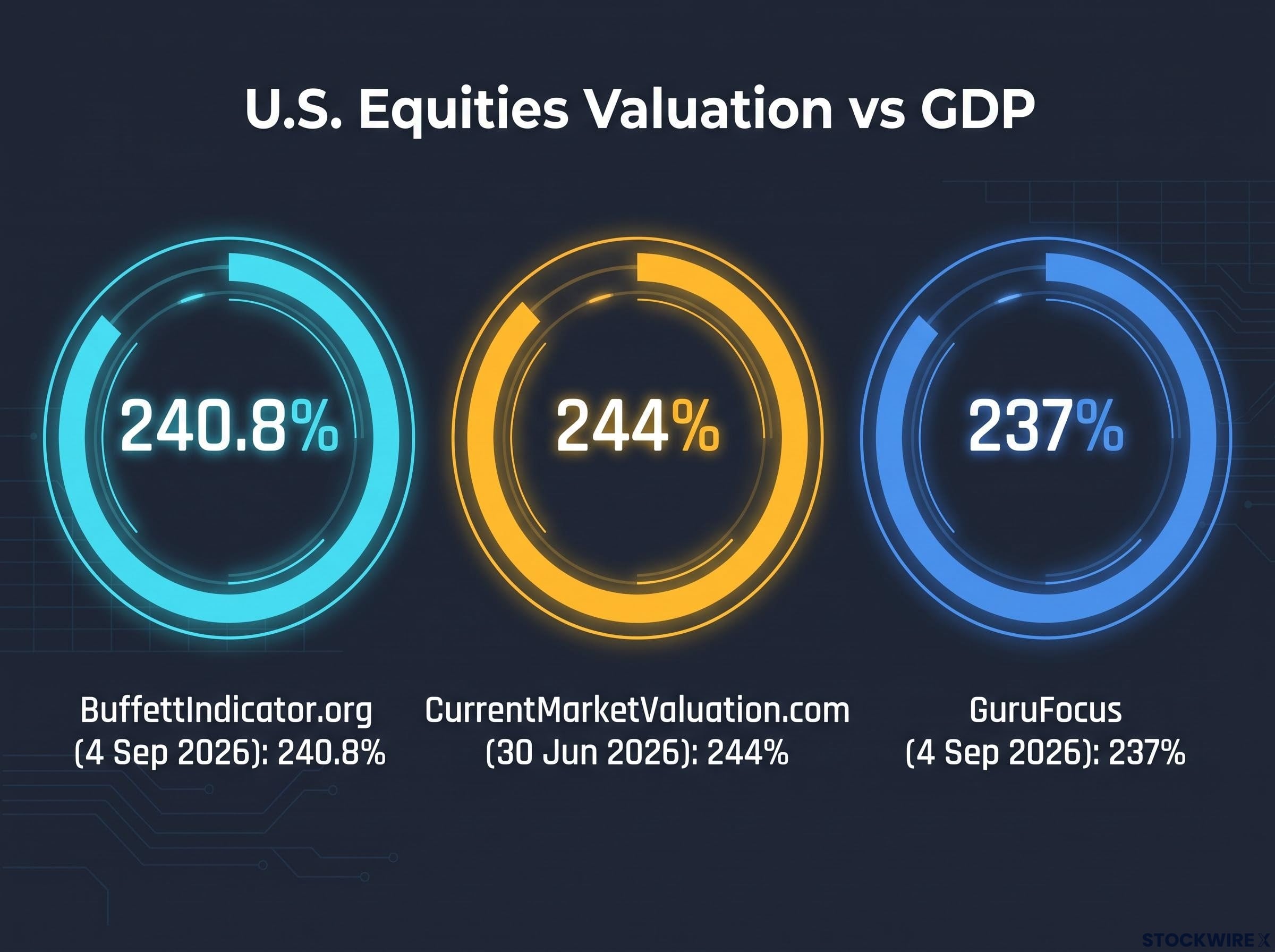
| Source | Reading | Deviation from Norm | Date |
|---|---|---|---|
| BuffettIndicator.org | 240.8% | “Strongly Overvalued” | 4 Sep 2026 |
| CurrentMarketValuation.com | 244% | 2.6 standard deviations above trend | 30 Jun 2026 |
| GuruFocus | 237% | 42.7% above long-term average of 1.66x | 4 Sep 2026 |
That convergence matters more than any one figure. When bulls dismiss valuation warnings, they usually attack the methodology of a single provider. Three independent trackers telling the same story removes that escape hatch entirely.
The convergence across independent trackers is not incidental: Buffett Indicator signals carry more weight when Berkshire Hathaway’s own cash position, sitting near $373 billion as of mid-2026, implicitly confirms that the controlling shareholder finds no large-scale deployment opportunity at current prices.
What the statistical language actually means
CurrentMarketValuation.com’s figure sits 2.6 standard deviations above the historical trend line. In plain terms, that means the current reading is so far from the historical average that it falls into a range the market has reached only a handful of times in recorded history.
GuruFocus frames the same distance differently, at 42.7% above the long-term average of 1.66x. However you slice it, the market is not slightly rich. It is at an extreme.
Jeremy Grantham, the GMO co-founder who called both the dot-com and 2008 tops, reached the same verdict independently in June 2026.
“Based on the Buffett Indicator, this is the most expensive market in American history.” — Jeremy Grantham, GMO
Valuation alone does not tell you when a correction arrives. What it does tell you is the ceiling on how far markets can run before mean reversion becomes mathematically punishing. At 240% of GDP, that ceiling is closer than at any prior point on record.
When big ASX news breaks, our subscribers know first
Record global debt as the accelerant, not the spark
If valuation sets the ceiling, debt determines how hard the floor is when the fall comes.
Faber’s argument here is not that debt causes the correction. It is that debt removes the cushion that would otherwise allow an orderly one. When assets are bought heavily on borrowed money, a price decline forces selling, and forced selling amplifies the decline rather than absorbing it.
The IMF’s September 2025 Global Debt Monitor anchors the scale. Total global debt, public and private combined, stabilised just above 235% of global GDP.
- 2020 peak: 258% of global GDP
- Current: just above 235% of global GDP
- Pre-COVID baseline: approximately 230% of global GDP
The trajectory tells you something the headline number alone does not. Debt has eased slightly from its pandemic peak, but it remains above where it sat before COVID, and it is sitting there while valuations are at record highs.
That pairing is the core of Faber’s case. Elevated valuations and elevated debt have rarely coexisted at this scale at the same time, and the combination changes the arithmetic of any correction.
Debt at 235% of GDP means a sustained decline in asset prices does not simply erase paper wealth. It triggers margin calls and credit contraction that feed back into the real economy, which is the mechanism Faber argues central banks can no longer defuse without permanent market support.
Faber predicted in November 2025 that global financial markets could deflate by around 50% in real, inflation-adjusted terms.
For your own portfolio, the practical read is uncomfortable. In a genuine deleveraging event, diversification offers less protection than the models suggest, because selling is driven by margin calls and liquidity needs rather than the relative fundamentals of each asset class. Most things fall together.
Is the AI earnings story real or extrapolated?
This is where the bull and bear cases are genuinely competitive, not a strawman on either side.
Faber’s critique is direct. He argues that earnings across AI and semiconductor stocks are extrapolations of abnormally elevated results, inflated in part by years of monetary stimulus, and “grossly overestimated.” When the cycle turns, he expects them to disappoint sharply.
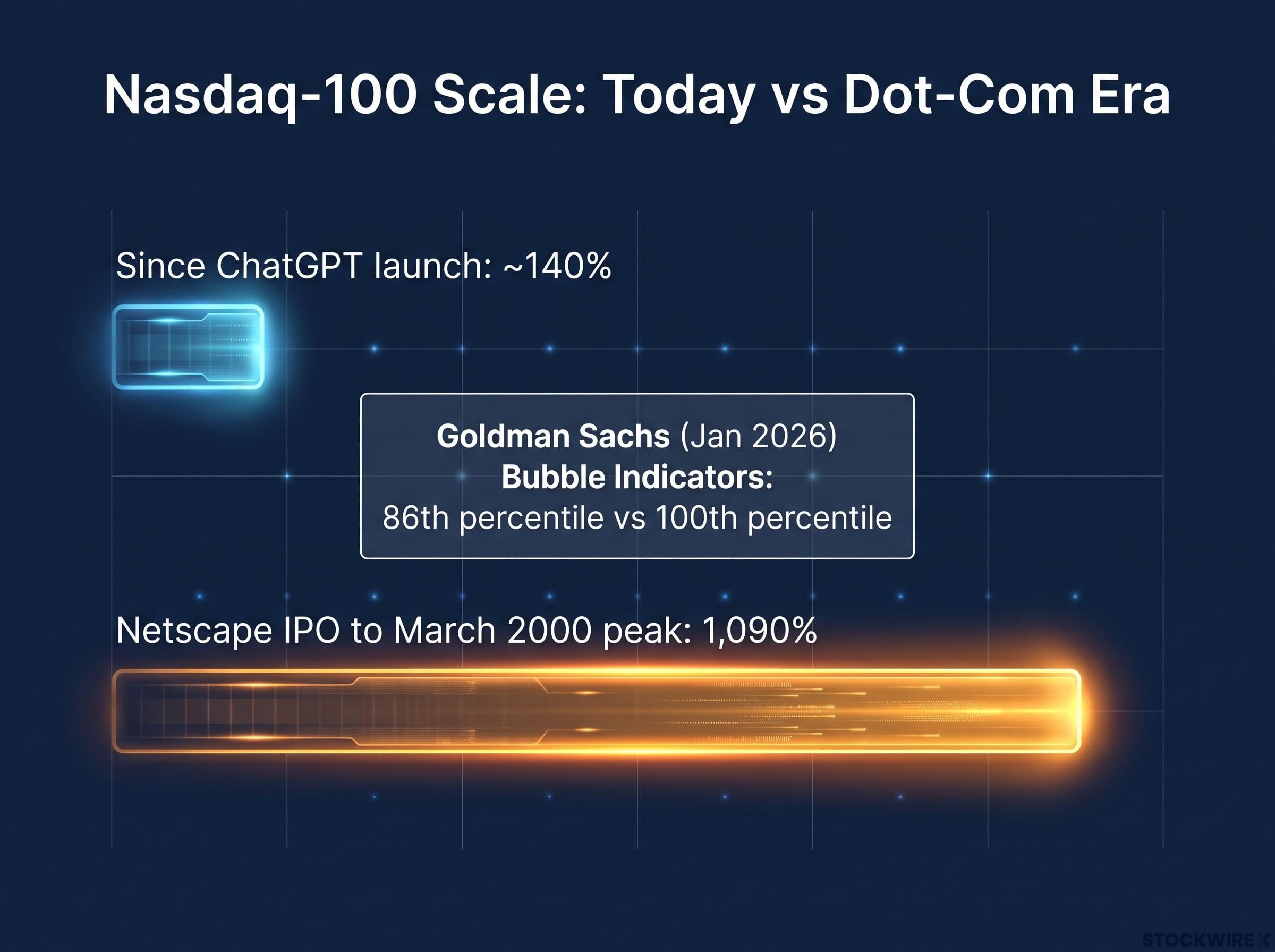
The bull case is not naive optimism. Goldman Sachs, analysing bubble indicators in January 2026, concluded that today’s market resembles 1997 rather than the 1999 blow-off top, with median bubble indicators at the 86th percentile versus the 100th percentile reached in 2000.
Man Group and Intuition Labs add the fundamental point: today’s leaders generate billions in real free cash flow and genuine revenue growth, unlike the unprofitable IPOs that defined 1999.
The scale of the rally supports a degree of caution against the bubble comparison too. The Nasdaq-100 has climbed roughly 140% since ChatGPT launched, far short of the 1,090% run between Netscape’s IPO and the March 2000 peak.
The bear case rests on one unresolved number
Faber grounds his pessimism in market history. He says he has not seen this level of speculative euphoria since 1970, and he reaches for episodes where investors bought on price momentum rather than understanding.
- Nifty Fifty (1973): blue-chip growth stocks bid to unsustainable multiples, then collapsed in the 1973-74 bear market.
- Oil boom (1980): energy speculation that reversed hard as the cycle turned.
- Souk Al-Manakh (1982): a Kuwaiti market driven by credit through post-dated cheques, collapsing when the credit chain broke.
The Souk Al-Manakh comparison is the sharpest. Faber argues a large share of today’s younger investors hold AI and semiconductor exposure without understanding the underlying businesses, participating purely because prices rise.
Index concentration risk adds another dimension to the AI earnings debate: the Magnificent Seven represent approximately 32% of S&P 500 total weight as of 2026, meaning a broad index investor carries a concentrated AI bet regardless of whether they sized it deliberately, a structural feature that did not exist at the same scale during the Nifty Fifty era Faber cites.
The empirical question sitting underneath all of this is the AI capex-to-revenue ratio. Spending is extreme relative to current revenue. Either the revenue is coming, which validates the bull case, or overcapacity and margin compression are, which validates Faber.
Where Goldman Sachs and Faber actually agree
The disagreement is narrower than the headlines suggest. Both Goldman and Faber accept that conditions are elevated. Their dispute is about degree and timing, not whether the risk exists.
That 86th percentile finding is the most useful number for locating yourself on the risk spectrum. It says this is not yet the 2000 peak. It also says this is not a normal market, and the remaining distance to the historical extreme is smaller than most investors assume. Goldman’s 1997 analogy implies room to run before the top, not a clean bill of health.
What inflation is actually running at, and why it matters for rates
Ask most households whether inflation is running at 3.4%, and you will get a sceptical look. That gap between the official figure and lived experience is where Faber builds his rate argument.
The official numbers are clear. BLS headline CPI-U was 3.4% year-over-year as of July 2026, with core CPI (excluding food and energy) at 2.5%. Faber has cited figures nearer 3.8%, a discrepancy that reflects the timing of his interviews against more current data.
His alternative estimate is far higher. He puts the true annual cost-of-living increase for ordinary households at 5% to 12%, citing personal grocery spending that rose roughly 40% over four years and criticising Owners’ Equivalent Rent (OER), the method that estimates housing costs by imputing forgone rent rather than tracking home prices and mortgage rates directly.
The mainstream technical case runs in the opposite direction, and it deserves its space. The Boskin Commission concluded that traditional fixed-basket CPI actually overstates the cost of living, because it fails to capture consumers substituting toward cheaper goods. That substitution bias, it estimated, adds roughly 1.1 percentage points per year to reported inflation.
The BLS methodology on OER and substitution bias explains how Owners’ Equivalent Rent is derived from imputed rental surveys rather than observed mortgage or home-price data, and how upper-level substitution is addressed through the Chained CPI, the technical foundation underlying the mainstream counterargument to Faber’s inflation critique.
| Inflation Measure | Source | Current Reading | Faber’s Critique |
|---|---|---|---|
| Headline CPI-U | BLS, Jul 2026 | 3.4% YoY | Understated via selective weighting |
| Core CPI | BLS, Jul 2026 | 2.5% YoY | Excludes food and energy that households feel |
| OER-based housing | BLS methodology | Imputed rent | Ignores home prices and mortgage rates |
| Household cost estimate | Faber | 5-12% annually | Alternative independent methodology |
This is a genuine dispute between credible positions, not a settled question. The point for an investor is what the answer implies for rates.
Faber estimates a genuinely neutral 10-year Treasury yield, neither stimulating nor restricting the economy, would need to sit at 5.5% to 6.0%.
Whether inflation runs at 3.4% or nearer 5-12% determines whether the 10-year at 4.77% is above, at, or below neutral. If Faber is right, real rates remain negative even at current nominal levels, which means the bond market has not yet imposed discipline on asset prices. The eventual adjustment would then be larger when it finally arrives.
Treasury market engineering and the price of artificial calm
Faber’s final argument is that the calm in the bond market is manufactured, and manufactured calm has a breaking point.
Under Treasury Secretary Scott Bessent, sworn in on 28 January 2025, the Treasury has intervened at the long end of the yield curve using two tools. It has shifted issuance toward short-term Treasury bills rather than longer notes and bonds. And in August 2026, it doubled a programme of long-term bond buybacks across 10 to 30-year maturities after a sell-off pushed the 30-year yield close to 5%.
The scale is not trivial. Financial analyses by Miran and Nouriel Roubini estimate the bill-heavy issuance strategy had an economic effect similar to quantitative easing.
The strategy’s impact was estimated at roughly $800 billion in QE-equivalent terms, shaving about 25 basis points off the 10-year Treasury yield.
The Treasury defends the buybacks as liquidity and market-function operations, not yield targeting. Supporters argue that in a heavily leveraged system with record debt and thin summer trading, smoothing the curve is a legitimate mandate that protects borrowers from destabilising spikes.
Critics frame the buyback programme as financial repression, a deliberate policy architecture that holds sovereign borrowing costs below market-clearing rates to erode the real debt burden over time, a strategy the U.S. last deployed systematically during the 1942-1951 period when it carried comparably elevated debt-to-GDP ratios.
The debate about legitimacy
Critics, Faber among them, do not accept that framing. Faber says he cannot identify a single case in his 50-year career where government market intervention solved a problem without creating new imbalances. The critics point to four specific risks:
- Crowding out private price discovery
- Creating moral hazard by signalling permanent support
- Installing an effective ceiling on long-term yields
- Risking abrupt repricing if buyback capacity runs out
The implication for your holdings is concrete. If the Treasury is suppressing the 10-year by 25 basis points, the price investors use to value equities, credit, and long-duration bonds is a policy output rather than a free-market signal. The risk is not only that rates rise, but that they snap back sharply when the policy hits its capacity.
The international yield context
This is not a U.S.-only story, which is what makes it harder to dismiss. Yield pressure is building across major developed markets at the same time.
Japan’s 10-year JGB reached 2.93% to 2.95% in mid-August 2026 and briefly touched 3.00% on 1 September 2026, its highest level since the mid-1990s. That matters because Japan has anchored global assumptions about permanently low rates for three decades. In the UK, 30-year gilt yields hit 5.40% in 2025, the highest since August 1998.
Where Faber’s thesis holds, and where it depends on timing he cannot specify
The useful takeaway from Faber is not a verdict. It is a map of which arguments rest on hard evidence and which rest on judgment he cannot prove.
Three pillars are empirically well supported. The Buffett Indicator sits at historic highs across three independent sources. Global debt is elevated at 235% of GDP. And Treasury yield suppression has a quantified mechanism behind it, the roughly $800 billion QE-equivalent estimate.
Two pillars are contested or unknowable. The inflation measurement argument pits credible economists against each other, with the Boskin Commission pointing the opposite way to Faber. And the prediction of a 50% real-terms decline depends on timing that Faber has consistently called early across previous cycles.
| Argument | Evidence Quality | Key Data Point | Bull Counter |
|---|---|---|---|
| Equity valuation | Strong | 240-244% of GDP, three sources | Valuation is not a timing tool |
| Global debt | Strong | 235% of GDP (IMF) | Below 2020 peak of 258% |
| Treasury suppression | Strong | ~$800B QE-equivalent | Framed as liquidity operations |
| AI earnings risk | Contested | 86th percentile (Goldman) | Real free cash flow, not 1999 |
| Inflation understatement | Contested | 5-12% (Faber) vs 3.4% (BLS) | Boskin: CPI overstates by 1.1pp |
A reader who leaves with a binary “Faber is right” or “ignore the perma-bear” has missed the point. The renewed market weakness of September 2026 makes this live rather than theoretical, and the asymmetry of being early versus being wrong changes when valuations are at record extremes. Your job is not to pick a side. It is to understand how sensitive your own holdings, especially long-duration assets in a yield-suppression regime, are to the specific risks he identifies.
Market leadership rotation is the portfolio implication that follows logically from the 86th percentile reading: historical episodes of extreme concentration in the Nifty Fifty, Japan Inc., and the TMT bubble each saw the dominant cohort deliver annualised returns approximately 3-5 percentage points below the broad global market over the subsequent decade, according to BlackRock Investment Institute research.
This article is for informational purposes only and should not be considered financial advice. Investors should conduct their own research and consult with financial professionals before making investment decisions. Past performance does not guarantee future results, and these statements are speculative and subject to change based on market developments.