DXY is pressing against the 100 handle, a round number that carries real psychological weight in currency markets, while the daily chart’s momentum indicators are pointing in one direction: down. RSI sits in the high-30s to low-40s. MACD is below zero. And one data release, the July US Consumer Price Index (CPI) print due mid-August, could either validate the bearish structure or blow it apart by end of week.
The dollar index is sitting in a technically fragile posture on the daily chart, and the market has been structuring around this CPI release as the next directional catalyst. The technical setup gives you a framework for anticipating price movement, but a significant inflation surprise can override chart structure entirely. Knowing how those two layers interact is what separates prepared positioning from reactive scrambling.
This piece maps the exact technical conditions in play on DXY as of 11 August 2026, identifies the support and resistance levels that matter, and lays out what each CPI outcome means for price direction, so you can form a view before the data lands rather than chase headlines after it does.
Why the chart already has a bearish lean before any data lands
The daily chart shows DXY printing at 99.87, a level that sits comfortably beneath both the 20-day exponential moving average (EMA) and the 100-day simple moving average (SMA). Both of those dynamic levels now function as overhead resistance rather than support, meaning price has to climb back through them to shift the technical picture.
The 100 handle itself adds another layer. Round numbers carry psychological weight in currency markets because they concentrate order flow, and DXY has failed to sustain above 100 in recent sessions. The intraday range has been roughly 99.75 to 100.06, a narrow band that keeps testing and failing at that threshold.
The bearish chart posture sits against a broader macro backdrop that Morningstar’s valuation model has been flagging for weeks; DXY overvaluation signals of approximately 15% above fair value suggest the current dollar weakness is a correction with structural backing rather than a random drift below the 100 handle.
Then there is the Moving Average Convergence Divergence indicator (MACD), a trend-following momentum measure that tracks the relationship between two EMAs. MACD is trading below zero on the daily timeframe, confirming that shorter-term momentum sits beneath longer-term momentum. Sellers, not buyers, are in control of the daily structure.
Three confirmed bearish signals are now in place:
- Price trading below the 20-day EMA (resistance in the 100.30-100.70 zone)
- Price trading below the 100-day SMA
- MACD below zero on the daily chart
The combination is not ambiguous. It tells you the burden of proof sits with the bulls, who need a catalyst to reverse this structure rather than extend it.
When big ASX news breaks, our subscribers know first
What RSI is telling you about the momentum underneath
The Relative Strength Index (RSI) is a momentum oscillator that measures the speed and magnitude of recent price changes on a 0 to 100 scale. Readings above 70 signal overbought conditions; readings below 30 signal oversold conditions. The zone between 40 and 60 is considered neutral.
RSI(14) on the daily DXY chart: approximately 36-43, depending on data provider and snapshot timing. Individual readings across multiple sources cluster in a range spanning 36.10 at the lower end, through roughly 41, and up to approximately 43.1. Taken together, the evidence points to a reading in the high-30s to low-40s, which sits below the neutral zone and reflects weak buying pressure without yet reaching the sub-30 territory that typically draws in mean-reversion traders.
The weight of evidence places the reading in the high-30s to low-40s. That is below neutral, confirming sellers are pressing, but it is not yet at the sub-30 extreme that typically attracts mean-reversion buyers looking for exhaustion signals.
This distinction matters for positioning. An RSI in this zone tells you momentum is soft and downside pressure is present, but no automatic floor is in place from oversold mechanics. Further downside remains technically available if the CPI catalyst confirms the trend. The threshold to watch is a move below 30, which would shift the momentum interpretation from “trend continuation” to “potential exhaustion,” a different setup entirely.
Mapping the levels that matter: where DXY finds support and where it runs into walls
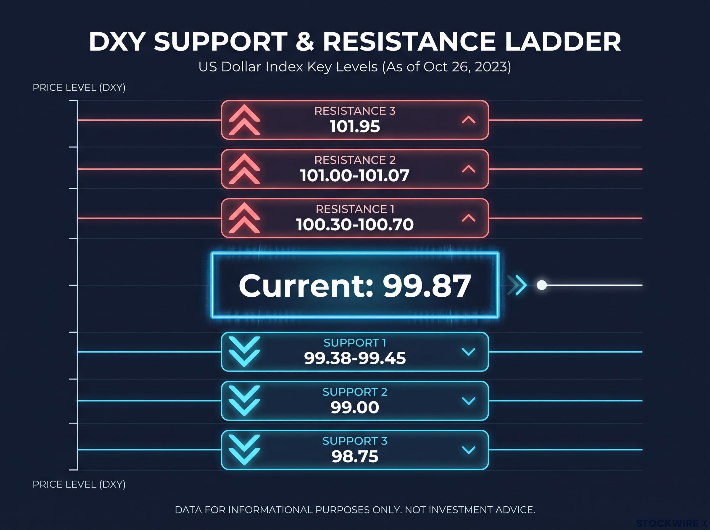
Support and resistance levels are the price zones where buying or selling pressure has historically concentrated. Knowing where the next reaction point sits in either direction means a CPI-driven move can be assessed against structure rather than watched without context.
| Direction | Price Zone | Technical Basis | Significance |
|---|---|---|---|
| Support | 99.38-99.45 | June 15 two-month lows converging with lower Bollinger Band | Near-term support cluster; breach accelerates downside |
| Support | 99.00 | Clean round-number handle attracting concentrated order flow | Concentrated order flow at a clean handle |
| Support | 98.75 | Late-May swing low representing a prior floor on the chart | Deeper downside target on sustained selling |
| Resistance | 100.30-100.70 | Current 20-day EMA level and mid-Bollinger Band confluence | Initial overhead barrier; first test for any recovery |
| Resistance | 101.00-101.07 | July 30 high | Meaningful reversal threshold; sustained break needed |
| Resistance | 101.95 | Upper Bollinger Band | Extended recovery territory |
The sequencing logic matters as much as the individual levels. Each support level, if breached, accelerates movement toward the next one down. Each resistance level, if reclaimed, needs to be held on a closing basis to validate recovery. This level map functions as a decision grid: you know in advance where the market is likely to react, so you can interpret a CPI-driven move in real time rather than constructing the framework after the fact.
Volume confirmation at breakout levels is the additional filter that separates a genuine breach of the 99.38-99.45 support cluster from a false breakdown; valid breakouts and breakdowns typically require volume of at least 1.5 to 2 times the 20-day average on the triggering bar, a check that applies directly to any CPI-driven DXY move through the key levels mapped above.
How technical indicators are built and why they work together
The indicators referenced in this analysis are not black boxes. Understanding how each one is constructed tells you why the signal matters, and lets you apply the same framework to any liquid instrument, not just DXY.
- Exponential Moving Average (EMA): A moving average that weights recent price data more heavily than older data. This makes it more responsive to current trend shifts than a simple moving average (SMA), which weights all data points equally. When price trades below the EMA, it tells you the current price is weaker than the recent weighted average, a bearish signal. DXY’s 20-day EMA sits in the 100.30-100.70 zone, functioning as dynamic resistance.
- Relative Strength Index (RSI): A momentum oscillator measuring the speed and magnitude of recent price changes on a 0-100 scale. It answers a specific question: how strong is the current move relative to recent history? DXY’s RSI(14) in the high-30s to low-40s tells you momentum is soft but not yet at exhaustion levels.
- MACD (Moving Average Convergence Divergence): A trend-following momentum indicator that tracks the relationship between two EMAs (typically the 12-day and 26-day). When MACD is below zero, the shorter-term average is below the longer-term average, confirming bearish momentum. DXY’s MACD below zero reinforces the directional read from the other two indicators.
When trend (EMA), momentum (RSI), and confirmation (MACD) all align in the same direction, the technical case is materially stronger than any single indicator reading alone.
Practitioners read these three in sequence: the moving average establishes the trend, RSI confirms momentum strength, and MACD provides a second momentum check. A brief note on Bollinger Bands, which also appear in the level map: they use the 20-day SMA as their midline, which is why they feature alongside EMA references in DXY analysis.
The CPI fork in the road: two scenarios and what each means for DXY
The July US CPI release, due in the mid-August window, is the catalyst the market has been structuring around. The transmission mechanism runs in a clear chain: a CPI surprise affects rate expectations, which moves Treasury yields, which affects the dollar. That chain is how a single data print overrides or confirms a technical setup.
The transmission chain from CPI data to rate expectations to the dollar is the same mechanism through which Fed language and DXY direction have been interacting all cycle; when the FOMC hardened its guidance in June 2026, the DXY consolidated back above 100 and held both its 50-day and 200-day moving averages, demonstrating how decisively a single policy communication shift can override near-term chart structure.
| Scenario | CPI Outcome | Rate Expectations | Yield Direction | First Key DXY Level |
|---|---|---|---|---|
| Hot print | Stronger than expected | Higher-for-longer Fed pricing | Up | 100.30-100.70 (initial resistance) |
| Soft print | Weaker than expected | Reduced tightening pressure | Down | 99.38-99.45 (near-term support) |
A hot CPI reading would support Treasury yields and push DXY toward the 100.30-100.70 resistance zone, but a sustained move above 101.00-101.07 would be needed to call the bearish structure reversed. That is multiple layers of resistance to overcome.
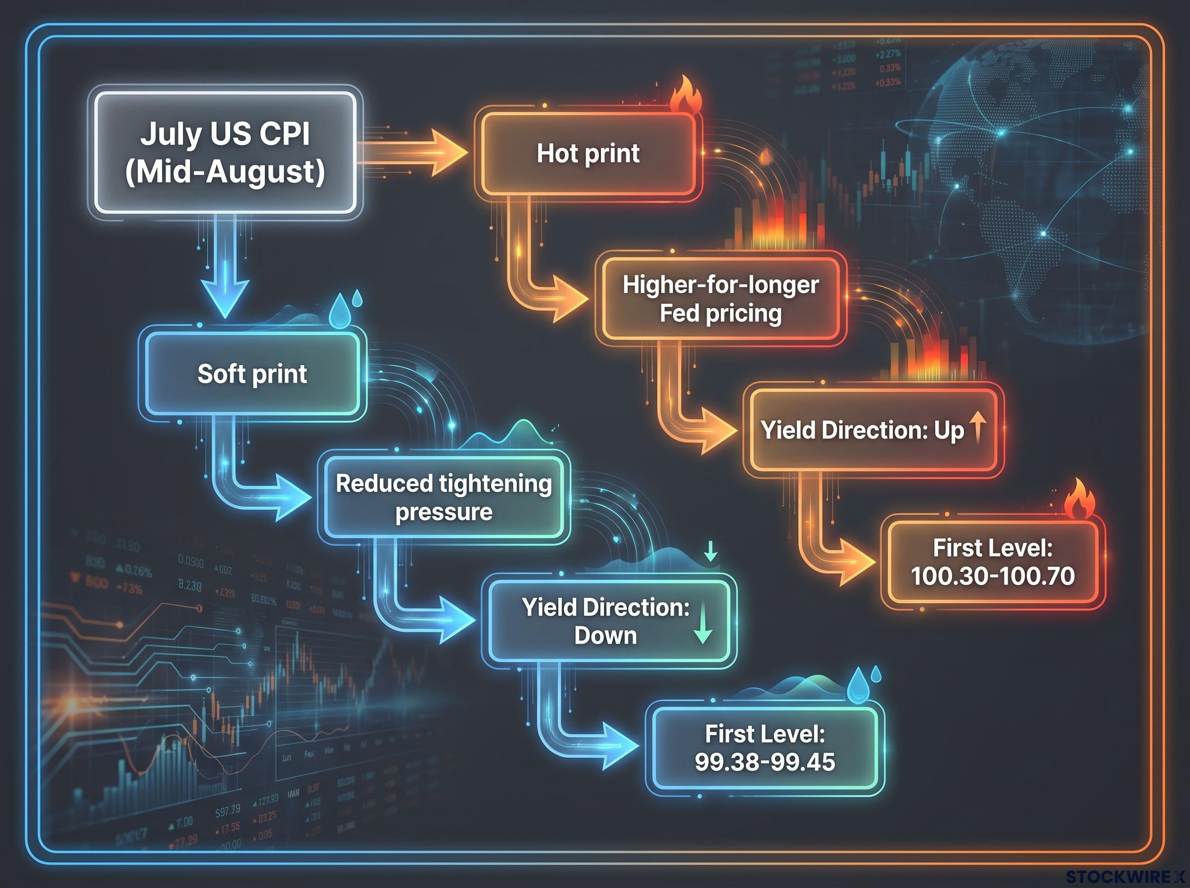
A soft CPI reading would reduce tightening pressure, push yields lower, and flow directly into the existing bearish technical posture. The path toward 99.38-99.45 and potentially 98.75 faces little structural resistance from the chart.
The asymmetry is the key takeaway: a soft CPI faces the path of least resistance in the current technical setup, while a hot print must overcome layered resistance to generate a lasting reversal.
The existing technical structure does not treat both outcomes equally. Knowing which direction faces the lower hurdle turns a data release from a coin flip into a structured probability assessment.
What the DXY setup tells you before the print arrives
DXY is in a technically bearish structure. Price sits below two key moving averages, MACD is below zero, and RSI confirms soft momentum without yet reaching oversold extremes. The burden of proof rests with the bulls, and the CPI release is the catalyst that could either validate or challenge that posture.
Two price actions to watch post-release:
- A break and hold below 99.38-99.45 confirms bearish extension and opens the path toward 98.75
- A break and hold above 101.00-101.07 opens the case for a technical reversal and shifts the burden of proof back to sellers
The analytical approach here, identifying a technical setup, mapping levels, confirming momentum with RSI and MACD, and then stress-testing the setup against a known catalyst, is the method, not just the conclusion. You can apply this same framework to any liquid instrument ahead of any major data event. The chart has already given you a directional lean. The CPI will confirm or contest it. Now you have the specific price levels to use as decision points in real time.
Cross-market CPI transmission extends well beyond the DXY; the April 2026 3.8% print simultaneously stressed gold below its 50-day moving average and stalled AUD/USD at key resistance near 0.7280, demonstrating that a single inflation data point can create coordinated technical inflection points across multiple asset classes at once.
This article is for informational purposes only and should not be considered financial advice. Investors should conduct their own research and consult with financial professionals before making investment decisions. These statements are speculative and subject to change based on market developments and incoming data.