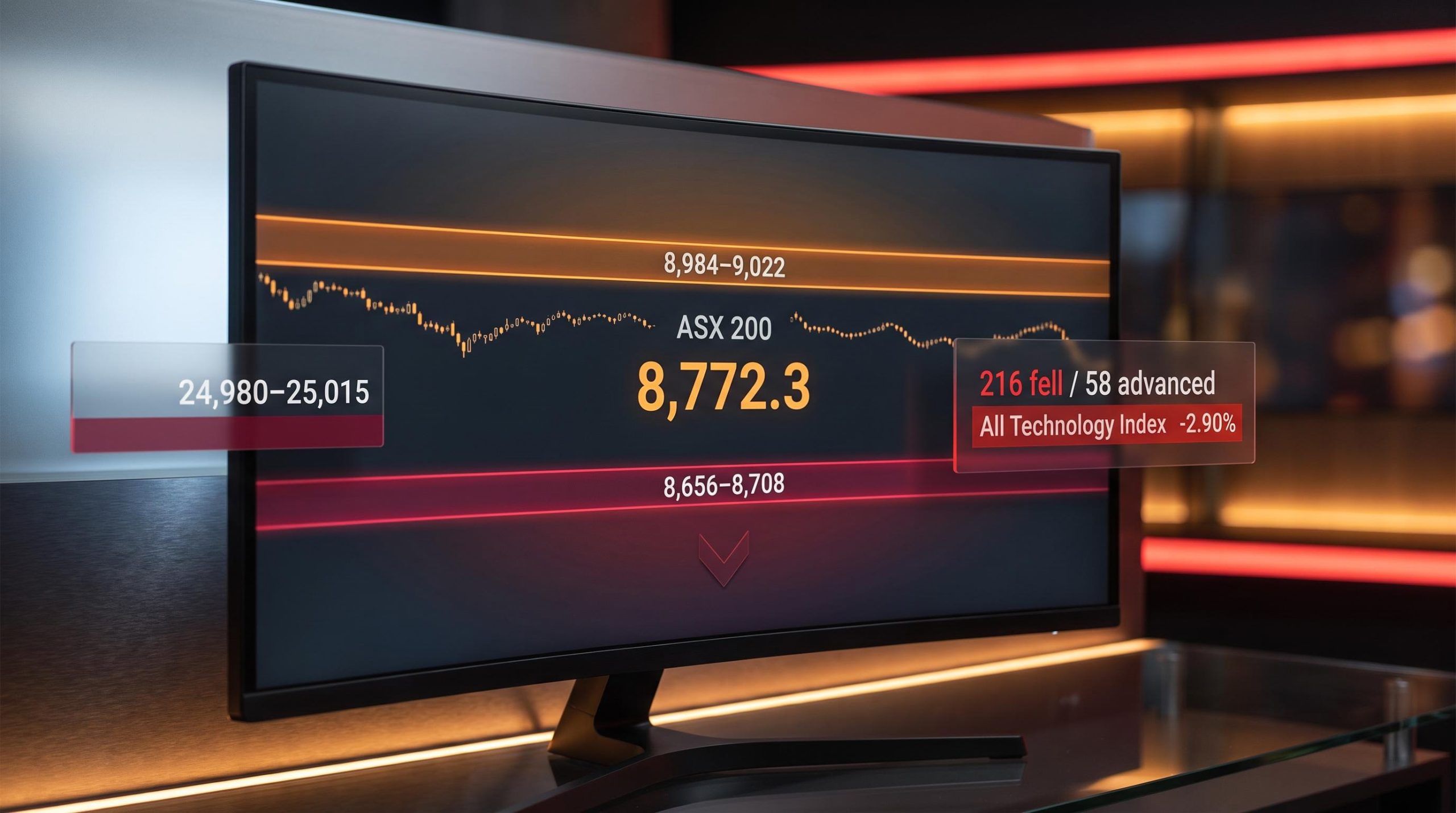
The ASX 200 closed at 8,772.3 on 24 July 2026, down a modest 0.76%. That number, on its own, reads like a forgettable session. But inside the S&P/ASX 300 on the same day, decliners outnumbered advancers by a ratio of nearly four to one, with 216 stocks falling against just 58 that managed to gain ground. Roughly 79% of the index’s constituents declined on a day the headline barely moved.
That gap between what the index says and what the stocks inside it are doing has been widening for weeks. The ASX 200 has gone effectively nowhere over three months, slipping just 0.09%, while remaining pinned in a 8,500 to 9,000 range for 14 to 15 weeks running. The surface is calm. The question is whether anything underneath it is.
Here is a specific technical framework for assessing whether the ASX 200’s current level is genuine or fragile, built around the exact price levels that separate those two outcomes. It includes an offshore variable, the Nasdaq at a support test that feeds directly into Australian technology exposure, and a clear monitoring checklist for the sessions ahead. The data tells a story the headline number does not. Here is what it means for how you position yourself.
What the headline numbers are hiding
The 24 July session exposed a market where the index and its components are telling different stories. The ASX 200’s 0.76% decline was the tamest reading of the day. Beneath it, the damage escalated quickly.
| Index | Closing Level | Session Change |
|---|---|---|
| ASX 200 | 8,772.3 | -0.76% |
| All Ordinaries | 8,941.5 | -0.85% |
| Small Ordinaries | 3,278.5 | -2.08% |
| All Technology Index | 2,763.4 | -2.90% |
Small caps fell nearly three times harder than the headline index. Technology names fell almost four times harder. The All Technology Index shed 2.90% in a single session, the kind of move that would dominate coverage if the ASX 200 itself had done the same.
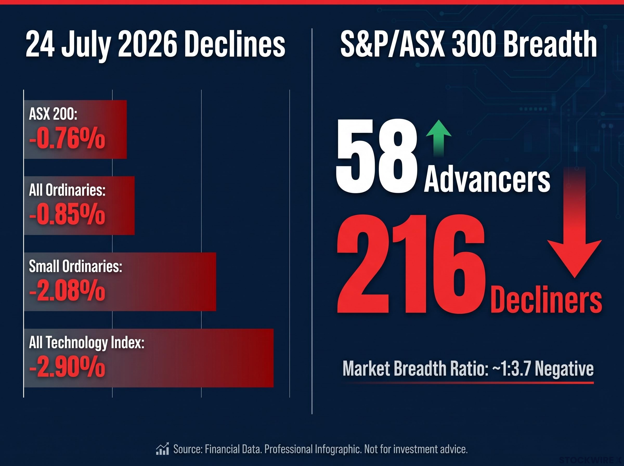
Only 58 stocks advanced against 216 that fell. Within the S&P/ASX 300, the advance/decline tally ran at a ratio of roughly one winner for every four losers, all on a day when the headline index surrendered less than 1%.
That breadth ratio tells you the index’s resilience is not being manufactured by a healthy market. It is being sustained by the weight of a small number of large-cap names holding the line while most of the index sells off around them. That distinction, between broad stability and concentrated support, matters enormously when assessing whether a market is genuinely stable or simply masking fragility.
The pattern is not new: ASX market breadth data from May 2026 showed 84.5% of ASX 200 constituents trading at least 10% below their 52-week highs while the headline index sat only 2% off for the year, an earlier and more extreme version of the same capitalisation-weighting distortion now playing out in the 24 July session.
The weekly picture compounds the point. Over the five sessions, the ASX 200 shed 24.4 points, or 0.28%, finishing the week far closer to its intraweek trough than its peak, with energy the only sector that held up consistently throughout.
When big ASX news breaks, our subscribers know first
Why the range-bound structure deserves more scrutiny than it gets
On the surface, the ASX 200’s position looks constructive. The index sits above both its 50-day and 200-day moving averages. It is only about 4% below its 52-week high. It has held a recognisable range for months without breaking down.
- Trading range: 8,500 to 9,000 for 14-15 weeks
- Magnet zone: 8,780 to 8,800, approximately where the 200-day moving average sits, and where price has repeatedly gravitated over the past six weeks
- 1-month return: +0.22%
- 3-month return: -0.09%
Those last two numbers are the ones that reframe everything above them. A market that has moved 0.22% in a month and slipped 0.09% over three months is not trending. It is drifting. The moving-average positioning that looks supportive is reflecting the memory of older strength, not recent buying pressure.
Sector rotation has been the clearest expression of the index’s internal contradictions in recent weeks, with the Week 26 pattern of utilities, healthcare, and consumer staples pressing 52-week highs while energy names hit 52-week lows all occurring beneath an ASX 200 that posted a deceptively flat 0.28% weekly gain.
What this tells you is that an index sitting above its key averages while delivering zero forward progress is not a bullish setup. It is a market running on inertia. Inertia without fresh buying eventually resolves in one direction when a catalyst appears, and the internal data from the previous section suggests which direction carries the higher probability.
The closing auction problem, and what it signals about intraday demand
There is a microstructure detail in recent ASX sessions that most commentary skips, and it changes how you should interpret the headline close.
The closing auction is the final minutes of each trading session where institutional buyers and sellers submit orders that are matched at a single price. That price becomes the official closing level of each stock, and by extension the index. It is a routine mechanism, but it becomes analytically significant when the auction is doing disproportionate work.
A pattern has emerged across recent sessions: early weakness, a partial recovery into the close, and a final print that flatters the day’s actual trading. According to Market Index analysis, large institutions have been directing buy orders into the closing auction, with the major banks among the primary beneficiaries of these late flows, and this behaviour has been cushioning the headline index close. When the bulk of apparent buying activity is concentrated into that brief auction window rather than distributed across continuous trade, the closing level reflects something narrower than genuine session-wide demand.
The practical risk: if auction-concentrated buying dries up, the index faces an air pocket between the closing level it has been printing and the intraday demand that would actually need to be present to sustain it.
For you, assessing whether the ASX 200’s close around 8,772 represents genuine support, the closing auction concentration means the answer is: only partly. That distinction becomes decisive if institutional auction flows rotate or retreat.
What “below-average volume” actually confirms here
Below-average trading volume has been a persistent feature of recent sessions, with Market Index describing activity as “cautious and somewhat directionless.” In isolation, low volume is ambiguous. In context, it sharpens the picture.
A market basing genuinely, building a foundation for the next move higher, tends to show volume contracting on declines and expanding on recoveries. That is the pattern of accumulation. A market drifting shows low volume throughout, with no signal that buyers are stepping in with conviction on weakness. The current environment matches the second pattern, not the first.
Reading the Nasdaq at its support test, and why it matters for Australian investors
The All Technology Index’s 2.90% single-session decline on 24 July did not happen in isolation. It happened because the Nasdaq Composite’s short-term trend had turned lower, and Australian technology names carry structural leverage to that direction.
The ASX 200 vs Nasdaq divergence has been building since at least mid-2025, with the local index delivering an effectively flat price return over that period while US technology compounded meaningfully higher, a structural gap that makes Australian technology names systematically vulnerable when the Nasdaq corrects rather than simply correlated to it.
As of 24 July, the Nasdaq is testing a specific support zone. Carl Capolingua of Market Index’s ChartWatch identified the key levels:
| Zone | Level Range | Technical Role |
|---|---|---|
| Key support | 24,980-25,015 | Current test zone; short-term trend depends on this holding |
| Key resistance | 26,789-27,191 | Upper boundary; a reclaim confirms the uptrend resuming |
| Longer-term support band | 23,619-24,532 | Risk zone if key support fails; deeper correction territory |
The Nasdaq closed near 25,691 on 22 July before moving lower. In the sessions that followed, price has been carving out a sequence of lower highs and lower lows, with selling pressure progressively asserting itself. The longer-term uptrend has not been broken, but its forward momentum is fading.
Where the disagreement matters is between the two prevailing interpretations:
- Capolingua / ChartWatch view: The near-term trend has rolled over. The index is now pressing against the 24,980 to 25,015 demand zone, and a failure there would expose the longer-term support band between 23,619 and 24,532.
- FN Arena view: The recent pullback tested and held channel support. The correction may already be complete, and the longer-term uptrend remains the dominant structure.
Both readings agree the longer-term trend is up. They disagree on whether the latest leg lower is a buyable dip or the start of something deeper.
Whether you hold ASX technology names or are considering adding them, the Nasdaq’s behaviour at 24,980 to 25,015 over coming sessions is not an offshore data point to monitor casually. It is a direct input into the risk profile of Australian tech exposure right now.
The levels that separate resilience from deterioration
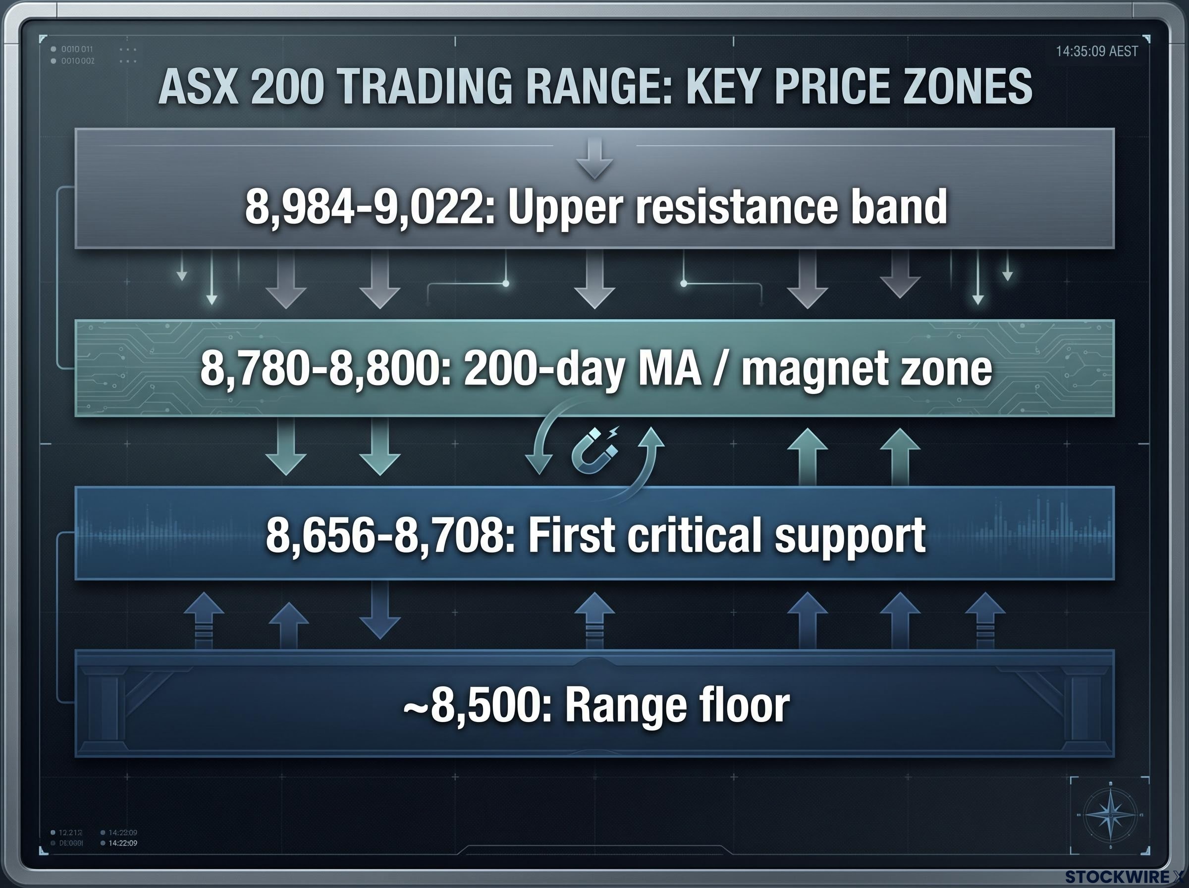
The ASX 200’s technical picture reduces to four zones. Each carries a distinct signal about what happens next.
| Zone | Level | Implication |
|---|---|---|
| Upper resistance band | 8,984-9,022 | Top of the multi-month range; a sustained break above is required for a genuine new leg higher |
| 200-day MA / magnet zone | 8,780-8,800 | Area repeatedly attracting price; continued hold with poor breadth increases downside vulnerability |
| First critical support | 8,656-8,708 | A sustained break on rising volume validates a deeper correction and opens a full retest of the range floor |
| Range floor | ~8,500 | Major support in place for 3-4 months; target if 8,656-8,708 fails |
The three scenarios that flow from this map:
- A rally into 8,984-9,022 on weak breadth and low volume signals distribution, not a breakout. That type of move would be one to sell into, not chase.
- Continued sideways action at 8,780-8,800 with poor breadth leaves the market drifting and vulnerable to a downside resolution whenever a catalyst arrives.
- A sustained break below 8,656-8,708 on rising volume confirms the fragility is real and triggers a potential full retest of the 8,500 range base.
The 8,984-9,022 supply zone has been a recurring structural ceiling across multiple analysis periods, with the late-June technical setup establishing the 8,708 trough as the floor that separates a continuing uptrend from a failed rally, a framing that maps almost exactly onto the current configuration.
Oscillator readings (RSI around 63, noted as indicative only) and the moving-average position keep a constructive scenario alive. But the internal quality of the market’s activity does not support high-conviction bullish positioning. The 8,656 to 8,708 band is the most consequential number in this analysis: it is the line between the market continuing its fragile sideways act and the internal weakness finally showing up in the headline number. You should have a clear view on what you will do if it breaks.
Positioning for a market that looks stable but may not be
Three layers of evidence tell a consistent story when read together.
The headline structure says the ASX 200 is range-bound, above its moving averages, and not immediately threatening. The internal picture says breadth is poor, volume is below average, and the closing auction is doing disproportionate work to sustain the headline level. The offshore variable says the Nasdaq is at a support test with two credible but competing interpretations of what comes next.
That combination does not support complacency, but it does not demand panic either. Technical caution is the appropriate disposition, and that is meaningfully different from bearishness.
Two conditions would shift the reading:
- Breadth and volume improving meaningfully on up-days would argue the internal weakness is fading and the constructive scenario is regaining support.
- A sustained break of 8,656 to 8,708 on rising volume would confirm the fragility is real and the correction is beginning in earnest.
Your monitoring checklist for the sessions ahead:
- ASX 300 advance/decline breadth on any up-days
- Volume profile: does buying attract above-average participation, or does low volume persist?
- ASX 200 behaviour at the 8,656 to 8,708 support band
- Nasdaq Composite at 24,980 to 25,015: hold, bounce, or break?
The next two to three weeks of breadth and volume data will likely resolve the ambiguity. Until then, the data supports heightened monitoring of specific levels and internal indicators, not a wholesale exit from market exposure, but not a comfortable lean into it either.
This article is for informational purposes only and should not be considered financial advice. Investors should conduct their own research and consult with financial professionals before making investment decisions. Past performance does not guarantee future results. Technical levels and projections are subject to market conditions and various risk factors.