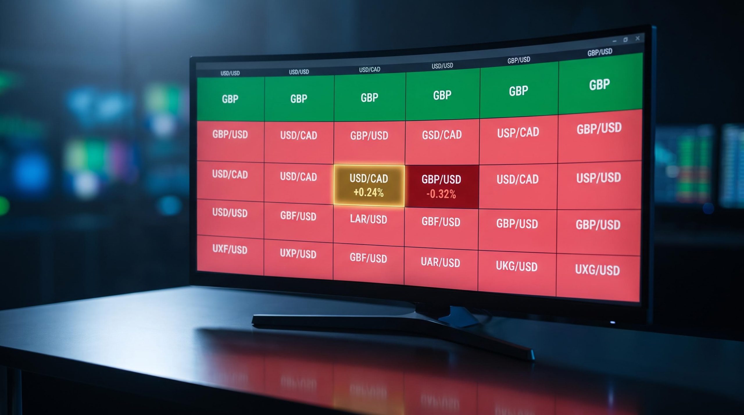
On 2 October 2026, the US Dollar did something that looks impossible on the surface. It rose against the Canadian Dollar and fell against the British Pound, the Australian Dollar, the Japanese Yen, the Swiss Franc, the Euro, and the New Zealand Dollar, all in the same session.
So which is it? If the dollar is “strong,” why was it losing ground to five major currencies at once while gaining on only one? That contradiction is not a glitch, and it is not a rare event.
It is how currency markets actually work most of the time, and the data behind it comes straight from the FXStreet currency heat map: USD up roughly +0.24% versus the Canadian Dollar, down about -0.32% versus the Pound. Reading that correctly means letting go of the idea that the dollar is simply strong or weak on any given day.
Here is what you will be able to do after this: look at a currency heat map and correctly diagnose what is driving each pair’s move, instead of drawing one misleading verdict about “the dollar” from a grid that is actually telling seven different stories.
What the heat map actually showed in this session
Start with the numbers themselves, before any explanation. The table below shows how the US Dollar moved against each of the seven major currencies in this single session, straight from the FXStreet heat map.
| Currency Pair | USD Direction | Session Move |
|---|---|---|
| USD/CAD | USD appreciated | +0.24% |
| GBP/USD | USD declined | -0.32% |
| AUD/USD | USD declined | -0.27% |
| USD/CHF | USD declined | -0.23% |
| USD/JPY | USD declined | -0.16% |
| EUR/USD | USD declined | -0.10% |
| NZD/USD | USD declined | -0.09% |
The headline finding jumps out once the data is laid flat. The US Dollar gained against exactly one currency, the Canadian Dollar, while slipping against every other major on the board.
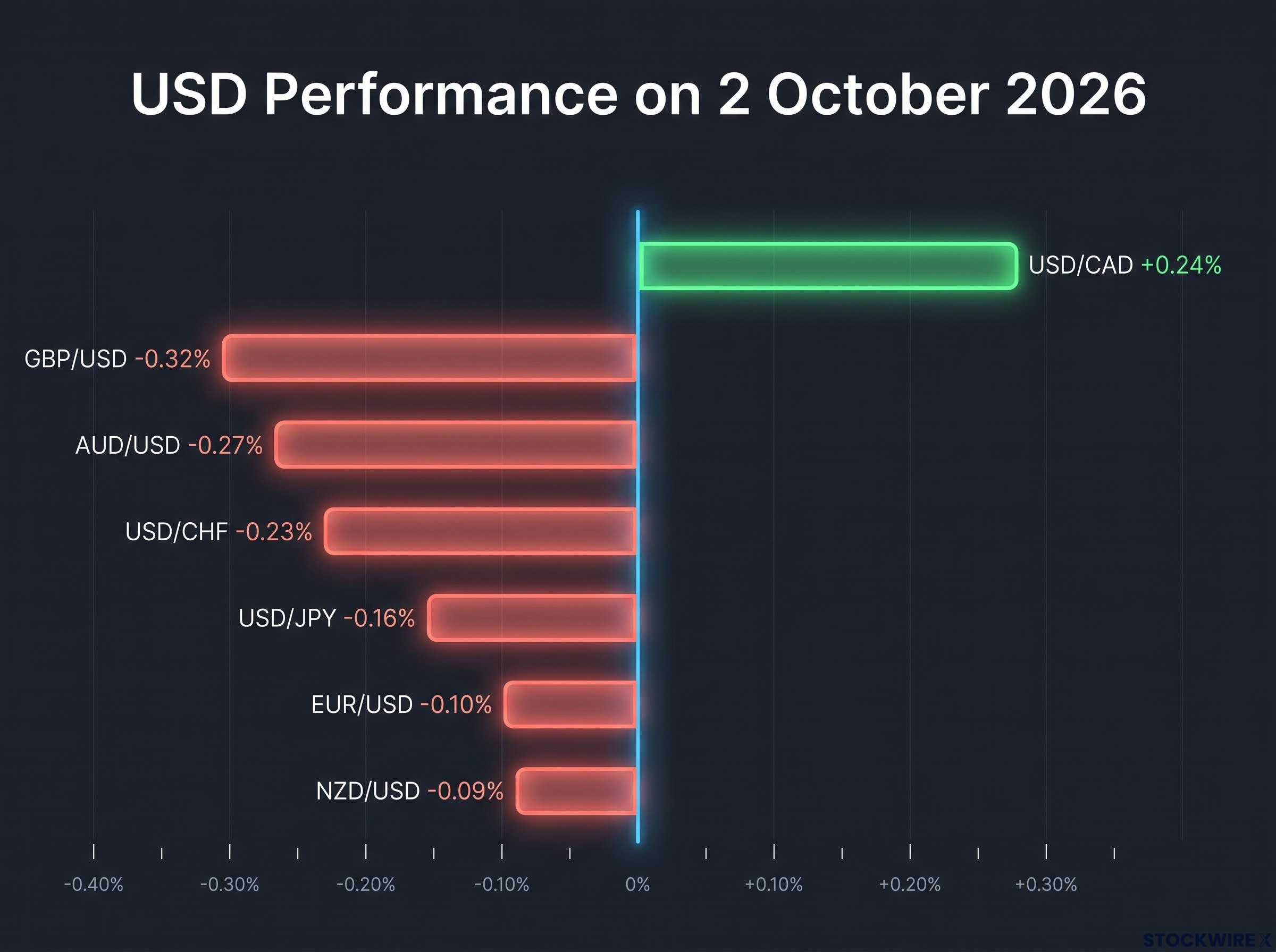
The British Pound was the standout on the other side. It did not just climb against the dollar; it posted gains against every listed currency, making it the single strongest performer of the session.
GBP/USD anchor level Sterling traded around 1.3235 on 2 October 2026, up roughly +0.30% on the day. That magnitude matters: it is the size of a meaningful intraday move, not noise, which is what makes the Pound’s broad outperformance worth explaining rather than dismissing.
This configuration has a name among traders: a “mixed dollar” session. And it carries a direct lesson for how you read these grids.
You cannot form a useful view of “the dollar” from a single row. Each cell in that table has its own story, driven by its own pair-specific forces, and reading across them as one unified verdict is exactly the shortcut that leads to the wrong conclusion. The rest of this piece unpacks the two most instructive stories in that grid, the Canadian Dollar’s isolation and the Pound’s strength, before showing how to read the whole thing properly.
When big ASX news breaks, our subscribers know first
Why the Canadian Dollar fell behind while others held firm
The Canadian Dollar’s weakness was not a dollar story at all. It was a rate story, and specifically a story about one widening gap.
In late September 2026, the Federal Reserve raised its target rate while the Bank of Canada held its policy rate at 2.25%. That single divergence, a Fed hike against a Bank of Canada pause, widened the interest-rate differential between the two economies and pushed USD/CAD to roughly 1.4150 on 28 September 2026, its sixth consecutive day of gains for the dollar against the loonie.
The mechanism driving USD/CAD in this session is a textbook example of central bank divergence, where the forward rate path gap between two central banks reprices a currency pair independently of what the dollar is doing everywhere else, sometimes for weeks at a stretch.
The mechanism here is worth understanding because it repeats constantly. When one central bank offers a higher return on its currency than another, capital tends to flow toward the higher-yielding side.
A widening rate gap therefore creates directional pressure on the pair, independent of whatever the dollar is doing elsewhere. Scotiabank strategists described the wider US-Canada spreads as “a major headwind for the CAD,” noting the currency was “under pressure against the USD and lagging most G10 peers.”
That lagging is the key word. The Canadian Dollar was not weak because the dollar was broadly strong; it was weak because its own yield disadvantage had grown while other currencies had their own, more supportive, stories running.
When oil stops being a tailwind for CAD
You might expect oil to rescue the Canadian Dollar here, given Canada’s status as a major energy exporter. It did not, and the reason reveals why commodity linkages are conditional rather than automatic.
Scotiabank’s April 2026 analysis found that the Canadian Dollar responds far more strongly to oil price increases driven by genuine demand growth than to those driven by supply disruptions. When oil rises because the world wants more of it, that signals a healthier global economy and tends to lift CAD. When it rises because supply is constrained, the signal is far weaker.
In late September 2026, the conditions worked against CAD on every front:
- The oil strength on offer was largely supply-driven rather than demand-driven
- The global demand backdrop was soft
- US safe-haven flows were running concurrently, pulling capital toward the dollar
Safe-haven flows into the dollar during periods of soft global demand complicate commodity-currency readings because they layer a risk-sentiment effect on top of the rate and commodity signals, making it harder to isolate which force is actually doing the work on any given day.
That combination, in Scotiabank’s framing, argued for a “subdued CAD response” to energy prices. Here is what it means for you: if you see oil rising and expect the Canadian Dollar to follow, check first whether the move reflects real demand growth or a supply shock, because only the former reliably feeds through to CAD strength. In a mixed-dollar session, CAD underperformance is more often a rate story than an oil story, and conflating the two is how traders end up systematically mispositioned.
What drove the British Pound’s broad outperformance
At first glance, the Pound looked genuinely strong. It topped the board, gaining against every listed currency, and closed near 1.3235 against the dollar, up about +0.30%.
Look closer, though, and most of that strength was borrowed. According to Pound Sterling Live, sterling’s intraday gain on 2 October 2026 was driven mainly by a weak September US payrolls report that reduced expectations for a Federal Reserve rate hike in October. The softer US data took the shine off the dollar, and the Pound recovered into the space that opened up.
The causal chain ran in a specific order:
- A weak US payrolls release landed below expectations
- Markets pared back the probability of a Fed rate hike in October
- The US Dollar Index pulled back from a two-month high
- Sterling recovered intraday, even though its broader multi-week trend still favoured the dollar
Forward rate expectations, not the current official rate level, are what currencies actually price: a US payrolls miss moved GBP/USD more than the Fed’s formal rate position because markets had already absorbed the known rate and were repricing the implied path for the next several meetings.
That sequence matters because it reframes what the heat map was showing. The Pound did not surge on its own fundamentals so much as the dollar’s yield advantage briefly narrowed when US data disappointed.
There was, however, a second and more genuinely sterling-specific layer of support.
BoE rate-path pricing The swaps curve in late September 2026 implied roughly 100 basis points of further Bank of England hikes over the next 12 months, taking the rate toward approximately 4.75%. That expectation gave the Pound a tailwind distinct from the US-weakness story, which is why it managed to firm against every currency, not just the dollar.
Even so, the broader picture was not uniformly bullish for sterling. TradingKey noted on 1 October 2026 that GBP/USD was trading near three-month lows despite its intraday recovery, a reminder that a strong single session can sit inside a weaker multi-week trend.
What this tells you is simple and important. The Pound appearing at the top of a daily heat map does not mean sterling has turned a corner. It may just mean US data disappointed enough to briefly dull the dollar’s yield edge, a move that can reverse the moment the next data print arrives. Treating a counterparty-driven rally as a trend signal is the error this distinction prevents, and it directly affects whether you enter, hold, or avoid a position.
How currency heat maps actually work, and where readers go wrong
A currency heat map is a simpler tool than it looks, and understanding what it measures is the first step to not misusing it.
The grid displays the percentage change in each major pair from a fixed reference point, typically the daily open, shown as relative performance rather than absolute price levels. It tells you which currencies are gaining and losing ground against each other over a defined window, and by how much. What it does not tell you is why, or whether the move will last.
That gap between what the tool shows and what traders assume it shows is where most errors live. The session in this article is a clean illustration: USD up against CAD only while down against five others is a mixed-dollar reading, not a sign of uniform dollar weakness. Scotiabank and Bank of Canada commentary both point to the same underlying reason, that pair-specific factors like rate differentials and commodity sensitivity routinely dominate over any single dollar verdict.
One more practical caveat shapes how much weight any reading deserves. Thin liquidity periods, such as early Asian or late US hours, can produce distorted percentage moves that reverse quickly, while the London-New York overlap tends to generate more informative price action. The same +0.30% move means different things depending on when it happened and which pair it belongs to.
Three misreading risks to avoid on any given session
The table below captures the three errors that most often turn a heat map from a useful screen into a misleading signal.
| Common misreading | What it misses |
|---|---|
| Treating USD down against GBP as proof “the dollar is weak” | The dollar was simultaneously up against CAD; the Pound’s move was driven by weak US payrolls narrowing the yield gap, not broad USD collapse |
| Assuming a top-performing currency is strong on its own fundamentals | Sterling’s gain was largely a counterparty effect from softer US data, sitting inside a broader GBP downtrend near three-month lows |
| Reading a single-session snapshot as a trend signal | USD/CAD rose for six straight days on rate spreads, while GBP firmed in one session against a weaker multi-week backdrop; a snapshot cannot distinguish the two |
The practical takeaway is to treat the heat map as the question, not the answer. It tells you which pairs are moving and deserve a closer look. It does not tell you what trade to put on. Read alongside rate expectations, the data calendar, and session liquidity, it becomes a sharp diagnostic. Read alone, it becomes a trap.
Making sense of a mixed-dollar session before the next one opens
The single most useful shift you can make is to stop asking “is the dollar strong today?” and start asking “which specific factor is driving each pair, and does that factor have staying power?” The first question invites a binary verdict the data rarely supports. The second leads to a decision you can actually act on.
Every mixed-dollar session, including this one, is produced by four recurring mechanisms. When you hit a confusing heat map, run through them in order:
- What is the rate-differential picture for this pair? A Fed hike against a Bank of Canada hold is what isolated CAD here.
- Did a specific data release drive the move? Weak US payrolls, not UK strength, is what lifted the Pound.
- Is there a commodity or structural linkage at play? Oil failed to support CAD because the move was supply-driven, not demand-driven.
- Is risk sentiment distorting the reading? Safe-haven flows into the dollar were muting CAD’s usual response to energy prices.
The durability point is what makes this framework worth keeping. USD/CAD extended gains for six consecutive days through 28 September 2026 on rate-spread dynamics alone, proof that a pair-specific driver can sustain a directional move even when the broader dollar picture is mixed.
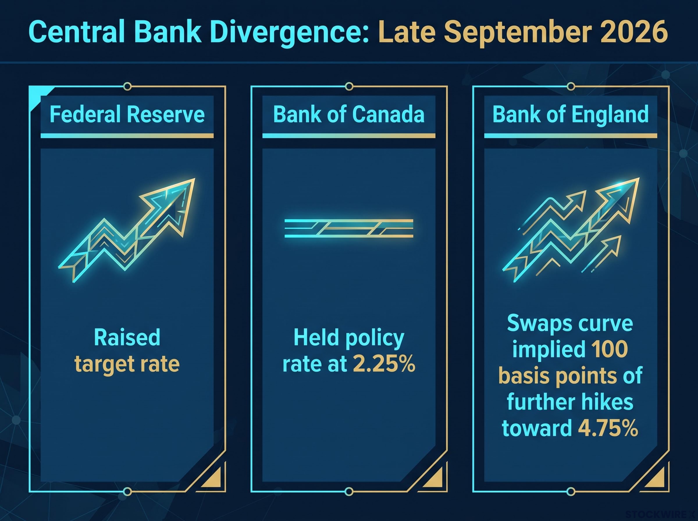
The same CAD-versus-GBP split visible here will recur whenever Fed and Bank of Canada policy paths diverge and US data stays volatile. That is why this is a reusable diagnostic, not a one-day explanation.
For readers wanting to apply this framework before the next scheduled release, our comprehensive walkthrough of macro event positioning covers how to check OIS curve pricing and options risk-reversal skew ahead of any data print, so the heat map reading starts before the number lands.
This article is for informational purposes only and should not be considered financial advice. Investors should conduct their own research and consult with financial professionals before making investment decisions. Past performance does not guarantee future results, and currency movements are subject to market conditions and various risk factors.