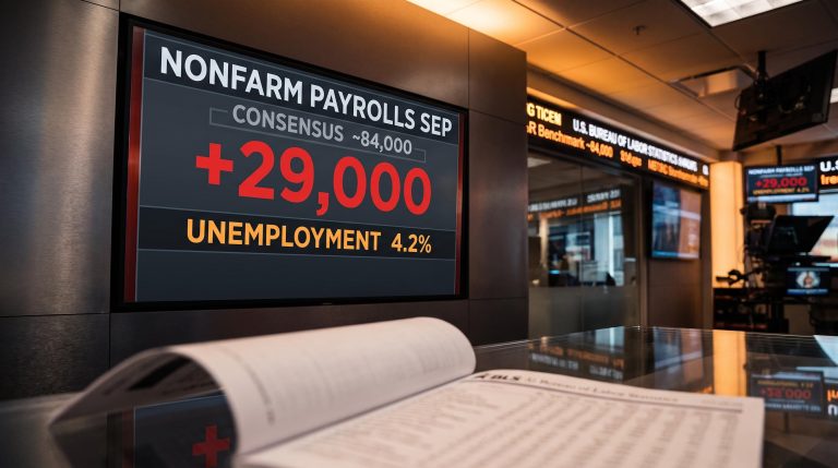
The September jobs report was the worst in recent memory. Employers added just 29,000 positions against a consensus near 90,000, unemployment ticked up to 4.2%, and wage growth slowed to a crawl. Investors did not flee.
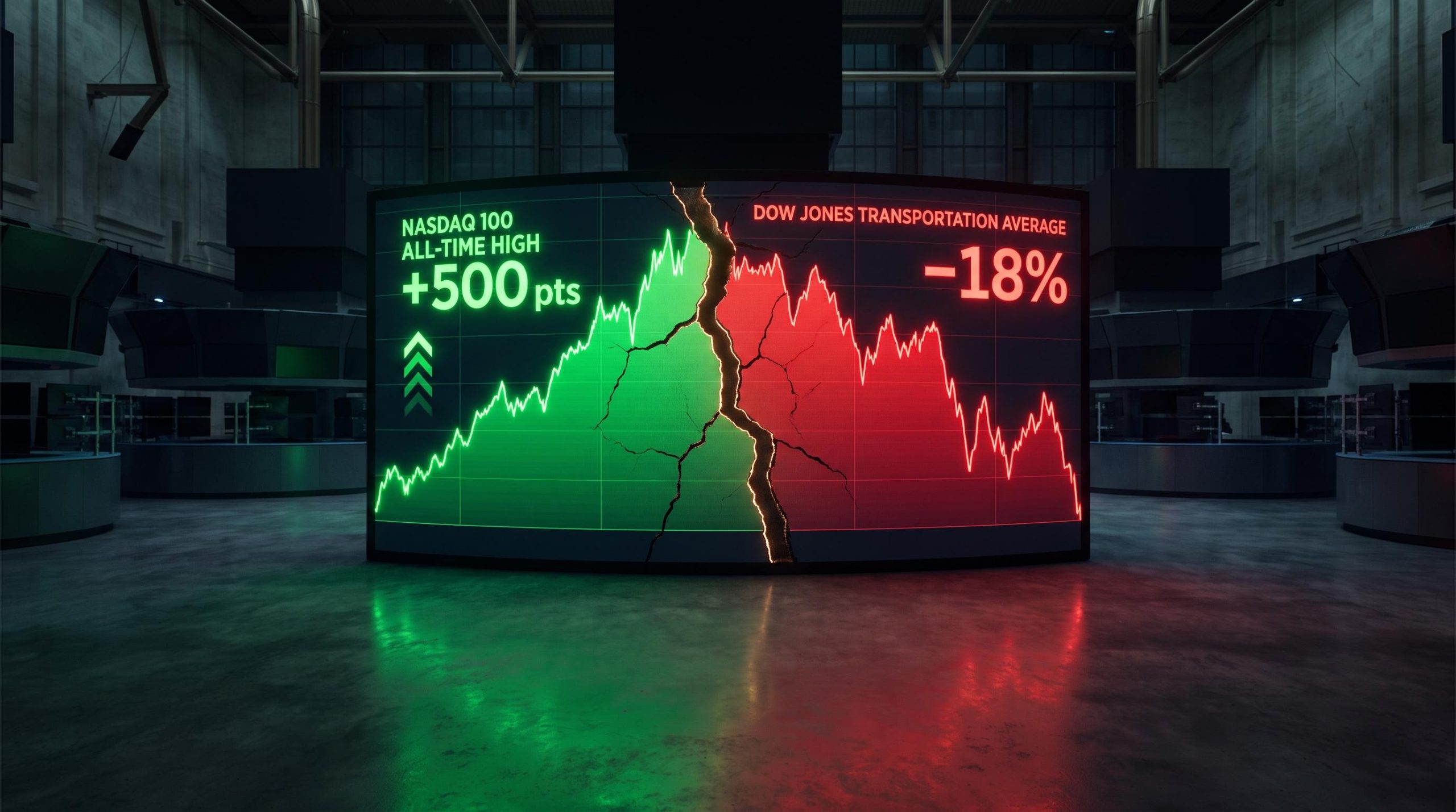
They bought. The Nasdaq 100 futures broke to all-time highs, gaining nearly 500 points, more than 1.5% on the session.
That contradiction is not a one-day quirk. The jobs report lit up a fault line already running through the market: technology-oriented instruments setting records while Dow-linked indexes sit well below their peaks, technical damage quietly accumulating beneath the surface.
This analysis maps that fault line with precision. Here is what the specific drawdown levels, the step-by-step semiconductor recovery, and the competing interpretations of the divergence actually tell you about which market you are looking at, and who the data suggests is right.
Why a bad jobs report became a good day for markets
The logic looks absurd on the surface. A labour-market miss this size should signal a weakening economy, and a weakening economy should worry equity holders. Instead, stocks rallied.
The mechanism has nothing to do with economic optimism. Softer labour data lowers the perceived path of future short-term rates and bond yields, which eases pressure on the Federal Reserve to keep policy restrictive. Lower expected rates lift the present value of future earnings, and that effect is strongest for long-duration assets: growth and technology stocks.
The Fed rate-path transmission channel also explains why payrolls as a lagging indicator can consistently produce counterintuitive equity reactions: by the time the Bureau of Labor Statistics publishes a monthly print, markets have already priced months of forward conditions, leaving the report’s primary function as a policy-expectations update rather than new economic information.
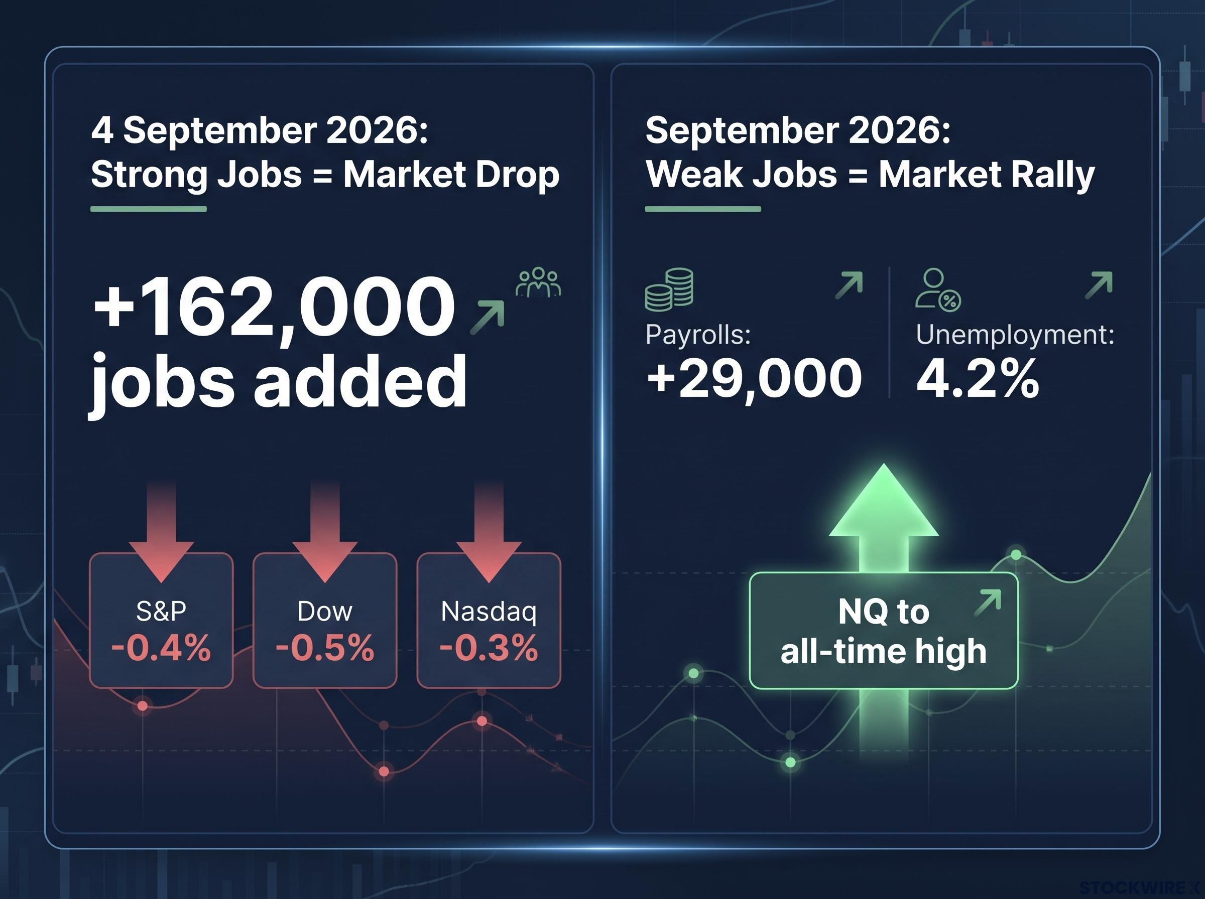
September’s numbers delivered exactly that reaction. Payrolls of 29,000 against a consensus near 88,000-90,000, unemployment at 4.2% versus 4.1% expected, and average hourly wages below forecast all pointed the same direction. The bond sell-off eased, and E-mini S&P 500 futures rose while Nasdaq futures added gains before the larger NQ move.
The mirror image had played out only weeks earlier. On 4 September 2026, a stronger-than-expected report showing 162,000 jobs added sent equities lower: the S&P 500 fell 0.4%, the Dow 0.5%, and the Nasdaq 0.3% as rate-hike odds climbed.
| Indicator | Actual | Expected | Market Response |
|---|---|---|---|
| Nonfarm payrolls (Sept) | +29,000 | ~+90,000 | Equities rallied, NQ to all-time high |
| Unemployment rate (Sept) | 4.2% | 4.1% | Bond sell-off eased |
| Average hourly wages (Sept) | Below forecast | Above actual | Reinforced soft-landing read |
| Strong print (4 Sept) | +162,000 | Below actual | S&P -0.4%, Dow -0.5%, Nasdaq -0.3% |
LPL Financial chief economist Jeffrey Roach said at the time that the strength of the September 4 payroll report made a rate hike “increasingly likely.” That comment frames the contrast perfectly: good labour news was bad for stocks, and bad labour news was good.
Here is the part that matters for everything that follows. The same mechanism that turned a weak jobs number into a rally is the mechanism that favours growth stocks over cyclicals. That asymmetry is why the divergence ahead is structural, not a single day’s anomaly.
When big ASX news breaks, our subscribers know first
The fault line: where the Nasdaq went one way and the Dow went another
The NQ’s roughly 500-point gain to record territory told one story. The Dow complex told another entirely.
Index construction differences between the price-weighted Dow and the market-cap-weighted Nasdaq amplify the visual divergence: a single high-priced Dow component can offset broad weakness in a way that the Nasdaq’s weighting never permits, making the two benchmarks structurally incapable of moving in lockstep even when underlying sector conditions are identical.
As the Nasdaq 100 printed fresh highs, the Dow Jones Industrial Average (DJIA) sat about 5% below its August peak as of 28 September 2026. The two more economically sensitive Dow averages had fared far worse, and their distances from prior peaks are where the real signal lives.
- The DJIA was off roughly 5% from its August high.
- The Dow Jones Transportation Average (DJTA) was down approximately 18% from its April peak, fell 1.2% in the week ending 26 September 2026 to close near 19,478, and broke below its 200-day moving average.
- The Dow Jones Utility Average (DJUA) was down roughly 15% from its peak, plunging 4.5% in that same week to close near 1,007. It had already been down 6.8% from its February peak while the DJIA was still hitting bull-market highs.
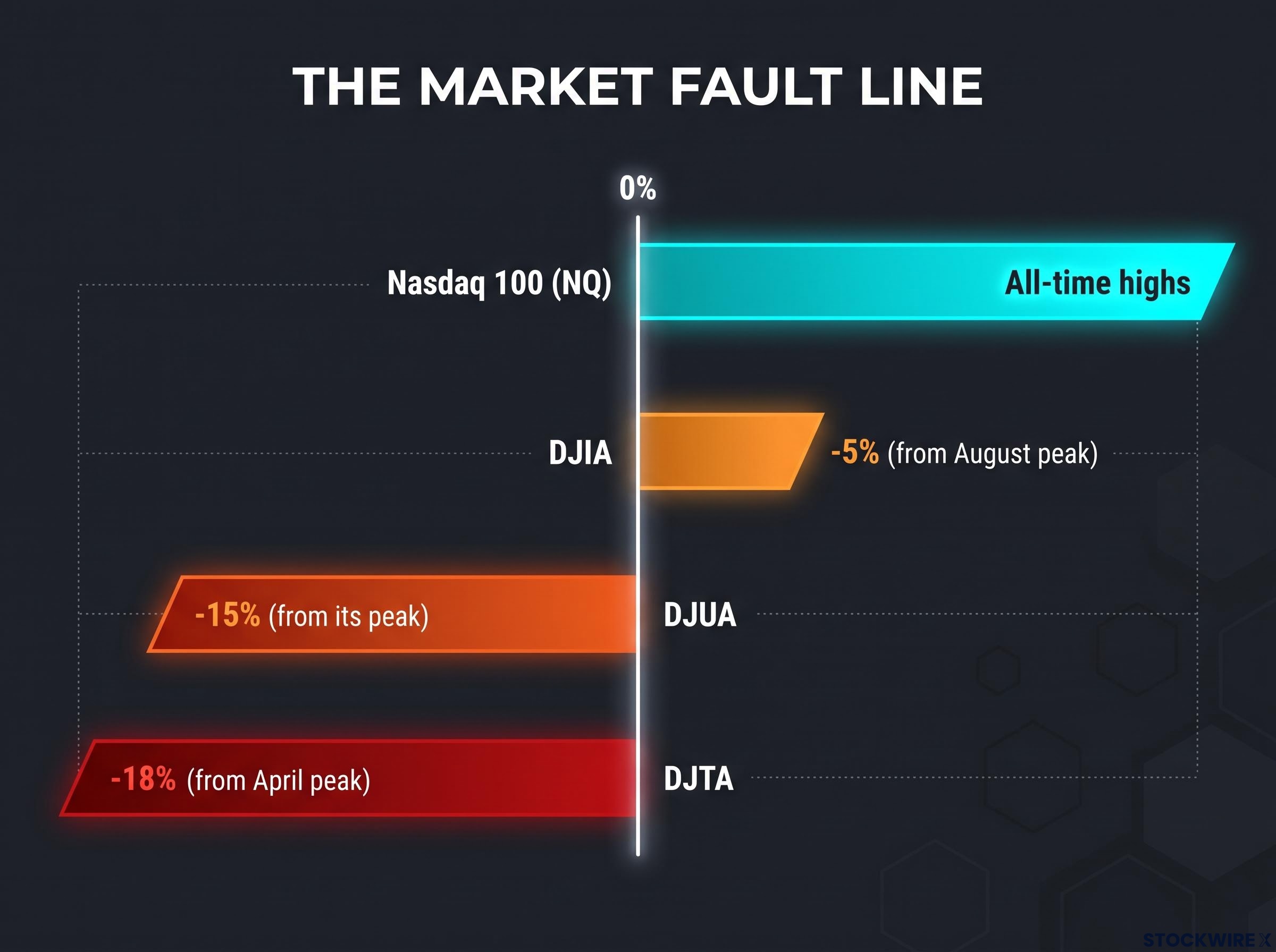
When Transports and Utilities are already down 15-18% from their peaks while the headline index is off only 5%, this is not sector-rotation noise. It is a pattern that has historically appeared at inflection points, and how you read it changes how a portfolio should be positioned.
According to HDFCSky’s 26 September 2026 note, the splits trace to clear causes: the DJUA fell on rate sensitivity, the DJTA on goods-demand concerns and fuel costs, while industrial Dow components held up thanks to technology and aerospace exposure.
Two ways to read the same chart
The first camp sees a warning. Investech Research, in its 28 September 2026 note, frames the divergence among Industrials, Transports, and Utilities as an internal warning signal rooted in market history.
Investech Research notes that Transports are “more economically sensitive” and Utilities “the most interest-rate sensitive,” and that both often peak ahead of the DJIA at major market tops. On that reading, the current pattern is a structural sign of weakness beneath the headline indexes.
The second camp sees a regime shift. VanEck’s argument is that tech leadership reflects where capital is being deployed, not broad deterioration. The engine is an artificial intelligence capital-expenditure boom: consensus 2026 capex for the five largest US hyperscalers stands at roughly $844 billion, up 81% year-on-year.
On VanEck’s view, cyclicals lagging tech is a function of that capital concentration, making the divergence a rotation rather than a topping signal.
Neither camp is obviously wrong, and the indicators each would watch differ. The warning camp watches the DJTA and DJUA for continued breakdown. The regime-shift camp watches hyperscaler capex guidance for any crack in the AI build-out thesis.
How semiconductors fit in: a recovery built in steps, not a snapback
Semiconductors are the cleanest test case for the regime-shift thesis, and their recent history contains a paradox worth sitting with.
In Q2 2026, semiconductor industry earnings surged 131%, driven by AI demand and large-scale data-centre investment. Over the same period, the VanEck Semiconductor ETF (SMH) fell 23%.
VanEck reads that disconnect not as a demand collapse but as a repricing of near-term cash flows and valuations. In other words, the market was not pricing semis on current earnings. It was pricing them on the sustainability of the AI capex cycle, which makes SMH acutely sensitive to any shift in hyperscaler spending plans.
Hyperscaler capex sustainability is the structural question underneath the semiconductor recovery: Goldman Sachs projects that AI capital expenditure among the big four now absorbs 93-94% of their operating cash flow, up from 33-40% in 2022-2023, leaving almost no financial buffer if revenue from AI deployments disappoints the scale of investment already committed.
The recovery that followed looked nothing like the NQ’s single-session breakout. It came in steps.
- Q2 2026: SMH fell 23% despite 131% earnings growth, a fundamentals-versus-price dislocation.
- July 2026: the $543 support zone was flagged as a key technical level. TechTimes, on 30 July 2026, characterised the setup as requiring high risk tolerance from investors, noting the volatile and technically complex chart following the sharp breakdown.
- 14 September 2026: SMH set a period low in the mid-$530s.
- 29 September 2026: SMH reached a period high near late-September levels, recovering materially from the prior low.
- Through 30 September 2026: SMH showed strongly positive year-to-date and one-year returns, with a one-year return exceeding 86% through September 2026.
The distinction matters. A step-by-step recovery of higher lows and higher highs carries different technical weight than a violent repricing, and critically, SMH has not returned to all-time highs the way the NQ has. The semiconductor recovery is real but incomplete.
The risks that could reverse the recovery
The same forward-looking sensitivity that powers the bull case is the recovery’s weak point. Two specific watch-points matter most.
The first is hyperscaler capex revision risk. VanEck warns that any downward revision in guidance from Microsoft, Meta, Alphabet, or Amazon would hit SMH “first and hardest.”
VanEck’s warning is direct: with hyperscaler capex at roughly $844 billion and near-term free cash flows pushed negative, a cut to spending guidance from the big four would pressure SMH disproportionately.
The second is the demonstrated fragility of the sector itself. A 23% drawdown during fundamentally strong conditions proves semiconductors can correct sharply even when the demand thesis is intact. If SMH loses the $543 support zone, the recovery narrative changes.
What the divergence pattern tells you about where the market actually stands
Pull the three threads together and the conclusion is uncomfortable but clear: the market is not moving as a single unit, and reading it as though it is leads to misdiagnosis.
The jobs-report mechanism explains why. Fed rate-path sensitivity flows unevenly through the market, lifting long-duration growth assets while leaving rate-sensitive and cyclical sectors exposed. The sectors showing the most stress, Utilities and Transports, are precisely the ones that mechanism punishes.
That is why the bull case and the bear case are both data-supported. The resolution depends on a handful of specific variables, not on general market mood.
| Bullish resolution conditions | Bearish resolution conditions |
|---|---|
| AI capex holds near the ~$844B consensus | Hyperscaler capex guidance is cut |
| Rate expectations continue to ease on soft labour data | Long-term yields stay elevated despite softer jobs data |
What you should watch, specifically, is a short list of instruments that will show the evidence first.
- The DJTA relative to its 200-day moving average, which it has already broken below.
- The DJUA and whether it recovers from its 4.5% weekly drop to near 1,007.
- SMH relative to the $543 support zone.
- Hyperscaler capex guidance in upcoming earnings, the single most important forward variable for the tech side of the trade.
The summary spread captures the whole tension: the NQ at all-time highs against a DJIA 5% below its August peak. Both are true at once, and that is the point.
This article is for informational purposes only and should not be considered financial advice. Investors should conduct their own research and consult with financial professionals before making investment decisions. Past performance does not guarantee future results. Financial projections are subject to market conditions and various risk factors.
Watching the right signals in a split market
The post-jobs-report rally was never a simple “markets are up” story. It exposed a market that is not moving as a unit, and that structural fact matters more than the direction of any single session.
So the useful posture is not to pick a camp before the evidence resolves. It is to treat this as a dual-signal environment, monitoring both the health of the Dow complex and the capex variables driving tech, rather than placing passive confidence in any one index-level reading.
The core divergence, in one line: the NQ at all-time highs, the DJTA down roughly 18% from its April peak, and the DJUA down roughly 15% from its peak. Three indexes, three different markets.
For a reader holding exposure across both tech and more traditional equities, that argues for active monitoring of the specific watch-points above rather than assuming the headline index tells the whole story.
Q4 earnings season is the next real test. Capex guidance from Microsoft, Meta, Alphabet, and Amazon is the single variable most likely to either resolve the split or deepen it, and it will tell you which of the two camps the data is backing.
For investors wanting to stress-test the bull case before Q4 earnings, our full explainer on AI capex concentration risk details how US IT spending at 4.9% of GDP already exceeds every prior technology investment peak, including the dot-com era, and identifies which sectors capture the rewards versus where the risks concentrate.