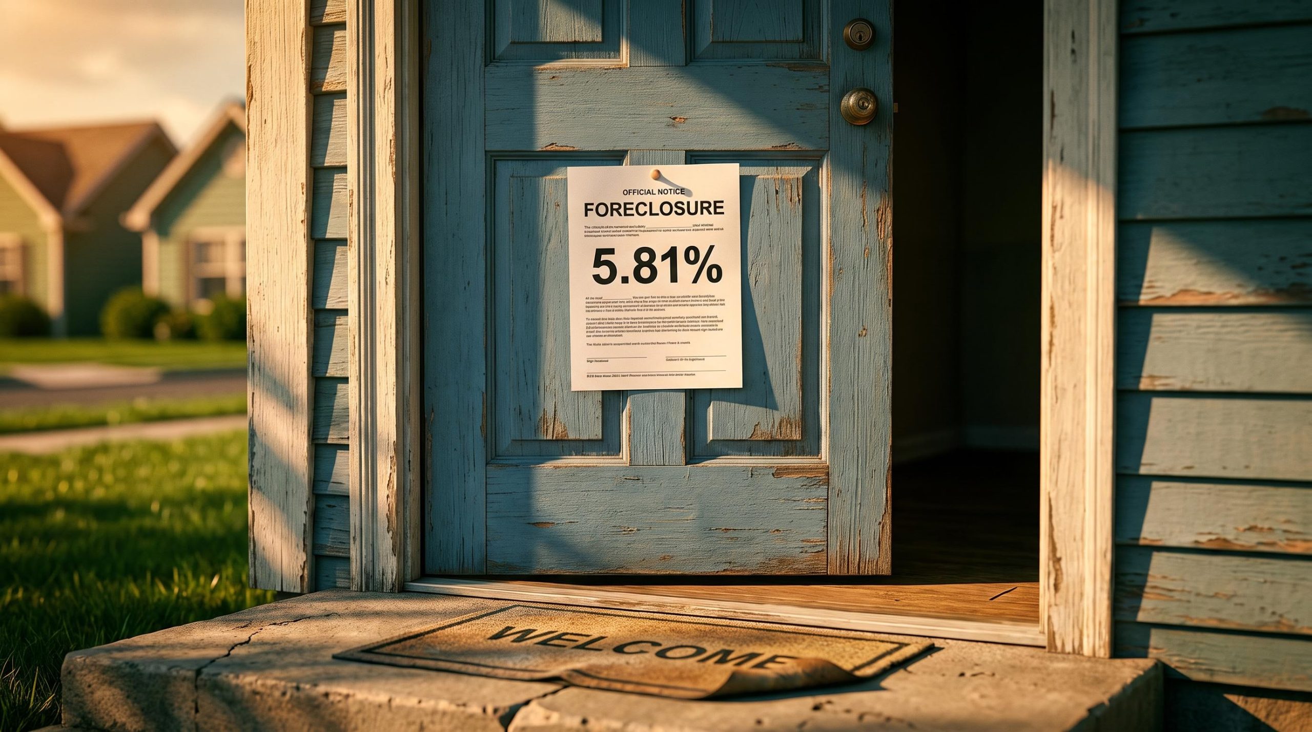
Most Americans treat a fixed-rate mortgage as a foreclosure-proof shelter. Lock in a low rate for 30 years, the thinking goes, and the payment can never move against you.
That belief did not survive the last crisis, and the current delinquency data suggests it is about to be tested again.
In Q1 2026, FHA serious delinquencies reached 5.81%, and the gap between FHA and conventional delinquency rates pushed past 900 basis points. Foreclosure filings for the first half of the year totalled 227,548 properties, up 21% on the same period in 2025 and 28% above 2024.
Those numbers do not yet look like a crisis. But the sequence in which they are rising, and the borrower segments leading the move, follow a recognisable pattern: the same two-phase progression that ran ahead of the broader collapse of 2007 to 2010.
This piece gives you a framework for reading that sequence. After it, you will be able to see which borrowers sit in the first wave of stress, which sit in the second, why fixed-rate status confers no immunity, and what the data actually says about how far the cycle has already travelled.
The first wave is already running: what the FHA delinquency surge tells us
Start with one number, because it does more diagnostic work than any other in the current data. As of the end of Q1 2026, the delinquency rate on FHA loans sat more than 900 basis points above the conventional rate, according to Mortgage Bankers Association National Delinquency Survey commentary.
The signal that matters most A spread exceeding 900 basis points between FHA and conventional delinquency is not a data anomaly. It is the structural signature of Phase One.
Compare that to the VA-conventional spread, which stood at roughly 225 basis points over the same period. FHA is not simply a higher-risk segment sitting a notch above everyone else. It is running an entirely different stress trajectory.
| Loan Segment | Delinquency Metric | Value | Period | Source |
|---|---|---|---|---|
| FHA | Serious delinquency rate | 5.81% | December (Q1 FY2026) | HUD FHA MMI report |
| FHA vs conventional | Delinquency spread | Over 900 bps | Q1 2026 | MBA NDS |
| VA vs conventional | Delinquency spread | ~225 bps | Q1 2026 | MBA NDS |
| All loans | Overall delinquency rate | 4.44% | Q1 2026 | MBA NDS |
The reason FHA leads every stress cycle is structural, not accidental. FHA borrowers carry lower incomes, higher debt-to-income ratios, and smaller down payments than conventional borrowers, with a heavier concentration of first-time buyers.
They also pay upfront and ongoing mortgage insurance premiums, which lift the effective monthly burden. Add thin cash reserves, and a modest income shock or a jump in living costs converts quickly into a missed payment.
There is a real-time layer to this too. Analyst Melody Wright, tracking her own servicing portfolio, flagged accelerating FHA foreclosure referral cases through July and August of the referenced period, ahead of the public data catching up.
What the spread tells you is this: government-backed lending has already become the system’s primary stress absorber. The overall delinquency rate of 4.44% in Q1 2026, easing slightly to 4.37% in Q2 2026, looks calm precisely because the pressure is concentrated in one corner and has not yet transferred outward. When FHA referral velocity picks up before the quarterly reports confirm it, a broader phase is usually forming underneath.
The concentration pattern visible in FHA data mirrors what broader consumer debt stress indicators show: headline aggregate figures look manageable precisely because pressure has pooled in specific borrower cohorts, particularly younger, lower-income, and subprime households, while higher-credit segments hold firm and pull the composite reading down.
When big ASX news breaks, our subscribers know first
What COVID-era program expiries and rising auction volumes reveal about the cycle’s clock
A delinquency cycle builds beneath the surface long before the filing data registers it. The pressure valve for the current cycle was the wind-down of COVID-era loss-mitigation programs, and that valve is now open.
For several years, forbearance and related workout options functionally suppressed the conversion of delinquency into foreclosure. Borrowers who would ordinarily have entered the filing system stayed out of it, held in place by pandemic-era relief. As those programs expire, with some cohorts not fully rolling off until the end of the referenced year according to Wright’s commentary, the buffer that kept struggling borrowers out of the pipeline is disappearing.
The filing trajectory shows what happens next, and it reads as a multi-year acceleration rather than a single spike.
| Period | Total Filings | Year-over-Year Change | Completed REO | Source |
|---|---|---|---|---|
| Q1 2026 | 118,727 | +26% | Not specified | ATTOM |
| H1 2026 | 227,548 | +21% | Not specified | ATTOM |
| August 2026 | 40,277 | +13% | 5,794 (+42%) | ATTOM |
Note the different stages layered into that data. Foreclosure starts in August 2026 came to 25,894, up 7% year over year, marking loans entering the process. The compounding year-over-year pattern across Q1, mid-year, and the monthly snapshots is the tell that this is momentum, not noise.
ATTOM foreclosure rate data tracks state-level filing activity and REO completion volumes, providing the granular geographic breakdown that aggregate national figures obscure and that reveals which markets are absorbing the heaviest distressed-property supply pressure.
The single most operationally significant figure is the completed foreclosure, or REO, count. In August 2026, ATTOM recorded 5,794 completed REOs, up 42% year over year.
That number matters more than new filings because it sits at the end of the resolution waterfall. A completed REO tells you a borrower exhausted every workout the servicer offered: forbearance, partial claim, modification, the lot. It is a far more severe signal than a fresh delinquency, which still has options ahead of it.
Government auction behaviour and what discount pricing signals about supply
Who holds these loans shapes how the distressed property comes to market. Government entities (FHA, VA, USDA, Fannie Mae, and Freddie Mac) hold or guarantee roughly 85% of outstanding mortgages, according to Wright’s assessment.
That concentration creates a specific disposition dynamic. Government agencies carry high holding costs on foreclosed property and prioritise quick sale, unlike the pre-2008 private holders who applied strict capital-recovery criteria before releasing inventory.
The practical result shows up in auction pricing. Wright observed foreclosure auction bids landing around 22% below initial property valuations and roughly 10% below appraisal estimates, a concrete illustration of what quick-disposition behaviour does to price.
One further blind spot compounds the picture. Homebuilder inventory is assessed as underreported, which limits how fully anyone can read the supply-side pressure feeding into home prices and the equity buffers that determine who gets pushed into default next.
Why a fixed-rate mortgage does not protect against foreclosure
Here is the assumption this article has been quietly circling. A fixed-rate mortgage locks your payment, so the payment can never become the thing that forces you out. It is a comforting idea, and it is wrong in a specific and important way.
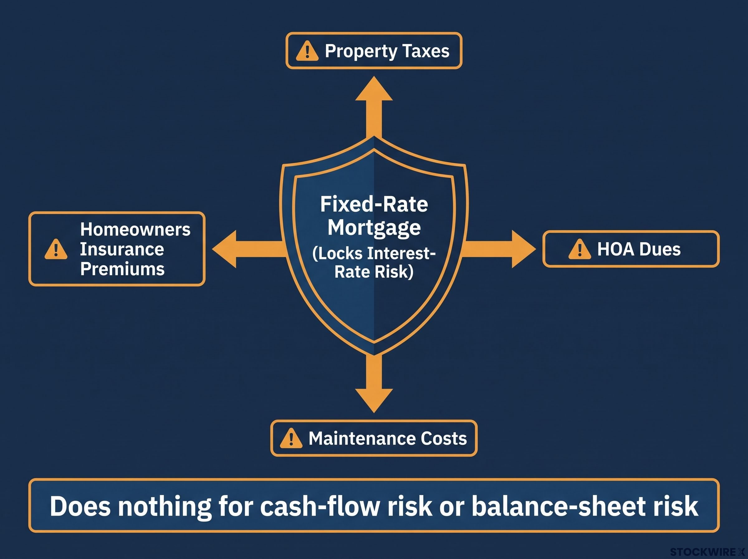
A fixed rate addresses interest-rate risk. It does nothing for cash-flow risk or balance-sheet risk, and those are the actual drivers of foreclosure.
The 2008 record makes the point clearly. Research by Atif Mian and Amir Sufi in House of Debt, alongside Federal Reserve analyses, found that local employment declines and income shocks were among the strongest predictors of default for both subprime and prime borrowers, regardless of whether the loan was fixed or adjustable. The bulk of actual foreclosures in that crisis involved fixed-rate, higher-credit borrowers who lost income, not adjustable-rate subprime borrowers alone.
Equity, not rate type, was the hinge.
The housing market freeze operating through the rate-lock mechanism also suppresses new listings, which limits the inventory available to absorb rising REO volumes and dampens the price-discovery signal that would otherwise clarify equity positions for distressed borrowers earlier in the cycle.
The critical default determinant Research at the Federal Reserve, the Urban Institute, and CoreLogic consistently identifies equity position, not rate type, as the critical determinant of default probability.
When home values fell below outstanding loan balances, fixed-rate borrowers could not refinance into cheaper terms and could not sell without crystallising a loss. Negative equity turned what might have been a temporary delinquency into a permanent default.
Then there are the costs that rise no matter how your mortgage is structured:
- Property taxes. Reassessments push these up even when the mortgage payment is frozen.
- Homeowners insurance premiums. These have climbed sharply in an inflationary environment and in higher-risk regions.
- HOA dues. Association fees rise with maintenance and reserve requirements outside the borrower’s control.
- Maintenance costs. Repairs and upkeep scale with inflation and cannot be deferred indefinitely.
Any of these can create cash-flow stress on a household with a perfectly affordable fixed mortgage payment.
What this means for you is straightforward. A 30-year fixed mortgage at a low rate is not a sufficient condition for foreclosure immunity. The questions that actually determine your exposure are income stability, the size of your equity cushion, and the trajectory of your non-mortgage housing costs. That distinction is exactly why Phase Two of the current cycle could sweep in borrowers who feel entirely secure right now.
Phase Two and the conditions that would spread stress to conventional borrowers
Phase Two is not a forecast. It is already visible in early-stage data.
Wright’s proprietary observations picked up early-stage delinquencies among higher-credit conventional borrowers during the summer of the referenced period. That makes the second phase a current reading of the data, not a speculative scenario, even though it has not yet reached the headline statistics.
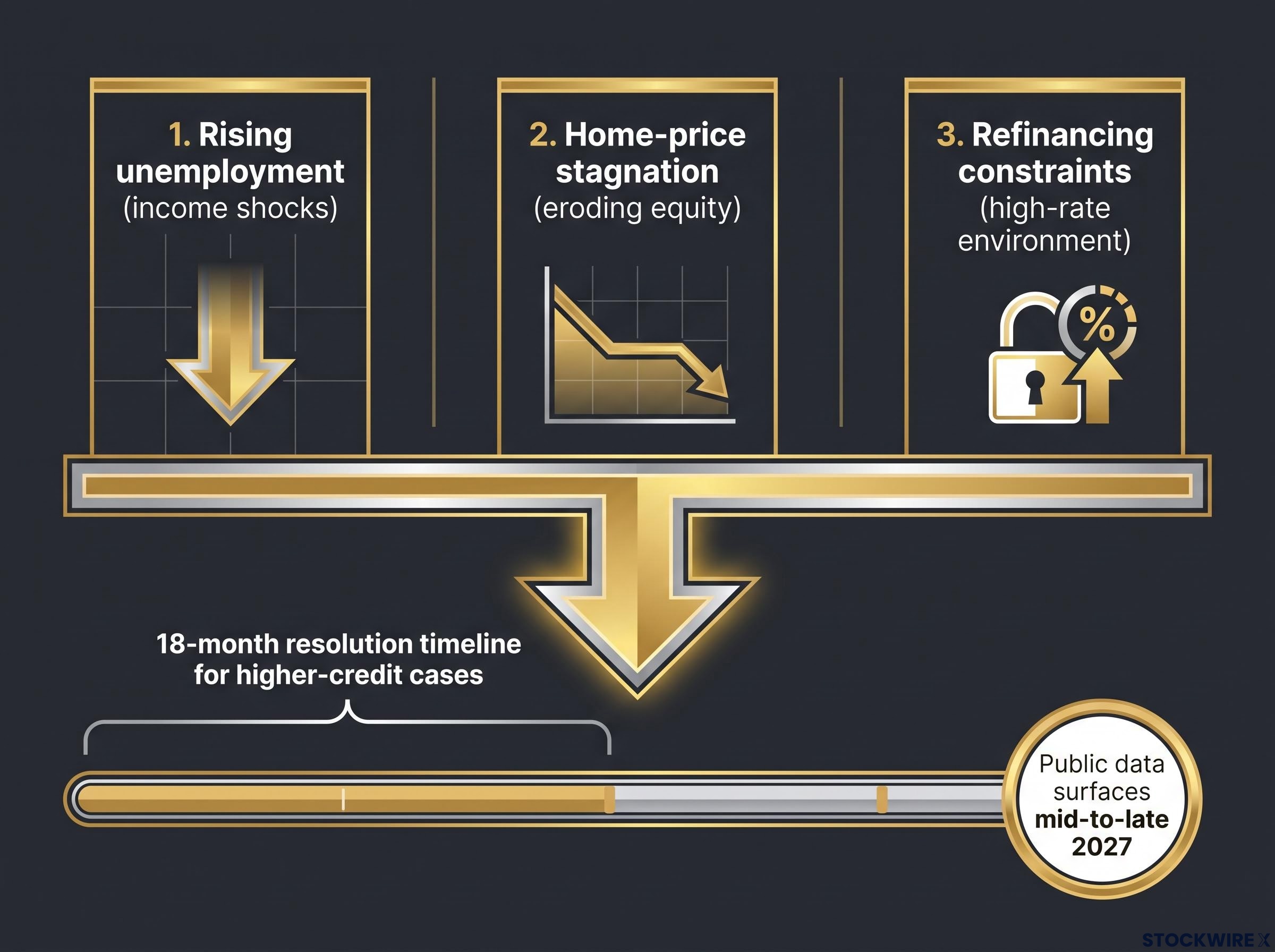
Whether that early stress becomes systemic depends on three macroeconomic triggers, listed here in order of analytic weight:
- Rising unemployment producing broad income shocks. Stable employment is the main thing insulating higher-credit borrowers. Broad-based job losses remove that insulation and push delinquency into segments that have so far held firm.
- Home-price stagnation or decline eroding equity buffers. The equity accumulated through the 2012 to 2022 appreciation cycle is the cushion keeping distressed conventional borrowers solvent. Flat or falling prices thin that cushion and reintroduce the negative-equity trap from 2008.
- Refinancing constraints in a high-rate environment. When prevailing rates sit well above the coupon on existing loans, conventional borrowers cannot refinance to lower their payment or tap equity. The escape valves that equity-rich households normally rely on close.
Refinancing constraints in the current rate environment are more binding than in any prior tightening cycle: homeowners locked in at or below 3.5% during 2020 and 2021 would pay more than $200,000 in additional lifetime interest on a $300,000 loan by refinancing at prevailing rates, closing the equity-extraction and payment-reduction channels that distressed households normally rely on.
The structure of the process is why this unfolds so slowly. Wright estimates higher-credit borrower foreclosure cases take around 18 months to resolve fully, working through the standardised loss-mitigation waterfall that governs the roughly 85% of mortgages held or guaranteed by government entities.
For you, that lag is the whole point. If Phase Two stress is already appearing in early-stage data now, the public filing data confirming it will not surface until mid-to-late 2027. Understanding the cycle’s structure today is more useful than waiting for a confirmation that arrives after the resolution clock has already run for well over a year.
What the 2008 parallel does and does not tell us
The 2008 sequence rhymes with this one. Phase One in that cycle also began with lower-credit and investor borrowers; Phase Two arrived once employment deteriorated and pulled in higher-credit households.
The institutional structure has changed, though, and that changes the timing and pricing rather than the sequence. In 2008, private holders applied strict capital-recovery criteria to distressed property. Today, government entities holding around 85% of mortgages prioritise quick disposition, which alters how inventory hits the market and at what discount.
The fragmented private-label securitisation market of the pre-2008 era has largely been replaced by government and GSE channels. That concentrates credit risk on public balance sheets with standardised loss-mitigation, which is more orderly but also creates a different kind of systemic exposure.
Keep the comparison balanced. The 2008 parallel is instructive about sequence, but the current cycle carries real buffers, notably more homeowner equity and tighter underwriting since 2010, that should alter the probable severity. The contained-stress view held by the MBA and Urban Institute reads elevated FHA delinquency as the concentration of marginal borrowers in government programs, not necessarily a leading indicator for conventional loans. That view deserves weight alongside the spillover case.
The contained-stress view draws analytical support from housing’s diminished share of GDP, which has fallen to the low single digits from a pre-GFC peak of roughly 6.5%, and from equity market readings that have largely absorbed documented housing weakness without repricing broader economic risk.
Reading the cycle correctly before the public data catches up
The two-phase framework becomes useful the moment you translate it into a short list of signals to track, rather than a story you tell after the fact. Watch these:
- FHA referral case velocity. The earliest indicator, visible in servicer data before quarterly reports.
- Completed REO monthly volumes. The severity gauge; the 42% year-over-year jump in August 2026 shows resolution failure, not just early stress.
- Early-stage conventional delinquency rates. The Phase Two tripwire, currently visible only in proprietary data.
- Employment data trends. The primary macro trigger for spillover.
- Home price trajectory in high-LTV markets. The equity-buffer test that determines who reaches negative equity.
The data-lag problem sits underneath all of them. Because higher-credit borrower cases take roughly 18 months to resolve, aggregate public statistics consistently understate where a delinquency cycle actually is when read in real time.
Why Phase Two stays hidden An 18-month resolution timeline for higher-credit cases means the cycle can be well underway before it ever appears in headline numbers.
The ATTOM trajectory (up 26% year over year in Q1 2026, up 21% across H1 2026, and 42% REO growth in August 2026) says the cycle is accelerating, not plateauing. The contained-stress reading from the MBA and Urban Institute and the broader-spillover reading from ATTOM trend data, Moody’s Analytics, and Wright’s proprietary signals are both live interpretations, and the honest position holds them side by side.
The value of the framework is not predicting severity. It is reading the sequence correctly, so you are not caught off-guard by Phase Two simply because Phase One has not yet resolved.
This article is for informational purposes only and should not be considered financial advice. Investors should conduct their own research and consult with financial professionals before making investment decisions. Past performance does not guarantee future results, and forward-looking statements are speculative and subject to change based on economic conditions and various risk factors.