The Federal Reserve just raised interest rates for the first time since 2023, and at least one prominent analyst thinks it did not go nearly far enough.
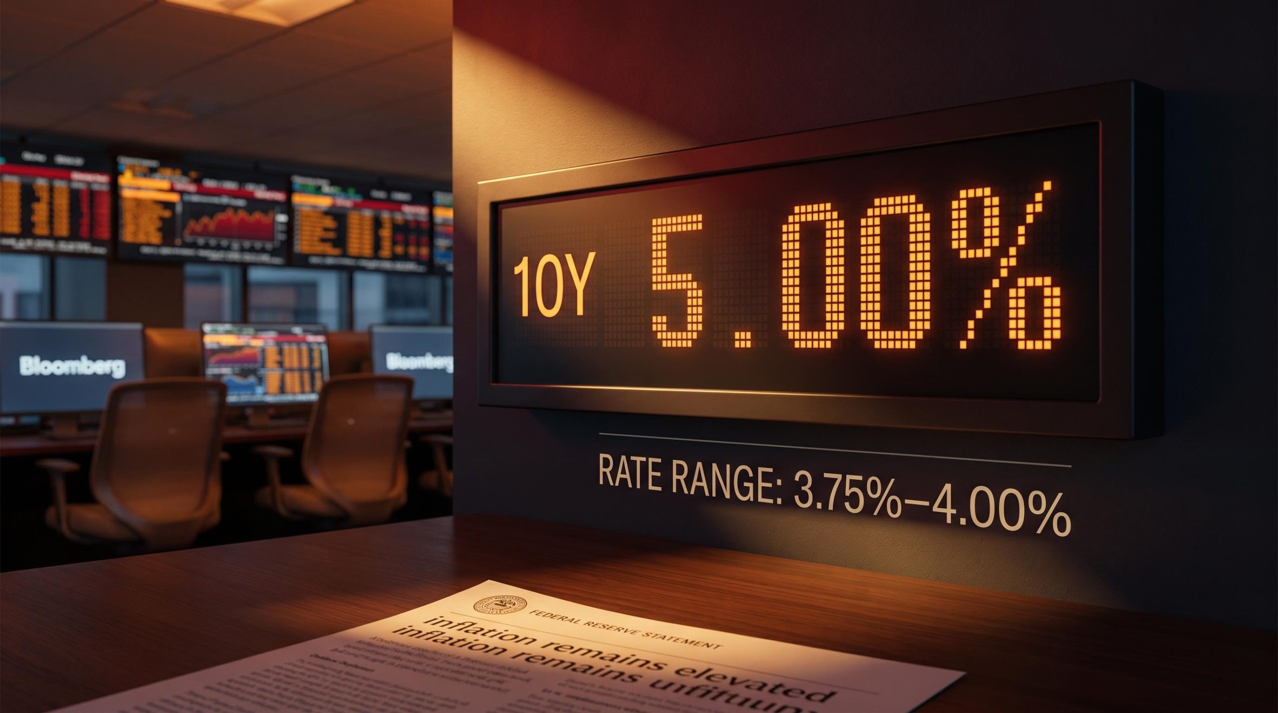
The vote was clean. All twelve members of the Federal Open Market Committee (FOMC) backed a 25 basis point increase on 16 September 2026, lifting the target range to 3.75%-4.00%. On paper, that is a picture of internal agreement.
Beneath that orderly headline sits a sharper disagreement. Sri Kumar, president of Sri Kumar Global Strategies, calls the quarter-point move too small and politically timed, and he is not the only hawkish voice questioning whether the Fed has done enough on inflation.
After reading this, you will know whose rate forecast deserves your attention heading into year-end, what the Fed’s own dot plot signals versus what Kumar is warning, and why this debate has direct consequences for the rate-sensitive parts of your portfolio right now.
A unanimous vote, a terse statement, and a bond market that wasn’t satisfied
The decision itself was the least surprising part of the day. The FOMC lifted the federal funds rate by 25 basis points to a target range of 3.75%-4.00%, the first increase since the previous tightening cycle ended in 2023, and it did so on a 12-0 vote with no dissents.
September rate hike odds swung from nearly 70% to a coin flip in under 48 hours before the meeting, a volatile setup that made the unanimous 12-0 vote and clean 25 basis point outcome more of a relief than a genuine policy surprise.
The accompanying statement gave little away. According to TD Economics, it ran to roughly 130 words, and its most direct language was that “inflation remains elevated” and that the move would support a “timelier return to the Committee’s 2 percent goal.” Economic activity was still described as expanding at a solid pace.
That brevity was not carelessness. It was a choice. The Fed pushed most of the forward-looking information into its Summary of Economic Projections rather than the statement, and the Chair reinforced the point at the press conference by grounding the decision in the Fed’s own assessment of employment and economic strength, and by cautioning that markets sometimes try to get ahead of the committee.
Markets sometimes try to “prejudge our outcomes.”
That framing tells you the Fed wanted to keep its options open rather than lock in a path it might need to revise. Which raises the question the statement was designed to avoid: how did the decision actually land?
What the bond market heard
Not the way the Fed might have hoped. The 10-year Treasury yield sat at roughly 5% on the day of the decision, and it rose rather than fell.
That direction matters. When a central bank hikes to fight inflation and long-term yields fall, markets are reading the move as a credible commitment to price stability. When yields climb after a hike, markets are signalling doubt that the action is enough.
A unanimous vote and a terse statement can project either confidence or restraint, and the 10-year at 5% tells you which reading bond markets took. This is exactly where Kumar’s critique begins: to him, rising yields after a rate hike are the market’s way of saying the step was insufficient, not reassuring.
When big ASX news breaks, our subscribers know first
Why Sri Kumar calls this hike too small and politically timed
Kumar’s starting point is straightforward. He argued the Fed should have moved 50 basis points, not 25.
His reasoning is grounded in signalling, not aggression for its own sake. A larger increase, in his view, would have demonstrated a firmer resolve against inflation and given bond markets a reason to settle, pulling yields down rather than leaving the 10-year stranded near 5%. The half-point move was the calming gesture the market was waiting for, and the Fed declined to make it.
His second objection is about communication. Kumar characterised the Chair’s press conference as the performance of someone watching the committee from the outside rather than leading it, and he argued that the near-absence of forward guidance left markets to fill the vacuum themselves.
During the press conference, the Chair resembled an outside observer rather than a committed committee member.
Then comes the more charged claim. Kumar’s explanation for the gap between what he thinks the data warranted and what the Fed delivered is political: he sees the 25 basis point decision as shaped by political considerations rather than economic necessity, consistent with a historical pattern of the Fed avoiding bold moves in close proximity to elections.
Laid out in sequence, his critique has three parts:
- The hike was too small; 50 basis points was the appropriate response to still-elevated inflation.
- The press conference offered inadequate forward guidance, leaving bond markets to guess at the reaction function.
- The restraint reflected political timing rather than the economics of the situation.
The market context makes the size of the move less of a surprise than the criticism suggests. On 11 September 2026, Kalshi’s prediction market assigned an 81% probability to a 25 basis point hike, with 19% on a hold and just 2% on anything larger. Prediction markets around that date also priced a 64% probability of exactly two total hikes across 2026. In other words, the Fed delivered precisely what the market expected, which is part of Kumar’s point: expectation is not the same as sufficiency.
If his political-motivation argument holds even partially, it means the Fed may be letting non-economic factors shape rate decisions. That is precisely the credibility problem that tends to push long-term yields higher rather than lower, and it feeds directly into mortgage rates, bond portfolios, and any asset priced off the long end of the curve.
What the dot plot says, what Kumar says, and where Wall Street sits between them
The Fed’s own forecast is more hawkish than the modest headline hike implies. The September Summary of Economic Projections put the end-2026 median federal funds rate at 4.1%, up from 3.8% in June, which points to at least one more quarter-point increase before the year is out.
The June 2026 experience illustrates why dot plot vs market pricing divergences carry real portfolio stakes: the June median masked a near-even split among FOMC participants, making the headline number a signal of uncertainty rather than committee conviction.
The bigger signal sits in 2027. The end-2027 median also came in at 4.1%, up from 3.6% in June, which removes the rate cut policymakers had previously pencilled in for that year. The end-2028 median rose to 3.9% from 3.4%, sketching a slower and shallower path back down than the June projections implied.
The inflation numbers moved the same direction. The 2026 PCE inflation projection edged up to 3.7% from 3.6%, and core PCE to 3.4% from 3.3%, both comfortably above the 2% target. Kumar characterised the dot plot as implying inflation would not return to target until 2029, a timeline he still regards as optimistic.
Where the banks and Kumar diverge from the dot plot
Even among professional forecasters, the range is wide. As of 11 September 2026, HSBC sat at the dovish end with no further hikes expected, Goldman Sachs projected another 25 basis points, and Bank of America, Barclays, and BNP Paribas clustered at the hawkish end with 50-75 basis points of additional tightening.
| Source | Additional hikes (2026) | End-2026 rate | End-2027 rate |
|---|---|---|---|
| Dot plot (June SEP) | Implied path lower | 3.8% | 3.6% |
| Dot plot (September SEP) | ~25 bp implied | 4.1% | 4.1% |
| HSBC | 0 bp | ~3.75-4.00% | Not specified |
| Goldman Sachs | 25 bp | ~4.1% | Not specified |
| BofA / Barclays / BNP Paribas | 50-75 bp | Above 4.1% | Not specified |
Kumar sits beyond even that hawkish cluster on the question that matters most. He expects one more 25 basis point hike in December, no move at the late-October meeting because of the election-proximity pattern, and further hikes into 2027, directly contradicting the dot plot’s signal of a hold.
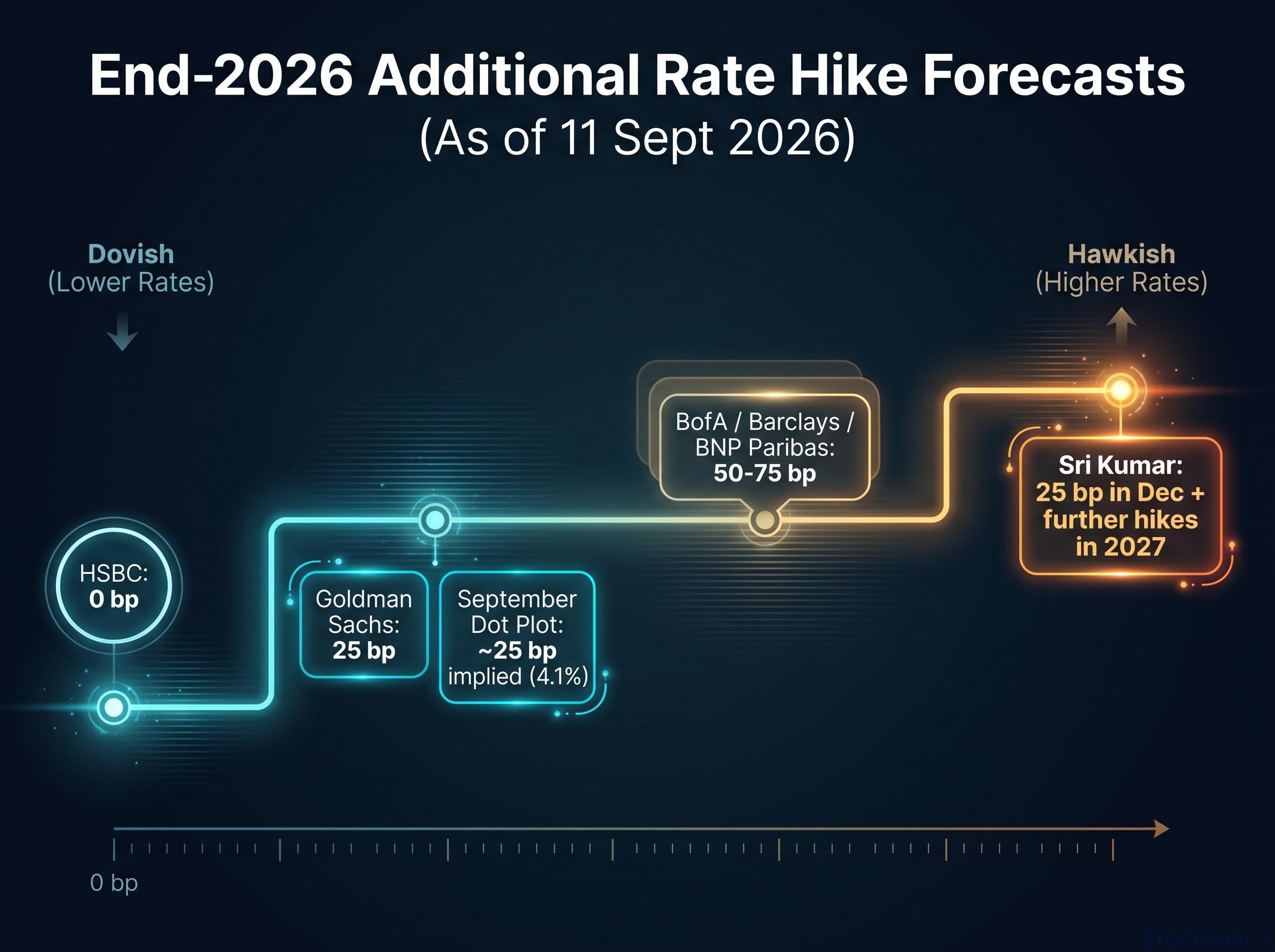
The 2027 path is where the real disagreement lives. The dot plot says hold steady at 4.1%; Kumar says keep hiking. Which view proves right will determine whether this cycle inflicts the kind of sustained damage on rate-sensitive portfolios seen last time, when the Fed raised rates by a cumulative 500 basis points from March 2022 through July 2023 and the S&P 500 fell nearly 30%.
Knowing the full range of credible forecasts, not just the median, lets you stress-test your own assumptions against the scenarios that differ most from consensus. And the scenario that differs most has a mechanism behind it.
The structural argument underneath Kumar’s hawkish call
Kumar’s forecast is not simply a preference for higher rates. It rests on the claim that the model the Fed leans on is broken.
That model is the Phillips curve, the traditional inverse relationship between unemployment and inflation: when the labour market tightens and joblessness falls, inflation is expected to rise, and when unemployment climbs, inflation is expected to cool. The Fed implicitly relies on it every time it treats a softening jobs market as evidence that price pressures will fade.
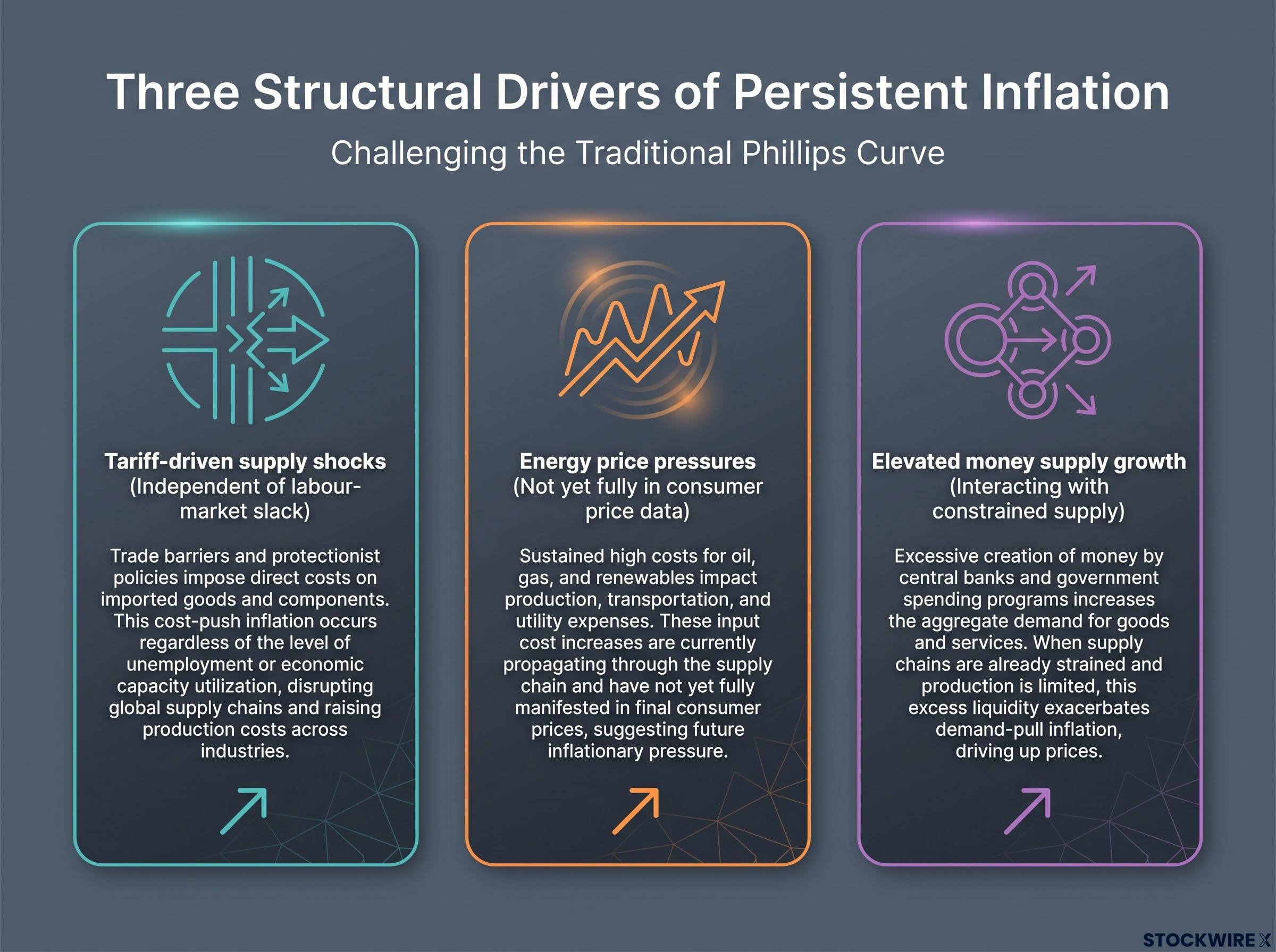
Kumar’s argument is that this relationship no longer holds. When inflation is driven by tariffs, energy costs, and elevated money supply growth rather than an overheating labour market, prices can stay high even while unemployment sits near normal levels. In that world, waiting for joblessness to rise before easing up is a mistake, because the source of the inflation has nothing to do with the labour market in the first place.
Federal Reserve research on the Phillips curve slope identifies both pre-pandemic flattening and post-pandemic nonlinearities as complicating factors in using unemployment data to forecast inflation, which is the precise limitation Kumar’s structural argument exploits.
He is not alone in the underlying diagnosis. Economists including Olivier Blanchard, Gita Gopinath, and Isabel Schnabel have pointed to supply-side disturbances, from global supply chain disruptions to tariffs, as a driver of post-pandemic inflation that can coexist with only modestly tight labour markets.
When energy and imported-goods prices are the primary drivers, domestic unemployment can remain near or above the natural rate while inflation stays elevated.
Larry Summers and Mohamed El-Erian have made a related point about how strong nominal demand interacting with constrained supply produces inflation dynamics that a simple unemployment-to-inflation relationship fails to capture. The IMF and OECD have flagged energy price swings and geopolitical shocks as forces that weaken the Phillips curve’s predictive power.
Kumar’s three structural factors can be laid out cleanly:
- Tariff-driven supply shocks that raise prices independent of labour-market slack.
- Energy price pressures that, in Kumar’s view, have not yet fully worked their way into consumer price data.
- Elevated money supply growth interacting with constrained supply to keep inflation sticky.
The energy point is the one to watch, because Kumar frames it as a leading indicator. He expects the Fed’s primary focus over the coming months to be inflation data rather than employment figures, precisely because he does not anticipate the labour market weakening enough to matter.
War-driven energy costs routed through airfares, logistics, and imported goods are contaminating core inflation figures in ways that make the official energy category systematically understate the conflict’s true price impact, with Dallas Fed estimates placing US headline PCE 0.35 to 1.47 percentage points above a no-war baseline.
If Kumar and the supply-shock economists are right, then waiting for unemployment to tick up before declaring victory on inflation is exactly the error the Fed may be making. It also means rate pressure on your portfolio could persist well beyond what the dot plot implies, regardless of what the unemployment rate does over the next twelve months.
What the next twelve months actually look like if Kumar is right (or wrong)
The disagreement resolves into two clean scenarios, and the difference between them is measured in the rate-sensitive corners of your portfolio.
Equity duration risk is the mechanism connecting rate forecasts to portfolio damage: Morgan Stanley estimates a 100 basis point rise in real yields drives 3-4 turns of multiple compression in US growth stocks, a purely mechanical repricing that requires no change in underlying earnings.
- Scenario A (the dot plot path): One more hike in December, rates held around 4.1% through 2027, and inflation grinding back toward 2% by roughly 2029. The key risk here is overtightening; the BIS and IMF have both warned that holding rates high can expose hidden leverage and trigger non-linear financial instability.
- Scenario B (the Kumar path): The December hike, plus further increases into 2027, on the assumption that supply-driven inflation proves more persistent than the SEP allows. The key risk here is that inflation fades on its own, leaving the Fed to have tightened into weakness.
Two meeting dates anchor the near term. Kumar expects no change at the late-October meeting, citing the Fed’s habit of standing pat close to elections. Both the dot plot and Kumar converge on the December meeting as the venue for the next hike.
That makes the October meeting the first real test. If the Fed holds as Kumar expects, that is not dovish confirmation; it is the setup for a December move that both the dot plot and Kumar’s model already anticipate, which means your next decision point is closer than it looks.
Kumar is not the only hawkish name on record either. In live coverage of the meeting, Kevin Warsh stated that inflation remains too high, a second voice at the hawkish end of the debate.
Three variables to watch before the December meeting
Understanding the two-scenario structure gives you a framework for reading incoming data rather than reacting to each headline in isolation. Three signals will tell you which scenario is unfolding:
- PCE and CPI releases between now and December: any upside surprise on inflation accelerates the Kumar scenario and lengthens the tightening cycle.
- Energy prices: Kumar specifically flagged energy as not yet reflected in CPI, which makes it a leading indicator for where the headline number heads next.
- The December dot plot revision: if the end-2027 median moves above 4.1%, that signals the Fed itself is drifting toward Kumar’s view.
The vote was unanimous, but the outlook is anything but. Watching those three variables is how you tell, in real time, whether the Fed’s median forecast or its most hawkish critics are winning the argument.
This article is for informational purposes only and should not be considered financial advice. Investors should conduct their own research and consult with financial professionals before making investment decisions.
Past performance does not guarantee future results. Financial projections are subject to market conditions and various risk factors. Forward-looking statements referenced here are speculative and subject to change based on economic developments and policy decisions.