Ask most investors whether the Nasdaq 100 is riskier than the S&P 500, and the answer comes back fast: much riskier, obviously. Then the long-run data lands, and the answer looks shaky. Measured over multi-year horizons, the realized volatility gap between the two indices compresses to roughly 3.1 to 3.5 volatility points, a fraction of the difference most people carry in their heads.
That gap between perception and record has rarely been under more scrutiny than it is now. Across the summer of 2026, the AI and semiconductor cycle pushed the implied volatility spread between the two indices to its widest reading in over two decades before it cooled sharply into September, giving a live case study in how far the relationship can stretch and how quickly it snaps back.
This analysis gives you a working framework for that relationship. You will see how to read the realized and implied volatility numbers, how the beta asymmetry should shape the size of a Nasdaq position, and how the pairing behaves across different market regimes, so you can size exposure, judge options pricing, and know which signal to watch before adjusting.
The realized volatility spread is smaller than investors think, but it is not stable
The assumption is that the Nasdaq 100 (NDX) swings roughly twice as hard as the S&P 500 (SPX). Index-level data does not support that. While individual technology names inside the NDX can be genuinely wild, the index calculation averages those extremes away through diversification, which is why the aggregate figure is far tamer than the single-stock reputation.
The anchor number is the long-run spread. Since 2008, the NDX has realized roughly 3.1 to 3.2 volatility points more than the SPX on average. Realized volatility here simply measures how much an index actually moved over a set window, annualized so the readings are comparable.
Shorter windows run a little hotter. Over trailing one-month periods, the NDX premium has historically sat closer to 4.8 to 5.0 points, and recent readings match that pattern.
Current conditions, early September 2026 Trailing 20-day realized volatility: NDX at 13.0% annualized versus SPX at 8.2% annualized, a spread of approximately 4.8 points. The 60-day NDX reading stood at 23.8%.
| Measurement period | NDX realized vol | SPX realized vol | Spread |
|---|---|---|---|
| Long-run since 2008 | ~SPX + 3.1-3.2 pts | Baseline | ~3.1-3.2 pts |
| One-month trailing (Sept 2026) | 13.0% | 8.2% | ~4.8 pts |
| April-June 2026 peak | Widest realized divergence in several decades | Reverted by Sept | |
The takeaway for sizing is direct. An investor who treats Nasdaq exposure as twice as volatile as the S&P 500 is working from a number the record does not support, and that mistake cuts both ways: it leads to over-hedging that drags on return or under-sizing that leaves upside on the table, without the proportional risk reduction that would justify either.
The catch is that the spread is not a fixed premium. It is cyclical and regime-dependent, widening in tech-led stress and narrowing, sometimes vanishing, in broad systemic crises. During the semiconductor-driven period of April through June 2026, the realized gap stretched to its widest in decades before reverting, which means where you sit in the cycle matters more than any single volatility print.
When big ASX news breaks, our subscribers know first
How options markets price Nasdaq risk, and why they consistently overpay
Realized volatility describes what happened. Implied volatility describes what options traders expect to happen, and that is where the more persistent signal lives. Options markets price NDX implied volatility, measured by the VXN index, at roughly 5 points above SPX implied volatility, measured by the VIX.
Set that 5-point implied premium against the roughly 3.5-point long-run realized premium and a structural gap appears. Options consistently price in more Nasdaq risk than the index actually goes on to deliver.
That gap has a name: the variance risk premium (VRP). It is the compensation option sellers collect for taking on crash risk and extreme left-tail outcomes, the rare but violent moves that wipe out sellers who mispriced them. The premium is not evenly distributed; it clusters around specific event risks.
- Crash risk compensation: payment for absorbing sudden, severe downside moves.
- Federal Reserve decision risk: rate announcements that reprice growth-heavy names sharply.
- Big Tech earnings risk: concentrated event days when a handful of mega-caps report.
- Institutional hedging mandates: funds that must buy protection regardless of price, structurally lifting demand.
What this tells you as an options trader is specific: buyers are structurally overpaying for Nasdaq downside protection relative to what volatility delivers, which is the economic rationale behind selling that premium. The caution is equally specific. This is not free money. The premium can compress to almost nothing in certain regimes, sometimes as thin as NDX implied volatility at 21.6% against realized at 21.4%, a 0.2-point margin, and one infrequent extreme move can erase a long string of profitable premium-selling trades.
Summer 2026 and the widest spread in two decades
The clearest recent illustration of how far the implied spread can travel came this summer. Heavy market concentration in AI chips and semiconductors drove the tech-specific implied premium to its highest in over twenty years, as traders paid up for protection against a narrow cluster of names carrying the whole index.
Mid-June 2026 blowout VXN near 30.91 versus VIX near 18.41, with the VXN/VIX ratio peaking near 1.64 and absolute spreads stretching to 11 to 12.5 points.
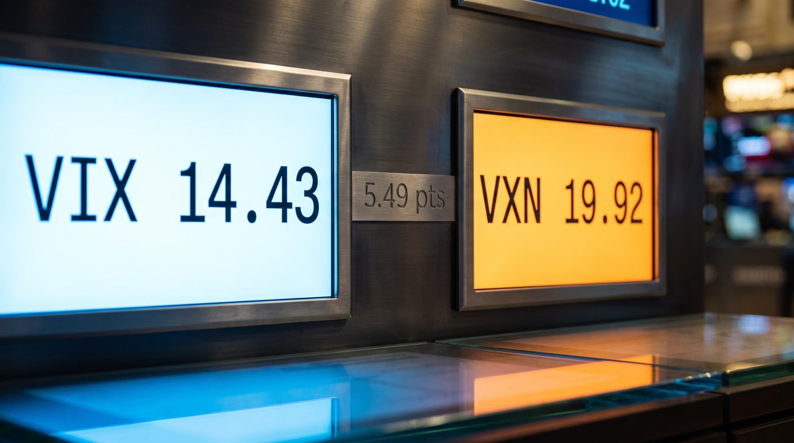
By early September the extreme had drained away. As of 3 September 2026, the VXN-VIX spread was roughly 5.5 to 5.8 points, sitting at the 76th percentile of readings since 2001 and about 1.3 times its five-year average. A late-August print showed VXN at 19.92 against VIX at 14.43, a 5.49-point gap, while the year-to-date 2026 average ran near 6.34 points. The read here is normalization, not calm: elevated versus history, but well off the summer peak.
What beta asymmetry actually means for position sizing
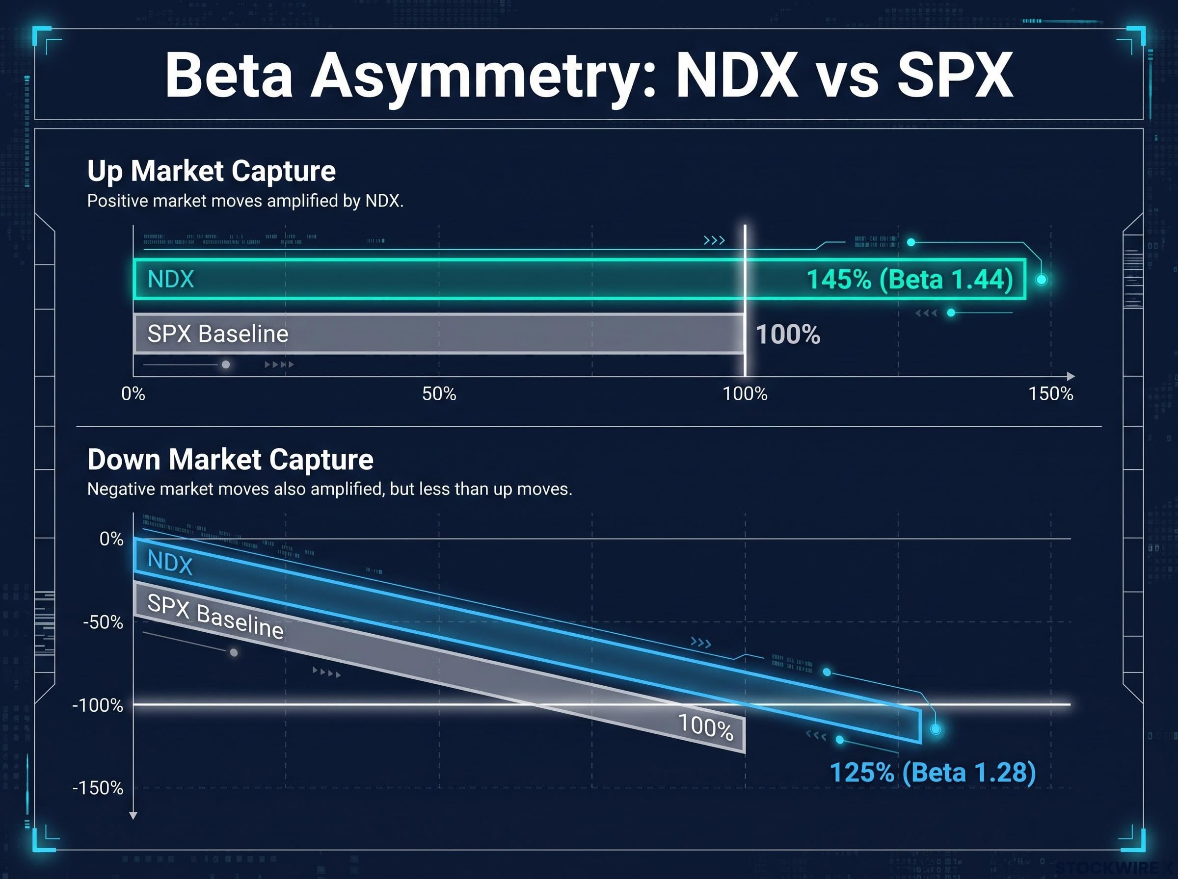
The NDX is not simply a louder version of the SPX. It amplifies moves unevenly, and the direction of that unevenness is the whole point. Historically, the index captures more of the market’s gains than its losses.
Upside capture runs at roughly 145% of S&P 500 gains, with an upside beta near 1.44 during rising months. Downside capture runs at roughly 125% of S&P 500 drawdowns, with a downside beta near 1.28 during falling months.
| Market direction | NDX capture rate | SPX baseline | Practical translation |
|---|---|---|---|
| Up market | ~145% | 100% | 10% SPX gain ≈ 14.5% NDX gain |
| Down market | ~125% | 100% | 10% SPX decline ≈ 12.5% NDX decline |
Sit with those two numbers and the position-sizing logic writes itself. Swapping an S&P 500 allocation for Nasdaq 100 exposure is not turning one dial up uniformly; it is buying more convexity to the upside for a smaller, though real, penalty on the downside. That is a structurally different trade from a levered SPX position, which would amplify both directions equally.
There is a caveat that matters most at the worst moment.
Risk warning: During severe market stress, correlations between NDX components spike and the downside capture can worsen disproportionately.
That is the trap in the asymmetry. The favourable trade-off holds in normal and rising markets, but it can erode precisely when portfolios are under the most pressure and the diversification that softened past drawdowns collapses. Understanding the capture differential gives you a quantitative basis for calibrating Nasdaq size against a core S&P 500 holding deliberately, rather than treating it as an arbitrary amplifier and ending up with too much or too little.
Why these indices move together, and where their paths diverge
If the two indices track each other so closely in calm markets, the reason is mechanical. They share most of their heavyweight members. As of mid-2026, roughly 87 to 88 companies appear in both, and those shared names account for approximately 51% of the entire S&P 500 by market capitalization.
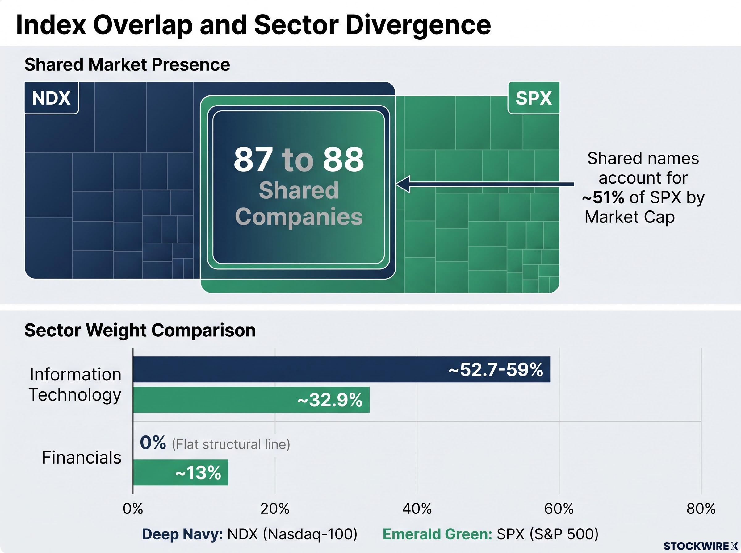
So half the S&P 500, by weight, is also driving the Nasdaq 100. That overlap is why diversifying across the two indices offers far less protection than moving into a genuinely different asset class; you are largely buying the same companies twice.
The divergence lives in the sector weightings, and it is stark. The NDX carries no Financials at all, while the SPX holds roughly 13%, and the technology tilt is far heavier in the Nasdaq.
| Sector | NDX weight | SPX weight |
|---|---|---|
| Information Technology | ~52.7-59% | ~32.9% |
| Financials | 0% | ~13% |
Concentration sharpens the effect. The top ten NDX names make up roughly 58% of the index, and that density has a measurable mechanical consequence: a 5% fall in a single mega-cap constituent moves the whole index by approximately 0.4 percentage points. On the largest single name, sources differ, with Nvidia’s NDX weight cited anywhere from around 8.5% to a 13.6% to 14.6% range across 2025-2026 analyses; either figure underlines how much rides on one company.
The read for anyone holding or comparing both indices is this: they will move together in normal conditions because they share half the S&P 500 by value, but any macro regime that rotates out of technology and into financials or defensives will expose a divergence the calm-period correlation hides completely.
Five regimes that tested the relationship
History shows just how far the relationship can stretch under different kinds of stress. Each of these episodes was a distinct mechanism, and in every case the spread eventually mean-reverted.
- Dot-com era (2000-2002), a sector bubble: the NDX averaged 43.23% realized volatility against 18.40% for the SPX before the premium collapsed back.
- 2009, a systemic aftershock inversion: in the wake of the financial crisis, the NDX actually realized lower volatility than the SPX, flipping the usual order.
- March 2020, an event shock: during the pandemic panic, SPX implied volatility briefly rose above NDX implied volatility, a rare inversion.
- 2022 rate shock, interest-rate sensitivity: rate-sensitive tech pushed NDX realized volatility to 31.4% against the SPX’s 23.4%, an unusual 8-point spread that later moderated.
- Summer 2026, concentration risk: AI and semiconductor crowding produced an 11 to 12.5-point implied spread that cooled heavily by early September.
The consistent thread is reversion. Each extreme, whatever caused it, eventually pulled back toward the long-run relationship, which is the structural pattern the whole framework rests on.
Using this data to make better decisions about Nasdaq 100 exposure
Pull the four threads together and a single readable framework appears. The realized spread tells you how much extra movement to expect, the implied premium tells you whether options are pricing that risk richly, the beta asymmetry tells you how to size the position, and the composition data tells you which regimes will break the pairing apart.
Three variables anchor any practical judgment about Nasdaq exposure relative to the S&P 500.
- Where the realized vol spread sits versus its history: compression back toward the 3.1 to 3.2-point long-run average from the summer extremes is a normalization signal.
- Whether the VXN/VIX premium is elevated or compressed: the current spread at the 76th percentile reads as elevated but firmly post-peak.
- Where the macro regime stands on technology concentration: rotation risk into financials or defensives is where the divergence bites.
For options traders, the operational focus is the VRP and the gap between implied and realized: the persistent overpricing of Nasdaq downside is the edge, provided you respect the regimes where that premium compresses to near-zero during systemic, broad-market stress.
For equity investors, the anchor is the 145% upside and 125% downside capture, which converts Nasdaq sizing from guesswork into a deliberate calibration against a core S&P 500 holding.
The convergence right now is worth naming: a post-peak implied spread, realized volatility normalizing toward its long-run average, and a beta asymmetry still intact. For anyone who was waiting for the summer extremes to cool before revisiting Nasdaq 100 sizing, that combination is a specific and readable entry context rather than a vague all-clear.
This article is for informational purposes only and should not be considered financial advice. Investors should conduct their own research and consult with financial professionals before making investment decisions. Past performance does not guarantee future results, and volatility relationships are subject to changing market conditions and various risk factors.