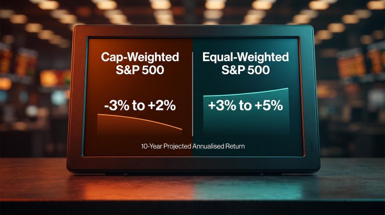
Bank of America just pulled its highest-alert market warning off the table, and equity markets are not out of danger. The bank’s bear-market signal shifted from red to yellow on 31 August 2026, but the same note puts the S&P 500 on course for an annualised loss of around negative 3% across the coming decade.
This is not a routine research update. The red-to-yellow shift reflects a genuine reduction in near-term bear-market risk, with credit markets stabilising and the most excessive tech-sector dominance pulling back. But the signal framework that generated the red flag in the first place still has 60% of its indicators triggered. Bank of America’s long-term return model has not changed its verdict: starting valuations remain elevated enough to argue against a confident buy-and-hold posture in U.S. equities.
Here is how the signpost framework actually works, what moving from 70% to 60% triggered indicators has historically meant for 12-month returns, and why the bank’s own numbers point to a lost-decade scenario even after the alert level dropped. The distinction between a moderated near-term risk signal and a structural long-run valuation problem is where your investment decision lives.
How Bank of America reads market risk through its 10-indicator signal system
Bank of America tracks 10 discrete bear-market signposts for the S&P 500, each mapped to a specific risk category. The framework does not rely on subjective judgment or a single analyst’s forecast. It monitors measurable market conditions across three broad categories, and the number of signposts triggered at any given time determines the overall risk classification.
The three broad categories the signposts cover:
- Valuations: Metrics such as forward price-to-earnings ratios and elevated growth expectations that measure how expensive the market is relative to its earnings power
- Credit conditions: Indicators tracking the health of corporate borrowing markets, including spreads and lending conditions that tend to tighten before bear markets
- Speculative behaviour: Measures of concentrated positioning, tech-sector dispersion, and momentum-driven crowding that historically precede sharp drawdowns
Savita Subramanian, Head of U.S. Equity and Quantitative Strategy at Bank of America Securities, leads the framework and the team at Bank of America Global Research that maintains it. That matters because the signpost system is not a black-box algorithm; it has a named institutional owner whose research notes investors can follow directly.
From signpost count to market classification
The trigger-rate logic is straightforward. When a high share of the 10 signposts activate simultaneously, the system classifies the market environment as red. When fewer are triggered, it steps back to yellow, and implicitly to more benign readings below that.
Each classification level carries a historically observed return distribution, not a point forecast. That distinction matters: the framework tells you the range of outcomes that have historically followed a given trigger rate, not what will happen next quarter. Understanding how the classification is built is what separates a useful signal from a headline you react to and forget.
When big ASX news breaks, our subscribers know first
What the red-to-yellow shift actually signals, and what it does not
The starting point was severe. Around the close of May and into early June 2026, approximately 70% of the signposts (7 of 10) had activated, pushing the overall classification firmly into red territory.
Citi’s Bear Market Checklist registered 10 of 18 flags globally in June 2026, its highest reading since the 2008 financial crisis, with U.S. markets alone triggering 11.5 flags versus only 5 for European markets, a regional divergence that sharpened the case for geographic reallocation at precisely the moment BofA’s own red-alert reading peaked.
Bank of America explicitly framed the red-alert reading as requiring clients to take profits and exercise caution, a level of directness that institutional research notes rarely employ unless the signal warrants it.
In the 31 August 2026 note, the share of triggered indicators fell to approximately 60% (6 of 10). The drop was driven by two factors: a recovery in credit conditions serving as the main catalyst, alongside a fading of the previously outsized outperformance within the tech sector. Less frothy tech leadership is a genuine positive in the data the bank tracks.
The S&P 500’s forward price-to-earnings ratio narrowed over the course of 2026, moving from around 22x at the year’s opening to roughly 20x by August. Subramanian’s team characterised this as a constructive development because it was driven by earnings growth outpacing price appreciation, not by stock prices falling. Earnings did the work, which is the healthier version of multiple compression.
But here is what 3% looks like in context. Where the trigger rate sits at 60%, the bank’s own historical record shows that the median return over the following 12 months has come in at a modest 3%. That is better than the red regime. It is not a confident bull-market signal. The historical distribution around that 3% median is wide enough that investors who interpret yellow as a buy signal are running ahead of what the data actually supports.
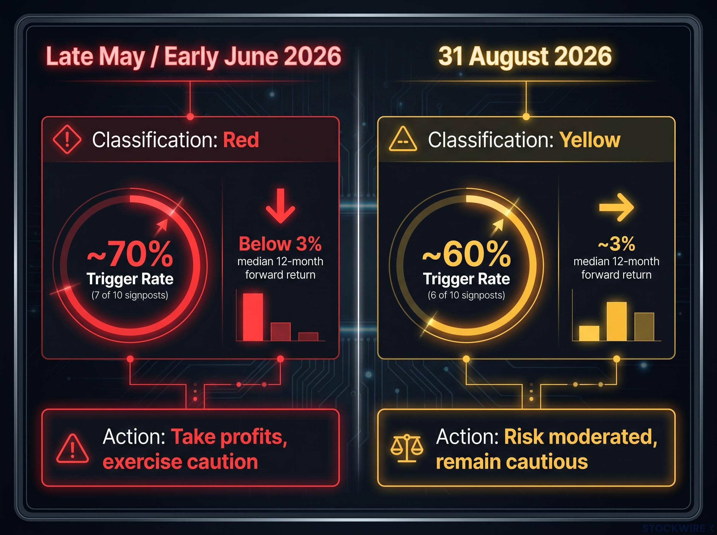
| Signal metric | Red (late May/early June 2026) | Yellow (31 August 2026) |
|---|---|---|
| Trigger rate | ~70% (7 of 10) | ~60% (6 of 10) |
| Classification | Red | Yellow |
| Median 12-month forward return | Below 3% (elevated drawdown risk) | ~3% (wide range of outcomes) |
| BofA investor guidance | Take profits, exercise caution | Risk moderated, remain cautious |
The shift is real. A 3% median expected return at the current signal level tells you the near-term risk has genuinely moderated. It does not tell you to add aggressively.
The valuation problem that a yellow signal cannot fix
The near-term signal improved. The structural return picture did not.
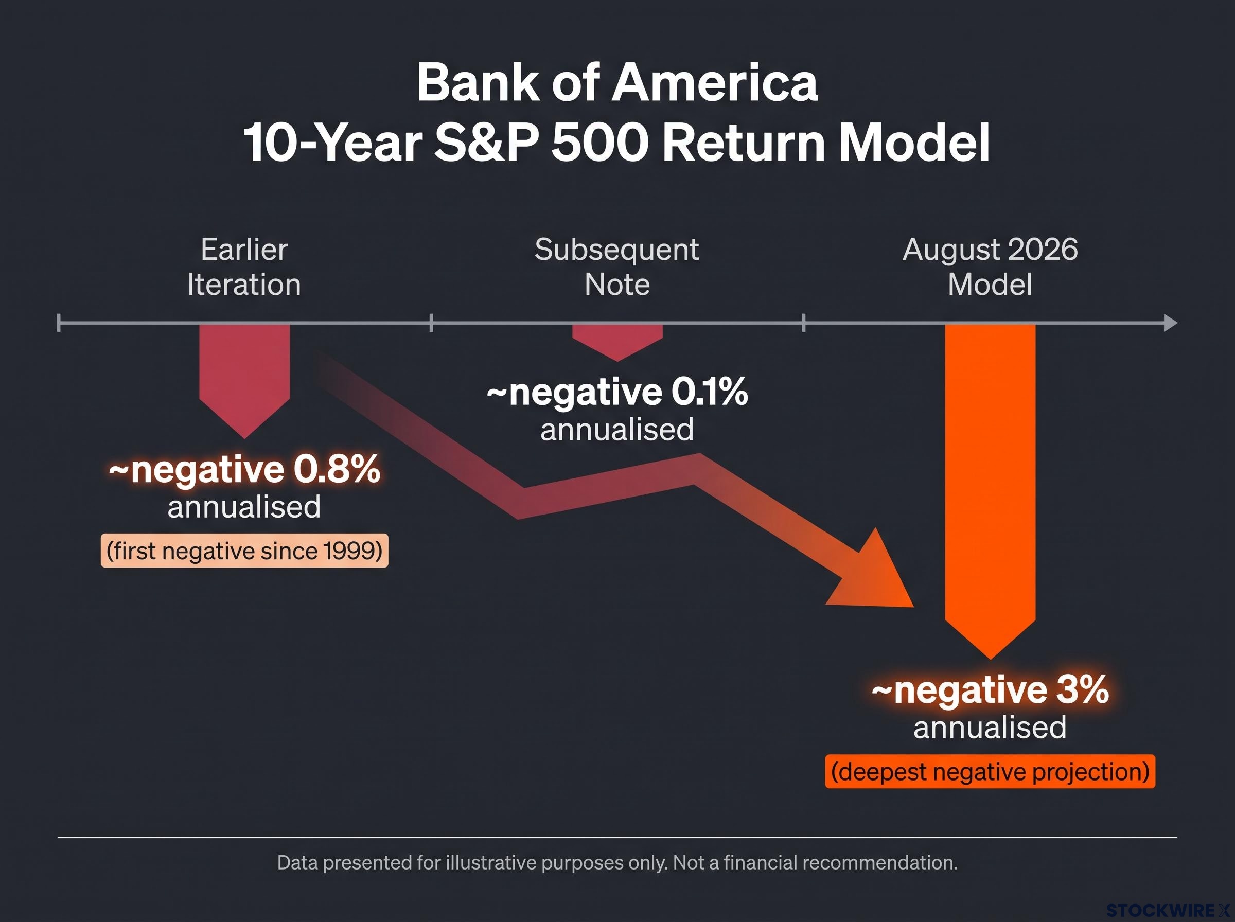
According to reporting by Investing.com on the 31 August 2026 note, Bank of America’s proprietary 10-year return model indicates the S&P 500 is on track to produce annualised losses of roughly negative 3% from where it currently stands. That is the most recent and source-specific figure available from Subramanian’s framework.
The negative long-term read is not a new development. The model has been moving in this direction through successive iterations:
Bank of America’s long-term valuation model projects cap-weighted S&P 500 annualised returns as low as negative 3%, a range that sits well below the 10% historical average most U.S. retirement plans assume and that frames the structural problem the bear-market signal cannot resolve on its own.
- Earlier iteration: approximately negative 0.8% annualised, the first time since 1999 that the model turned outright negative
- Subsequent note: approximately negative 0.1% annualised in a widely cited Bank of America communication
- Current August 2026 model: approximately negative 3% annualised, the deepest negative projection yet
The directional consistency across these readings is itself a signal. This is not a single alarming data point; it is a model that has been worsening through each update.
Why the P/E compression matters less than it appears
The move from 22x to 20x forward earnings is a genuine improvement. It reflects earnings growing faster than prices, the constructive version of multiple contraction. Bank of America acknowledged as much in the August note.
But 20x remains elevated relative to long-run historical averages. The long-term return model does not require a crash to produce a lost decade. It requires only a combination of high starting valuations and mean-reverting return expectations over time. At 20x, the maths still does not work for the model to project positive annualised returns over a 10-year horizon.
For a buy-and-hold investor in U.S. equities, a projected negative annualised return over the next decade is not an abstract risk. It is a direct argument for reconsidering the assumption that holding the S&P 500 passively will compound wealth over your investment horizon.
This article is for informational purposes only and should not be considered financial advice. Investors should conduct their own research and consult with financial professionals before making investment decisions. Past performance does not guarantee future results. Financial projections are subject to market conditions and various risk factors.
What yellow actually means for how investors should position
The temptation with a red-to-yellow shift is to treat it as permission to buy. The data argues for something more measured.
Historically, 3% median 12-month returns at the current signal level mean that rallies function as rebalancing opportunities rather than momentum signals worth chasing. The signpost categories still triggered, valuations, speculative positioning, and elevated growth expectations, are the categories most associated with disappointment when the market rolls over.
Three positioning implications follow from the yellow signal and negative 10-year model taken together:
- Selective risk-taking over aggressive reallocation. Elevated valuations and lingering triggered signposts argue for maintained diversification rather than concentration in the most expensive or speculative segments of the market.
- Rallies as rebalancing events, not momentum signals. Forward 12-month returns at this signal level have historically been modest enough that chasing strength has rarely been rewarded. Treat market rallies as opportunities to upgrade quality or take profits in extended positions.
- Allocation flexibility and quality emphasis for longer-horizon investors. A potential lost decade for U.S. equities means that investors relying on passive buy-and-hold compounding face a real possibility of flat or negative real returns. Allocation to cheaper assets, active risk management, and flexibility in glide-paths become more important than usual.
Defensive investing, structured around consistent loss avoidance rather than return maximisation, becomes a materially stronger framework when the 10-year return model projects negative annualised returns: the mathematics of drawdown recovery mean a 50% loss requires a 100% gain to break even, compounding the cost of ignoring what the yellow signal leaves unresolved.
The yellow classification represents a technical moderation of near-term risk, not a fundamental endorsement of the market. Bank of America’s own models and signposts continue to argue for cautious, valuation-aware positioning rather than a confident embrace of a new bull phase.
The reader who understands that yellow means “risk moderated but not resolved” and that the long-term model still projects losses will make materially different decisions than the reader who hears “Bank of America upgraded its market signal” and interprets that as a buying opportunity.
A signal worth watching, not celebrating
The red-to-yellow shift is real and data-driven. It resolves a near-term risk concern. It does not touch the structural valuation problem the 10-year model identifies.
Keep two figures in mind: a median 12-month return of roughly 3% based on where the signal currently sits, set against an annualised 10-year loss projection of approximately negative 3%. The gap between those two figures is where the investment decision lives.
What to monitor through the remainder of 2026: the share of triggered signposts, particularly any movement in credit conditions or tech-sector positioning that could push the indicator count back toward 70%. Any revision to the long-term return model as earnings and valuations evolve will matter as well. Bank of America’s year-end 2026 S&P 500 target remains 7,100, a near-term reference point that sits within the modest-return framework the yellow classification implies.
Subramanian and her team at Bank of America Global Research are the institutional source to follow for signal updates. Investors who track the signpost count as it moves through the back half of 2026 will have a more rigorous basis for adjusting their positioning than those who rely solely on the directional headline of red, yellow, or green.
For readers wanting to compare BofA’s signpost methodology with a different institutional approach, our full explainer on Goldman’s sentiment framework examines how a composite U.S. Equity Sentiment Indicator at the 73rd percentile has historically correlated with below-average S&P 500 returns over the following 2-8 weeks.