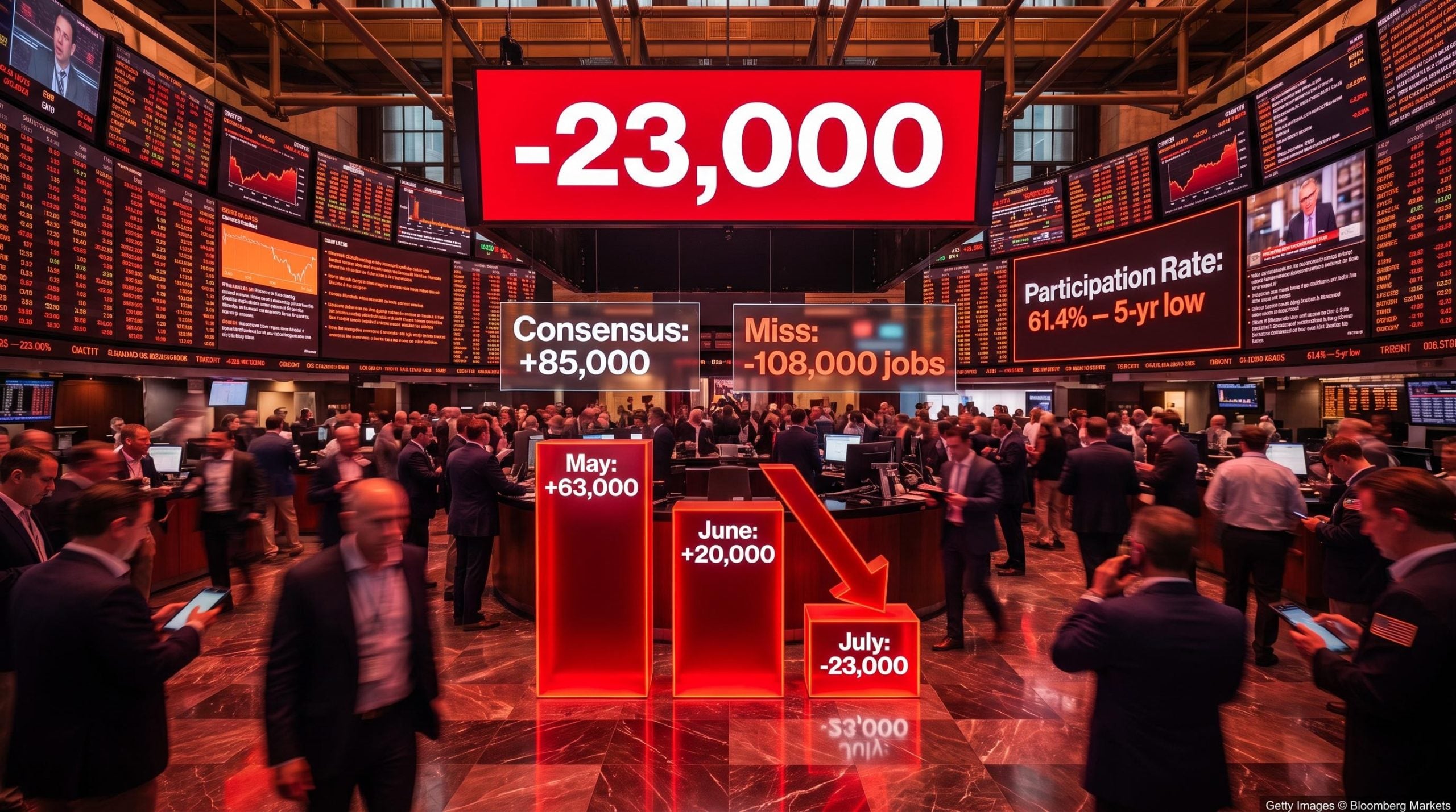
The U.S. economy did not just slow its hiring in July. It shed jobs outright. Nonfarm payrolls contracted by 23,000 positions, missing the consensus forecast of roughly +85,000 by 108,000 jobs, the kind of miss that changes the character of the labour market conversation, not just its temperature.
The July 2026 Employment Situation report landed today, 7 August 2026, from the Bureau of Labor Statistics (BLS). The headline contraction sits inside a three-month trend that has deteriorated sharply: May’s modest gains gave way to a June print that was revised dramatically lower, and July tipped into outright job losses. This is harder to dismiss as statistical noise. It arrives at a moment when the Federal Reserve is already navigating a policy inflection point, and every data release now carries outsized weight.
Here is how to read what the report actually shows, separate the misleading signals from the genuinely alarming ones, and understand what the shift means for Fed expectations, sector exposure, and your positioning right now.
A labour market that moved from cooling to contraction in three months
Start with May. Payrolls grew by +63,000, a soft number but still positive. At the time, the read was straightforward: the labour market was cooling in an orderly fashion.
Then June arrived. Initially reported at +57,000, it looked like a continuation of the same gentle decline. But today’s revision slashed that figure to just +20,000, meaning the strength investors consumed last month was overstated by 37,000 jobs.
The June payrolls miss, which came in at 57,000 against a 114,000 consensus forecast, also carried a participation rate decline and downward revisions to prior months, forming the same pattern of headline-versus-internals divergence that makes July’s contraction harder to dismiss as an isolated event.
Now layer in July’s -23,000. The three-month sequence reads 63,000 → 20,000 → -23,000, producing a three-month average of approximately 20,000 jobs per month. That is a dramatic departure from the pace required to absorb normal labour force growth, which economists generally place above 100,000 per month. Average hourly earnings were nearly unchanged month-over-month, removing any wage-driven inflation offset that might have softened the signal.
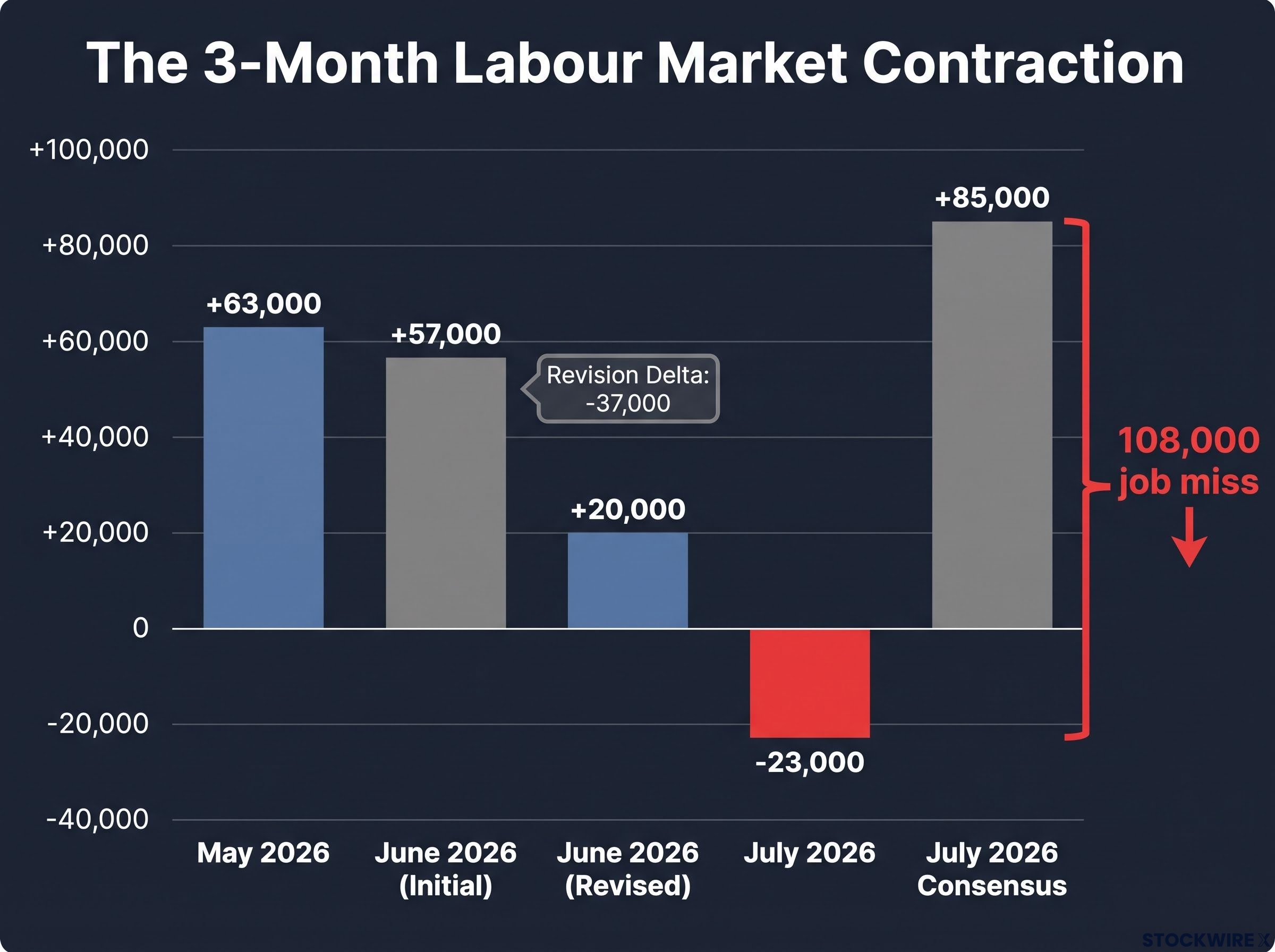
The key shock metric: July payrolls missed consensus by 108,000 jobs, the largest negative surprise in more than two years.
The revision pattern is what matters most here. The employment data you consumed in prior months overstated the labour market’s health. The weakness did not begin in July; July is simply when it became impossible to ignore.
| Month | Initially Reported | Revised | Revision Delta |
|---|---|---|---|
| May 2026 | +63,000 | +63,000 | 0 |
| June 2026 | +57,000 | +20,000 | -37,000 |
| July 2026 | -23,000 | Pending future revision | TBD |
When big ASX news breaks, our subscribers know first
Why unemployment fell to 4.1% while payrolls turned negative
If you saw the unemployment rate drop from 4.2% to 4.1% and felt reassured, the report needs a closer read. The two numbers, payrolls and unemployment, come from entirely different surveys with different methodologies, and they can tell contradictory stories.
- Establishment survey (Current Employment Statistics, or CES): Surveys employers directly. This is where the -23,000 payroll figure comes from. It counts jobs on company payrolls.
- Household survey (Current Population Survey, or CPS): Surveys individuals about their employment status. This is where the 4.1% unemployment rate comes from. It counts people who say they are working or actively looking for work.
- Labour force participation rate: The share of the working-age population either employed or actively job-seeking. In July, this fell to 61.4%, its lowest in more than five years.
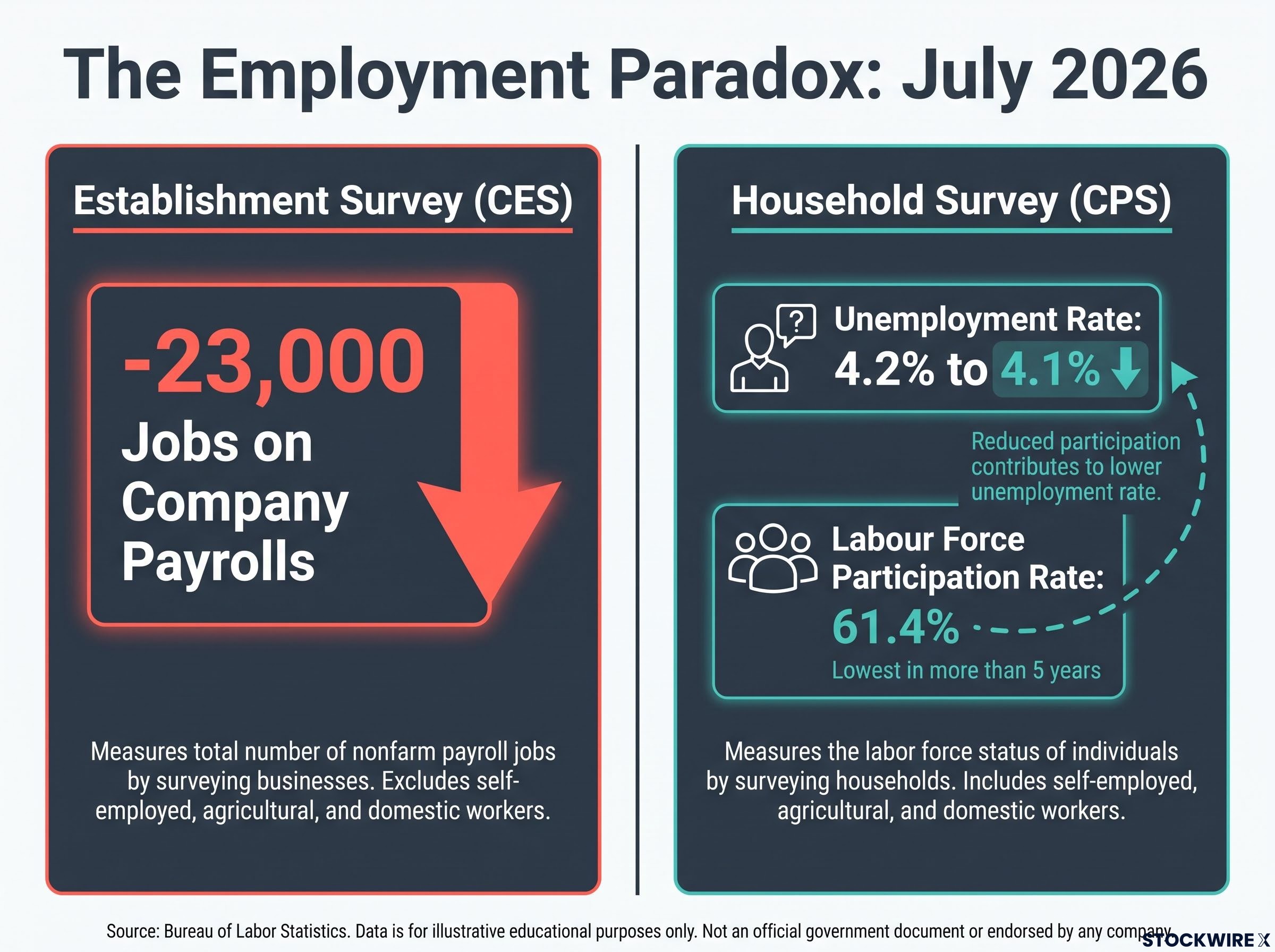
The unemployment rate is a fraction: unemployed people divided by the total labour force. When people stop looking for work, they are removed from both the numerator and denominator, mechanically pushing the rate down even if employment conditions have not improved.
What the participation rate decline actually signals
A falling participation rate means fewer people are earning wages, regardless of what the headline unemployment number says. That directly reduces future consumer spending capacity, which accounts for roughly two-thirds of U.S. GDP. The unemployment rate decline gives you no comfort here: it is a statistical artefact of people giving up on the job search, not evidence that the labour market strengthened.
This distinction is the foundation for everything that follows. If you misread the unemployment drop as a positive signal, you will misinterpret both the Fed’s likely response and the true state of consumer demand.
What this report does to the Federal Reserve’s calculus
The Fed operates under a dual mandate from Congress: pursue maximum employment and price stability simultaneously. When employment weakens sharply, the balance of that mandate shifts, and the institutional pressure to ease monetary policy rises.
Today’s combination of outright job losses, a participation-driven unemployment decline, flat wages, and multi-month downward revisions creates exactly that shift. The employment side of the mandate is now flashing a warning that the Fed cannot easily dismiss as temporary softness.
The FOMC policy framework entering August 2026 is already operating without forward guidance, a deliberate architectural choice made at the June meeting under Chair Warsh that stripped the committee’s communication down to a strict data-dependent posture, making each labour market release carry more market-moving weight than it would under a guidance-anchored regime.
The immediate market mechanism is straightforward. Fed funds futures, the contracts traders use to bet on where interest rates are heading, are repricing toward earlier and potentially more aggressive cuts. Short-term Treasury yields are biased lower as that repricing flows through. For investors holding rate-sensitive assets, the rate environment is now more likely to move in your favour in the near term.
But the reason for that shift matters as much as the shift itself. The Fed is not easing because the economy is healthy enough to tolerate lower rates. It would be easing because the labour market is deteriorating fast enough to demand them. An emergency inter-meeting cut remains unlikely on this data alone; the Federal Open Market Committee will want confirmation from August employment data and inflation readings before committing to aggressive action. If that confirmation arrives, the stakes rise considerably.
How equity markets are likely to interpret the shock
The question every equity investor faces after a report like this is whether bad news is good news (rate cuts lift valuations) or bad news is actually bad news (weakening demand erodes earnings). Both scenarios have legitimate analytical support, and the tension between them is real.
| Dimension | Scenario A: Rate-Cut Focus | Scenario B: Demand Deterioration |
|---|---|---|
| Market narrative | Faster easing supports valuations | Earnings and demand risk dominate |
| Likely beneficiaries | Growth and tech stocks, REITs, utilities | Defensive quality, cash-rich balance sheets |
| Likely at-risk sectors | Short-duration value trades | Cyclicals, retail, hospitality, industrials, financials |
| Key condition to dominate | Weakness stays mild and isolated | Multi-month deterioration confirms a trend |
The three-month deterioration arc, combined with the scale of downward revisions, tilts the evidence toward Scenario B gaining credibility. When weakness was confined to a single soft print, the rate-cut trade worked cleanly. A three-month pattern of declining payrolls with prior strength revised away is a different signal entirely. If “bad news is good news” has run its course, the playbook that worked during earlier soft patches may now work against you in sectors with direct exposure to hiring momentum, consumer spending, and credit quality.
Recession probability frameworks built around the Sahm Rule and Conference Board LEI were already flagging a slower expansion ahead as of early July 2026, before today’s contraction print; July’s payroll data shifts those probability distributions in a direction that makes the amber-light portfolio posture described in those frameworks harder to sustain.
This article is for informational purposes only and should not be considered financial advice. Investors should conduct their own research and consult with financial professionals before making investment decisions.
The data points that will determine whether July was a warning or a turning point
Each upcoming release answers a specific question that today’s report raised but did not resolve:
- Weekly initial jobless claims: Are layoffs accelerating beyond what the monthly snapshot captured? This is the timeliest available gauge, and a sustained move higher would confirm broadening weakness.
- Sector breakdown of July payrolls (fuller detail forthcoming): Was the contraction concentrated in one or two industries, or spread across multiple sectors? Widespread weakness is materially more concerning.
- Consumer spending data (retail sales, high-frequency card data): How quickly is weaker job growth translating into a consumption slowdown? This is the transmission mechanism from labour market fragility to GDP risk.
- August Employment Situation report: A second consecutive contraction, or further downward revisions to July, would significantly raise recession probability and change the Fed’s posture from cautious to urgent.
- CPI and PCE inflation data: If inflation remains contained, the Fed has a clear runway to cut. Any re-acceleration complicates that path considerably and forces a harder trade-off between its two mandates.
These are not just calendar entries. Each one is a test of whether the labour market fragility signalled today is self-reinforcing or isolated, and the answer will shape how aggressively the Fed moves and how markets reprice risk assets over the coming quarter.
For readers wanting to understand the political dimension of the Fed’s easing calculus, our dedicated guide to Fed independence under Warsh covers how documented presidential pressure and a narrow Senate confirmation shape the institutional constraints around the committee’s response to deteriorating labour data.
Reading the July report for what it is, not what the headlines suggest
The surface contradictions in this report, payrolls negative, unemployment down, will generate misleading headlines. The three genuine signals are clearer than the noise suggests:
- The payroll contraction is not an anomaly. A 108,000-job miss against consensus, sitting inside a three-month average of roughly 20,000 jobs per month, represents a labour market that has shifted from cooling to contracting.
- The unemployment decline is misleading. It was driven by a participation rate collapse to 61.4%, not by improving employment conditions.
- The Fed’s policy calculus has shifted materially toward easing. The employment side of the dual mandate is now under genuine stress, and the data gives officials institutional cover to move if inflation cooperates.
July may prove to be the start of a sustained downturn or a sharp but temporary contraction. The appropriate response is not a binary risk-on or risk-off call based on a single report, however significant. It is calibrating your exposure to fragility: exercising caution in cyclical and labour-sensitive sectors, prioritising balance sheet quality, and actively monitoring the data sequence outlined above. The investors best positioned from here are those who can read this report precisely, not those who react to a single headline.
Past performance does not guarantee future results. Financial projections are subject to market conditions and various risk factors.