
For most of the past century, calling US Treasuries “risk-free” was not really a description. It was a foundation. Now something quieter and stranger is happening: some of the largest institutional investors on the planet are treating that foundation as a variable rather than a given.
The evidence is in the numbers. The 10-year US Treasury yield touched 5.01% on 16 September 2026, sitting against total public debt of $40.11 trillion as of 15 September 2026. When the world’s benchmark safe asset yields 5% while borrowing keeps climbing, the market is telling you the old assumptions no longer hold cleanly.
This is not the usual cyclical worry about deficits. The so-called Ferguson indicator has been crossed, Norway’s sovereign wealth fund is cutting its Treasury exposure by roughly a third, and the Federal Reserve is increasingly constrained by the very market it once steered with ease.
Here is the framework you need: what US Treasury market risk actually means today, what a disorderly selloff would look like in practice, and why the fallout would reach assets you hold well beyond Treasuries themselves.
What “risk-free” actually meant, and why that consensus is fracturing
You have probably absorbed the idea that Treasuries are safe by definition. That belief was never a law of nature. It was a functional label resting on three specific conditions, and each of them is now under measurable strain.
Consider what actually held the “risk-free” status together:
- Liquidity depth: the ability to buy or sell enormous volumes without moving the price. Still the deepest market in the world, but showing stress at the long end.
- Dollar reserve dominance: the fact that global central banks hold dollars as their default reserve. The dollar’s share of allocated global official reserves remains high at roughly 57% in early 2026, so this pillar persists even as others weaken.
- Debt serviceability assumption: the belief that the US could always comfortably pay what it owes. This is the assumption now being questioned as interest costs balloon.
The reason this matters is that the safety premium investors have always received for free is now being priced. The International Monetary Fund (IMF) made the point directly in its April 2026 Fiscal Monitor, warning that a wave of Treasury issuance is wearing away the structural convenience yield, which is simply the extra value investors assign to an asset for being safe and easy to sell.
IMF April 2026 Fiscal Monitor Surging US Treasury issuance is eroding the structural convenience yield: the safety and liquidity premium that has historically made Treasuries function as the world’s default collateral.
The Bank for International Settlements (BIS) added a telling data point in its September 2025 Quarterly Review. Treasuries’ historical tendency to move in step with other safe-haven assets and with the VIX, the index that measures expected market volatility, has drifted toward zero since early 2025. In plain terms, Treasuries are behaving less like a shelter during stress.
Institutions including State Street, HSBC, and BlackRock issued their own 2026 warnings that government bonds are no longer working flawlessly as a hedge against falling markets. This is the institutional layer confirming what the yield data already shows.
None of this means a US default is coming. It means the free safety premium is disappearing, and that changes the calculus for every portfolio that holds Treasuries as ballast. If the anchor is being repriced, so is everything you have built around it.
When big ASX news breaks, our subscribers know first
The Ferguson indicator and what the debt arithmetic is actually telling us
Start with the raw money flows, because the pattern speaks before any conclusion is named. The US takes in roughly $5.5 trillion to $5.6 trillion in annual revenue and spends somewhere between $7 trillion and $7.4 trillion. That gap is the deficit, and it is not shrinking.
For FY2025, the federal deficit landed at $1.8 trillion, equal to 5.9% of GDP. For FY2026, projections point to a deficit between $1.9 trillion and $2.1 trillion, or 5.8% to 6.4% of GDP.
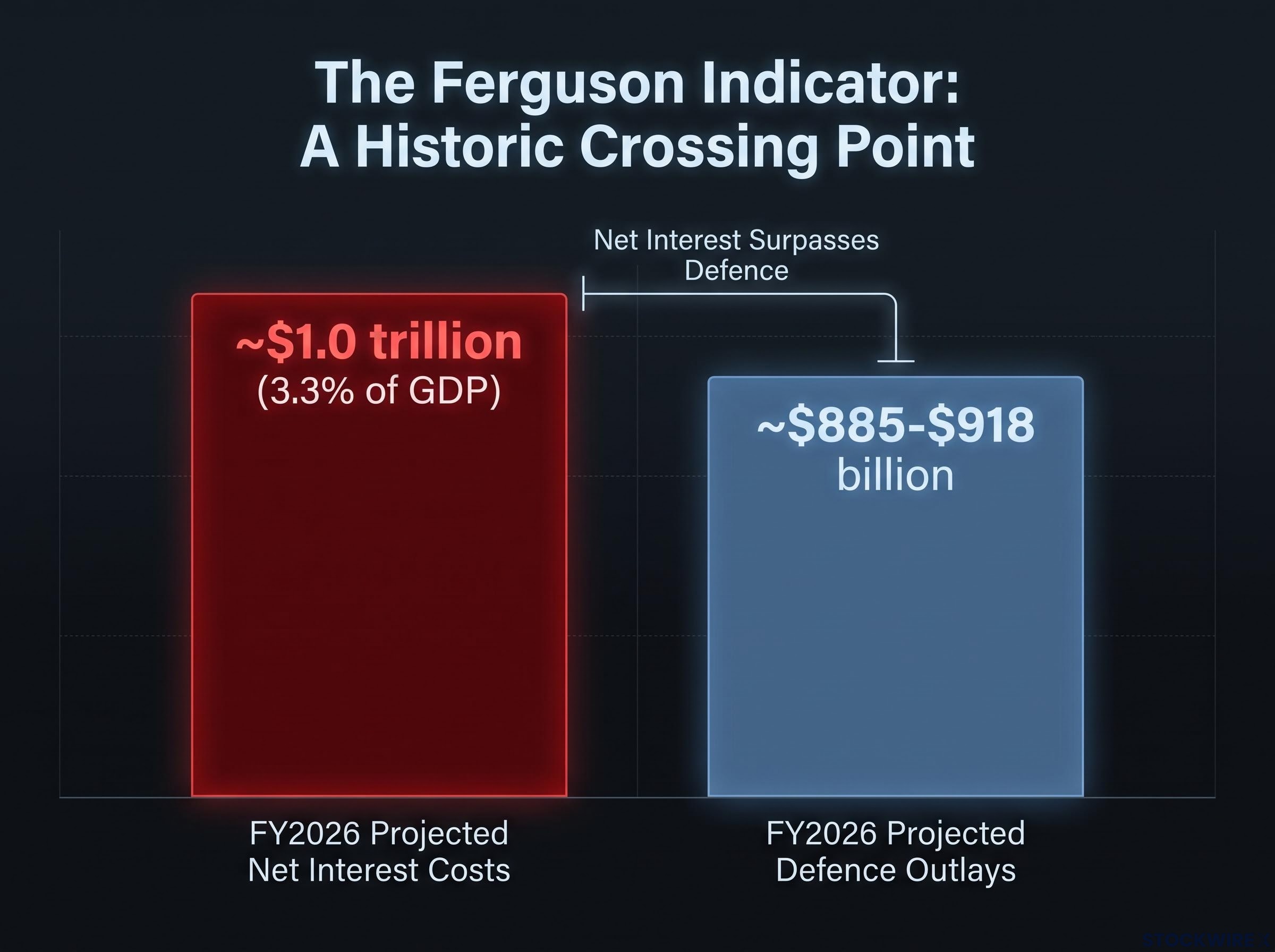
Now look at where the money goes. The Congressional Budget Office (CBO) projects FY2026 net interest costs at approximately $1.0 trillion, around 3.3% of GDP. Total defence outlays for the same year sit in the $885 billion to $918 billion range.
That comparison is the whole story. Interest on past borrowing now matches or exceeds what the country spends on its entire military.
| Metric | FY2025 | FY2026 (projected) |
|---|---|---|
| Total deficit | $1.8 trillion | $1.9-$2.1 trillion |
| Deficit as % of GDP | 5.9% | 5.8%-6.4% |
| Net interest costs | Not available | ~$1.0 trillion (3.3% of GDP) |
| Defence outlays | Not available | ~$885-$918 billion |
This crossing point has a name. Historian Niall Ferguson has argued that when a great power spends more servicing its debt than funding its military, it has entered the fiscal territory historically associated with imperial decline. That threshold, the Ferguson indicator, has now been reached.
Debt sustainability thresholds carry more complexity than headline ratios suggest: academic research places the level where fiscal stress becomes meaningfully elevated above 140% of GDP, and both the UK and Japan have demonstrated that breaching the 100% mark does not by itself trigger market rupture, provided structural conditions hold.
The Ferguson indicator, confirmed Net interest costs have crossed total defence spending. Historically, this marks the point where debt service becomes the dominant claim on a nation’s finances.
Here is the part that makes this hard to reverse. Most US spending is locked in through long-term commitments, so rapid correction is not really available. As the original analysis framed it, adjusting course is less like turning a bicycle and more like turning an aircraft carrier: slow, wide, and constrained by momentum.
When a government spends more to service old borrowing than to fund its military, the debt itself becomes the primary limit on every other choice, including the ones that would normally fix the problem. That is the benchmark to watch, and it now sits behind you rather than ahead.
How foreign capital is quietly exiting, and why the Federal Reserve cannot simply fill the gap
The demand side is where the picture turns from strained to structural. Foreign central bank holdings held in custody at the New York Fed have slipped into the $3.4 trillion to $3.78 trillion range, with periodic drops of $130 billion to $233 billion. That is not one seller. It is many, moving in the same direction.
The named actors make it concrete:
- Norway (NBIM): On 4 September 2026, Norges Bank Investment Management proposed cutting its government bond benchmark allocation from 70% to 50%, and its US Treasury share from 34.1% to 21.9%, implying roughly $75 billion to $80 billion in potential sales.
- Japan: Sold $26.4 billion in Treasuries in June 2026.
- United Kingdom: Sold $8.7 billion over the same month.
- Turkey: Has largely liquidated its holdings.
There is a geopolitical accelerant behind these numbers. The freezing of roughly $300 billion in Russian assets through the SWIFT payment system showed other governments that dollar reserves can be switched off, and alternative settlement arrangements now offer a partial way around that dependence. Trust, once assumed, is now being actively priced.
The de-dollarisation timeline matters for interpreting the foreign retreat data correctly: much of the measured decline in dollar reserve share reflects currency-valuation effects rather than active central bank selling decisions, and no rival currency currently meets the structural prerequisites of deep liquid markets, an open capital account, and institutional credibility at comparable scale.
The trapped-holder problem explains why selling is so painful. Consider Bank of America, which reportedly bought around $500 billion in Treasuries near 2020 at yields as low as 0.33% to 0.6%. After subsequent rate rises, the marked-to-market value of that book is estimated to have fallen by at least 50%.
The trapped-holder problem A holder who bought $500 billion in Treasuries at 0.33% now faces a paper loss estimated at half the position’s value if forced to sell. Holding is painful; selling crystallises the loss. That trap keeps supply overhanging the market.
Why the Federal Reserve cannot simply buy its way out
The Fed’s own analysis frames its influence as conditional. In normal conditions it steers rate expectations effectively. But in the extreme tail, the outer 5% of market conditions, bond market forces override its guidance. The current yield environment sits in that tail.
There is a structural fingerprint of this already. Issuance has crowded into the long end of the curve, pushing the Treasury toward shorter maturities to shave costs, which flattens the curve. That shift is a quiet signal that monetisation of long-dated debt is already underway.
The leadership dynamic sharpens the point. The original analysis expects incoming Fed leadership, positioned publicly as dovish, to be forced by market conditions into raising rather than cutting rates as a first substantive move. When sovereign wealth funds, central banks, and major institutions all reduce exposure at once, the Fed is not facing a liquidity gap it can plug with a facility announcement. It is facing a demand shortfall that money-printing can only partly and temporarily offset. Treat rate guidance as one variable, not the dominant one.
What a disorderly bond selloff would look like, and how contagion spreads across Western markets
A disorderly selloff is not a single dramatic crash. It is a sequence, and understanding the order is what separates deliberate decisions from panic.
Here is how the transmission runs:
- Yield spike trigger: A shift in sentiment sends yields sharply higher, potentially starting in the UK, Japan, or the US.
- Margin calls on leveraged positions: Non-bank financial institutions holding bonds on borrowed money face demands for more collateral.
- Forced selling: Those institutions dump positions across repo and derivatives markets to raise cash, pushing yields higher still.
- Spillover to correlated sovereign markets: Stress jumps to other advanced-economy bonds sharing the same vulnerabilities.
- Flight to cash and temporary precious metals pressure: Institutions sell even gold and silver to meet margin calls, causing short-lived weakness before stabilisation.
- Eventual reallocation: Once the acute phase passes, capital moves back toward assets perceived as durable stores of value.

The reason this spreads so fast is convergence. The Eurozone, UK, Japan, Canada, Australia, and New Zealand adopted broadly similar fiscal and monetary policies, leaving them with comparable debt vulnerabilities. BIS research finds that a single contagion factor explains roughly 70% of the variation in advanced-economy term premia, the extra yield investors demand for holding longer-dated bonds.
| Jurisdiction | Debt / fiscal pressure | 10-year yield direction | Key vulnerability |
|---|---|---|---|
| United States | $40.11tn public debt | Rising, near 5% | Interest costs above defence spending |
| United Kingdom | High financing needs | Rising | LDI pension leverage exposure |
| EU average | 12 states at high risk | Rising | Rollover and spillover risk |
| Japan | Very high debt-to-GDP | Rising off low base | Yield curve control unwind |
The scale is documented. The IMF’s Fiscal Monitor puts advanced-economy debt-at-risk near 134% of GDP, with global public debt projected to reach 100% of GDP by 2029 on current trends. The EU’s Debt Sustainability Monitor 2025 flags 12 member states at high medium-term fiscal sustainability risk.
The modern proof of concept is recent. In 2022, UK pension funds using liability-driven investment (LDI) strategies, which use borrowing to match long-term obligations, were forced to sell gilts under margin pressure, driving yields sharply higher in a matter of days.
The 2022 UK gilt crisis Leveraged pension strategies were forced into fire-sales, spiking yields sharply in days and requiring intervention. It showed how quickly leverage turns a bond move into a systemic event.
The original analysis points to a target of roughly 6% on the 10-year Treasury as part of a broader debt market reset. The takeaway for you is direct: a Treasury dislocation does not stay in Treasuries. It travels through collateral chains and correlated sovereign positions, so exposure to only equities or real assets does not insulate you the way you might assume.
Stock-bond correlation assumptions are the channel through which a Treasury repricing reaches equity portfolios most directly: the 2022 episode demonstrated that when inflation drives yields higher, bonds and equities fall simultaneously, eliminating the diversification benefit that four decades of falling rates had made investors treat as structural rather than conditional.
What changes from here, and what this framework lets you do
Pull the threads together and one shift emerges rather than four separate worries. The repricing of “risk-free” status, the crossing of the Ferguson threshold, the coordinated foreign retreat, and the contagion mechanics are all facets of a single structural change that alters the baseline assumptions behind portfolio construction everywhere.
The most useful response is not a prediction but a reorientation. If Treasuries are no longer functioning as the unconditional anchor, then your assumptions about correlation and diversification need revisiting before markets force the revision on you.
Treasury safe-haven risk and dollar reserve-currency risk are distinct variables that are frequently conflated: investors who treat them as identical risk being under-hedged on Treasury volatility while simultaneously over-hedging against outright dollar displacement scenarios that the current data does not support as near-term outcomes.
Here are the variables worth watching:
- 10-year Treasury yield: Track its position within the 5% to 6% band flagged in the research. Movement toward the top of that range signals accelerating stress.
- Foreign central bank custody holdings at the New York Fed: Continued declines confirm the demand shortfall is structural, not seasonal.
- Sovereign wealth fund allocation announcements: Norway’s NBIM decision on 4 September 2026 is the template. More of these would signal broadening institutional retreat.
- NBFI margin stress: Early signs of forced selling among leveraged non-bank institutions are the contagion warning light.
- Fed policy direction versus market-implied rates: A gap where markets demand higher rates than the Fed wants tells you who is actually in control.
Be clear about the limits. The IMF and BIS do not treat a synchronised multi-country default as their baseline, but they do flag a violent repricing of term premia across US, UK, eurozone, and Japanese markets as a highly material risk. This framework is a map of that risk landscape, not a timetable, and the structural constraints mean the relevant horizon is years, not quarters.
The informational edge sits in understanding the mechanism now, rather than waiting for official confirmation later.
This article is for informational purposes only and should not be considered financial advice. Investors should conduct their own research and consult with financial professionals before making investment decisions. Past performance does not guarantee future results. Financial projections are subject to market conditions and various risk factors, and forward-looking scenarios discussed here are speculative and subject to change based on market developments.