
Most people read a rate hike as an event. The Federal Reserve moves, markets flinch, and the story feels finished. But the real damage from elevated rates is not the hike itself. It is the pressure that builds quietly afterwards, relocating risk from balance sheet to balance sheet long before anything visibly breaks.
The Bank for International Settlements (BIS) made this point directly in its 2024 Annual Economic Report: peak financial stress and loan-impairment ratios usually surface two to three years after rate hikes begin, not at the moment the hikes land.
Now consider where the United States sits as of September 2026. The 30-year fixed mortgage rate is near 6.66%, a $930 billion wall of commercial real estate maturities is coming due this year, and net federal interest costs hit $970 billion in 2025. The machinery of slow-burn stress is already running.
The question is not whether rates are high. It is where that sustained pressure finds its weakest outlet. What follows is a sector-by-sector guide to the fault lines most exposed to elevated rates, what the data shows about each, and which signals to watch before conditions tip from stress to fracture.
Why high rates hit differently the longer they stay elevated
Here is the counterintuitive part: the danger is not the level of rates. It is the duration.
A single rate hike is a shock, and markets are good at absorbing shocks. What they struggle with is the slow grind that follows, because elevated rates do not destroy leverage overnight. They expose leverage that already exists, one refinancing cycle at a time.
Think of it this way. A borrower who locked in cheap debt in 2021 feels nothing when rates rise in 2022. They feel it when that debt matures and has to be refinanced at 7%, 8%, or 9%. Multiply that across housing, private credit, and commercial property, and you get a pressure wave that arrives in stages rather than all at once.
The transmission runs through three channels:
- Funding costs: Floating-rate borrowers pay more immediately, while fixed-rate borrowers pay more only when they refinance.
- Asset price compression: Higher discount rates push down the value of property, private holdings, and long-duration bonds.
- Balance-sheet restructuring pressure: As earnings thin out and debt matures, borrowers are forced to renegotiate, defer, or default.
This is why the BIS lag finding matters so much. If peak stress typically shows up two to three years after hikes begin, then the clock that started ticking in 2022 and 2023 is now approaching its most dangerous phase.
The BIS 2024 Annual Economic Report documents this lag explicitly, noting that financial stress historically surfaces within two to three years following the first rate hike, as loan impairment ratios rise and economic activity weakens.
That reframes how you should read the headlines. A bank passing a stress test or a sector holding steady this quarter is not a clean bill of health. It is a snapshot taken partway through a slow-moving sequence, and the sectors with the most leverage and the earliest refinancing needs are exactly where you should be watching first.
When big ASX news breaks, our subscribers know first
Housing and the GDP drag hiding in plain sight
Start with the number that tells the whole story. Existing-home sales ran at 3.98 million on a seasonally adjusted annual basis in August 2026, down from 4.06 million in July 2026 and a 2021 peak of 6.6 million.
That is not a dip. It is a market operating at roughly 60% of its recent capacity.
The volume of existing homes changing hands has fallen from 6.6 million a year at the 2021 peak to just 3.98 million as of August 2026.
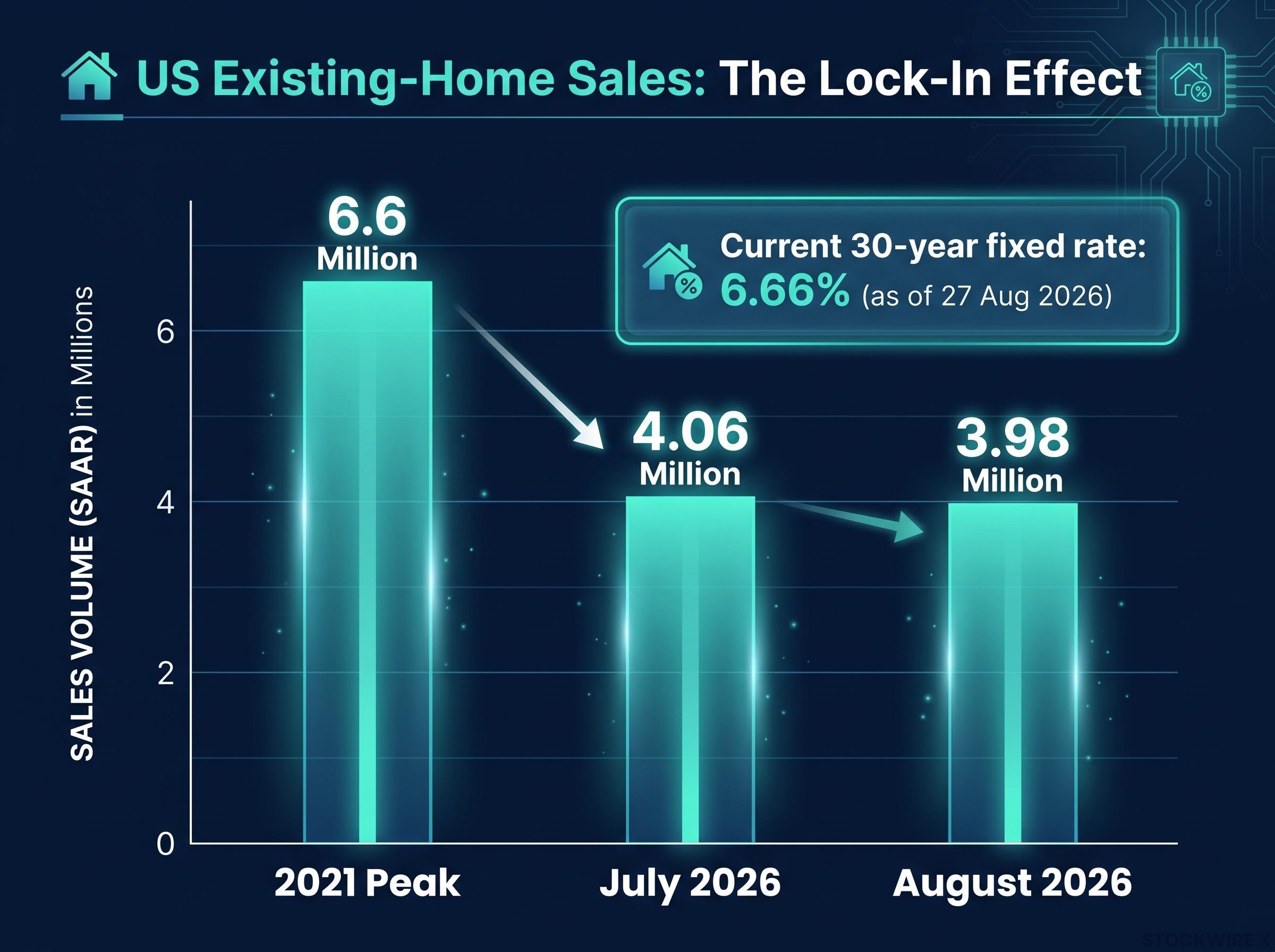
The reason is the lock-in effect. With the 30-year fixed rate averaging 6.66% as of 27 August 2026, homeowners who secured sub-3% mortgages during the pandemic have little reason to sell. Moving means trading a cheap loan for an expensive one, so they stay put. That suppresses the supply of homes for sale, which throttles turnover across the entire market.
Mortgage rate lock-in mechanics explain why the constraint is structural rather than cyclical: on a $300,000 loan, moving from a 3.9% rate to a 7.0% rate adds more than $200,000 in total interest over the loan term, a cost that keeps roughly 86% of mortgaged homeowners frozen in place regardless of what prices do.
The GDP cascade
Here is why this reaches far beyond real estate. Housing-related activity accounts for an estimated 16% of US GDP, and a transaction is not a single economic event. It is the trigger for a chain of spending.
When homes stop changing hands, that chain goes quiet across a run of adjacent industries:
- Furniture retail
- Appliance manufacturing
- Home renovation and improvement
- Brokerage commissions
- Relocation services
- Mortgage and lending fees
For you, the takeaway is that assessing housing exposure through homebuilder stocks or mortgage REITs alone badly understates the reach. The real exposure map runs through home improvement retailers, appliance makers, real estate services firms, and regional lenders, and several of those carry their own second-order sensitivity to rates. A slowdown in one rate-sensitive market quietly hollows out half a dozen others.
Private equity, private credit, and the maturity wall no one can defer forever
For now, the stress inside private credit is mostly invisible. That is by design, and it is the most important thing to understand about this sector.
Private credit refers to loans made by non-bank lenders directly to companies, usually smaller and more heavily leveraged borrowers. These loans are typically floating-rate, which means the interest owed rises directly with the rate environment. Market data points to average leverage of around 7x for US middle-market borrowers, with median interest-coverage ratios near 1.8-2.0x.
An interest-coverage ratio measures how many times over a company’s earnings can pay its interest bill. At 1.8x, there is not much cushion, and rate hikes have eroded it fast.
Over one-third of private credit borrowers now have interest costs that exceed their current earnings.
When a borrower cannot cover interest out of earnings, the honest response is a restructuring. The industry response has been to defer instead, through amend-and-extend deals (which push out maturity dates) and payment-in-kind structures (which let borrowers pay interest with more debt rather than cash). These tools keep losses off the books, but they do not resolve anything. They stack a pipeline of credits refinanced forward rather than fixed, raising the risk of clustered restructurings later.
The knock-on effect reaches private equity directly. With debt financing for acquisitions running at roughly 7-9%, the maths of the leveraged buyout stops working. Fewer deals get done, and existing portfolio companies cannot be sold at valuations owners will accept. A basket of alternative asset managers has reflected the strain, with some names down 20-40% over the prior year.
| Stress metric | Current level | Warning threshold | What a breach signals |
|---|---|---|---|
| Middle-market leverage | ~7x earnings | Above 6x | Thin margin for earnings decline |
| Interest-coverage ratio | 1.8-2.0x | Below 1.5x | Earnings barely cover interest |
| Acquisition debt cost | 7-9% | Sustained above 7% | Buyout economics break down |
Deferral is not resolution. A pipeline of amend-and-extend credits is a pipeline of deferred losses, and those losses become visible at the exact moment liquidity is needed. If you hold exposure through a semi-liquid fund (an increasingly common way retail investors access private credit), that moment matters, because a wave of redemption requests can force the fund to gate withdrawals just as underlying losses surface.
The private credit liquidity mismatch sits at the centre of this opacity: when funds holding illiquid loans face a wave of redemptions, they may be forced to sell public equities and bonds to raise cash, transmitting losses into markets far removed from the original borrower stress.
Commercial real estate and the regional bank fault line
Two statements about US banks are both true at the same time. The banking system is resilient. Regional banks are exposed. Knowing which applies to which institution is the entire question.
Total US commercial real estate (CRE) mortgage debt reached $6.2 trillion as of Q2 2025, with bank loans making up roughly 40% of that. Total CRE loans across all commercial banks sat at approximately $3.11-$3.13 trillion in mid-2026. At the aggregate level, all-commercial-bank CRE delinquency was still contained at 1.56% in Q1 2026.
That aggregate number is reassuring. It is also misleading, because the risk is not spread evenly.
Where the concentration actually sits
The exposure is heaviest precisely where the regulatory buffers are thinnest. Concentration here means CRE loans as a percentage of Tier 1 capital, which is a bank’s core loss-absorbing cushion. The higher the percentage, the less room a bank has if those loans sour.
| Bank category | Asset range | CRE concentration (% of Tier 1 capital) | Approx. share of CRE mortgage debt |
|---|---|---|---|
| Regional banks | $10B-$100B | 289% | ~20% |
| Smaller/community banks | $1B-$10B | 314% | Remainder |
A bank carrying CRE loans at 314% of its Tier 1 capital does not have much room for error. And the near-term trigger is already scheduled.
An estimated $930-$936 billion in commercial real estate maturities are due in 2026 alone.
The Federal Reserve’s DFAST 2026 stress tests project $76.5 billion in aggregate domestic CRE loan losses at an 8.8% portfolio loss rate over the 2026 Q1 to 2028 Q1 window. The pattern echoes the 2023 regional banking turmoil, which was driven by concentrated interest-rate risk rather than a broad system failure.
For you, the practical point is this. If you hold deposits, equity, or bonds in regional or community banks, the comforting “banking system is resilient” framing does not describe your specific institution. The names most exposed to the CRE maturity wall are rarely the ones that appear in Fed stress test headlines.
The sovereign debt compounding problem
The same rate pressure squeezes the largest borrower of all. The US national debt recently crossed roughly $40 trillion, and servicing it is getting more expensive fast.
The Congressional Budget Office (CBO) reports net interest costs of $970 billion in 2025, equal to 3.2% of GDP and roughly 14% of total federal outlays. Broader Treasury-based compilations put the gross-interest figure as high as $1.22 trillion.
Here is the dynamic that worries debt-sustainability analysts. When interest rates run close to or above nominal GDP growth, debt compounds faster than the economy can outgrow it. US nominal GDP growth of roughly 6% sounds like a comfortable buffer, but set against a $40 trillion debt stock and rising interest costs, the cushion is thinner than it looks.
Treasury Secretary Scott Bessent announced a plan to double bond buybacks to press down on longer-dated yields. Market consensus reads it as a signal of concern rather than a structural fix, insufficient on its own to change the rate trajectory.
Contagion pathways: where a stress event spreads beyond the epicentre
The five fault lines above are not sealed compartments. They are wired together, and that wiring is what turns a sector problem into a systemic one.
The propagation runs along three main pathways:
- Leveraged fund forced selling. Some funds carry leverage of 10x, 20x, or even 30x on directional bets in Treasuries or equities. When volatility spikes, margin calls force these funds to sell, and that selling compresses asset prices in markets far from the original stress point.
- Emerging market capital flight. Sustained high US rates pull capital into the dollar. That drives currency depreciation, capital outflows, and rising dollar-denominated debt service costs across emerging markets, where debt distress has historically tracked US rate cycles closely.
- Technology funding constraint. A rate-driven equity decline of 5-15% can close IPO windows for capital-intensive firms. Companies such as Anthropic, which has a planned IPO to fund large AI infrastructure buildouts, rely on public market access. Equity weakness constrains fundraising, which stalls investment, which feeds further weakness.
The IMF and the Financial Stability Board (FSB) have both warned that opaque interconnectedness between these markets can amplify a shock, propagating losses abruptly across the wider system.
Cross-border private credit spillovers add a dimension the domestic watchlist does not fully capture: the ECB has modelled scenarios where second-round losses through European equity revaluations exceed the initial direct credit hit, a dynamic that can feed back into US institutional portfolios through the same contagion pathways the IMF and FSB have flagged.
This is the part that matters even if you own none of these assets directly. You may have no position in private credit, no regional bank exposure, and no CRE holdings, and still feel the effect through an equity market dislocation, an emerging market sovereign scare, or a sudden repricing of high-growth technology names. The network, not the sector, is the real exposure.
Watching for the break: what to monitor before stress becomes fracture
You do not need to predict which scenario plays out. You need to know which signals mark the shift from slow-burn stress to acute fracture.
Two credible camps frame the debate. The Federal Reserve’s DFAST 2026 tests project that 32 large banks can absorb $708 billion in total losses while staying above regulatory capital minimums, supporting the manageable-stress view. Against that, the IMF’s Global Financial Stability Reports and the FSB argue that aggregate “all-bank” models structurally underestimate the fragility of regional institutions and nonbank entities.
Repo market stress signals sit among the earliest-warning indicators available in public data: the SOFR-Fed Funds spread and the MOVE Index together reflect the funding tightening that historically precedes the forced Treasury selling and cascading asset price moves the contagion section describes.
The IMF’s position is that near-term risks appear contained, yet structural opacity makes a severe disruption likely rather than remote.
The gap between the two views is not really about optimism versus pessimism. It is about which institutions and instruments each model actually captures. That tells you where to point your attention: the exposures regulators’ own stress tests are least likely to see, namely nonbank and regional risks.
Here is a sector-by-sector watchlist built around the five fault lines.
| Sector | Metric to watch | Current level | Escalation signal |
|---|---|---|---|
| Housing | Existing-home sales (SAAR) | 3.98M (Aug 2026) | Sustained decline below 3.8M |
| Private credit | Fund redemption gating | Isolated events | Clustered gating across funds |
| CRE / regional banks | CRE delinquency rate | 1.56% (Q1 2026) | Accelerating toward stress-test loss rate |
| Emerging markets | Sovereign spread widening | Rate-sensitive | Rapid outflows on dollar strength |
| Federal fiscal | Interest as % of outlays | ~14% (2025) | Rising share crowding out spending |
Watching these converts a diffuse macro worry into a concrete watchlist, letting you hold exposure in less vulnerable areas while monitoring the specific signals that would warrant repositioning.
What the slow burn tells you about positioning in a higher-for-longer world
The value of this map is not a crash prediction. It is a lens for separating risks that are already priced from risks still hiding inside opaque structures.
It helps to sort the fault lines into two categories:
- Structurally disadvantaged by elevated rates: housing transaction volume, leveraged buyout economics, and floating-rate borrowers. These face a slow, grinding headwind for as long as rates stay high.
- Acute fracture risk if a tripwire is crossed: regional banks at concentrated CRE maturities, and leveraged funds in a volatility event. These can hold steady, then break quickly.
Remember the BIS finding that anchors all of this. If peak stress arrives two to three years after hikes begin, the timeline runs well into the late 2020s, not into the rear-view mirror.
The most useful thing to hold onto is that managed stress and systemic fracture are not either-or outcomes. Both can be true across different parts of the system at once. Knowing which sector sits in which category is itself a form of risk management, and that awareness stays useful whether the fracture comes in 2026, 2027, or not at all.
This article is for informational purposes only and should not be considered financial advice. Investors should conduct their own research and consult with financial professionals before making investment decisions.
Past performance does not guarantee future results. Financial projections and stress-test scenarios are subject to market conditions and various risk factors, and forward-looking assessments are speculative and may change with market developments.