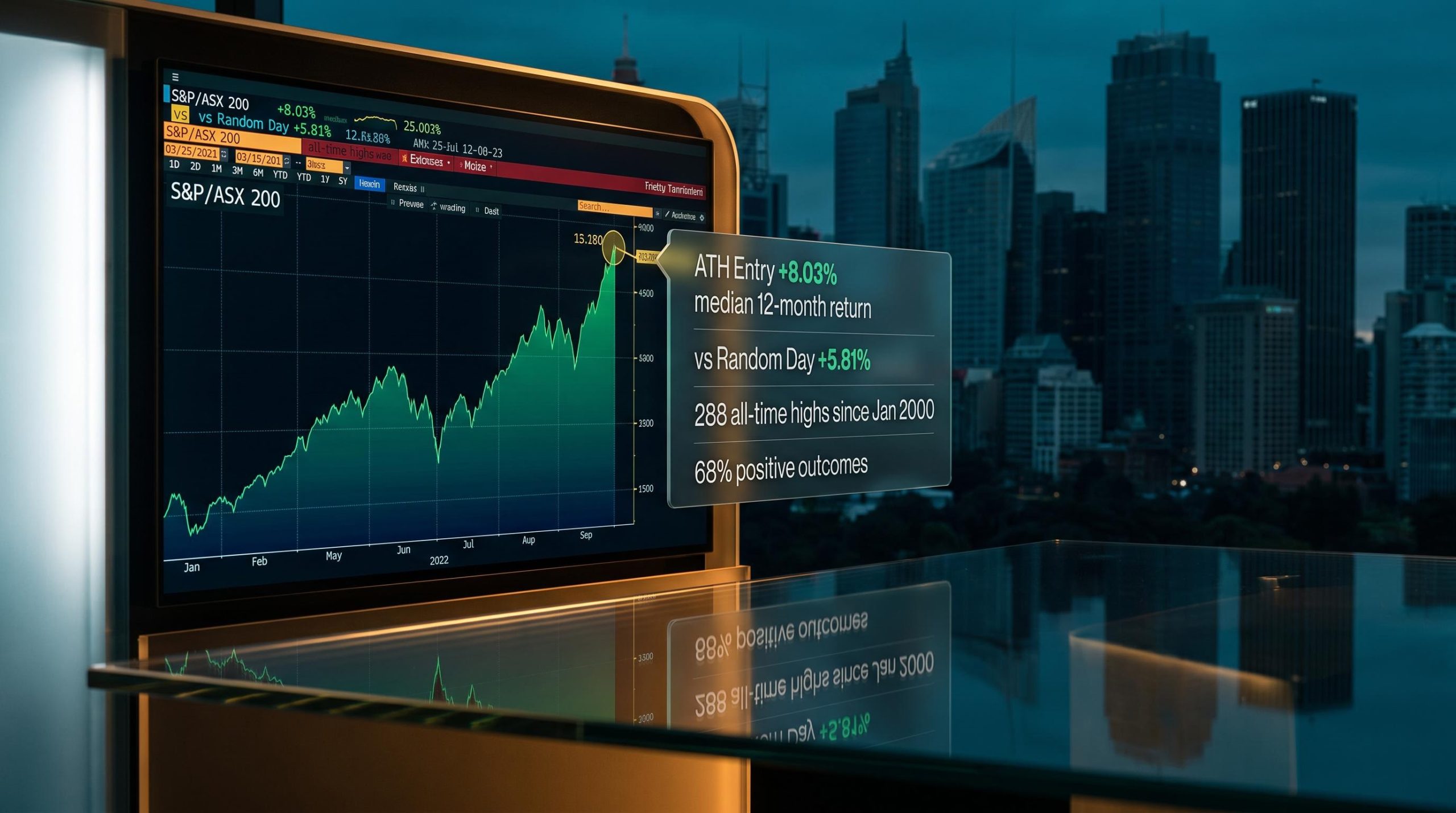
The ASX 200 just closed at a fresh all-time high, and the instinct is familiar: wait for a pullback, buy the dip, avoid being the person who bought the top. It feels rational. It feels disciplined.
The data tells a different story. A 26-year dataset covering 288 all-time highs on the S&P/ASX 200 from January 2000 through August 2026 reveals that buying at record levels has historically outperformed buying on a random day over 12 months, even though short-term returns soften. The dataset is based on the price index rather than the total return index, so dividend income is stripped out of every figure shown here, meaning the numbers understate what investors holding an ASX 200 ETF would have actually received.
What the numbers show may shift how you think about the decision sitting in front of you right now: whether hesitating at record levels has historically cost investors money, and what that means for entry timing, position sizing, and the behavioural plan you need before you act.
The counterintuitive 12-month finding
The headline result is not what most investors expect.
Over shorter horizons, records entries trail random-day entries across every timeframe through to six months. At the 12-month mark, however, that relationship flips: the median return for an all-time high entry comes in at +8.03%, while a random-day entry over the same period produces just +5.81%. The gap between the two is a 2.22 percentage point advantage in favour of buying at the record.
| Horizon | ATH median return | Random day median return | Differential |
|---|---|---|---|
| 1 week | +0.11% | +0.24% | -0.13% |
| 1 month | +0.38% | +0.82% | -0.44% |
| 3 months | +0.99% | +1.87% | -0.88% |
| 6 months | +3.09% | +3.39% | -0.30% |
| 12 months | +8.03% | +5.81% | +2.22% |
The key figure: buying at an all-time high has historically delivered a 2.22 percentage point median outperformance over a random-day entry at the 12-month mark.
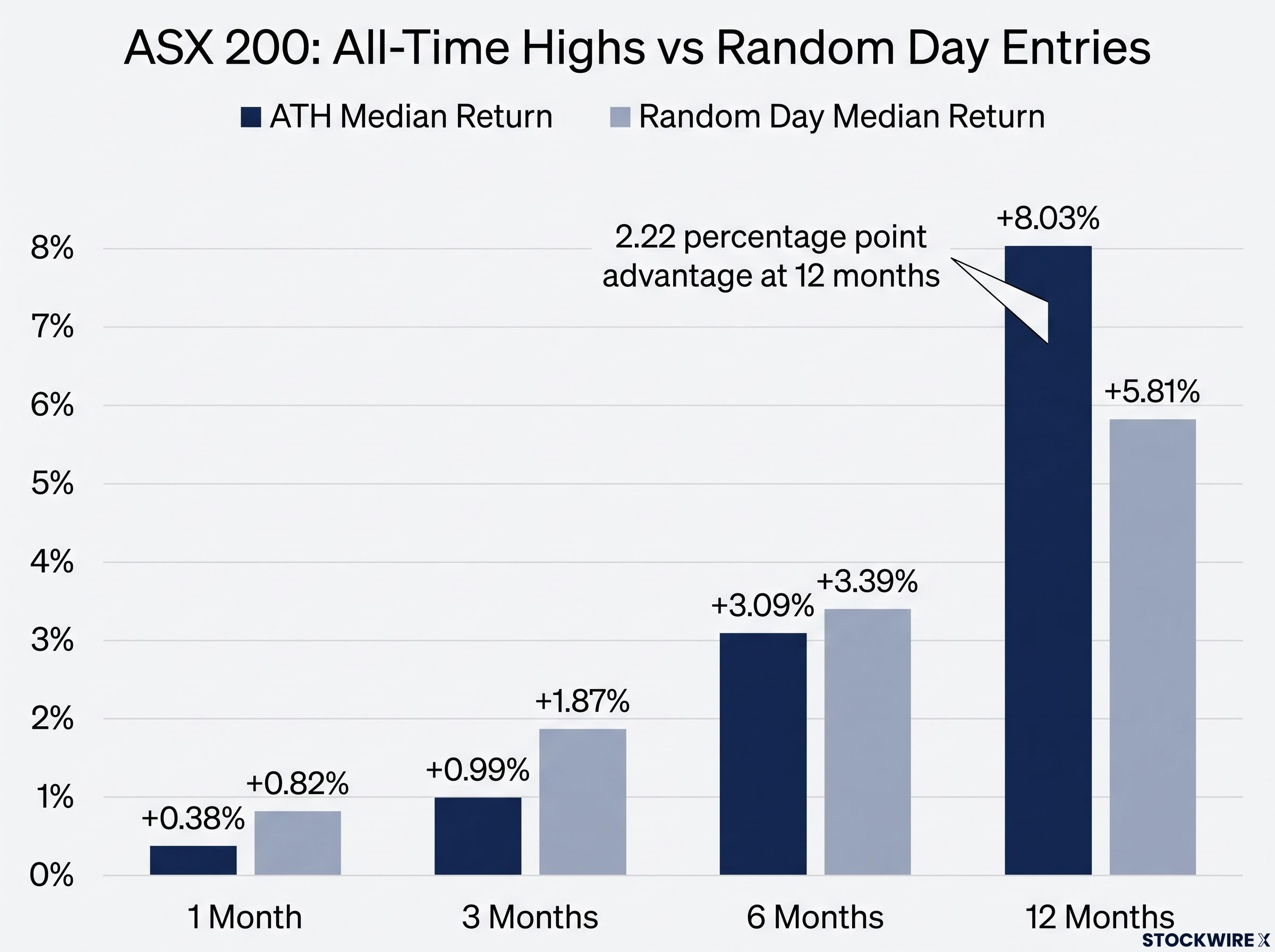
Around 68% of all-time high entries produced positive outcomes after 12 months. Roughly two-thirds of investors who bought at a record were ahead a year later.
There is an honest caveat in the numbers. The median 12-month return is +8.03%, but the average is lower at +6.19%. That gap tells you something specific: the danger of buying at highs is concentrated in a small number of severe entries, not spread evenly. A handful of catastrophic events (the GFC, the COVID crash) drag the average down, but the typical experience, captured by the median, is materially better than the mean suggests.
When big ASX news breaks, our subscribers know first
What the short-term data is actually telling you
Before treating the 12-month finding as a green light, the near-term picture deserves its own read.
The short-term underperformance is not noise. Average forward returns after buying at a record are negative at one week (-0.27%) and one month (-0.12%), and barely positive at three months (+0.69%). The odds of being ahead at each of those horizons are thin:
- 1 week: 55% positive outcomes
- 1 month: 58% positive outcomes
- 3 months: 56% positive outcomes
Those numbers are only marginally better than a coin flip. What this tells you is that buying at a record does not give you a near-term edge; it gives you a near-term headwind that resolves over a longer holding period.
Path risk versus permanent loss
The distinction matters. Path risk is the short-term volatility you experience on the way to a positive 12-month outcome. It feels uncomfortable, but it does not cost you money unless you sell during it. Permanent loss is what happens when you crystallise that drawdown by exiting at the bottom.
The case for staying invested is reinforced by documented superannuation member behaviour during the March 2026 ASX decline, where investors who switched to cash locked in losses and missed a 1.1% single-session recovery, a real-world illustration of the path-risk dynamic that short-term return data describes in aggregate.
If your investment horizon is under six months, the data does not support treating all-time highs as equivalent to any other entry point. Position sizing matters more than entry timing at shorter horizons, and cash reserves become part of the strategy.
Why all-time highs are a normal feature of a rising market
A useful reframe: the question is not “should I be worried about this number?” but “what does it mean that this number keeps appearing?”
From January 2000 to August 2026, the S&P/ASX 200 notched up 288 all-time highs in total, which works out to a new record roughly once every 23 trading sessions. Rather than arriving at a steady pace, records tend to bunch together in runs, with the three most prominent clusters spanning the periods 2004-07, 2019-20, and 2024-26, the last of which includes the February 2026 record close of 9,202.90. Between those runs, the index can go long stretches without a new peak.
One record every 23 trading sessions. That is not a warning. It is the normal behaviour of a positively compounding index.
The exception proves the rule. No new all-time high was set across the entire period spanning 2008 to 2018, a stretch of roughly 12 years with zero fresh peaks. That drought was the product of a once-in-a-generation financial crisis, not the typical consequence of buying at any prior high.
The 2022-2024 ASX market cycle offers a concrete reference point for that behavioural pattern: ASIC research shows a significant cohort of retail investors remained cautious past the cycle transition point and missed the early recovery, crystallising the cost of waiting in real portfolio outcomes.
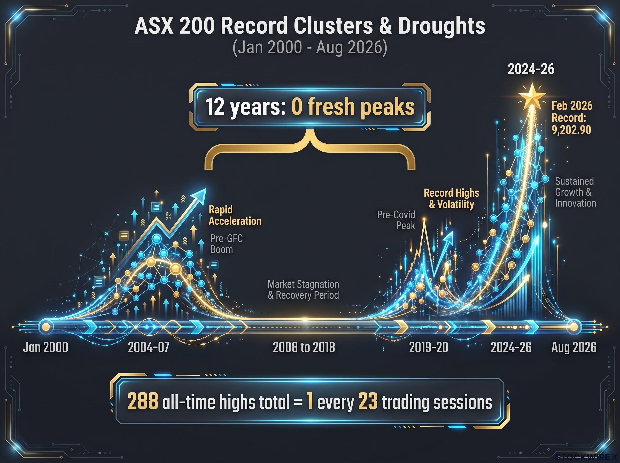
Seeing multiple record closes in a short period is not a signal that the market is about to reverse. According to research from Kerry Sun at Market Index, clustering is structurally normal during bull markets, and it is what a rising index is supposed to do.
What filtered data reveals about true risk
The reassuring headline numbers change meaningfully when you isolate the scenarios where hesitation was justified.
Filter 1 introduces a 1% pullback rule: rather than counting every new high, only those where the index had first retreated at least 1% from the preceding peak are included. Applying this screen shrinks the count from 288 entries down to just 64, concentrating the analysis on records that came after a genuine pause rather than mid-trend momentum.
Filter 2 removes the 22 all-time highs recorded immediately before the GFC and COVID crashes, stripping out the concentrated tail risk to show what buying at records looks like in the absence of systemic events.
| Metric | Full dataset (288 entries) | Filter 1: 1% pullback (64 entries) | Filter 2: pre-crash excluded (266 entries) |
|---|---|---|---|
| Median 12-month return | +8.03% | +3.84% | +10.95% |
| Positive outcome rate (12 months) | 68% | 62% | 74% |
| Average 3-month return | +0.69% | -0.78% | +1.92% |
The two filters move in opposite directions, and both make analytical sense. Filter 1 isolates weaker entries and the returns soften accordingly: the 12-month median drops from +8.03% to +3.84%, and the three-month average turns negative. Filter 2 removes the worst outcomes and the profile improves sharply: a +10.95% median 12-month return with 74% of entries positive.
The coherent takeaway is this: those 22 pre-crash highs are the concentrated source of genuine danger in the dataset. You cannot identify them in advance. But you can manage their impact through position sizing and diversification rather than by avoiding the market entirely.
The dividend gap and what it means for your actual returns
Every return figure in this analysis understates what you would have actually earned as an investor, and the gap is not small.
All figures in this 26-year study are drawn from the S&P/ASX 200 price index rather than the total return index. That means dividend income is absent from every number presented here.
That distinction matters more for the ASX 200 than for most global indices, because the Australian market is dominated by sectors that pay substantial dividends:
- Banks: the big four are among the highest-yielding large-caps globally
- Miners: BHP, Rio Tinto, and Fortescue have delivered significant dividend streams
- Telcos and utilities: consistent payout ratios above global averages
Independent total return data suggests materially higher outcomes than the price-index figures captured in this dataset. Investors in ASX 200 ETFs or accumulation superannuation funds receive those dividends (and potentially franking credits), turning the headline figures into a floor rather than a ceiling for real-world returns.
For ASX 200 ETF holders and superannuation accumulation funds, the dividend gap is compounded further by franking credits, which can lift a fully franked 5% cash yield to approximately 7.1% on a grossed-up basis, widening the gap between what a price-index study captures and what investors actually receive.
The case for staying invested at record levels is stronger in practice than the price-index numbers alone suggest.
Making the entry decision with the data behind you
The right answer depends on your horizon and your capacity to hold through short-term pain. Three variables matter, in order of importance:
- Time horizon. Investors with three or more years have historically been better served by entering than by waiting. The 2.22 percentage point median outperformance at 12 months, with 68% positive outcomes, is the anchor for the long-horizon case, and that is before dividends.
- Position sizing. If your horizon is shorter or your risk tolerance is lower, the data argues for adjusting how much you deploy, not for standing aside entirely. The cost of waiting for a dip has historically exceeded the benefit.
- Behavioural preparation. This is non-negotiable. Anyone entering at or near record levels should pre-commit to a plan for near-term volatility: what drawdown you can hold through without selling, how the position sits relative to your total portfolio, and how much cash you keep in reserve.
Vanguard Australia research on market timing costs finds that investors who remained fully invested through downturns, even those with poor entry timing, accumulated significantly more wealth over the long run than those who held cash while waiting for a better entry point.
The short-horizon investor
The period from 2008 to 2018 stands as the dataset’s clearest tail-risk reference point: roughly a decade without a single new high on the price index. If you may need the capital within 12 months, the slightly weaker short-term profile and the possibility of a severe drawdown are directly relevant. The response is to size the position appropriately and maintain reserves, not to avoid the market while waiting for a correction that may not arrive.
This article is for informational purposes only and should not be considered financial advice. Investors should conduct their own research and consult with financial professionals before making investment decisions. Past performance does not guarantee future results.
What the record means, and what it does not
The historical data makes a reasonable case for being invested at record levels if you have a long horizon. That case rests not on all-time highs functioning as buy signals, but on the consistent finding that staying out of the market at records has typically proven more costly than staying in.
The genuine risk remains: rare systemic shocks are the dominant tail threat in the dataset, and no amount of historical analysis removes that possibility. Diversification across sectors and asset classes, including international exposure beyond the ASX 200’s bank-and-miner concentration, manages that risk more effectively than attempted market timing.
The ASX 200’s concentration in banks and miners, which together represent roughly 45% of the index, is precisely why diversification beyond domestic equities matters: Australian investors and SMSFs currently hold more than 45% of equity exposure in domestic shares despite Australia representing roughly 2% of the global equity market, a home bias that amplifies the sector concentration risk this dataset captures.
The final reframe is the dividend gap. Real investor returns from ASX 200 exposure have historically been materially higher than any price-index study captures. The decision to stay invested, and to reinvest dividends, compounds that advantage over time. The data does not promise you a smooth ride from here. It tells you that the cost of waiting on the platform has usually been higher than the cost of boarding the train.