On 2 October 2026, at exactly 8:30 AM, the US economy posted its worst jobs number in recent memory: just 29,000 positions added against expectations of roughly 90,000. Markets reacted instantly. Bonds rallied, gold climbed, Bitcoin jumped, and the dollar sank.
For about 105 minutes, it looked like this number was going to matter. Then it didn’t. Everything that had moved simply moved back.
Here is the puzzle worth sitting with: if a jobs report that misses expectations by that much cannot durably shift Fed rate expectations, what does that tell you about how monetary policy actually works in real time? This was not a fluke. It is a recurring pattern, and understanding it will change how you read every future data release. After this, you will have a working mental model for why Fed forward guidance can outweigh even shocking economic data, and which signals are actually worth watching instead of the headline number.
What the September jobs report actually showed
Start with the headline, then watch it get worse as you add each layer.
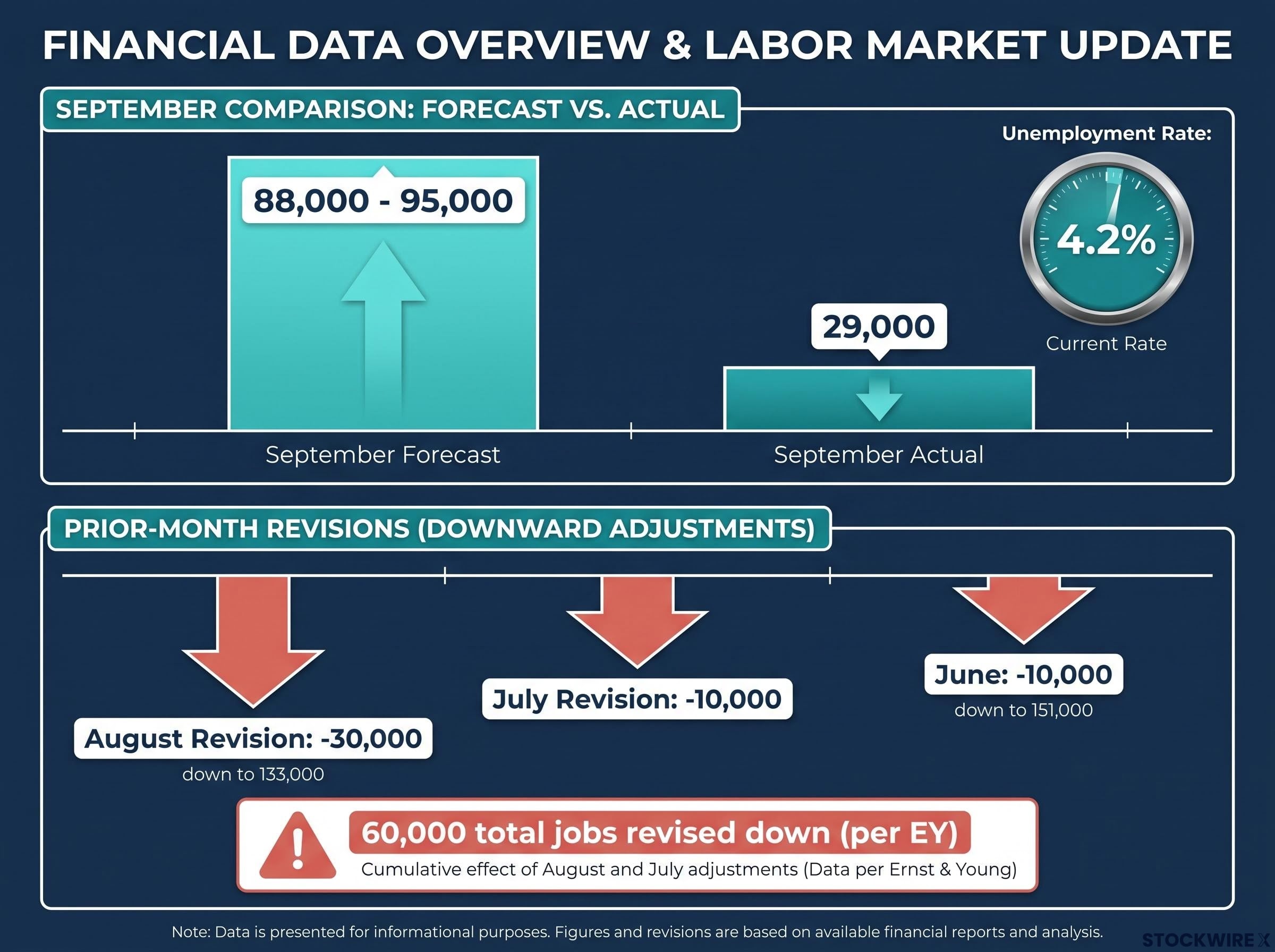
The Bureau of Labor Statistics (BLS) reported that nonfarm payrolls grew by just 29,000 in September 2026. Consensus forecasts had clustered between 88,000 and 95,000, depending on whether you looked at the FactSet figure cited by Morningstar or the range reported by CBS News and Yahoo Finance. By any measure, this was a miss of roughly two-thirds.
Then came the revisions, which is where the number got genuinely uncomfortable. August payrolls were cut from an initial 162,000 down to 133,000, a reduction of about 30,000. July was revised into negative territory, roughly 10,000 lower than its prior estimate. According to EY, the combined July and August downward revision came to 60,000 jobs.
The BLS nonfarm payroll estimation methodology relies on a sample-based estimator combined with a birth-death model, which is precisely why any single monthly print carries substantial measurement uncertainty and why the annual benchmarking process routinely produces the kind of compounding revisions seen across July and August.
Revisions matter as much as the headline because neither the Fed nor serious investors read a single print in isolation. They read the cumulative trend, and the trend was softening on every line.
The June 2026 payroll miss of 57,000 against a 114,000 consensus forecast, accompanied by 74,000 in combined April and May downward revisions, established the deteriorating trend line that gave the September print its cumulative weight rather than treating it as an isolated surprise.
Layer the unemployment rate on top. It ticked up to 4.2%, consistent with a labour market losing momentum rather than one experiencing a one-off wobble.
| Metric | Consensus Forecast | Actual Result | Prior-Month Revision |
|---|---|---|---|
| September nonfarm payrolls | 88,000-95,000 | 29,000 | n/a |
| August payrolls | n/a | Revised to 133,000 | Down ~30,000 from 162,000 |
| July payrolls | n/a | Revised negative | Down ~10,000 |
| Unemployment rate | n/a | 4.2% | n/a |
EY sharpened the point further.
If the recent overstatement pattern of roughly 30,000 jobs per month were to hold, September would effectively represent near-zero net job creation.
So this was not a borderline disappointment you could wave away. A weak headline, stacked on negative revisions to two prior months, amounts to a comprehensive softening of the labour picture. That is precisely why the first market reaction was so sharp, and why the next question becomes so interesting.
When big ASX news breaks, our subscribers know first
Why the two-hour rally reversed and what it revealed
The market’s first move was perfectly logical. It was also premature, and watching it unwind tells you more than the rally itself ever could.
Weak hiring points to weaker demand, which points to less inflation pressure, which points to a more dovish Fed. So capital rotated accordingly in the opening minutes after the release.
- Rallied: fixed income, precious metals (gold), and Bitcoin, all classic beneficiaries of a softer rate outlook.
- Weakened: the US dollar, as lower expected rates reduce its yield appeal.
- Mixed then reversed: equities rose initially, before sellers reconsidered that weak hiring is also a signal of slowing growth, which is not unambiguously good for stocks.
- Unaffected: crude oil, which stayed anchored to geopolitical conflict rather than domestic payroll data.
That last point is worth holding onto. Not every asset treats a jobs report as the same kind of signal, and oil ignoring it entirely shows how context-dependent these reactions are.
What the implied probability math actually showed
Here is where the story lives. Market-implied probability is a reading derived from Fed funds futures pricing, essentially the odds traders are collectively assigning to a rate move based on where they are putting money. When futures prices shift, the implied odds shift with them.
Coming into the week, the market was pricing roughly a 73-75% chance of an additional Fed rate hike. Within the first 105 minutes after the release, that probability collapsed to below 50%.
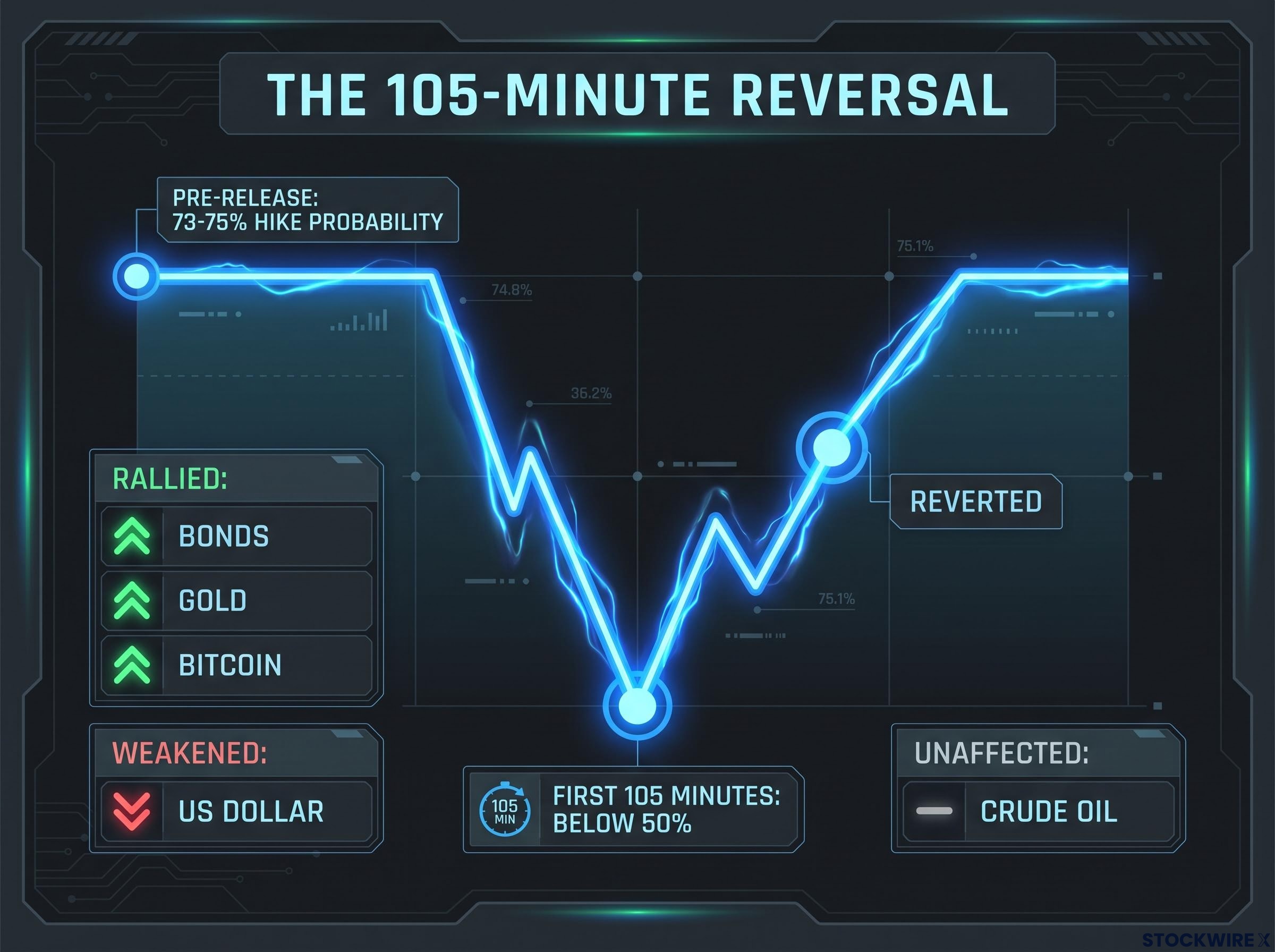
Then it reverted. The original analysis of this episode characterises that sub-50% move as an irrational overreaction given the Fed’s existing guidance, and the logic is straightforward: a single data point, however weak, rarely justifies fully discounting a rate path the Fed has publicly committed to.
The reversal inside two hours is the tell. Futures markets themselves concluded the initial repricing had gone too far. If you only saw the rally and logged off, you drew exactly the wrong lesson. The full arc, spike then reversion, is the diagnostic, and understanding why markets reached back toward their prior conviction is the key to reading every future data-market interaction more accurately.
How forward guidance acts as a floor under rate expectations
The signal is simple: rates barely moved, then reverted. The institutional logic behind that signal is what you need to understand, because it explains why Fed communication can outweigh even dramatically weak data.
Forward guidance is the practice of a central bank publicly signalling its likely future policy moves. The important part is what markets do with it. When the Fed says one more hike is probable, investors treat that statement as information about the Fed’s reaction function, how it will respond to conditions, not merely as a comment on current conditions. That distinction is what makes guidance sticky.
Fed forward guidance evolved from terse 130-word statements in 2002 to nearly 900 words at its 2014 peak, and the two clearest failures, the 2013 taper tantrum and the 2021 transitory inflation episode, both originated from the gap between prior guidance and subsequent action rather than from the policy change itself.
Crucially, most of the repricing had already happened before September’s report ever landed. Speculation about hikes at both the October and December meetings had already collapsed to a single expected hike. The timing of that remaining hike had shifted from October to December. The data arrived into a market that had already done its positioning.
Academic work reinforces why guidance holds. Economist Michael Woodford’s research on forward guidance and central bank credibility emphasises that once the Fed publicly commits to a course, backing away carries a reputational cost. That cost functions as a floor under hike probabilities. A single report has to be extremely and persistently inconsistent with the guidance before markets price the guided move out entirely.
EY captured the prevailing analyst read cleanly.
A stable and disinflationary labour market argues for Fed patience.
In other words, the weak print was viewed as compatible with a gradual policy path, not as a trigger to abandon prior communication.
Three episodes where guidance outlasted weak data
This pattern repeats. Three prior episodes make it recognisable.
- The 2016 Verizon strike. A large telecommunications strike temporarily depressed payrolls that year. The Fed treated the weakness as transitory and strike-related, maintained its normalisation guidance, and markets looked through it.
- The 2015-2016 pre-liftoff period. Ahead of the December 2015 first hike, several soft payroll prints appeared. Pricing dipped after each but never permanently dislodged expectations, because FOMC communication stayed consistent and pointed to accumulated labour market improvement.
- The 2021 taper discussions. During the pandemic recovery, multiple months disappointed on hiring, yet the Fed’s tapering guidance held. Policymakers stressed that decisions were tied to substantial progress over time, not to any single release.
For you, the lesson is practical. When the Fed has clearly telegraphed a move, one data release is almost never enough evidence to conclude it will blink. Positioning as though it will is exactly where overreaction risk lives.
The two camps: rational repricing or noise overreaction?
After this episode, you will encounter two confident and opposing interpretations. Both are partly right, and seeing why is what upgrades your framework.
The case for a rational market repricing
This camp argues that futures markets are obligated to incorporate new information. A 29,000 payroll gain, unemployment rising to 4.2%, and compounding downward revisions together suggest genuinely weaker labour demand and reduced inflation pressure. On that basis, briefly pricing the hike below 50% is a reasonable Bayesian update, meaning markets rationally adjusted their odds as fresh evidence arrived.
Jerry Tempelman, quoted by CBS News, gave the cleanest articulation of this view.
The tiny payroll gain raises questions about the durability of the labour market after the Federal Reserve’s first interest rate increase since 2023.
From this seat, weakening momentum is a real signal, and markets should price it.
The case for an overreaction to statistical noise
The opposing camp, including the original source’s own read, argues that payrolls are volatile, heavily revised, and distorted by temporary factors such as strikes, weather, and seasonal adjustment quirks. That makes one extreme print more likely to reflect measurement error than a true regime shift.
The caveats stack up. Weakness can be concentrated in a few sectors while others hold firm. Hours worked and wage growth can tell a different story than the headline. And the BLS revision record is the clincher: that 60,000 combined July-August revision is concrete proof that the first estimate is often wrong. A White House economist told Yahoo Finance the September report was “stronger than it looks,” pointing at the details beneath the surface.
The synthesis is the useful part. Both forces were present here, which is exactly why the move happened the way it did: the data camp pushed odds down, then the guidance camp pulled them back. The question to carry forward is not “is this bad?” It is “is this bad enough, and sustained enough, to override what the Fed has already told markets?”
What to actually watch instead of the headline number
You have earned a framework by working through this. Here is the tool.
Professional investors and the Fed itself do not read labour conditions through a single payroll print. That is the retail tendency, and it is the one that gets people positioned at the worst possible moment. The Fed reads the totality, and so should you. Track these five alongside the headline:
FOMC structure and the voting composition, seven Board of Governors members, the New York Fed president, and four rotating regional presidents, determine whose public comments carry binding weight versus contextual colour, a distinction that becomes critical when parsing which Fed signals to treat as durable guidance and which to discount.
- Multi-month rolling average of job gains. Smooths out the noise that makes any single month unreliable and shows the actual direction of travel.
- Wage growth trajectory. Tells you about inflation pressure and worker bargaining power, which the headline count misses entirely.
- Unemployment rate trend. One reading is almost meaningless; the trend over several months is what signals genuine softening or stabilisation.
- Participation rate. Reveals whether changes in unemployment reflect people leaving the workforce or genuine job losses, two very different stories.
- Fed communications and speaker signals. The clearest read on the policy path, and in this episode, the signal that actually predicted the outcome.
Notice how September resolved. It was not the data that settled things. It was the combination of established forward guidance, the recognition of data noise, and broader labour market resilience reasserting itself over a single print. That combination is the framework that actually called it right.
The practical implication is direct: fixating on one payroll number, especially in a month where the Fed has been explicit about its intentions, is a reliable way to misread market direction and act at precisely the wrong time.
This article is for informational purposes only and should not be considered financial advice. Investors should conduct their own research and consult with financial professionals before making investment decisions.
When the data and the Fed diverge, the Fed usually wins
The durable principle sits here. When the Fed has publicly committed to a policy path and labelled that commitment clearly, a single data release has to be extraordinary and persistent to override it. 105 minutes of futures pricing does not clear that bar.
The September arc proves it in miniature: 73-75% hike odds coming in, a collapse to below 50%, then a full reversion once the noise was recognised and the guidance reasserted itself. The 2016 strike, the 2015-2016 pre-liftoff stretch, and the 2021 taper discussions all tell the same story.
So what would actually change the calculus? Multiple consecutive weak prints, a sustained shift in inflation data, or an explicit pivot in Fed communication. Not a single morning’s headlines.
A stable and disinflationary labour market argues for Fed patience.
Use that as your filter. The next time a jobs number misses badly and markets spike, the only question that matters is whether anything in the data is genuinely new enough, and durable enough, to challenge established guidance. In monetary policy, the communication is usually the more durable signal, and treating one print as a policy pivot is a predictable, and entirely correctable, mistake.
For readers wanting to extend this framework into live rate-expectations monitoring, our dedicated guide to Fed dot plot versus market pricing walks through how the June 2026 median projection masked a near-even committee split, and which convergence events actually resolve the gap.