
Whether you are trading foreign exchange, managing a multinational equity portfolio, or simply watching the next inflation print, most major financial moves eventually trace back to one thing: the strength of the US Dollar. Its direction sets the tone for liquidity everywhere.
Fundamental economic data gives you the long-term roadmap for where a currency is heading. But technical indicators give you the precise coordinates for where momentum is shifting right now, which is exactly what DXY technical analysis is built to read.
This gives you a clear framework for reading the Dollar Index chart on your own. By the time you finish, you will be able to interpret moving averages and momentum gauges the same way institutional analysts do, and connect what you see back to Federal Reserve policy.
The internal mechanics and fundamental drivers of the Dollar Index
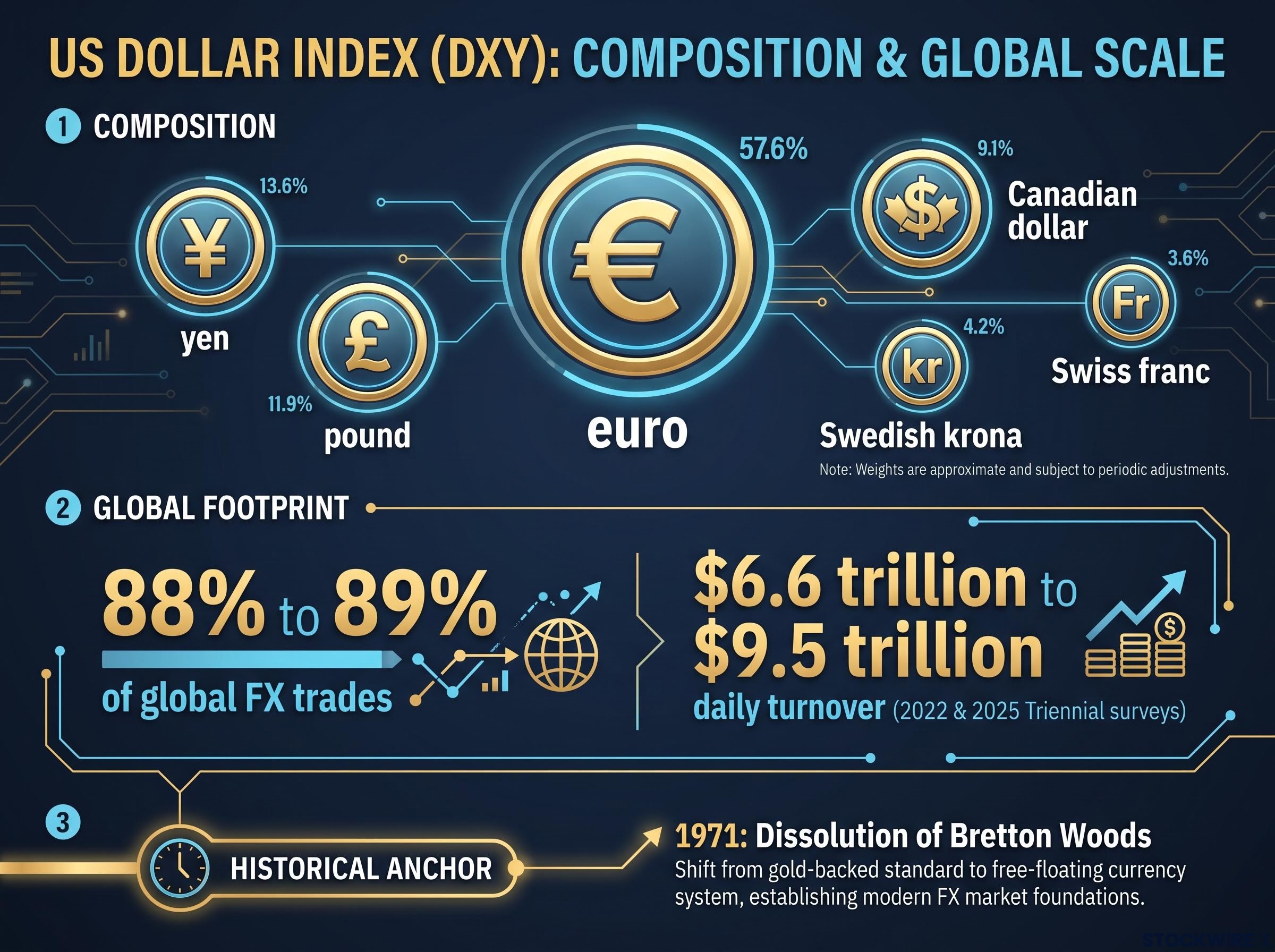
Before you read a single chart line, you need to know precisely what you are measuring. The US Dollar Index (DXY) tracks the dollar’s value against a basket of six major currencies, and it is not a balanced global gauge. The euro dominates the weighting, with the rest split across the yen, pound, Canadian dollar, Swedish krona, and Swiss franc.
That composition matters because it tells you the DXY is really a developed-market strength measure, with no direct exposure to emerging-market currencies or the Chinese yuan.
The ICE Dollar Index methodology specifies that the euro carries a 57.6% fixed weighting in a geometrically averaged calculation across six currencies, which is why broad dollar commentary anchored solely to the DXY can diverge sharply from what traders see happening in emerging-market pairs.
The dollar sits at the centre of the global financial system, which is why its moves ripple through every asset class. According to the Bank for International Settlements, the US Dollar features on one side of roughly 88% to 89% of all global foreign exchange trades, representing daily turnover of approximately $6.6 trillion to $9.5 trillion across the 2022 and 2025 Triennial surveys. When a currency is this embedded in world trade, its strength dictates how easily money flows everywhere else.
The engine behind long-term dollar strength is Federal Reserve monetary policy. The Fed operates under a dual mandate covering price stability and maximum employment, and it uses interest rates as its main lever. Higher or more restrictive rates lift US yields relative to peers, which pulls capital toward dollar assets.
The most recent policy signal came from the 10 December 2025 FOMC meeting, which cut the federal funds target range by 25 basis points to 3.50% to 3.75%. Markets read this as a hawkish cut: a small reduction paired with cautious, higher-for-longer projections and a divided 9-3 vote. That combination kept US yields structurally attractive, and it is the reason your baseline bias for the dollar must align with the current rate environment before you ever open a price chart.
The FOMC structure determines whose words actually carry binding policy weight: only 12 members vote at any given meeting, meaning public commentary from non-voting regional presidents should be read as context rather than forward guidance, a distinction that prevents costly misreads when hawkish or dovish rhetoric surfaces between scheduled decisions.
Educational note: what “hawkish” and “dovish” actually mean A hawkish stance means the central bank is prioritising inflation control, favouring higher or slower-falling rates. A dovish stance means it is prioritising growth and employment, favouring lower rates. Hawkish signals tend to support the dollar; dovish signals tend to weaken it.
Here is how the major fundamental drivers typically push the index:
| Fundamental Driver | Typical DXY Impact |
|---|---|
| Hawkish Fed guidance (higher-for-longer rates) | Supports the dollar via wider yield differentials |
| Dovish rate cuts (aggressive easing signals) | Pressures the dollar as yield advantage narrows |
| Quantitative tightening (shrinking balance sheet) | Supports the dollar by making dollar funding scarcer |
| Quantitative easing (asset purchases) | Pressures the dollar by expanding dollar liquidity |
This foundation, dating back to the 1971 dissolution of the Bretton Woods gold standard that created the modern fiat dollar, keeps your technical reading anchored in economic reality rather than chart patterns that drift free of it.
The euro bias caveat
Because the euro carries such heavy weight in the basket, the DXY can technically fall while the dollar is actually strengthening against emerging-market currencies, and vice versa. So when you hear commentary about “dollar strength,” remember the index is answering a narrower question than it appears to. For structural arguments about the dollar’s global role, you should pair the DXY with broader trade-weighted data rather than treating it as the final word.
When big ASX news breaks, our subscribers know first
Identifying dynamic support with Exponential Moving Averages
With the fundamentals grounded, you can turn to the chart itself, and the first tool worth mastering is the moving average. An Exponential Moving Average (EMA) is a line that plots the average price over a set period, but it weights recent prices more heavily. That weighting is why an EMA reacts faster to fresh price action than a simple moving average, which treats every day in the window equally.
The line to watch most closely is the 20-day EMA. It works as the primary dividing line between near-term bullish momentum and structural weakness, and it acts as dynamic support: a moving level where buyers tend to step back in during a pullback.
The clever part is that an EMA’s function flips depending on which side of it price is trading. In a downtrend, the line sits overhead and caps rallies as resistance. In an uptrend, it sits beneath price and cushions dips as support.
You saw both behaviours in the DXY over a single month. During the early September 2026 soft patch, the index traded near 98.70, trapped below both the 9-day and 50-day EMAs, which acted as a ceiling on every attempt to recover. By late September 2026, the picture had reversed: the DXY reclaimed the 100.00 handle and pushed above its 20-day EMA at 99.71, turning that level into constructive support.
Here are the three rules of thumb for reading price against a short-term EMA:
- Trading above the EMA: momentum favours the bulls, and the line marks a demand zone where dips are more likely to find buyers.
- Trading below the EMA: momentum favours the bears, and the line becomes overhead resistance that caps rallies.
- Testing the line: price is at a decision point, and how it reacts here often tells you whether the trend continues or turns.
The practical payoff is discipline. When you see the DXY holding above its 20-day EMA during a pullback, you can treat that level as a demand zone signalling the uptrend is intact, rather than panicking out of a position on a routine dip. That gives you an objective visual rule for separating a buying opportunity from a genuine reversal.
Fibonacci retracement levels add a second layer of precision to EMA-based analysis: when the DXY stalls near a key retracement zone that coincides with a moving average, the confluence of two independent methods at the same price point significantly raises the probability that the level will hold as support or resistance.
Gauging exhaustion risk using the Relative Strength Index
A moving average tells you the trend’s direction. What it does not tell you is whether that trend is running out of fuel, and that is where momentum comes in. The Relative Strength Index (RSI) is a gauge, usually set to 14 periods, that measures the speed and change of price movements on a scale from 0 to 100.
The two levels that matter most are 70 and 30. A reading above 70 is considered overbought, meaning the move higher has been fast and may be stretched. A reading below 30 is oversold, meaning the sell-off has been sharp and may be due for a bounce.
There is a third level worth watching: the 50 midpoint. It acts as a line of bias. RSI holding above 50 in a rising structure supports bullish continuation, while RSI stuck below 50 in a falling channel confirms bearish conditions.
Two DXY readings show how this plays out. In June 2026, the index pushed RSI near 74, a sign of powerful momentum but also a warning that the latest leg higher was becoming stretched. By late September 2026, RSI had settled into the 63.49 to 66.84 range, showing firm positive momentum without tipping into overbought exhaustion.
Indicators do not dictate reversals on their own. An overbought dollar can remain overbought for extended periods during structural macroeconomic shifts, which is why RSI is a risk-management context signal, not a mechanical sell trigger.
One refinement that separates reliable RSI signals from misleading ones is the RSI failure swing: a specific pattern where RSI fails to reach its prior high during a price recovery, confirming momentum deterioration before price itself rolls over, which is a more precise reversal signal than a simple overbought reading alone.
This is the point most newcomers get wrong. An RSI above 70 is telling you the move is stretched and that you should tighten your risk management, perhaps by reducing position size or moving stops closer. It is not an automatic signal for you to short a strong dollar uptrend, especially when hawkish Fed guidance and wide yield differentials are still pushing in the same direction.
Used alongside your price analysis, RSI helps you avoid the two most expensive timing errors: buying at the absolute peak of a rally and selling into the bottom of a panic. That alone can meaningfully improve where you choose to enter and exit.
Applying the tools to the September 2026 dollar setup
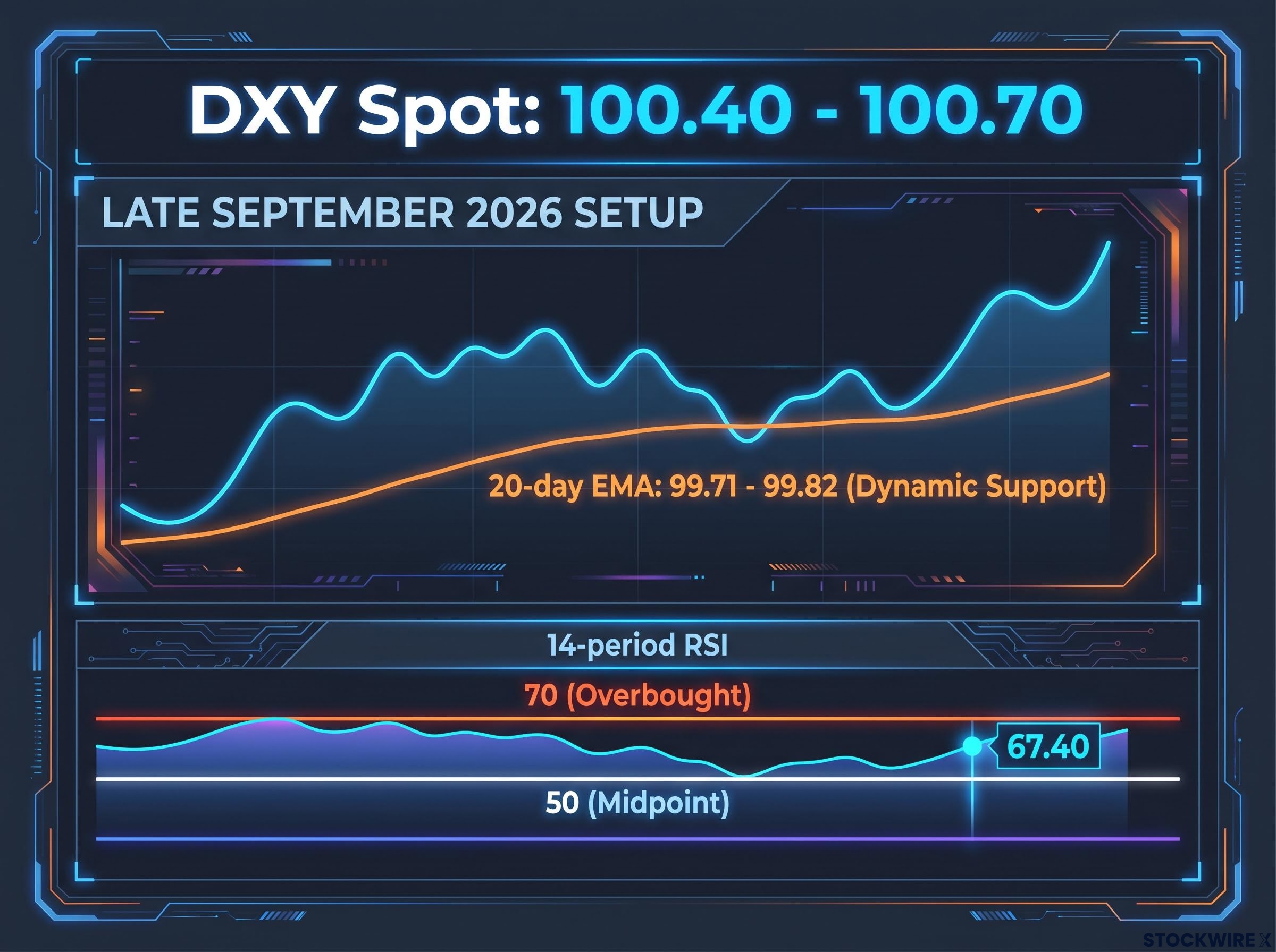
Now watch how the pieces fit together, because a professional never reads one indicator in isolation. As of late September 2026, the DXY sits near 100.40 to 100.70, and the technical and fundamental signals are pointing the same way.
Start with the trend. The 20-day EMA sits at 99.71 to 99.82, comfortably below spot price, which means it is functioning as immediate dynamic support rather than resistance. Price above the line keeps the near-term bias constructive.
Layer in momentum. The 14-period RSI is reading around 67.40, positive and firmly in bullish territory, yet still below the 70 exhaustion threshold. That is close to an ideal configuration: strong momentum with room left to run before the move looks overheated.
Then check the overhead. The source analysis identified no significant technical resistance immediately above current levels, which leaves room for either consolidation or a modest advance rather than an obvious wall for price to break through.
Here is the three-step process you can replicate on any live chart:
- Check the macro backdrop first. Is Fed policy hawkish or dovish, and are yield differentials favouring the dollar? This sets your baseline bias.
- Identify the EMA level second. Is price above or below the 20-day EMA, and is that line acting as support or resistance?
- Consult the RSI third. Is momentum confirming the trend, and is it stretched above 70 or comfortable below it?
Because the current technicals show constructive momentum without extreme exhaustion, you can read near-term pullbacks toward the 99.80 level as normal consolidation rather than structural failure. That single interpretation changes how you would react to a dip.
Converging technicals and fundamentals
This is why the setup carries weight: the technical breakout above 100.00 lines up with the lingering effects of the cautious 2025 Fed easing cycle. The hawkish December cut kept yields attractive, and the chart is simply reflecting that underlying support.
A technical setup is most reliable when it matches the fundamental narrative. When a bullish chart is backed by a genuine reason for the dollar to be strong, the signal carries far more conviction than a chart pattern floating on its own.
This article is for informational purposes only and should not be considered financial advice. Investors should conduct their own research and consult with financial professionals before making investment decisions. Past performance does not guarantee future results, and technical analysis is subject to changing market conditions.
Building your own dollar momentum framework
Put it all together and you have a repeatable routine. Fed policy sets your baseline bias, the 20-day EMA identifies the trend, and the RSI gauges whether that trend has momentum or is running on fumes.
The single most important lesson is that no indicator works in a vacuum. The 20-day EMA and the 50 RSI midpoint are your baseline barometers, but they earn their reliability only when they agree with each other and with the macro backdrop.
Watch how these boundaries shift around upcoming data releases. A softer inflation print or a dovish shift in Fed language could pull the DXY back below its EMA and drag RSI under 50, flipping the entire read.
Treat this framework as a daily health check for the global economy. Use it to confirm or challenge your existing portfolio assumptions, and you will start interpreting financial news through your own analytical lens rather than waiting to be told what it means.
For readers wanting to extend this framework beyond the EMA and RSI combination, our deep-dive into technical indicators that survive live trading examines RSI divergence, Volume Market Profile, and Smart Money Concepts across 30-plus years of live capital deployment, with academic evidence on which signals carry a genuine edge.