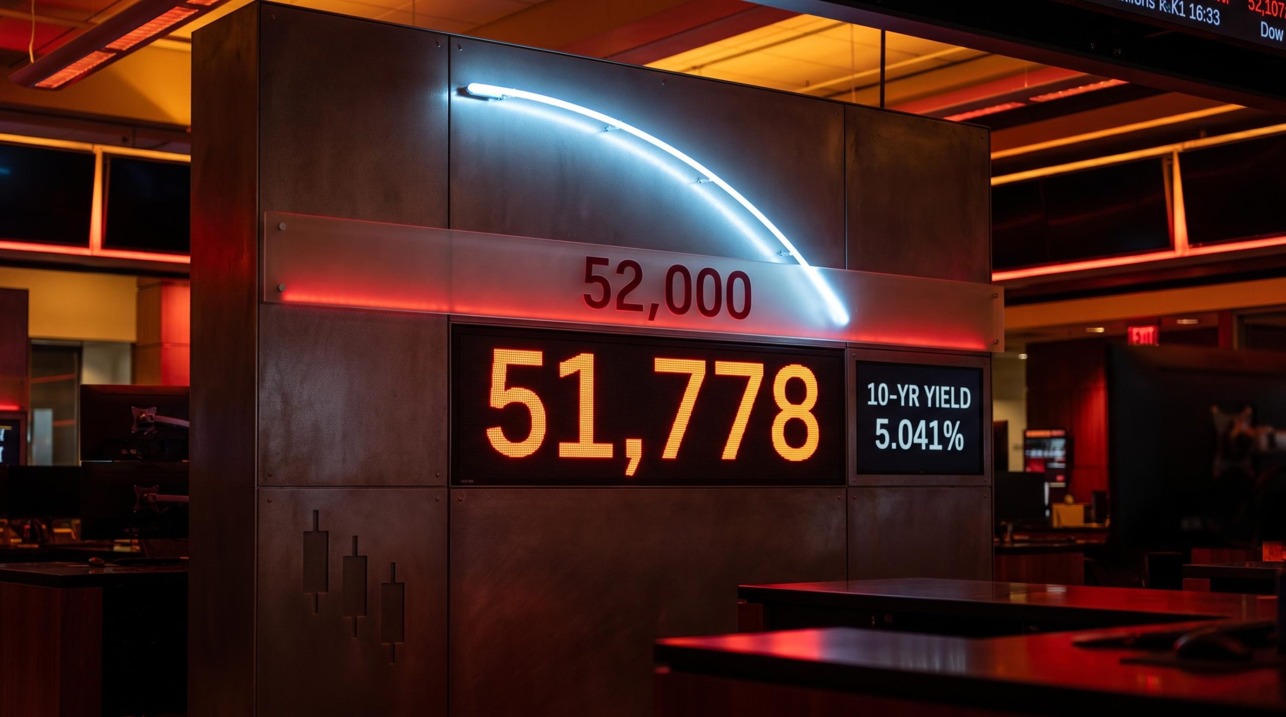
The Dow Jones Industrial Average is doing something it has not done in five months, and the technical setup around it is one with a documented history. As of 17 September 2026, the index is pressing up against a falling 50-day exponential moving average sitting near 52,150, while the 10-year Treasury yield has just briefly crossed 5% for only the second time since 2007.
Layered on top of that: three consecutive trading sessions have each printed a lower high, the textbook confirmation of downward momentum, and every recovery attempt keeps stalling below 52,000.
Three forces are now reinforcing each other in real time. The break below the 50-day average on 1 September 2026 ended a run of the Dow holding above it since April. The Federal Reserve’s own September projections show core inflation staying above 3% through 2026 and not returning to target until 2029. And the 52,000 level keeps capping every bounce.
This piece breaks down how to read the specific signals defining this bearish setup, why the 52,000 ceiling and the declining moving average carry the weight analysts assign them, and what would need to change for the setup to invalidate itself. Think of it as analytical literacy, not a forecast.
Three sessions, three lower highs: reading what the Dow’s price structure is telling you
Start with the tape. The DJIA closed at 51,778.04 on 17 September 2026, up from the prior close of 51,461.90. On its own, a green session looks like a recovery.
The context complicates that reading. Across the recent sessions, each attempt to rally has topped out lower than the one before it, three consecutive lower highs, and a Thursday recovery attempt was fully reversed before the close. Wednesday’s session low near 51,200 marked the lowest the index has traded since June 2026.
That sequence is the market’s scoreboard, and right now it reads as sellers fading every bounce. The structural inflection point was 1 September 2026, when the Dow slipped below its 50-day moving average after holding above it every single day since 11 April 2026. A five-month uptrend became a confirmed downtrend on that break.
Moving average crossover signals carry a documented lag problem: the 50-day can only cross the 200-day after prices have already trended in the new direction for weeks, which is why the September break below the 50-day average is a lagging confirmation of a trend that began forming earlier, not a predictive trigger.
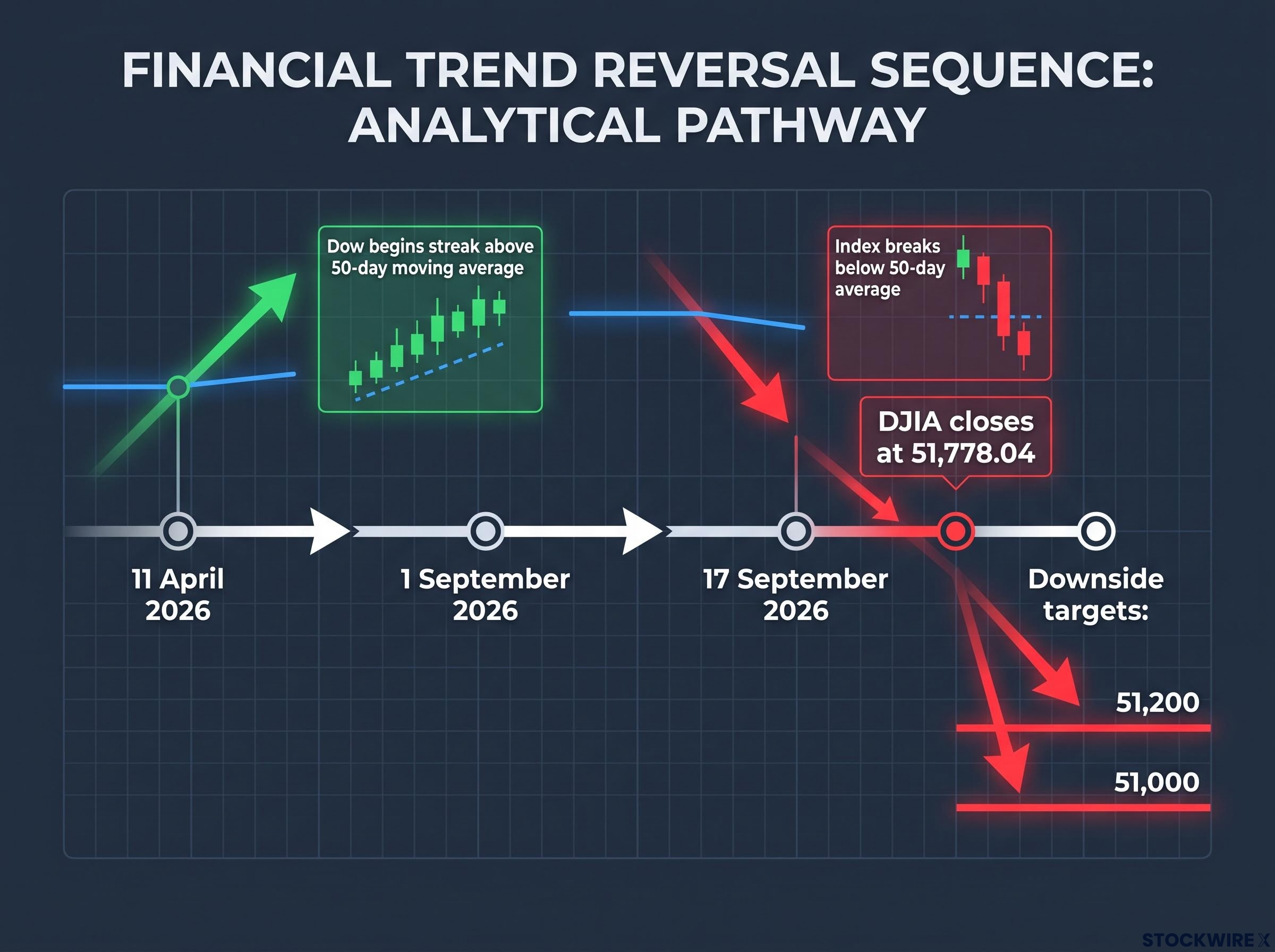
Here is the sequence that defines the current structure:
- 11 April 2026: The Dow begins a streak of closing above its 50-day moving average that would run five months.
- 1 September 2026: The index breaks below the 50-day average, ending that streak and flipping the trend character.
- 17 September 2026: DJIA closes at 51,778.04, still capped below the falling average, with three lower highs confirming the downtrend.
- Downside targets: 51,200 as immediate support (the June low), then 51,000 if that breaks.
The reason this matters to you is timing. When sellers are actively fading every rally, waiting for a “clear bottom” before acting carries its own risk, because that clarity may only arrive well below current levels. The break below the 50-day average is not a routine wobble, and there is recent precedent for what follows it.
A recent warning from the chart MarketWatch and Morningstar flagged the 50-day break as a “key chart level,” noting that the prior time the Dow slipped below this average it followed a 10% drop from a record high. That was the February to March 2026 correction, when the index fell from 50,188 to 45,166.
When big ASX news breaks, our subscribers know first
Why the 52,000 ceiling and the falling EMA are not the same obstacle
Resistance is not one thing. There is a static ceiling at 52,000, a fixed price level that has capped every recent upside attempt. Then there is the declining 50-day moving average sitting just above it, and the difference between the two is what makes this setup mechanically difficult to break.
A static level is simply a price where selling has clustered before. A dynamic level moves with price. According to Investing.com’s technical readings on 17 September 2026, the 50-day simple moving average sits at 52,151.77 and the 50-day exponential moving average at 52,170.85, both flagged “Sell.” Because that average is sloping downward, the ceiling effectively descends toward the index over time.
Above those two levels sit further supply clusters: 52,700 has been tested three times, the 52,720-53,012 zone forms a structural wall where the SuperTrend indicator, the 50-period SMA, and the top of the Ichimoku cloud converge, and 53,400-53,800 marks a broader distribution zone where large sellers have repeatedly dominated.
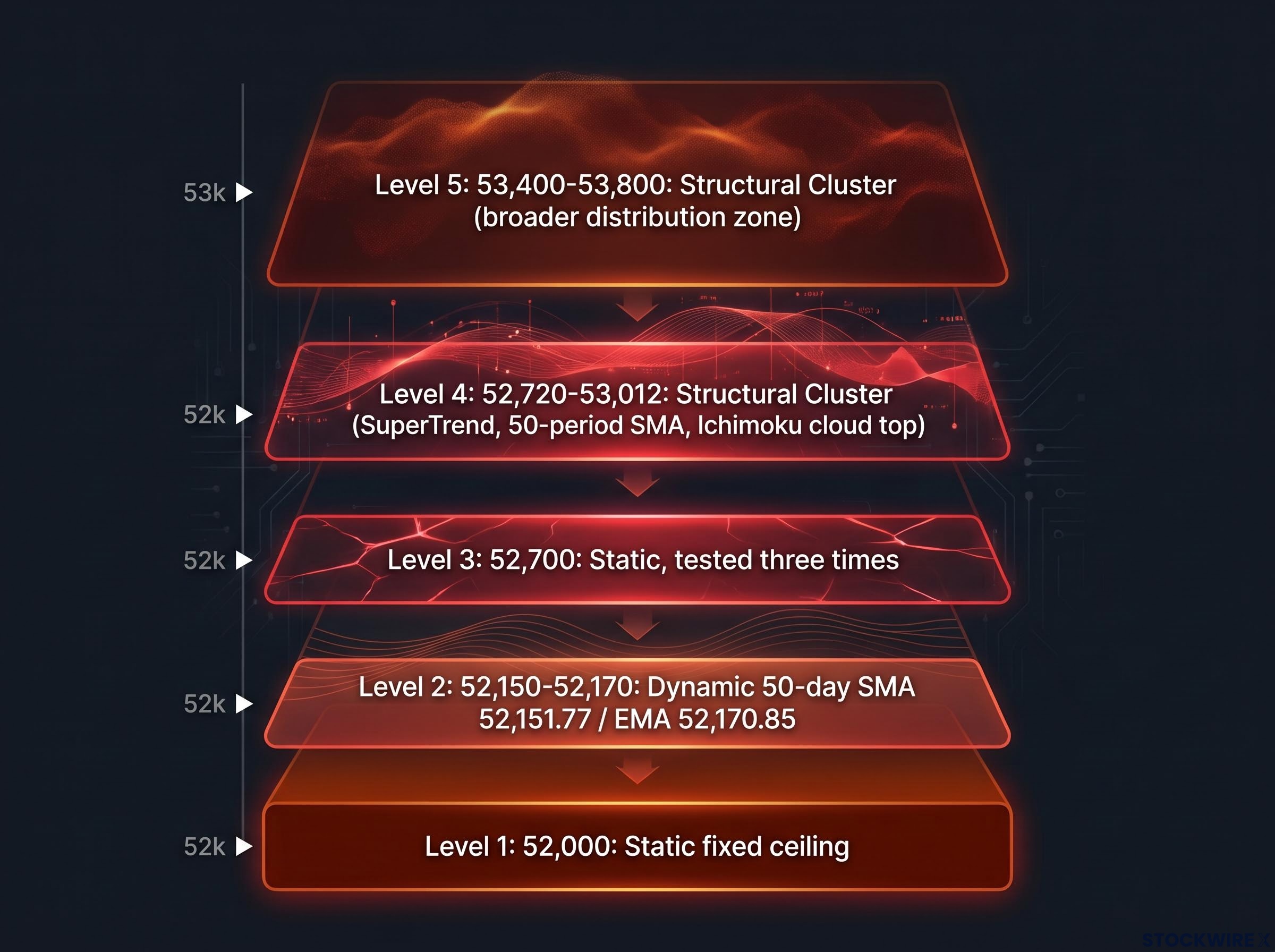
| Level | Type | Current Reading | Significance |
|---|---|---|---|
| 52,000 | Static | Fixed ceiling | Caps every recent rally; daily close above it needed to invalidate the bearish scenario |
| 52,150-52,170 | Dynamic | 50-day SMA 52,151.77 / EMA 52,170.85, “Sell” | Declining average; average cost basis of past 50 sessions |
| 52,700 | Static | Tested three times | Strong overhead supply |
| 52,720-53,012 | Structural Cluster | SuperTrend + 50-period SMA + Ichimoku cloud top | Full technical reversal trigger if reclaimed and held |
| 53,400-53,800 | Structural Cluster | Broader distribution zone | Repeated resistance failures; large sellers dominant |
The practical read for you is this: until proven otherwise, any rally back toward 52,000-52,170 is a selling opportunity, not a recovery signal. The index has to clear several overlapping barriers before the bearish setup is structurally broken.
Why the Dow’s price-weighting makes the 50-day EMA more potent than in cap-weighted indexes
The Dow is a price-weighted index, meaning higher-priced constituent stocks exert more influence on the index level than lower-priced ones, regardless of company size. A market-cap-weighted index like the S&P 500 works differently, weighting by total company value.
The Dow’s price-weighted index mechanics mean a $1 move in any single component shifts the index by roughly 5.94 points regardless of that company’s total market value, a structural fact that amplifies the influence of the index’s highest-priced constituents on every session’s close.
When the Dow’s high-priced components trend lower, they drag the 50-day moving average down more sharply than the same move would in a cap-weighted index. That makes the Dow’s declining average a more aggressive barrier, and it is part of why every bounce toward it keeps meeting supply.
The macro ceiling: what 5% yields and the Fed’s own projections mean for Dow multiples
The chart’s resistance levels are not arbitrary. Underneath them sits a macro environment where the Fed’s own published projections confirm that the “higher for longer” thesis will not resolve quickly.
The 10-year Treasury yield reached 5.041% on 15 September 2026, its highest level since July 2007, before retreating to 4.94% by 17 September. The 30-year yield held above 5.28%-5.30% through the week, well above its long-term average of 4.74%. When risk-free rates sit at multi-decade highs, the discount rate applied to future corporate earnings rises, which mathematically reduces what investors should rationally pay for stocks today.
The four forces driving the yield surge in the week of 13 September — a hotter core CPI print, an oil-price spike, structural fiscal deficit anxiety, and curve-wide selling across the 2-year, 10-year, and 30-year simultaneously — explain why the 10-year move was sharper than the headline rate change alone would suggest.
That is where the technical ceiling gains a fundamental explanation. And the Fed’s September projections turn that from interpretation into a stated policy path.
| Metric | 2026 | 2027 | 2028 | 2029 |
|---|---|---|---|---|
| Core PCE inflation | 3.4% | 2.5% | 2.2% | 2.0% |
| Headline PCE inflation | 3.7% | 2.3% | 2.1% | 2.0% |
| Real GDP growth | 2.3% | 2.4% | n/a | n/a |
| Unemployment rate | 4.1% | ~4.1% | ~4.1% | ~4.1% |
Reuters confirms the Fed does not project inflation returning to its 2% target until 2029. Kansas City Fed President Schmid, whose recent speech scored 8.0 on a hawkishness scale against his historical average of 7.2, said inflation is running above 3% with pressures widespread across goods and services rather than concentrated in energy.
What that timeline tells you is important. The macro headwind is not a temporary condition to wait out over a quarter or two; it is a multi-year rate environment that changes the valuation math for the whole index. JPMorgan’s scenario analysis even frames a “no-hike” decision as bearish, on the reasoning that it would signal the Fed losing its inflation fight and push long-dated yields higher still.
A rare level with a bearish track record The 10-year yield above 5% has occurred only twice since 2007. The prior instance was October 2023, a period that coincided directly with Dow weakness as high yields pulled capital away from equities.
What history says about 5% yields and declining moving averages (and where it gets complicated)
The current configuration can feel unprecedented in the moment. It is not. The 10-year has crossed 5% before, and the episodes share a common mechanism worth understanding rather than simply cataloguing.
In July 1966, April 2006, and October 2023, the yield broke above 5% and equities saw initial drawdowns of roughly 4% to 15%. Six-month returns after each breakout ranged widely, from -1.6% to +4.7% to +19.6%. The consistent thread was not the crossing itself; the durable equity bottom in each case arrived only after yields peaked and began to fall.
| Year / Episode | Initial Drawdown | Six-Month Return | Yield Peak Trajectory |
|---|---|---|---|
| 1966 | ~ -15% | -1.6% | Turn came after yield peaked |
| 2006 / 2007 | ~ -8% | +4.7% | Dow set record Oct 2007 after peak |
| October 2023 | ~ -4% | +19.6% | Rally followed yield retreat |
| 2026 (current) | ~ -10% (Feb-Mar) | Unresolved | Yield near 5%, not yet peaked |
The 2026 precedent is direct and recent. The Dow fell from 50,188 on 10 February 2026 to 45,166 on 27 March 2026, roughly a 10% decline, the last time it broke below its 50-day average in a sustained way. This specific technical setup has already carried a real, recent cost.
The three-part pattern across every episode looks like this:
- The 10-year yield crosses 5%, a rare multi-decade signal.
- Equities take an initial drawdown, historically somewhere between 4% and 15%.
- The durable turn arrives after yields peak and begin declining, not at the moment of the crossing.
Here is the honest complication. S&P Dow Jones Indices research covering 1991 to 2015 found the S&P 500’s average monthly return was actually higher during rising-rate periods, at 1.26%, than during declining-rate periods, at 0.73%. Elevated yields and a hawkish Fed do not automatically produce sustained bear markets. The 1987 precedent sits at the opposite extreme, when the 30-year yield surged to 10.24% and sharply rising yields contributed to the largest single-day Dow decline on record.
What you should take from this is a reframing of what to watch. The bearish case is well supported by historical analogy, but the timing of any equity bottom is almost certainly tied to when yields crest and turn, not to where yields sit on any given day.
What would actually change the setup: specific technical and macro triggers to watch
A single green candle does not reverse this. The setup changes when specific, named price levels are reclaimed and held, which means the levels matter more than day-to-day percentage moves.
Here are the reversal conditions in ascending order of confirmation strength:
- Minimum threshold: A sustained daily close above 52,000. This begins to invalidate the bearish scenario but does not confirm a reversal on its own.
- Full technical reversal trigger: Reclaiming and holding above the 52,720-53,012 resistance cluster, where the SuperTrend, 50-period SMA, and Ichimoku cloud top converge.
- Trend change confirmation: Regaining the 50-day EMA at 52,150-52,170 and then the 200-day moving average, with rising volume behind the move.
- Macro complement: The 10-year yield retreating and holding below 5%, accompanied by softer Fed communication or clear evidence of disinflation.
There is a genuine near-term counter-signal worth naming. The daily Stochastic RSI registered around 24 and declining, which is oversold territory. Deeply oversold momentum readings can produce relief rallies even inside a downtrend, and some commentary has flagged a bullish engulfing candlestick as a short-term positive.
The distinction that matters for you is between a tactical bounce and a structural reversal. An oversold bounce that stalls below 52,000 leaves the bearish setup fully intact; only reclaiming and holding the higher levels changes the structure. For context, the Motley Fool notes this is the fifth rate-increase cycle since 1999, and the last four each coincided with bear markets or corrections, though markets recovered in every prior instance.
Morgan Stanley’s early-warning flag Morgan Stanley has warned that tightening liquidity and spikes in short-term funding spreads are early warning signs of a sharper correction if left unaddressed. Watching those funding-market signals alongside the yield path gives a fuller read than price alone.
When the ceiling becomes the floor: the conditions that would change this analysis
Three reinforcing forces define the current bearish setup. The technical structure holds a declining 50-day EMA, a 52,000 ceiling, and a lower-high sequence. The macro environment shows the 10-year yield in a 4.94%-5.04% range this week and a Fed SEP projecting inflation above target through 2028. And the historical precedent includes a roughly 10% Dow correction in early 2026 under similar conditions.
The prior five-month uptrend, running from 11 April to 1 September 2026, was real. Its reversal is recent, which is precisely why the setup deserves attention rather than complacency.
This is a conditions-based assessment, not a prediction. The bearish setup remains valid as long as 52,000 acts as a ceiling and yields stay elevated. It changes when yields crest and the index reclaims the technical levels outlined above. The signals are named and the thresholds are defined, so the next move in the data tells you what to do with the framework. The Motley Fool’s balancing note is worth holding: markets recovered after all four prior rate-increase cycles since 1999.
For investors tracking whether the yield path or the equity drawdown matters more to Washington’s next policy move, our deep-dive into bond market pressure on policy examines why Wolfe Research, Bloomberg Opinion, and Mohamed El-Erian have each concluded that Treasury stress — not S&P 500 weakness — is now the primary forcing mechanism on White House decision-making.
This article is for informational purposes only and should not be considered financial advice. Investors should conduct their own research and consult with financial professionals before making investment decisions. Past performance does not guarantee future results. Financial projections are subject to market conditions and various risk factors. These statements are speculative and subject to change based on market developments and company performance.