The US economy is doing fine in 2026. Unemployment has stabilised, growth expectations have been revised upward, and yet the bond market is behaving in a way that makes seasoned investors nervous. The 30-year Treasury is trading around 5.28% and the 10-year sits at 4.80%, levels not seen since 2003 and 2007. To anyone glancing at the headline, those numbers read like a warning.
They are not. Or at least, not the warning most people assume.
Here is the trap. A yield surge at these levels looks like a crisis, so investors reach for defensive moves, shortening duration, trimming fixed income, bracing for a US debt reckoning. But if the surge is actually a repricing of economic strength rather than a signal of fiscal distress, that defensive reaction is a diagnosis that does not match the condition.
Getting this distinction right matters for real money. A yield surge driven by growth confidence and one driven by genuine sovereign stress demand almost opposite responses.
Here is what the data actually tells you about why yields are moving, and what it means for how you should read the bond market right now, using the specific mechanisms playing out in September 2026 as your reference case.
Why US Treasury yields are surging in September 2026
Start with the numbers, because they set the stage for everything that follows.
- 10-year Treasury yield: 4.80% on 8 September 2026 (Federal Reserve DGS10 data), with an intraday high of 4.812% before closing at 4.786%.
- 30-year Treasury yield: 5.28% on 9 September 2026 per YCharts, sitting in 19-year-high territory.
- 5-year yield: up roughly 0.8 percentage points across 2026.
- 30-year yield: up roughly 0.4 percentage points over the same period.
The anchor fact On 31 July 2026, the 30-year Treasury closed at 5.27%, its highest level since 2007, according to the Peter G. Peterson Foundation.
That closing level carries real historical weight. The last time long-term US borrowing costs sat this high, the global financial crisis had not yet happened. So the instinct to treat this as alarming is understandable.
What the shape of the move actually tells you
Look again at the two figures that matter most: the 5-year rose about 0.8 percentage points in 2026, while the 30-year rose only about 0.4 percentage points. The short end led. The long end lagged.
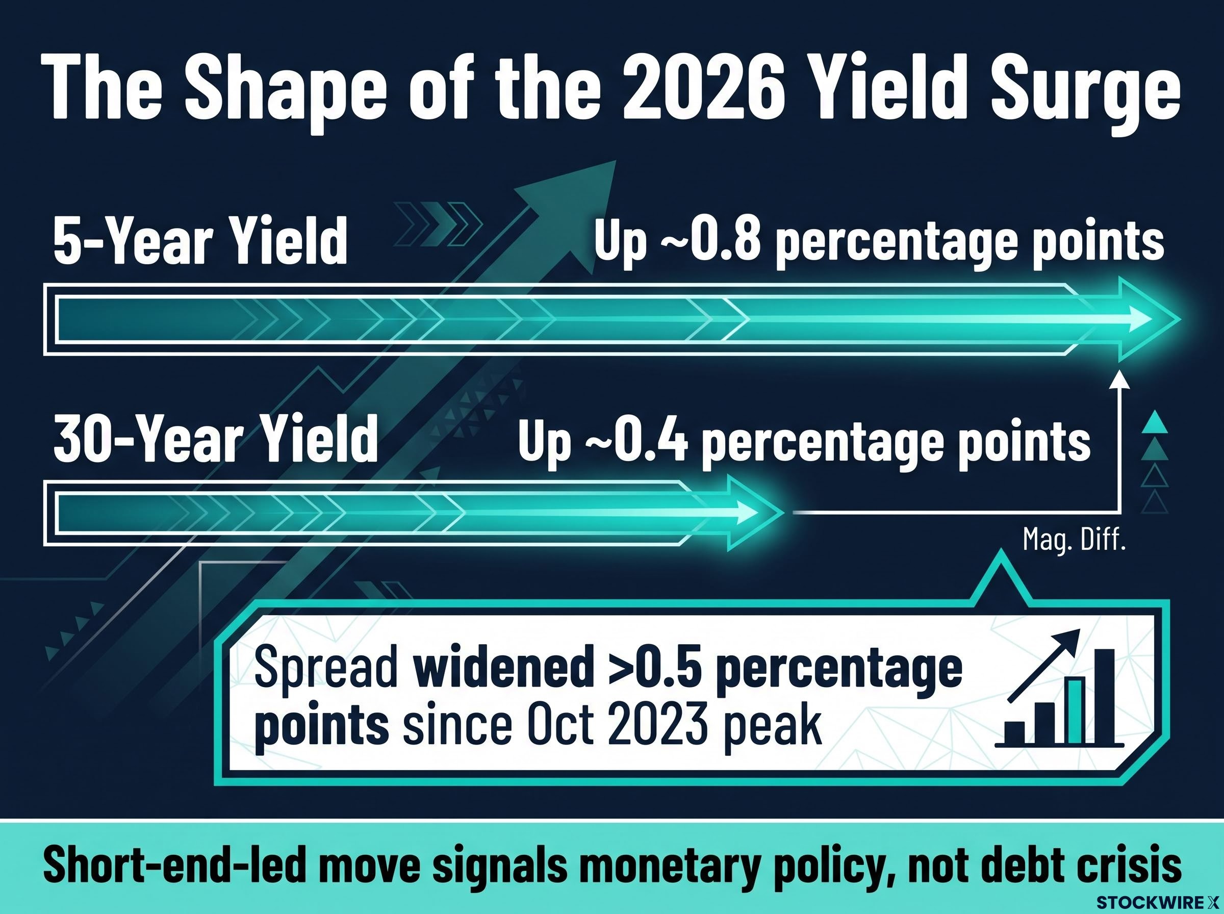
Since the October 2023 peak, the spread between the 30-year and the 5-year has widened by more than 0.5 percentage points through early September 2026. That is the diagnostic clue most casual observers miss.
When the short end leads a yield move, the signal points to monetary policy. Markets are repricing where they expect the Federal Reserve to take interest rates. When a debt crisis is brewing, the long end leads instead, because creditors are demanding more compensation to hold your government’s paper over decades.
This is short-end-led. That tells you the bond market is reacting to the Fed’s expected path, not to any loss of faith in the US government’s ability to pay. And that single distinction should change how you respond to the headline number.
When big ASX news breaks, our subscribers know first
What is actually driving yields higher, and why growth is the story
Three forces are pushing yields up. They operate at different levels of abstraction, and understanding them in order, from the concrete to the counterintuitive, is how you see why growth, not distress, is the story.
- Fed rate repricing: markets now expect higher short-term rates for longer.
- Term premium normalisation: a structural feature returning from an eight-year anomaly.
- Bond supply expansion: a flood of new long-duration issuance the market must absorb.
| Driver | Mechanism | What it signals |
|---|---|---|
| Fed rate repricing | Forward expectations for the funds rate shifted up roughly 1 percentage point | Confidence in economic resilience, not distress |
| Term premium normalisation | Extra yield on long bonds returned to positive after eight negative years | Removal of an anomaly, not a credit warning |
| Bond supply expansion | AI capital expenditure plus government issuance flood the market | Mechanical supply absorption, not creditor panic |
The Fed repricing at the short end
The FOMC held its rate target at 3.50%-3.75% through every 2026 meeting: 28 January, 18 March, 29 April, and 29 July. On the surface, nothing changed.
Underneath, expectations moved a lot. Market pricing for the funds rate by Q1 2027 shifted up roughly 1 percentage point during 2026. The Fed’s own June 2026 Summary of Economic Projections raised its median end-of-2026 rate to 3.8%, up from 3.4% in March, and the July 2026 Monetary Policy Report noted futures imply an effective rate near 4% by year-end.
A Fed on hold but with rising forward expectations pushes yields up specifically at the short and medium maturities. That is exactly why the 5-year led. The market is not fleeing Treasuries; it is repricing the cost of money based on an economy that keeps outperforming.
Term premium: from negative anomaly to positive normal
The term premium is the extra yield you demand to hold a long-dated bond rather than rolling over a series of short-term ones. It compensates you for the uncertainty of locking money up for years.
For eight straight years from June 2016, according to the New York Fed’s ACM model, this premium sat in negative territory, suppressed by quantitative easing, near-zero rates, and global demand for safe assets. That negative run was the anomaly. In August 2024, it turned durably positive again.
The normalisation adds yield mechanically. The five-year, five-year forward rate and the 20-year, ten-year forward rate each moved up about 0.4 percentage points. Crucially, a positive term premium is the market’s normal state, not a distress signal. It means you are being paid for duration risk again rather than subsidising the market.
Bond supply and the AI investment wave
The third force is the most counterintuitive: sheer volume of new bonds. Corporate issuance to fund AI infrastructure has become a genuine structural supply driver, layered on top of expanded government issuance tied to the fiscal deficit.
More bonds hitting the market require higher yields to clear. That is supply and demand, not a verdict on creditworthiness.
All three drivers point the same direction, and none of them points toward a solvency scare. That is why this surge is better read as a signal of economic resilience than as a warning klaxon over US debt.
How to tell a healthy repricing from an actual debt crisis
So how do you tell the difference yourself, in this episode or any future one? There is a specific test, grounded in three indicators.
- Breakeven inflation rates: In a genuine debt crisis for a currency-sovereign like the US, the adjustment mechanism is inflationary, because creditors demand a premium against debasement. That shows up in breakeven rates, the market’s implied inflation expectation. In 2026 they have stayed stable. That absence is itself the data point.
- CBO trajectory stability: A sudden fiscal deterioration would show up as a worsening long-run debt path. It has not.
- Curve shape: A short-end-led move points to monetary policy; a long-end-led move points to sovereign stress. This move is short-end-led.
Run the debt trajectory through that test. The CBO’s February 2026 projection has federal debt held by the public rising from 99% of GDP at the end of 2025 to 120% by 2036 and 175% by 2056. Those are large numbers, but the path aligns closely with the CBO’s February 2024 projection, meaning little net change. The 2050 projected ratio actually sits roughly 20 percentage points lower than the pre-pandemic January 2020 forecast.
None of that is trivial. National debt has surpassed $40 trillion, annual deficits run near $2 trillion, and higher yields genuinely raise federal interest costs. That is a real fiscal drag. But a fiscal drag is not a bond market panic, and the two should not be confused.
The scale reference that clarifies everything Bonds have lost about 4.2% this year. During the 2022 shock, they plunged 23%. On a rolling 20-day basis, global government yields have risen about 17 basis points in 2026 versus 62 basis points in late 2022, according to Bloomberg.
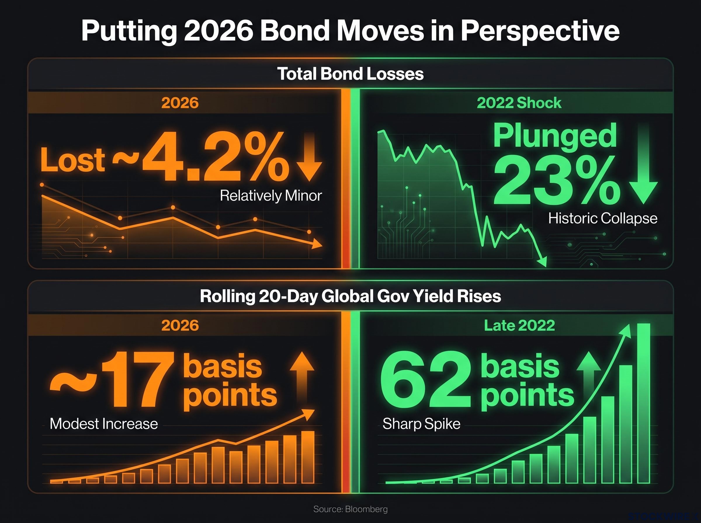
Put together, the stable CBO path and the flat breakevens tell you professional bond markets are not pricing a US solvency event. React to the yield level without checking these diagnostics, and you are responding to appearance rather than evidence. This framework travels well beyond September 2026; it is a repeatable method for reading any future yield surge.
What higher yields mean for investors navigating the bond market now
You now understand the mechanics. Here is how that understanding translates into your own positioning, without anyone telling you which specific trades to make.
- Income opportunity for new buyers: With the 30-year in the 5.25%-5.28% range, new bond buyers are locking in coupon income at levels rarely available in the past two decades, and doing it without the embedded crisis risk that would normally accompany yields this high.
- Mark-to-market pain for existing holders: Long-duration bonds fall in price as yields rise. If you bought the 30-year at lower yields, the current range represents real capital impact on paper.
- Term premium compensation, finally: After eight years of a negative term premium, the shift to positive means you are being paid extra to take on duration risk rather than subsidising the market as buyers were during the QE era.
That last point is the one worth sitting with. Morningstar views the term premium normalisation favourably for existing bond investors, offering higher future coupon income without embedded crisis risk. For a patient investor with a long horizon, this is arguably the first genuinely compensated entry point for long-duration Treasuries in nearly a decade.
Historical grounding Today’s 30-year levels remain far below the Volcker-era peak, when 10-year yields topped 15% in 1981. High as current yields feel, they are nowhere near the ceiling of living memory.
Whether yields are high because of growth or because of distress determines whether duration is a risk to cut or an opportunity to weigh. That is the call this understanding lets you make for your own situation.
Past performance does not guarantee future results. Financial projections are subject to market conditions and various risk factors.
What to watch as yields stay elevated through late 2026
None of this is a prediction. It is a map of the specific signals that will tell you whether the growth-repricing thesis is holding or whether the risk scenario is starting to materialise.
- The Fed’s rate path: The July 2026 Monetary Policy Report has futures implying an effective rate near 4% by year-end, and the June SEP nudged the 2027 median up to 3.6% from 3.1% in March. If core inflation persists and unemployment holds, that upward path continues and short-end pressure stays. If labour markets soften, that pressure may ease.
- Breakeven inflation rates: This is your early-warning diagnostic. A sustained move upward in breakevens would mean markets are starting to price the fiscal debasement scenario rather than the growth one. Stable breakevens keep the growth thesis intact.
- AI-driven issuance: Corporate borrowing for AI capital expenditure is a genuinely new structural supply driver. How much the market has to absorb through late 2026 and into 2027 will shape how much upward pressure supply alone contributes.
Watch these three, and you are tracking the underlying conditions rather than reacting to daily yield noise. That is the difference between deliberate positioning and getting whipsawed by every intraday tick.
Reading the bond market’s signal correctly, not just reacting to the number
Return to where this started. Yields at levels not seen since 2003 and 2007 look like a crisis, yet the underlying story is one of strength, not distress.
Three forces explain the surge together: the Fed repricing at the short end, the term premium normalising from an eight-year negative anomaly back to positive, and a wave of new bond supply from AI capital expenditure and government issuance. Each is mechanistically distinct, and all three point toward growth confidence rather than fiscal panic.
The lasting value here is the diagnostic method, not the specific conclusion. Check the curve shape, watch breakeven rates, and confirm the CBO trajectory is stable. Those three checks let you separate a yield surge that signals strength from one that signals distress, in this cycle and every one that follows.
The editorial read Morningstar frames the primary drivers as growth optimism and Fed repricing, not a debt crisis. That framing is the difference between panic and perspective.
Elevated yields in a growth-driven environment are not a reason to retreat from fixed income. They are a reason to ask whether the yield compensates you for the risk you are taking. Right now, for the first time in years, it might.
This article is for informational purposes only and should not be considered financial advice. Investors should conduct their own research and consult with financial professionals before making investment decisions.