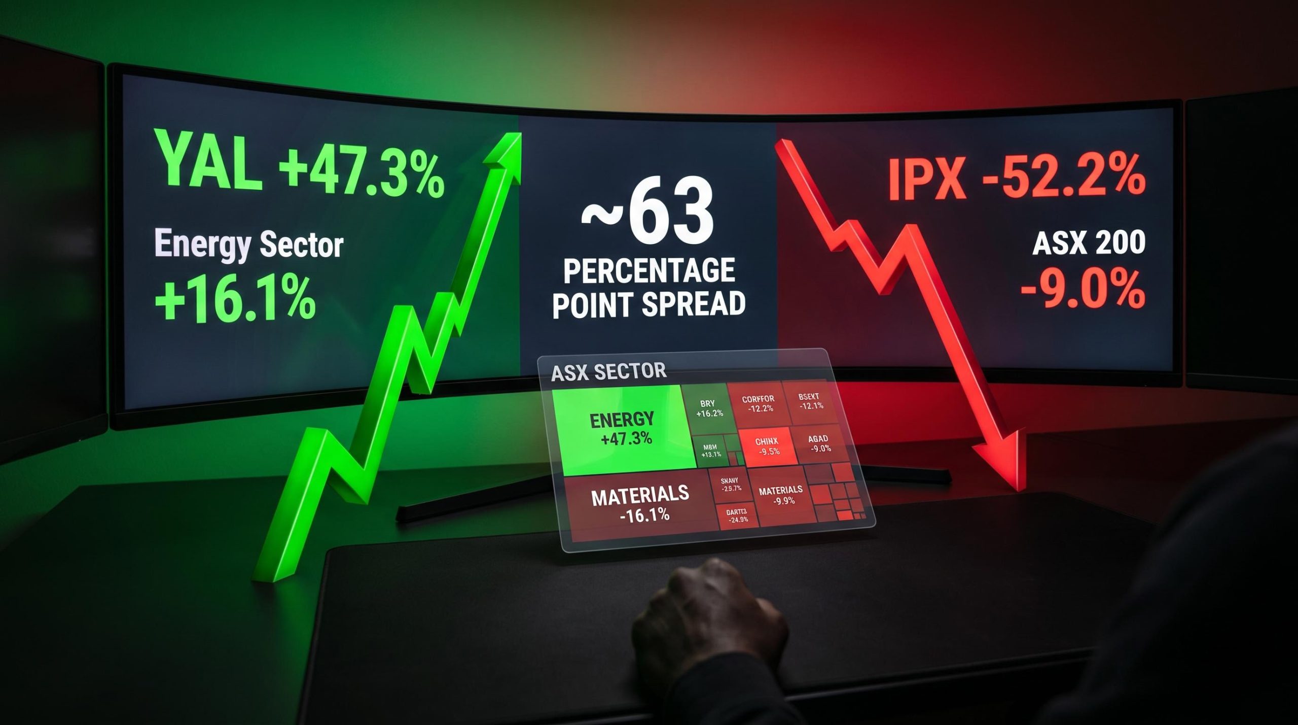
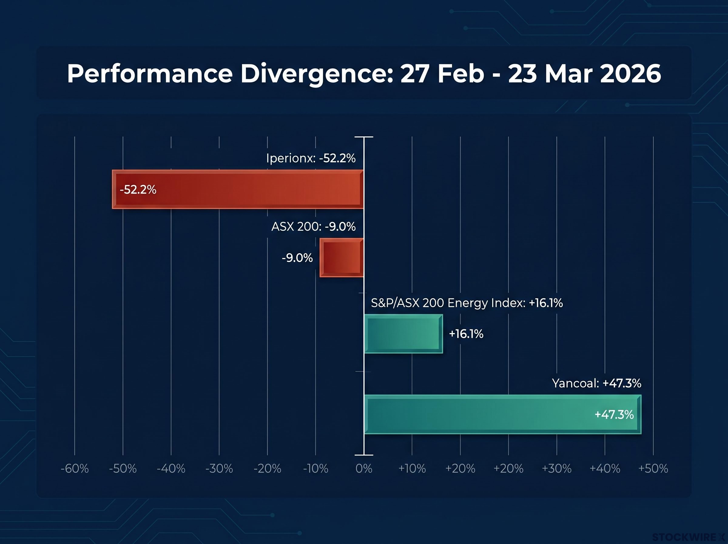
The ASX 200 fell 9% between 27 February and 23 March 2026. In the same four weeks, Yancoal gained 47.3%. Iperionx lost 52.2%. The spread between the best and worst individual performers reached roughly 63 percentage points, all inside a single index that was supposed to be moving in one direction.
The question is not whether the Iran conflict shook Australian equities. It did. The question is why the damage and the gains concentrated so sharply, and what the transmission mechanism from an oil supply shock to sector-level equity pricing actually looks like when you trace it step by step.
Here is a documented, evidence-based framework for recognising the same rotation pattern when it appears again, built from the exact prices, sector returns, and macro signals of the February-March episode. The goal is not prediction. It is recognition: which sectors tend to benefit, which tend to absorb damage, and which indicators flag the rotation before equity prices fully reflect it.
What the numbers actually show: a 63-point spread inside a falling market
The headline index decline understates what actually happened to individual portfolios during this period. While the ASX 200 lost approximately 9%, the S&P/ASX 200 Energy index gained 16.1%. That is a 25 percentage-point gap between the broadest measure of Australian equities and a single sector within it.
At the individual stock level, the divergence was far wider.
| Metric | Value |
|---|---|
| ASX 200 return (27 Feb – 23 Mar) | -9.0% |
| Energy sector return (same period) | +16.1% |
| Best-to-worst individual stock spread | ~63 percentage points |
| Materials sector rebound (trough to ~14 Apr) | ~20% |
The roughly 63 percentage-point spread between the best and worst ASX 200 performers means sector allocation drove more portfolio variance during this period than any decision about whether to be in equities at all.
The Materials sector complicated the picture further. After holding broadly steady across the opening three sessions, it turned lower and continued sliding until it bottomed on 23 March, before recovering approximately 20% through to mid-April. This was not a simple commodities-up story. The rotation was selective, and the pattern was not random.
The global oil supply crisis underlying this rotation was not a transient spike: Saudi crude output fell to its lowest level since 1990, global inventories were drawing at more than double the previous record pace, and IEA projections showed no supply-demand rebalancing before October 2026, making the duration of the shock a material input into how long the energy equity outperformance could persist.
When big ASX news breaks, our subscribers know first
The four-step transmission: how an oil shock moves through Australian equities
The Iran conflict triggered a specific macro cascade, and understanding its sequence is the difference between reacting to sector moves that have already happened and recognising the rotation as it unfolds. Each step in the chain feeds the next.
A systematic sector rotation strategy classifies each business cycle phase by which sectors it structurally favours, with Financials and Consumer Discretionary typically leading early recoveries while defensives offer relative resilience in contractions; the February-March episode illustrates how an oil-shock regime sits outside the standard cycle-phase model, demanding a separate analytical layer.
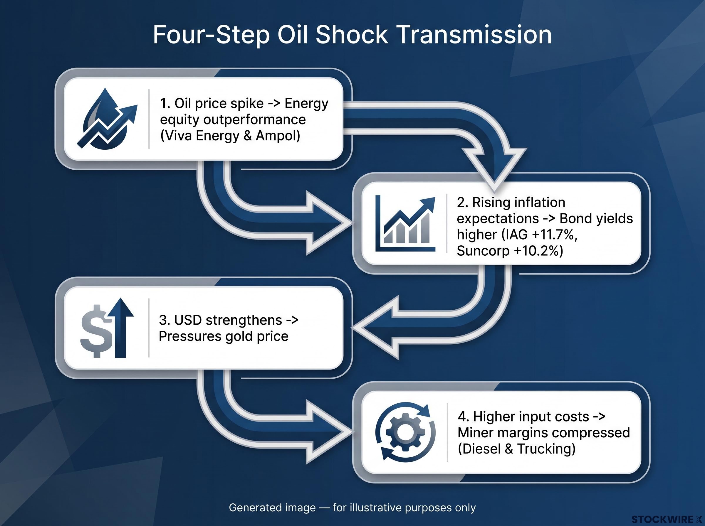
- Oil price spike drives energy equity outperformance. Energy producers benefited from higher realised prices against largely fixed short-term cost bases, amplifying earnings leverage. Refiners such as Viva Energy and Ampol saw widening margins as the crude spike fed through to product prices.
- Rising inflation expectations push bond yields higher. The oil price shock repriced inflation expectations, lifting front-end bond yields. This is where insurers separated from the rest of the market: IAG gained approximately 11.7% and Suncorp rose 10.2%, because the market focused on medium-term reinvestment yield improvements and better future investment income rather than near-term mark-to-market losses on existing bond portfolios.
- USD strengthens against commodity-currency pairs. Rate differentials and risk-off capital flows lifted the US dollar, creating a headwind for AUD-denominated commodity producers and pressuring the gold price, which functions as a long-duration, zero-coupon asset (an asset that pays no income and derives all its value from eventual sale price) sensitive to real yields.
- Higher input costs compress miner margins. Rising oil prices directly elevated diesel costs, a material component of open-pit mining operating expenditure. Trucking and contractor rates also index to fuel, meaning cost inflation extended well beyond the fuel tank.
Why this matters for real-time positioning
The mechanism matters because each step is observable before equities fully price it in. Front-end bond yields, breakeven inflation (the market-implied rate of future inflation derived from the difference between nominal and inflation-linked bond yields), and DXY movement each signal a specific part of the chain. What this tells you is that tracking these four indicators in sequence gives you an earlier read on where the sector rotation is heading than waiting for share prices to confirm what the macro signal already implied.
The 20 biggest winners: three archetypes behind the gains
| Stock | Ticker | Return | Entry Price | Exit Price |
|---|---|---|---|---|
| Yancoal Australia | YAL | +47.3% | $5.86 | $8.63 |
| Viva Energy | VEA | +34.5% | $1.77 | $2.38 |
| Karoon Energy | KAR | +33.3% | $1.55 | $2.06 |
| Telix Pharmaceuticals | TLX | +28.0% | $10.00 | $12.80 |
| Woodside Energy | WDS | +22.9% | $28.31 | $34.79 |
| New Hope Corporation | NHC | +21.1% | $4.69 | $5.68 |
| Magellan Financial Group | MFG | +20.7% | $8.46 | $10.21 |
| Whitehaven Coal | WHC | +20.2% | $7.81 | $9.39 |
| Santos | STO | +19.1% | $6.76 | $8.05 |
| Ampol | ALD | +18.7% | $28.17 | $33.44 |
| Beach Energy | BPT | +18.3% | $1.10 | $1.30 |
| Insurance Australia Group | IAG | +11.7% | $6.66 | $7.44 |
| Suncorp | SUN | +10.2% | $14.63 | $16.12 |
| 4DMedical | 4DX | +9.3% | $4.00 | $4.37 |
| Superloop | SLC | +7.5% | $2.95 | $3.17 |
| TechnologyOne | TNE | +6.2% | $26.07 | $27.68 |
| DroneShield | DRO | +5.8% | $3.62 | $3.83 |
| Coles Group | COL | +5.3% | $20.56 | $21.65 |
| News Corp | NWS | +4.3% | $37.84 | $39.48 |
| APA Group | APA | +4.0% | $9.20 | $9.57 |
Yancoal’s +47.3% gain made it the standout individual performer of the period, nearly doubling the return of the second-placed name.
The individual names resolve into three distinct winner archetypes:
- Direct commodity price leverage: Coal miners, oil and gas producers, and refiners, including YAL, VEA, KAR, WDS, NHC, WHC, STO, BPT, and ALD, captured the oil and thermal coal price spike against relatively fixed short-term cost bases.
- Yield-book beneficiaries: Insurers IAG and SUN, along with utility-style name APA, benefited from the repricing of bond yields and improved forward investment income.
- Idiosyncratic non-macro catalysts: Magellan Financial Group rose 20.7% during a 9% market decline because its 2 March 2026 announcement of the Barrenjoey merger overwhelmed the macro headwind. Telix, 4DMedical, Superloop, and TechnologyOne similarly moved on company-specific drivers.
What this tells you is that even in a macro-dominated rotation, screening for corporate catalysts during crisis periods can surface alpha that the macro playbook alone would miss entirely.
The 20 biggest losers: why gold and uranium miners bore the brunt
The bottom twenty performers were dominated overwhelmingly by gold, uranium, and copper names, with only a single stock from outside those categories appearing in the list.
| Stock | Ticker | Return | Entry Price | Exit Price |
|---|---|---|---|---|
| Iperionx | IPX | -52.2% | $6.72 | $3.21 |
| Pantoro | PNR | -46.3% | $5.75 | $3.09 |
| Northern Star Resources | NST | -43.2% | $30.28 | $17.21 |
| Kingsgate Consolidated | KCN | -39.0% | $7.05 | $4.30 |
| Regis Resources | RRL | -38.7% | $9.44 | $5.79 |
| Vault Minerals | VAU | -38.6% | $5.88 | $3.61 |
| Deep Yellow | DYL | -38.6% | $2.63 | $1.62 |
| Capricorn Metals | CMM | -36.1% | $14.72 | $9.41 |
| Emerald Resources | EMR | -35.5% | $7.08 | $4.57 |
| Westgold Resources | WGX | -35.2% | $7.75 | $5.02 |
| Capstone Copper | CSC | -34.7% | $14.70 | $9.60 |
| Greatland Gold | GGP | -34.0% | $13.81 | $9.12 |
| Catalyst Metals | CYL | -33.8% | $8.51 | $5.63 |
| Firefly Metals | FFM | -33.5% | $2.15 | $1.43 |
| Bellevue Gold | BGL | -31.2% | $1.83 | $1.26 |
| Evolution Mining | EVN | -30.6% | $16.58 | $11.50 |
| Genesis Minerals | GMD | -28.0% | $7.43 | $5.35 |
| Ramelius Resources | RMS | -27.9% | $4.59 | $3.31 |
| Sandfire Resources | SFR | -27.1% | $20.19 | $14.72 |
| Silex Systems | SLX | -26.7% | $6.90 | $5.06 |
Gold, uranium, and copper stocks accounted for 19 of the 20 worst-performing ASX 200 names across the period, a concentration that directly challenges the assumption that precious metals protect portfolios during geopolitical crises.
The mechanism behind the gold miner collapse is specific to this regime type. This was an oil-driven rate repricing, not systemic financial stress. In that environment, three pressures compound against gold names:
- Real yield headwind: Rising real yields increase the opportunity cost of holding gold, a zero-coupon long-duration asset, and pressure the spot price.
- USD strength: A stronger US dollar mechanically pushes down the USD-denominated gold price.
- Safe-haven bid failure: Because the shock was sector-specific rather than systemic, the flight-to-safety capital flows that typically support gold never materialised.
Iperionx’s -52.2% decline illustrates the extreme end of this dynamic. Small-cap critical minerals companies with long-dated, pre-revenue cash flow profiles trade as macro proxies during acute rotations. Higher discount rates, USD strength, and risk premia widening hit these names hardest and fastest. Investors who held gold miners as a conflict hedge experienced the opposite of the intended outcome.
For investors who held gold miners as a conflict hedge and experienced the opposite outcome, our full explainer on the long-term gold investment case examines why the structural thesis for gold operates on a multi-year horizon that is distinct from its behaviour during oil-shock regimes.
Peer-reviewed research on gold’s safe-haven performance finds that gold’s hedging effectiveness is highly conditional on crisis type, functioning more reliably as a diversifier during systemic financial stress than during supply-driven inflationary episodes where real yields rise alongside commodity prices.
Reading the real-time signals: indicators that flag the rotation before equities move
The February-March episode provides the empirical basis for a practical monitoring framework. Four indicators, tracked in sequence, signal the rotation’s direction before equity prices fully confirm it.
| Indicator | What It Signals | Regime Implication |
|---|---|---|
| Front-end bond yields | Rate repricing underway | Insurer benefit; REIT and infrastructure pain |
| Breakeven inflation | Oil or commodity-driven shock | Energy outperformance likely |
| DXY (US Dollar Index) | USD headwind for commodities | Gold and base metals de-rating |
| Crude oil front-month price | Direct supply shock severity | Energy equity leverage activated |
Beyond the entry signals, a separate set of indicators can flag when the macro-driven selloff in beaten-down sectors may be overshooting fundamentals:
- Spot commodity price moves are smaller than the corresponding equity moves
- No material downgrades to production volume or cost guidance from affected companies
- Evidence of insider buying or increased buyback activity within the sector
- Bid-ask spreads and liquidity conditions stabilising after the acute phase
The Materials sector’s approximately 20% rebound from its 23 March trough to approximately 14 April 2026 followed a pattern consistent with this framework. Large-cap names in beaten-down sectors tend to recover first as liquidity draws capital, with mid- and small-cap names following as risk appetite returns. Tracking the overshooting signals gives you a starting framework for timing that re-entry.
For investors wanting to see the same indicator framework applied to the next rotation episode, our deep-dive into the June 2026 ASX rotation documents how gold names recovered 13.6% in a single session while technology led the broader rebound, illustrating how quickly the winning and losing archetypes can reverse.
What this episode changes, and what it confirms
The February-March rotation produced a specific macro configuration: oil-driven rate repricing combined with USD strength. That is a distinct regime from systemic financial stress, and the distinction matters because applying the wrong crisis template leads to structurally incorrect positioning.
Three rules of thumb emerge from the documented evidence:
- Gold miners are unreliable hedges in oil-shock regimes. When real yields rise and the USD strengthens, gold faces headwinds from multiple directions simultaneously. The conventional safe-haven bid requires systemic stress to activate, not sector-specific supply disruption.
- High-beta, pre-revenue commodity developers are the most exposed names when discount rates jump. Their long-duration cash flow profiles make them acutely sensitive to changes in the rate used to discount those future cash flows. Iperionx’s -52.2% decline is the evidence.
- Operating leverage cuts in both directions. It amplified Yancoal’s +47.3% upside through the coal price spike and simultaneously amplified materials sector downside when rising input costs met falling output prices.
The value of this documented episode is not that you now know what will happen next time. It is that you know what pattern to look for and which indicators will confirm which regime is unfolding. Regime identification, not sector preference, is the primary variable in crisis positioning. The investor who can distinguish an oil-shock rotation from a systemic stress event is working with a meaningfully different toolkit than one who defaults to conventional safe-haven logic.
This article is for informational purposes only and should not be considered financial advice. Investors should conduct their own research and consult with financial professionals before making investment decisions. Past performance does not guarantee future results.