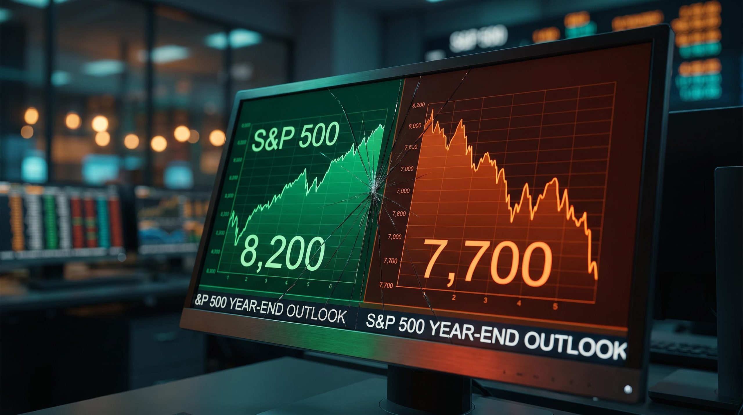
The S&P 500 is trading near record highs, and the professionals who watch it most closely cannot agree on where it goes next. One major bank has already cut its year-end target. Another implies the index could push above 8,200. And Fitch Ratings has quietly stress-tested a scenario where AI stocks fall 35% and the United States tips into recession.
That is the strange reality of the current bull market: it is celebrated and contested by the same professional class, at the same time.
The context makes the disagreement sharper. The bull market is in its fourth year, the Federal Reserve just raised rates for the first time in more than three years (to 3.75-4.00% on 16 September 2026), and the Shiller CAPE ratio sits near 40 against a long-term average of roughly 17. The rate environment has shifted, valuations are historically extreme, and the two biggest drivers of the bull case, AI spending and earnings growth, are also the two biggest sources of tail risk.
This is not a forecast. After reading, you will understand the specific logic behind each camp, the data points each side is watching, and which variables are most likely to determine whether the index ends 2026 closer to 7,700 or 8,200. Consider it a structured map of the debate so you can form your own view.
A market everyone agrees on, until you look at the numbers
Read the headlines and you would think Wall Street has settled the question. A Reuters survey of major brokerages on 10 September 2026 found the cluster of year-end targets sitting around 8,000. Consensus, apparently, achieved.
Then you look at the actual range, and the consensus dissolves.
Goldman Sachs sits at 8,000. Yardeni Research trimmed its base case to 7,900. Wells Fargo cut to 7,700. And Fundstrat’s Tom Lee implies something above 8,200. That is a spread of more than 500 points between the most cautious and the most bullish named houses, all describing the same index at the same moment.
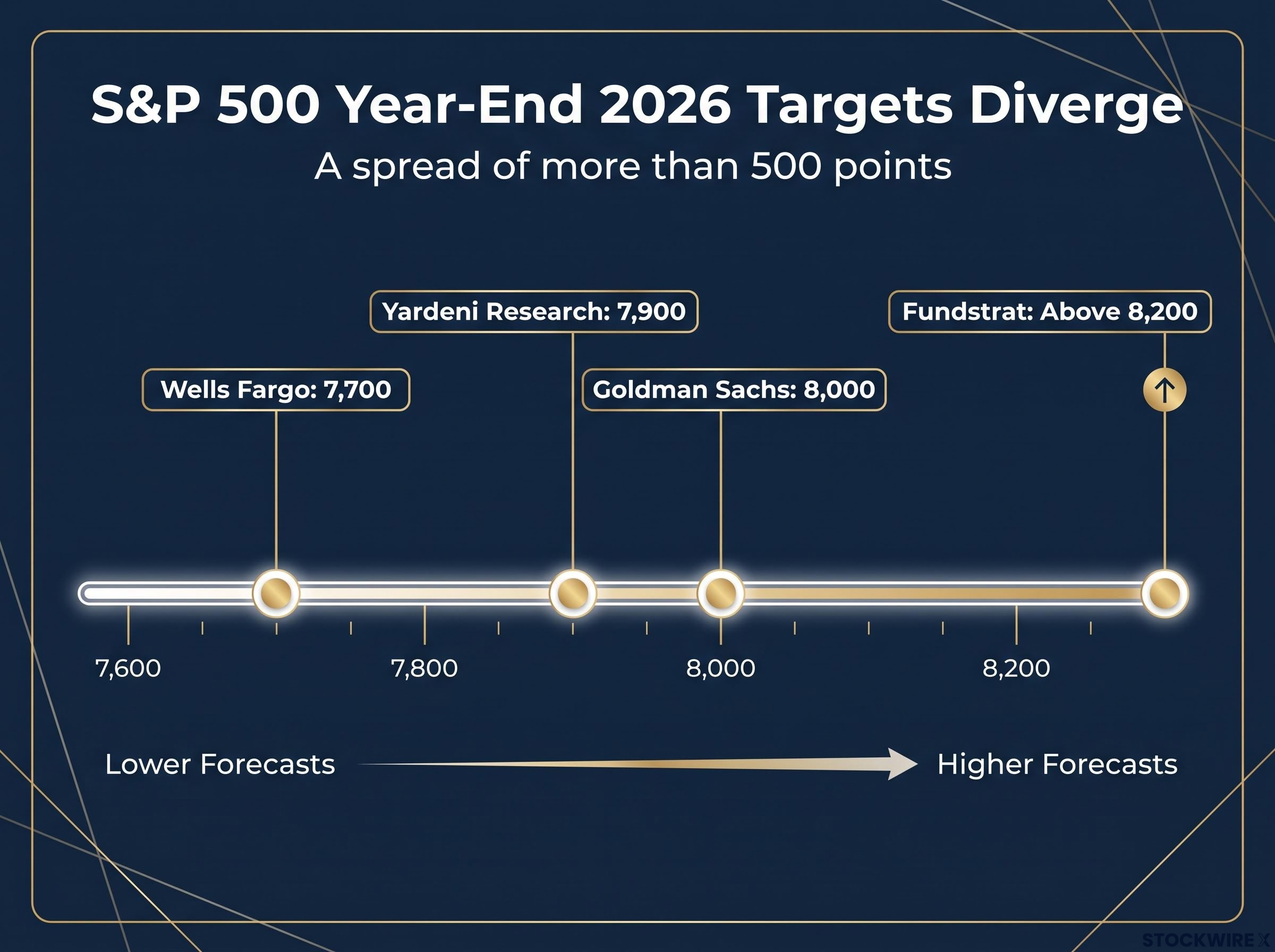
More telling than the spread is the velocity of the revisions. Goldman raised its target from 7,600 to 8,000 in late May. Wells Fargo lifted its number to 7,950 in June, then reversed course and cut to 7,700 on 15 September 2026. Yardeni climbed from 7,700 toward 8,400 before pulling back to 7,900 and raising its bearish probability to 20-30%.
| Firm / Strategist | Current 2026 Target | Prior Target | Most Recent Move | Key Rationale |
|---|---|---|---|---|
| Goldman Sachs | 8,000 | 7,600 | Raised (late May 2026) | Double-digit EPS growth expected in 2026 and 2027 |
| Wells Fargo (Ohsung Kwon) | 7,700 | 7,950 | Cut (15 September 2026) | Limited catalysts; good news already priced in |
| Yardeni Research | 7,900 | 8,400 | Cut; bearish odds raised to 20-30% | Constructive long-cycle case, higher near-term risk |
| Fundstrat (Tom Lee) | Above 8,200 | ~7,600 | Bullish, unchanged stance | Large-cap technology as primary driver |
Wells Fargo’s cut is the signal worth noting. The firm was among the first major banks to reduce a year-end target after the spring rally, and it went further with a specific near-term warning.
Wells Fargo near-term view: The firm has projected a potential decline of 5% to 10% from current levels, citing limited remaining catalysts for further gains.
Here is what the divergence means for you. If you are positioned at current index levels, you are implicitly choosing a side in this argument even if you have not consciously done so. The number on any single firm’s target page is less useful than the direction and pace of its revisions, and right now those revisions are pointing in opposite directions.
When big ASX news breaks, our subscribers know first
Why the bulls see a structural argument, not a speculative bubble
The bull case is not simply optimism about higher prices. It rests on a specific claim: that earnings, not multiple expansion, are doing the heavy lifting.
Goldman Sachs makes this argument directly. Its 8,000 target is underpinned by expectations of double-digit earnings-per-share growth in both 2026 and 2027, and the firm explicitly rejects comparisons to the dot-com bubble on those grounds. In Goldman’s framing, if earnings deliver, the valuation risk is far more manageable than the headline multiples suggest.
The strongest pillars of the bull case work together:
- Earnings growth as the anchor. Goldman ties its target to double-digit EPS growth across 2026 and 2027, arguing current levels reflect rising cash flows rather than speculative hype.
- AI capex as current economic activity. Wedbush’s Dan Ives projects roughly $2 trillion in AI-related spending over three years across data centres, semiconductors, and software. This is money being spent now, not a promise of future demand.
- Latent institutional capital. Pension funds and large managers have held capital in reserve awaiting Fed clarity, and a decisive shift in Fed signalling could release sudden, sizeable inflows into equities.
- A broadening earnings base. Goldman projects the earnings-growth gap between the Magnificent Seven and the rest of the index is narrowing sharply.
The AI point deserves emphasis because it connects the market to the real economy. Fitch data shows technology sector spending contributed approximately 1.4 percentage points to US GDP growth in the first quarter. That is not a narrative; it is measurable output flowing through the economy.
The earnings broadening case: why Goldman thinks concentration risk is easing
The most interesting bull argument targets the bears’ favourite weapon: concentration.
Index concentration risk sits at a level with no modern precedent: five companies now control roughly 30% of total US equity market capitalisation, a figure that exceeds the dot-com peak and means a correction in any one of those names carries index-level consequences rather than sector-level ones.
Goldman projects that the earnings-growth premium of the Magnificent Seven over the remaining 493 S&P 500 companies will narrow from roughly 30 percentage points in 2024 to around 4% by year-end. In plain terms, the rest of the index is starting to grow earnings at a pace much closer to the megacaps.
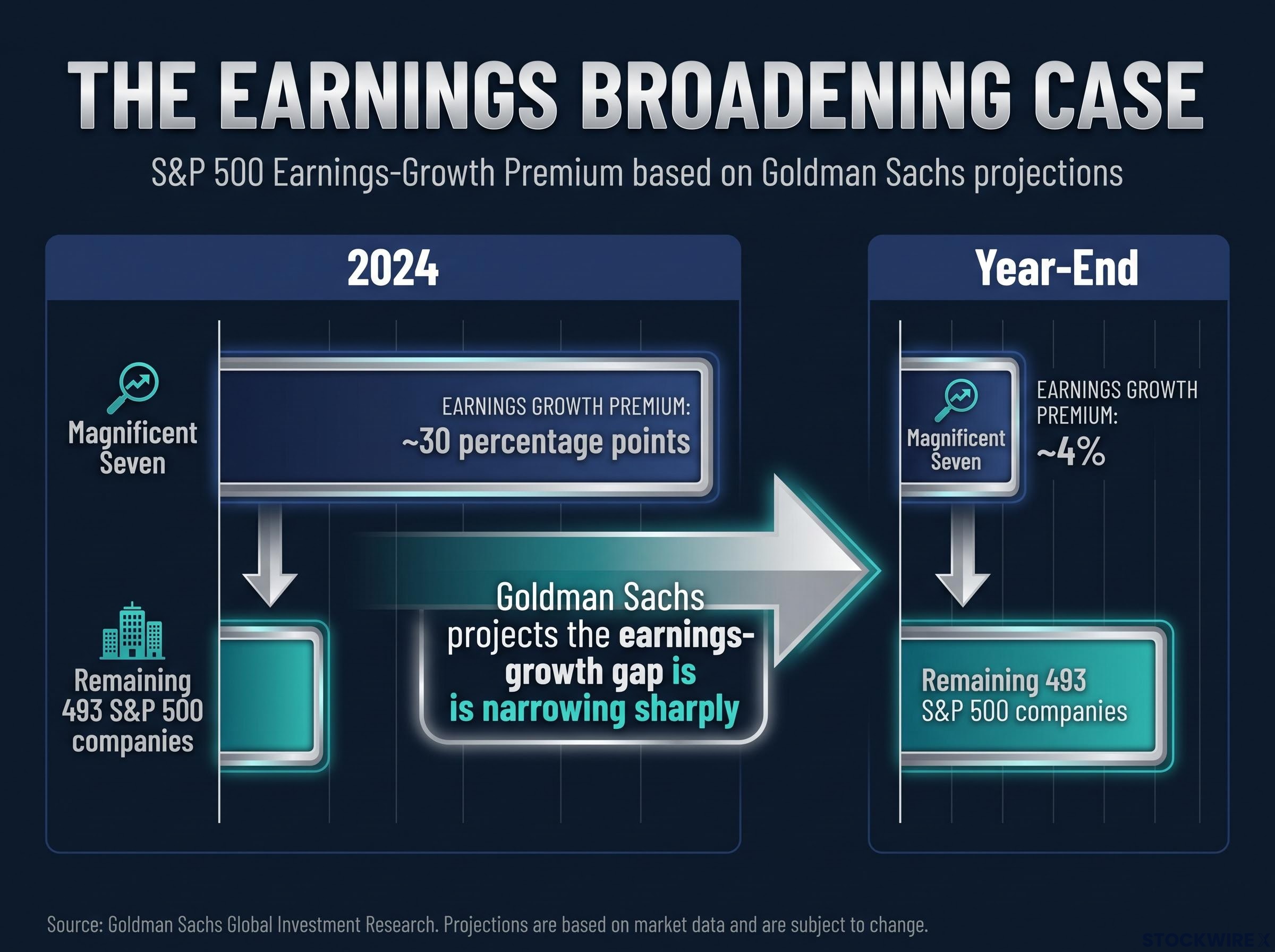
This matters because much of the bear case rests on the index being vulnerable to a pullback in a narrow group of names. If the earnings base genuinely broadens, that vulnerability shrinks. Yardeni’s “Roaring 2020s” framework extends this logic into a longer cycle, with an end-of-decade target near 10,000 built on sustained productivity gains.
If the broadening thesis proves correct, the bull market’s foundation is widening at exactly the moment critics are most fixated on concentration risk. That is the argument you need to weigh before deciding how much credence to give the bears.
What the bears are actually watching, and why the numbers are uncomfortable
The bear case is not a list of separate worries. It is a chain of pressures, where each link makes the next one worse.
It starts with valuation. The Shiller CAPE ratio, which measures price against inflation-adjusted average earnings over the prior decade to smooth out one-off distortions, sits near 40. The long-term average is roughly 17, and even the elevated recent decade averaged 28-32. The Buffett Indicator, which compares total US market capitalisation against GDP, reads approximately 235-237%, based on around $76 trillion of market value against roughly $32.5 trillion of GDP. Warren Buffett has cited 165% as a level signalling significant overvaluation.
The CAPE ratio as a market signal is frequently misread: a century of data confirms it was designed to forecast decade-ahead real returns rather than identify crash timing, and investors who have treated elevated readings as exit triggers have historically surrendered years of compounding in the interim.
These are the starting conditions into which every other risk lands.
| Metric | Current Reading | Historical Benchmark | What It Signals |
|---|---|---|---|
| Shiller CAPE ratio | ~40 | ~17 long-term average | Historically extreme valuation |
| Buffett Indicator | ~235-237% | 165% overvaluation threshold | Market cap far ahead of economic output |
| 10-year Treasury yield | Above 5% | Near-zero for prior decade | Real competition for equity capital |
| Investor equity allocation | ~72% | ~60% model-implied | Widest gap since 1969 |
Then comes the yield mechanism. With the 10-year Treasury yield above 5%, valuations face pressure through two channels: higher discount rates lower the present value of future earnings, and competitive bond yields reduce the equity risk premium investors will accept.
Wells Fargo quantifies the imbalance. Investors currently hold roughly 72% of their portfolios in equities, against a model-implied level of around 60% at current yields. That is the widest gap since 1969, wider even than the dot-com peak.
Layer the Fed on top. The 16 September 2026 hike to 3.75-4.00%, under Chairman Kevin Warsh, was the first increase in more than three years. Goldman itself acknowledges that equities historically struggle at the beginning of hiking cycles, and the reopened question is whether more hikes follow.
The Fitch stress scenario and what it reveals about index structure
The tail risk illustration comes from Fitch Ratings.
Fitch stress test (not a base case): A 35% decline in AI-linked stocks over six months, resulting in a US recession and broader global weakness. Fitch has explicitly framed this as a stress scenario, not its primary forecast.
The scenario’s value is diagnostic rather than predictive. It is structurally credible precisely because technology spending contributed about 1.4 percentage points to first-quarter GDP. That embeds AI-linked stocks in both index performance and real economic activity, which means a sharp AI correction becomes a macro event rather than a sector event.
The most underappreciated figure in this whole debate may be the Wells Fargo equity allocation reading. If investors already sit at the highest equity exposure since 1969, the pool of incremental buyers needed to push the market materially higher could be far smaller than the bull case assumes. Understanding which of these pressures is most live in real time tells you more than any single price target.
The variables that will settle the argument by December
Both camps make specific, testable predictions. The next two to three months of data will confirm or deny them. Three variables matter most:
- Earnings delivery. The bull case rests on double-digit EPS growth materialising and on the Magnificent Seven earnings gap narrowing toward 4%. Watch Q3 reporting season: revisions trending positive validate the bulls, downward revisions hand momentum to the bears.
The adjusted earnings baseline entering Q3 reporting season matters as much as the headline figures: approximately 20 percentage points of Q2’s reported 50.6% growth stemmed from non-recurring mark-to-market investment gains at just two companies, meaning the operationally relevant growth rate sits closer to 30-32%.
- The Fed path. The September hike reopened the question of whether the cycle continues. Further increases would compound the yield-valuation pressure Wells Fargo describes; a pause would remove a key bear catalyst. Watch Fed communication, CPI data, and the next FOMC meeting.
- AI capex return on investment. As major technology companies report Q3 results, the market gets early evidence of whether AI infrastructure spending is translating into margin improvement and new revenue, or whether spending is running ahead of returns. This is where Fitch’s tail scenario becomes more or less plausible in real time.
The near-term risk benchmark is clear: if catalysts disappoint, Wells Fargo’s projected 5-10% pullback becomes the operative framework. Goldman’s double-digit EPS growth expectations for 2026 and 2027 are the specific claim earnings season will test.
A longer lens: Even after trimming its 2026 base case to 7,900 and raising bearish odds to 20-30%, Yardeni Research maintains an end-of-decade target near 10,000, a reminder that near-term volatility and a constructive multi-year view can coexist.
For investors wanting to place Yardeni’s end-of-decade target in a broader return framework, our dedicated guide to S&P 500 decade-ahead return projections covers Bank of America’s valuation model, which projects cap-weighted annualised returns of -3% to +2% over the next ten years against the 10% historical average most retirement plans assume.
You do not need to predict which camp is right. You need to know which data points move the argument, so you can update your own view in real time rather than anchoring to a static forecast. Most self-directed investors follow price. These three indicators are what the professional community is actually watching, and tracking them improves your information advantage over the coming quarter.
What the divided forecasts tell you, beyond the numbers
Strip away the individual targets and the real tension emerges. The bull and bear cases are competing claims about a single question: can earnings growth outrun the compounding pressure of stretched valuations, higher rates, and a concentrated rally?
Read that way, the Wells Fargo cut and Yardeni’s raised bearish probability are not defeats for the bulls. They are the market’s professional risk-management layer doing its job, revising as conditions change. Both firms still hold constructive year-end targets despite raising their downside odds, which reflects the genuine ambiguity of the moment rather than a collapse in confidence.
That points to a practical posture built around three conditions:
- If earnings deliver (double-digit EPS growth, the earnings gap narrowing, AI ROI showing up in margins), the range toward 8,000-8,200 is well supported.
- If the Fed extends the hiking cycle beyond September, the yield-valuation pressure Wells Fargo describes compounds, and upside compresses.
- If AI capex ROI disappoints, the Wells Fargo 5-10% pullback scenario, and in the tail, Fitch’s stress case, moves from theoretical to operative.
The structural context does not resolve the debate, but it shapes the asymmetry. With CAPE near 40 and the Buffett Indicator around 235-237%, the margin for error is thin, which is why both a push toward Goldman’s 8,000 or Fundstrat’s 8,200-plus and a meaningful pullback remain inside current probability distributions.
The historical analogies each carry a real piece of the story. Dot-com narrow leadership, 2007 complacency, and 1950s-style productivity cycles all echo somewhere in the current picture. Your job is not to pick one analogy and wait to be proven right. It is to identify which elements are most live in the data as it arrives.
This article is for informational purposes only and should not be considered financial advice. Investors should conduct their own research and consult with financial professionals before making investment decisions.
Past performance does not guarantee future results. Financial projections are subject to market conditions and various risk factors, and the forward-looking scenarios described above are speculative and subject to change.