Record highs usually read as a clean bill of health. This time the S&P 500 and Nasdaq are breaking out while the Russell 2000, the equal-weight S&P 500 and the advance-decline line have gone essentially nowhere since mid-August. A narrow market rally like this can push the headline number higher even as most stocks stall.
The timing matters. The split opened just as Treasury yields began climbing. On 16 September 2026, the Federal Reserve raised its target range to 3.75-4.00%, its first hike in about three years.
If you judge your portfolio by the index level alone, you could miss how unevenly this advance has been shared. You could also misjudge how much of your own exposure is sitting in the part of the market that has stalled.
Here is what is driving the narrowness, how closely it echoes early 2000, and which move in bond yields would let the rest of the market take part.
What the breadth data is really telling you
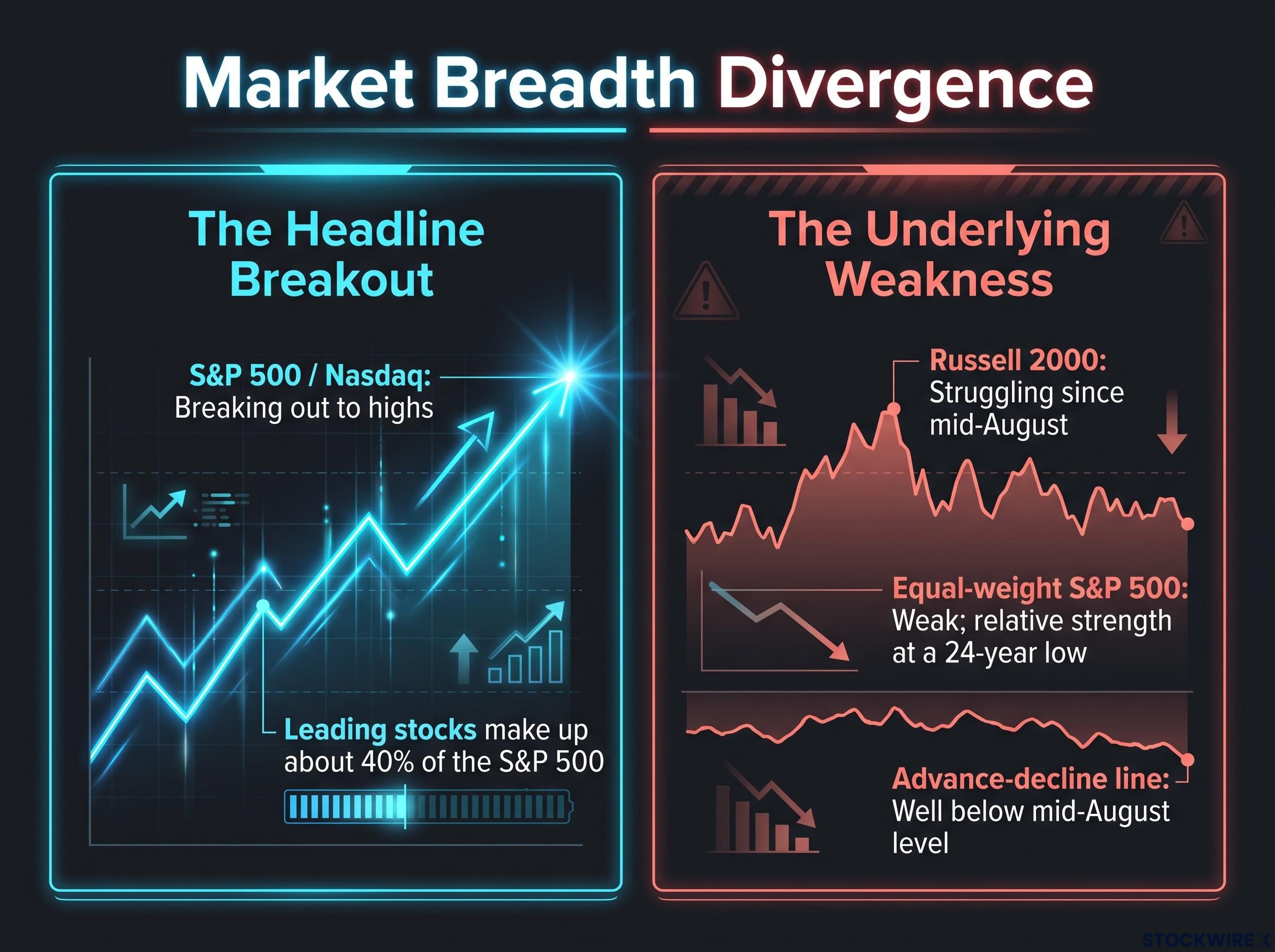
Start with the headline. The cap-weighted S&P 500 and the Nasdaq broke out this past week, led by semiconductors and mega-cap technology.
Now look underneath. The Russell 2000 has struggled since mid-August. The equal-weight S&P and the S&P excluding tech trace the same weak pattern, and the advance-decline line sits well below its mid-August level.
A 24-year extreme Relative strength in the equal-weight S&P 500 against the standard index has fallen to its lowest level in 24 years.
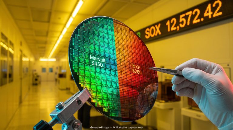
The leading stocks make up about 40% of the S&P 500. That share of the weight is enough to lift the index while the typical stock drifts. Semiconductors show the leadership most clearly: the VanEck Semiconductor ETF (SMH) climbed from about 503 to about 607, pulled back, then reached roughly 639 this week. That sits just past a two-equal-legs target near 635, which suggests the sector may have completed a counter-trend rally. The Magnificent Seven broke out a couple of weeks earlier but have not followed through.
| Measure | What it tracks | Current reading |
|---|---|---|
| S&P 500 / Nasdaq | Large companies, weighted by size | Breaking out to highs |
| Russell 2000 | US small caps | Struggling since mid-August |
| Equal-weight S&P 500 | The average S&P stock | Weak; relative strength at a 24-year low |
| Advance-decline line | Rising versus falling stocks | Well below mid-August level |
| % above 200-day average | Share of stocks in longer-term uptrends | Declining |
What this tells you is uncomfortable. If you hold diversified or small-cap funds, your returns may be badly out of step with the headline, so judge them against breadth measures and not the S&P 500 alone.
Weak market breadth is best treated as a condition to monitor rather than a timing signal, since earnings, cash flows and balance sheets decide whether concentration proves fragile or durable.
How breadth is measured
A cap-weighted index gives larger companies more influence, so a few giants can move the whole number. An equal-weight index gives every stock the same weight, which shows how the average company is doing.
The advance-decline line is a running total of rising stocks minus falling stocks. When it slides while the index climbs, fewer companies are doing the lifting.
The 200-day moving average is a stock’s average price over roughly the past 200 trading days. When the share of stocks trading above it falls, fewer companies are in longer-term uptrends, and a gap between these measures and the headline index flags a rally resting on a thin base.
When big ASX news breaks, our subscribers know first
Why rising yields squeeze the average stock but spare the leaders
The Fed’s September decision did more than lift the policy rate. It signalled that restrictive policy would stay in place, and that signal sorts companies by how much they depend on cheap money.
The Federal Open Market Committee (FOMC) voted 12-0 to raise rates by 25 basis points to 3.75-4.00%. A basis point is one hundredth of a percentage point.
The Fed framed the move as supporting a “timelier return” to its 2% inflation goal.
Higher yields hit companies through three channels:
- Cost of capital. Rising real yields make borrowing dearer, hurting firms that rely on outside financing or carry weaker balance sheets, which is more common among small caps.
- Discount rates. Higher yields shrink the present value of profits expected far in the future. Companies seen as earning from AI and chip spending soonest have nearer-term earnings, which supports their valuations.
- Lending conditions. Elevated yields tend to arrive with stricter lending standards, which bite smaller, domestically focused firms harder than global giants with diversified funding.
The dot plot, which shows where each Fed official expects rates to go, shifted higher. EY called it “decidedly more hawkish,” with no cuts pencilled in for 2027.
| Year | Median dot | Change vs June |
|---|---|---|
| 2026 | 4.1% | Up from 3.8% |
| 2027 | 4.1% | n/a |
| 2028 | 3.9% | n/a |
| 2029 | 3.6% | n/a |
| Longer run | 3.2% | Up from 3.1% |
A clear majority of officials now favour a second hike this year, although sources disagree on the exact count. Inflation has run above target for more than five years, and recent PCE revisions narrowed the gap between core PCE and core CPI from 0.9 to 0.6 percentage points, according to National Bank of Canada. That PCE decline came from revisions, with a reclassification subtracting 36 basis points, rather than genuine disinflation. Cleveland Fed nowcast figures are model estimates, not official data.
Where the Fed and the market disagree
Both sides expect a December hike. The split comes in 2026: the Fed sees rates peaking this year, while markets price two further hikes, a gap of about 50 basis points.
Goolsbee’s argument is that a demand shock calls for a firmer response than a supply shock, which Welsh reads as implying a measured hiking path. Yields are rising globally, including in France, and markets now put about 70% odds against an October move. With the funds rate projected near or above 4% through 2026-2027, the backdrop favours cash-rich quality companies, so the narrowness you are seeing is a rational response to policy rather than a glitch.
Can AI and semiconductor leadership hold, and does early 2000 offer a warning?
If yields explain why leadership is narrow, the next question is whether that leadership can carry the market much further. Both sides have a serious argument.
The case for durability
- Hyperscaler capital spending and data-centre build-outs remain the main revenue driver for AI hardware.
- Quality traits such as high margins, strong free cash flow and net cash have historically held up better under restrictive policy.
- Some investors treat AI as defensive, since Fed hikes seem unlikely to curb hyperscaler spending.
The cautious case is just as specific:
- A narrow group dominating returns leaves the index exposed to any slowdown in AI spending.
- Higher yields compress price-to-earnings (P/E) multiples, the price investors pay per dollar of profit.
- Semiconductor cycles are historically volatile, and inventory corrections can hit profits even amid strong demand.
Where the 2000 comparison holds and breaks
| Factor | Early 2000 | Today |
|---|---|---|
| Leadership | A few large tech and internet stocks | Mega-cap tech and semiconductors |
| Breadth | Advance-decline line weakening at index highs | Advance-decline line below mid-August level |
| Balance sheets | Many unprofitable dot-com firms | Stronger balance sheets and real cloud and chip revenue |
| Rate backdrop | Rising real yields, tighter conditions | Rising yields, a more gradual, data-dependent Fed |
The warning in the precedent is about timing. The Nasdaq gained roughly 50% from a November high in early 2000 despite poor breadth, and then a broad bear market followed, with the most richly valued leaders falling furthest.
The Nasdaq 1997-2000 parallel looks similar on the charts, but forward multiples near 25x against roughly 58x at the dot-com top suggest any correction would work through the market very differently this time.
Mid-2015 and stretches of 2018-2020 resolved differently: sometimes laggards caught up once yields steadied, sometimes broader corrections arrived. If yields keep rising, tech and the AI trade could eventually crack. Because narrow rallies can run for months, treat weak breadth as a warning about fragility in your portfolio, not a signal to sell on a particular date.
What would let the broad market catch up?
If yields caused the split, yields are the likely route to closing it.
The yield test A decline of 30-40 basis points in yields over one to three months would support broad-market strength and a possible S&P 500 path toward 8,000.
More generally, analysts tie wider participation to stabilising or falling long-term and real yields rather than a single threshold. Once rate paths clarify, money has historically rotated into cyclicals, financials and small caps.
Watch these signals, in order of importance:
- A clear yield rollover. RSI divergences, a momentum warning in which yields rise while their underlying strength fades, are appearing, but a cleaner turn lower is still needed and bond-selloff momentum deserves respect.
- A material fall in oil and energy prices, which could encourage the Fed to ease off.
- Cooler inflation data, particularly genuine disinflation rather than revision effects.
Welsh expects no October hike and a likely December hike. The implication for you is direct: broadening depends on yields stabilising, so the Treasury market, not the equity index, is the gauge to watch.
Reading the divergence without overreacting
The narrow leadership traces back to rising yields and a Fed that has turned more hawkish, which rewards cash-rich leaders and penalises rate-sensitive smaller firms. Early 2000 shows a divergence like this can persist for months and still end badly, yet today’s leaders carry stronger balance sheets than the dot-com cohort did.
AI concentration risk matters even for diversified holders, because the Magnificent Seven carry about 32% of the S&P 500, so a broad index fund already embeds a large AI bet.
Three variables are most likely to settle the outcome: the direction of long-term Treasury yields, the path of oil and energy prices, and the December FOMC meeting. A sustained drop in yields would give the broader market room to catch up, while a continued climb would test whether AI leadership can stand on its own.
Past performance does not guarantee future results. Financial projections are subject to market conditions and various risk factors. These statements are speculative and subject to change based on market developments.
This article is for informational purposes only and should not be considered financial advice. Investors should conduct their own research and consult with financial professionals before making investment decisions.