On 29 September 2026, the S&P 500 and the NASDAQ moved one way. The Russell 2000 and the equal-weighted version of the S&P 500 moved another. The gap that opened between them in a single session tells you more about how this market is positioned than the 5.61% headline ever could.
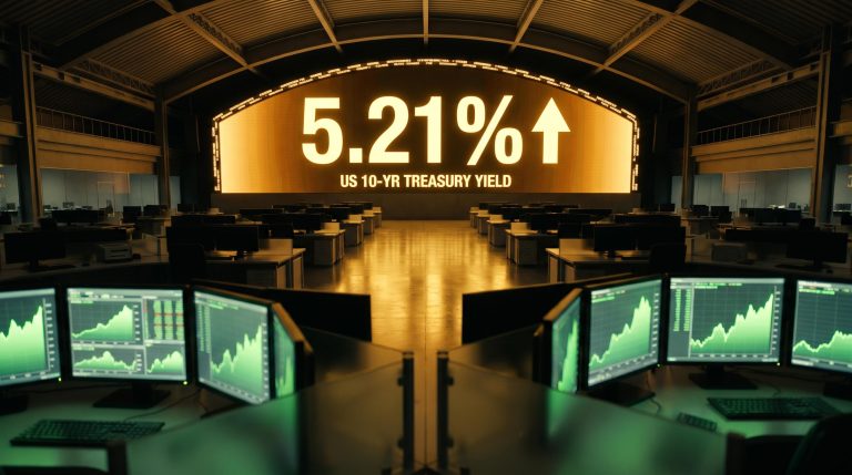
That headline was real enough: the 30-year Treasury yield touched roughly 5.609%-5.61% intraday, its highest reading since 2002, extending a six-session losing streak in long-bond prices. A milestone like that forces a re-examination of how different parts of the equity market are actually exposed to rate risk.
Here is the framework for reading index performance when yields move sharply, so the next time a rate-driven session throws out contradictory headlines, you can separate signal from noise.
A 24-year yield milestone and what the bond market is actually signalling
Twenty-four years is a long time. The last occasion the 30-year Treasury yield sat this high, the tech bubble was still deflating and the iPhone was five years from launch. Getting back to that level says something about how far the risk-free rate has travelled.
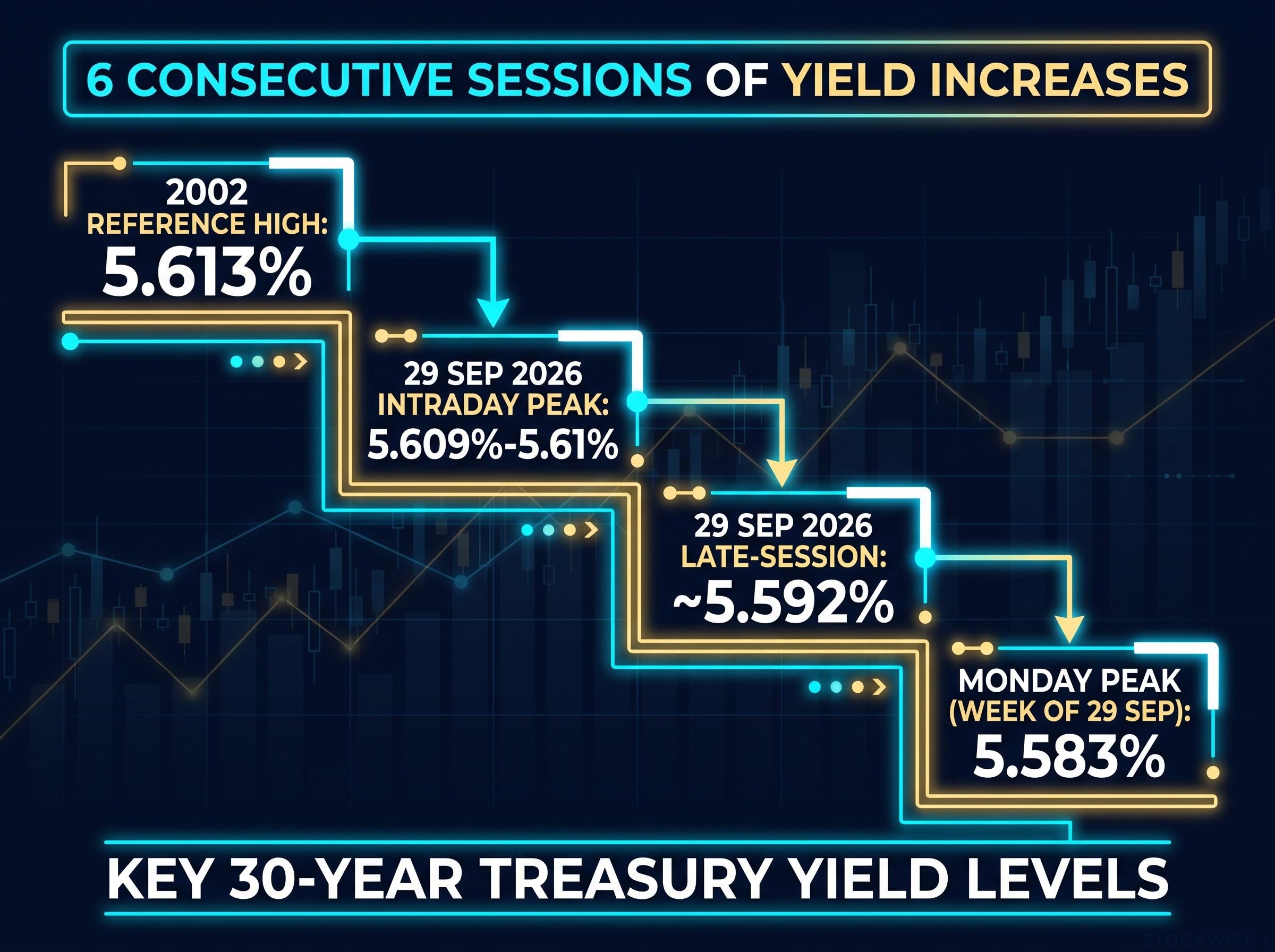
According to Bloomberg and CNBC, the 30-year yield surpassed 5.61% intraday on 29 September 2026, with a late-session reading near 5.592%. Morningstar noted the week’s earlier peak came Monday at 5.583%. The 2002 reference high sits just above, at 5.613%.
The FRED 30-year Treasury yield series shows the full historical context for this move, including the 2002 peak that the current level is brushing against, making it the authoritative data source for anyone stress-testing the 5.613% reference high against prior cycles.
| Metric | Value | Source |
|---|---|---|
| Intraday peak (29 Sep 2026) | 5.609%-5.61% | Bloomberg, CNBC, Yahoo Finance |
| Late-session level (29 Sep 2026) | ~5.592% | CNBC |
| Monday peak (week of 29 Sep) | 5.583% | Morningstar |
| 2002 reference high | 5.613% | CNBC |
| Consecutive sessions of yield increases | 6 | Bloomberg |
Six straight sessions of rising long yields is not a one-day spasm. It is a sustained trend, and one concentrated at the long end of the curve while front-end yields showed a more mixed pattern.
The financial press has described the move as part of a deepening selloff across global debt markets. Several forces are pushing in the same direction:
- Persistent inflation, amplified by elevated oil prices
- Heavy Treasury issuance requiring higher yields to clear the market
- A wave of corporate bond supply competing for the same buyers
- Episodes of weak demand at government auctions
- A rising term premium tied to concerns about U.S. fiscal sustainability
That last driver is the one to sit with. A term premium is the extra return investors demand for holding long-dated bonds rather than rolling short ones. When it rises because buyers are questioning long-run fiscal credibility, not just repricing inflation, the effect on equity valuations is more structurally disruptive than a straightforward growth repricing. It signals the market wants more compensation simply to hold U.S. long debt, and that pressure does not lift when a single inflation print cools.
Fiscal sustainability concerns are not merely sentiment: the CBO projects the average interest rate on US debt and nominal growth to converge around fiscal year 2031, the moment economists call r greater than g, after which stabilising the debt ratio requires a primary surplus rather than a smaller deficit, removing the mathematical cushion that has allowed current deficits to accumulate.
Knowing why yields are rising, not just how far, is what tells you whether this is a passing supply-demand imbalance or a genuine reset of the risk-free rate. That distinction shapes how every other asset should be positioned.
When big ASX news breaks, our subscribers know first
How three indexes told three different stories in the same session
Watch what each index actually did before reaching for an explanation, because the pattern does most of the analytical work on its own.
By late in the 29 September session, the NASDAQ had clawed back into positive territory. The cap-weighted S&P 500 posted only a modest decline, holding up better than the broader market. On the surface, that reads as resilience.
Then look wider.
- NASDAQ: recovered to positive territory into the close
- S&P 500 (cap-weighted): modest decline, outperformed on a relative basis
- Russell 2000: slid to its lowest intraday level since early June 2026
- Invesco S&P 500 Equal Weight ETF (RSP): tracked the small-cap Russell 2000 far more closely than the cap-weighted S&P 500
Precise percentage figures for the session were not confirmed in the retrieved coverage, so the point here is directional rather than decimal.
The RSP-versus-S&P 500 contrast is the tell
The most revealing comparison is not tech against small-caps. It is the same 500 companies weighted two different ways.
When every S&P 500 constituent carries equal weight, the headline index’s buffer disappears, and the stress in rate-sensitive and leveraged names shows through directly. The gap between RSP and the cap-weighted S&P 500 is the clearest real-time reading you get of how much the index depends on a handful of names.
That gap matters for a practical reason. On a high-yield day, the cap-weighted S&P 500 is not really “the market.” It functions as a heavily weighted bet on a small cluster of AI-driven mega-cap technology stocks, whose resilience masks what is happening underneath.
Mega-cap concentration has compounded to a level that now surpasses the 1930s historical peak, with five stocks controlling roughly 23% of the broad US market index and delivering more than half of April 2026’s recovery after causing approximately 70% of Q1’s decline.
If you benchmark your portfolio to the headline S&P 500, its performance on a session like this can actively mislead you about how your own holdings behaved, unless you happen to hold the same concentration in mega-cap tech. The equal-weight reading is the honest one.
Why small-caps and equal-weight indexes carry more rate risk by design
None of this divergence is random. It follows logically from how these companies are financed and what sectors they sit in. Three structural reasons explain why rising long yields hit small-caps and equal-weight exposure harder.
- Financing structure. Smaller companies lean more heavily on bank loans and floating-rate debt, and typically carry higher leverage relative to cash flow than mega-cap technology peers. When long-term yields and borrowing costs climb, interest expense grows faster, squeezing earnings directly.
The Russell 2000 debt architecture amplifies this exposure structurally: between 30% and 38% of constituent debt carries a floating rate, compared to roughly 7% for the S&P 500, which means every basis point of sustained yield elevation translates into direct earnings erosion across a 12-24 month horizon.
- Earnings duration. Small-cap and cyclical cash flows are more front-loaded and tied to the business cycle. Mega-cap technology is priced on long-duration growth stories with high margins and minimal need for external financing, giving it more room to absorb a higher discount rate.
- Sector composition. Small-cap benchmarks carry heavier exposure to domestically focused financials, industrials, real estate, and consumer discretionary. These sectors respond sharply to loan costs, mortgage rates, and household credit, unlike globally diversified mega-cap tech.
| Dimension | Mega-cap technology | Small-caps |
|---|---|---|
| Debt type | Cash-rich, minimal external financing | Higher leverage, floating-rate bank debt |
| Earnings duration | Long-duration growth narratives | Front-loaded, business-cycle-sensitive |
| Sector exposure | Global, diversified revenue | Domestic financials, industrials, real estate |
Put those three together and the transmission is clean: when the 30-year yield rises, small-cap earnings take a more direct hit than mega-cap tech earnings. The consequence for you is worth stating plainly. If you hold a diversified fund or an equal-weight product, you are carrying more rate duration than the headline S&P 500 implies, and the headline number will understate how exposed you actually are.
That reframes the question you should ask on a high-yield day. Not “what did the market do,” but “how much rate risk is embedded in the specific holdings I own.”
Four competing views on what sustained 5%-plus yields mean for equities
Market commentary does not agree on what a durable 5%-plus long yield means for stocks, and the honest read is to hold that disagreement rather than resolve it prematurely. Four distinct views are in play.
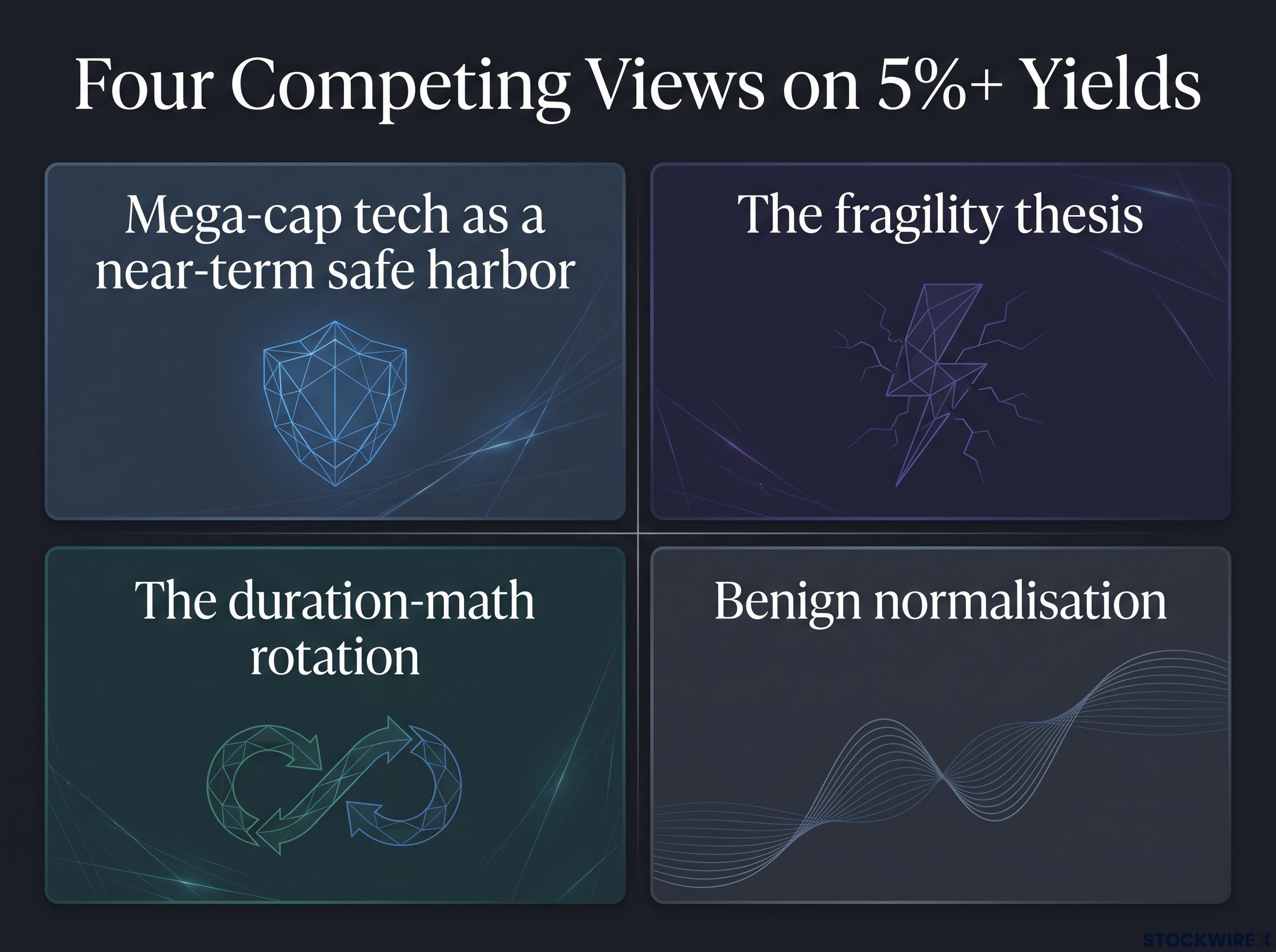
- Mega-cap tech as a near-term safe harbor. Higher discount rates compress long-duration valuations, yet dominant AI-linked firms have strong balance sheets, secular growth, and high margins that may let them weather higher yields longer than leveraged small-caps. The NASDAQ’s late-session recovery is consistent with this.
- The fragility thesis. Sustained 5%-plus yields eventually raise the required return on every equity, mega-cap tech included. Even cash-rich giants are valued on discounted future earnings; if the risk-free rate resets structurally higher, today’s premiums get challenged, and stress in small-caps and high-yield credit can spill over through tighter conditions.
- The duration-math rotation. Some strategists argue shorter-duration sectors should lead: financials benefiting from wider net interest margins, plus value and cyclical names with nearer-term cash flows, while richly valued AI growth stocks face persistent headwinds.
- Benign normalisation. In this reading, higher yields mostly reflect a return to normal after the ultra-low-rate era and healthy nominal growth, not a fiscal crisis. Under it, markets adapt over time, with leadership rotating rather than collapsing.
Where the concentration risk lives
The safe-harbor view carries a specific vulnerability. Because the cap-weighted index leans so heavily on a narrow cluster of AI names, any shock specific to those names, whether regulatory, competitive, or a repricing of AI growth expectations, could suddenly expose the broader market stress that concentration has been masking. The buffer and the risk are the same handful of stocks.
The variable that separates a manageable repricing from a damaging one is fiscal credibility. If the term premium is rising partly because investors doubt long-run U.S. fiscal sustainability, the implications for all equities are more serious than a standard rate-normalisation cycle.
Which of these four views you find most convincing should directly shape how you think about portfolio duration, sector tilt, and whether current mega-cap tech valuations are a port in the storm or an additional source of unpriced risk.
This article is for informational purposes only and should not be considered financial advice. Investors should conduct their own research and consult with financial professionals before making investment decisions.
These interpretations are speculative and subject to change based on market developments. Past performance does not guarantee future results.
What the 24-year yield milestone actually changes for how you read the market
Three insights carry through this analysis. The yield milestone reflects structural drivers, term premium and fiscal concern, not a temporary supply hiccup. The gap between cap-weight and equal-weight performance is a live signal of concentration risk. And the rate-sensitivity gap between small-caps and mega-cap tech is structural, not a passing cyclical quirk.
That gives you a diagnostic rather than a forecast. Three variables are worth watching from here:
- Whether the 30-year yield stabilises or pushes toward and past the 2002 high of 5.613%
- Whether auction demand improves or continues to weaken
- Whether AI-linked mega-cap earnings keep providing the buffer that has shielded the headline index
The practical lens is simple. On the next high-yield day, check equal-weight and small-cap behavior before drawing any conclusion about broad market health from the cap-weighted S&P 500.
Here is the decision that framework surfaces. If the 30-year yield pushes meaningfully past 5.613% without mega-cap tech earnings deteriorating, the headline S&P 500 may keep looking resilient while the rest of the market absorbs real stress. Your task is to decide which of those two readings reflects your actual exposure.
For investors weighing whether current mega-cap tech valuations are a port in the storm or a source of unpriced risk, our deep-dive into market leadership rotation examines how valuation spreads between US tech and international developed markets have reached multi-decade extremes, with historical concentration episodes delivering roughly 3-5 percentage points of annual underperformance in the dominant cohort over subsequent decades.