The Dow Jones Industrial Average keeps printing record highs in dollar terms. But swap the measuring stick from dollars to gold ounces, and something strange appears: US equities have spent most of this decade going nowhere.
That gap between what the scoreboard shows and what your actual purchasing power reflects is where this whole conversation begins.
A particular school of macro analysis, associated with traders such as Francis Hunt, argues that the United States is edging toward a structural breaking point. The case rests on an unsustainable debt trajectory, Treasury demand shortfalls that stablecoins cannot plug, and equity valuations that only look healthy when priced in a currency that may itself be losing credibility.
This guide takes that framework seriously without swallowing it whole. Positioning your portfolio for a systemic reset means understanding the price scenarios, the historical ratio mechanics, the positioning logic, and the genuine counterarguments that professional strategists raise against all of it.
Here is what you will walk away with: a concrete toolkit for stress-testing your own portfolio against a systemic disruption scenario. Where gold and silver sit today, what the Dow-to-gold ratio actually signals at current levels, and which asset classes the reset thesis favours and why. This is a framework for evaluation, not a prescription.
Why the gold price range for year-end 2026 is wider than most forecasters admit
Start with the spread, because the spread is the story. UBS carries a base case of $5,900/oz for end-2026. The World Gold Council pegs fair value at $4,100/oz, plus or minus 5%. That is a disagreement of more than 40% between two serious institutions looking at the same market.
If you were hoping for a single number to plan around, that spread is your first warning. It tells you that anchoring on any one target loads you with more model risk than you probably realise.
The structural gold demand drivers that most price models undercount include yuan-based gold settlement through China’s CIPS system and physical accumulation across Turkey, India, and China that now accounts for roughly 70% of global demand, flows that sit entirely outside the ETF and Western institutional data most forecasters treat as the primary signal.
Gold currently trades in the region of $4,372 to $4,392 per troy ounce, with silver in the mid-$60s at roughly $66.69/oz (both figures unverified as of the research date). Silver’s chart shows a falling wedge, a narrowing price pattern that some technical analysts read as a setup for an upside breakout.
Here is how the major forecasts stack up against a current price near $4,380.
| Institution | Year-end 2026 target | Implied move from ~$4,380 |
|---|---|---|
| World Gold Council | $4,100 (fair value) | -6% |
| JPMorgan | $4,500 | +3% |
| Bank of America / Deutsche Bank | ~$4,800 | +10% |
| Goldman Sachs | $4,900 | +12% |
| UBS | $5,900 | +35% |
The Hunt framework lands roughly in the middle, with a base case range of $3,950 to $5,700 and a central estimate near $5,000. What makes it more useful than a point forecast is that it comes with a probability distribution rather than a single line.
The Hunt framework distribution Base case (~$5,000/oz): roughly 65% probability Downside (below current levels): 15-20% probability Melt-up (above $5,600 in a debt dislocation): 20-25% probability
That melt-up tail carries a mechanism worth understanding. In a genuine debt dislocation, institutions under stress tend to sell whatever is liquid first, and that often includes gold. So the initial move could be a sharp selloff before the sustained recovery arrives.
For you, that means the entry point matters more than the target. The tail scenarios, not the base case, are where your portfolio construction actually gets tested.
When big ASX news breaks, our subscribers know first
What the Dow-to-gold ratio reveals that nominal price charts hide
The Dow-to-gold ratio asks a simple question: how many ounces of gold does it take to buy the 30 stocks in the Dow Jones Industrial Average? Track that number over decades and a cycle emerges that dollar charts completely obscure.
The Dow-to-gold ratio mechanics described here have been validated across multiple secular cycles since 1913, and a deeper look at how the ratio’s 50-year average of 15x is calculated, and why the 1999 peak at roughly 44 marked such a clean inflection, sharpens the signal considerably.
How the ratio works
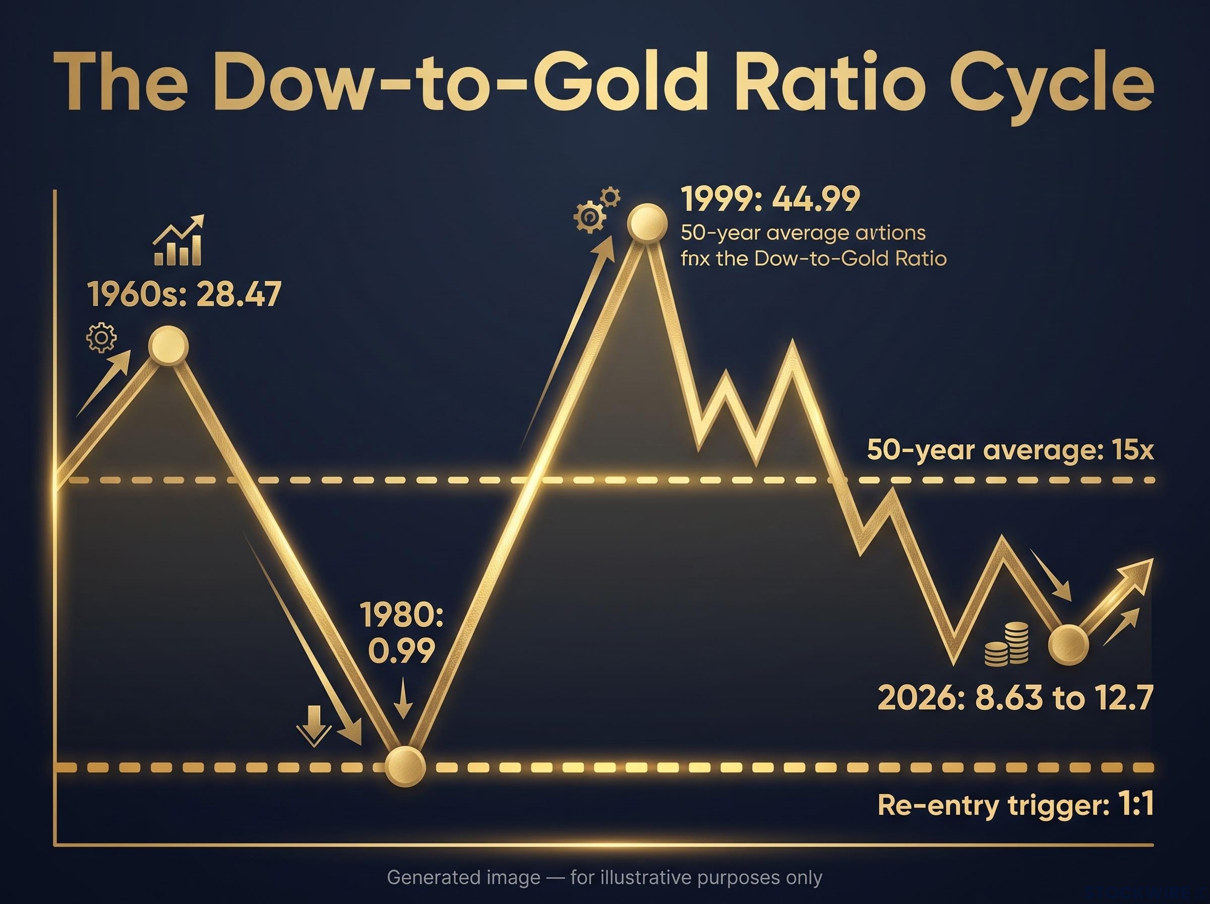
The pattern has repeated since the Federal Reserve was founded in 1913, swinging between eras when stocks dominate and eras when gold does. The waypoints tell the story.
- 1960s: approximately 28.47 ounces per Dow. Stocks expensive relative to gold, a strong period to own equities.
- 1980: approximately 0.99 ounces. Gold at a generational peak. One ounce bought the entire Dow basket, the moment to own metal.
- 1999: approximately 44.99 ounces. The dot-com summit, the best time in modern history to hold stocks over gold.
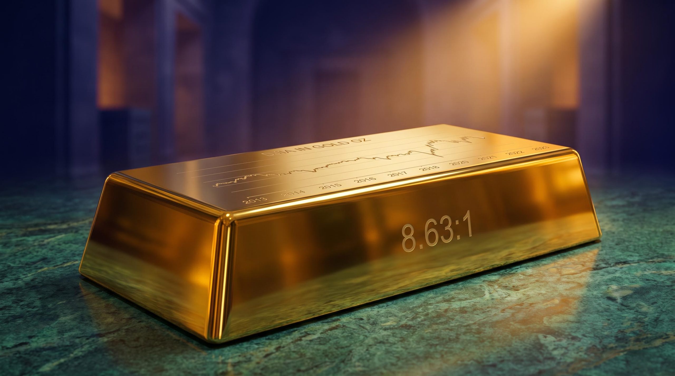
- Mid-to-late 2026: estimated between 8.63:1 and 12.7:1 (unverified). Below the 50-year average of roughly 15x, but nowhere near a crisis low.
What the current reading implies
A ratio somewhere between 8.63 and 12.7 tells you that stocks are already cheaper in gold terms than their half-century average. But they remain far above the 1:1 level that has historically marked the point where equities become genuinely cheap for a gold holder.
The Hunt framework treats that eventual 1:1 convergence as the signal to rotate back into stocks. It arrives, in this view, alongside low price-to-earnings ratios and broad public disgust with equities. Real-economy stress is already flickering in places: the source notes Florida housing markets where listed properties reportedly outnumber active buyers by four to five times.
How to read the current ratio without over-indexing on one framework
Mainstream strategists reject the gold-denominated lens outright, and their case deserves a fair hearing.
They argue that measuring stocks in gold overstates gold’s importance and ignores real wealth creation. In dollar terms, the Dow has delivered annualised returns of roughly 13% over 10 years and 11% over 20 years (unverified). Standard valuation leans on discounted cash-flow analysis, a current Dow price-to-earnings ratio around 21, and a dividend yield near 1.5%.
The deeper catch: the ratio only works as a signal if gold itself is fairly valued. If gold is expensive, the ratio flashes “stocks are cheap” when they may not be. For you, that means treating the ratio as one input among several, not a single oracle.
The debt math that makes systemic disruption a scenario worth pricing in
The fiscal numbers do not require catastrophising. They speak clearly enough on their own.
US national debt now exceeds 100% of GDP (unverified). Net interest on that debt has reached roughly 18.5% of federal revenue, with projections pushing toward 25% by 2036. Annual interest costs already top $1 trillion.
For a sense of scale, the Penn Wharton Budget Model marks the line where debt becomes unambiguously unsustainable.
The Penn Wharton threshold US debt is estimated to become clearly unsustainable once it exceeds approximately 210% of GDP. That is the level at which economists broadly agree the trajectory can no longer be managed through ordinary fiscal adjustment.
The disagreement is about timing, not direction. The Hunt framework anticipates major systemic disruption within roughly three years, possibly sooner. Mainstream bodies, including the IMF and Fitch Ratings, agree the medium-term path is unsustainable but see near-term default or dollar collapse as unlikely, expecting a gradual fiscal squeeze instead. This guide does not resolve that split for you; it hands you both readings.
The fiscal sustainability threshold that separates a manageable debt trajectory from a structurally unstable one is itself contested: net interest at 18.5% of federal revenue sits below the 20% level many analysts flag as a warning, but the GAO projects debt held by the public reaching 123% of GDP by 2036, a trajectory that compresses equity multiples and raises refinancing costs well before any default scenario arrives.
Where the framework becomes concrete is the stablecoin question. Stablecoins are dollar-pegged crypto tokens, and some argue they can absorb enough Treasury issuance to ease the funding strain. The scale comparison suggests otherwise.
| Metric | Approximate size |
|---|---|
| Total stablecoin market cap (mid-Sept 2026) | $302.4B (Tether ~$183.3B, USDC ~$73.8B) |
| Minimum annual US debt issuance | $1.5 trillion |
| Annual spending vs revenue gap | ~$7 trillion out vs ~$5.5 trillion in |
The takeaway is stark. Even if the entire stablecoin market doubled overnight, it would not cover a single month of the gap between what Washington spends and what it collects. If you have been waiting for stablecoins to quietly solve the Treasury demand problem, the arithmetic does not support the wait.
There is a further wrinkle. Stablecoin Treasury buying concentrates almost entirely in short-dated T-bills, compressing 3-month yields by an estimated 2 to 5 basis points while doing essentially nothing for the 10- and 30-year funding costs that drive long-term sustainability. Tether and Circle together hold an estimated $201.63 billion in Treasury-linked reserves, so the demand is real, just aimed at the wrong end of the curve to matter.
What “rotating into real assets” actually means in practice
Strip away the abstraction and the reset positioning framework points to a specific set of moves. Physical gold, silver, and platinum sit at the core. Selective crypto exposure comes second. Everything else is defensive.
The full checklist runs like this:
- Physical precious metals (gold, silver, platinum) as the primary holding
- Lean bank balances, reducing exposure to traditional financial institutions
- Geographic diversification of where assets are held
- Jurisdictional optionality, meaning the ability to move assets across borders if needed
- Selective cryptocurrency, sized as a speculative secondary position
Now the costs, because the thesis is usually sold without them. The Commodity Futures Trading Commission (CFTC) has bluntly called gold “no safe investment,” citing wide dealer spreads in stressed markets plus real storage and theft risks. Metal is not a frictionless hedge.
Crypto carries a sharper warning. Annualised volatility runs near 55%, roughly four times that of the S&P 500. Here is the number that should shape your sizing: even a 6% allocation to crypto can double your overall portfolio volatility.
That statistic is not an argument against holding crypto. It is the information you need to size the position deliberately, rather than treating it as a harmless little satellite. A 6% slice behaves like a much larger one.
Mainstream strategists, predictably, push back on the whole concentrated approach, favouring diversified multi-asset portfolios over a heavy tilt into physical metal and crypto. That is the counterweight to hold in mind as you calibrate.
Treating gold as a monetary reset asset rather than a peripheral hedge changes how you size the position: a CFA charterholder running roughly a third of his fund in precious metals argues the falsifiable monitoring variables are real interest rate trajectory, central bank purchase volumes, and the US fiscal deficit path, not any single price target.
The case for holding crypto despite the volatility data
The Hunt reasoning is almost contradictory on its face, and that is the point.
The framework holds philosophical reservations about crypto, yet still recommends exposure. The logic: if capital genuinely flees traditional finance during a systemic disruption, a meaningful share of it plausibly floods into crypto, inflating those values sharply.
So this is a speculative bet on capital flight, not a core conviction holding. That distinction should govern how much you commit.
The geographic and institutional risk layer
The jurisdictional moves are additive, not a substitute for the asset choices. The rationale for lean bank balances leans partly on cyber risk; the World Economic Forum has flagged cyber threats as a systemic vulnerability, and the concern here is remote seizure or disruption of digitally held funds. Diversifying where and how you hold assets is about optionality if the system seizes up, a separate question from what you own.
Measuring your own portfolio in gold terms before the next cycle turns
Here is the one analytical step you can take today, regardless of whether you buy any of the macro thesis.
Denominate your portfolio in gold ounces. It takes three steps.
- Take your total portfolio value in dollars.
- Divide by the current gold price (roughly $4,380 as a worked example, so a $100,000 portfolio equals about 22.8 ounces).
- Track that ounce figure over time instead of, or alongside, your dollar net asset value.
Why bother if you are a sceptic? Because this exercise strips out currency debasement. It shows whether your purchasing power is genuinely growing or merely running to stand still against a shrinking dollar.
Energy, not destruction The original framing describes the current transition as energy flowing from one asset class to another, rather than wealth being destroyed. That mindset reframes the whole exercise: you are watching where purchasing power migrates, not bracing for it to vanish.
The Dow-to-gold ratio doubles as your personal re-entry trigger for equities. The historically validated signal is 1:1, the level last seen in 1980 at roughly 0.99:1. Be honest with yourself about the timeframe: the last trigger was more than four decades ago, so waiting for the next one may mean patience measured in years, not quarters.
A reader who converts their portfolio into gold ounces and checks that figure quarterly holds a purchasing-power yardstick that is entirely independent of Federal Reserve policy. If you suspect the dollar’s role as a stable measuring stick is itself under strain, that independent yardstick is precisely the point.
This article is for informational purposes only and should not be considered financial advice. Investors should conduct their own research and consult with financial professionals before making investment decisions. Past performance does not guarantee future results. Financial projections are subject to market conditions and various risk factors, and forward-looking scenarios discussed here are speculative and subject to change.
Building a position before the cycle turns, not after it is obvious
Three tensions run through everything above, and none of them resolves cleanly. Nominal dollar strength sits against gold-denominated stagnation in equities. A base-case price drift in metals sits against genuine tail-risk scenarios. Mainstream fiscal gradualism sits against the three-year disruption thesis.
Your task is not to pick a side wholesale. It is to calibrate. That comes down to three questions you can answer for your own balance sheet:
- How much exposure to physical metals fits your conviction and your storage tolerance?
- What Dow-to-gold ratio level triggers your re-entry into equities? The framework says 1:1; the current reading of 8.63 to 12.7 shows how far the cycle still has to travel.
- What crypto position size matches your actual risk tolerance, given that 6% can double your volatility?
The gold price distribution belongs here as a sizing tool, not a prediction: a 65% base case with a 20-25% melt-up tail tells you how to weight the upside bet, not what will happen.
Track one number above all others. If the Dow-to-gold ratio grinds from 12:1 down toward 1:1, you will hold a continuously updating signal telling you when the generational rotation from gold back into stocks has arrived. That is worth more than any single price forecast, because it keeps working whichever scenario, the melt-up, the base case, or the slow grind, actually plays out.